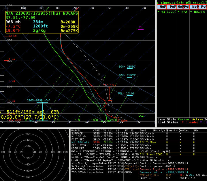
Comparing GLM Products from GOES 16 and 17- Wednesday

An approaching short wave trough as well as a remnant MCV moving through the area helped trigger thunderstorms over the upper Midwest.  Convection developed over Minnesota during the afternoon and evening hours.  Storms did not become severe near the Grand Forks, ND CWA until late in the afternoon. 

The upper Midwest is near the extent of coverage for both GOES 17 West and GOES 16 East.  This made it a good chance to compare how the GLM lightning products were affected by this issue.  Research has shown flash densities for both satellites diminish in this area, well away from the nadir of both satellites. 

Image 1 shows Flash Extent Density for GOES 17 on the left, and GOES 16 on the right.

The character and quality of the Flash Extent Density (FED) returns from each of the satellites can be seen, with GOES 17 showing a slightly westward tilt, and an eastward tilt in the returned grids for GOES 16.  The strongest storm in north central Minnesota has a higher and possibly better return on 17 than on 16.

Image 2 shows Minimum Flash Area for GOES 17 on the left, and GOES 16 on the right.

Values of Minimum Flash Areas from the satellites were quite different in some cases, and were also skewed as a result of the distance from the nadir of each satellite.  Placement of the flash areas also differed from “viewing” angle.

Image 3 shows Total Optical Energy from GOES 17 on the left, and GOES 16 on the right at 1958Z.

Total Optical Imagery (TOE) was also skewed.  It is interesting to note that the pixels of TOE in far southeastern ND change from minute to minute, as seen in Images 3 and 4.  At 1958Z, GOES 17 had an area of TOE returns along the ND/SD/MN borders, while GOES 16 had 2 separate areas, one in southern ND and one in west central MN.  By 1959Z, both GOES 17 and 16 agreed that there were 2 separate TOE returns in this region.

Image 4 shows Total Optical Energy from GOES 17 on the left, and GOES 16 on the right at 1959Z.

– Dana Scully

Tags: None

Analyzing the Performance of NUCAPS Gridded Forecast Parameters and GLM Comparison Between Satellites

Scattered strong to severe thunderstorms were popping up along the eastern ND and MN border today. However, these storms were struggling to become severe at times with a majority of the cells pulsing up and down. A NUCAPS pass around 19z provided gridded satellite observations and forecasts for the area to compare with SPC’s mesoanalysis page. The gridded NUCAPS at 19z shows CAPE (Image 1) values ranging from 500-1500 J/kg in the area mentioned above with little to no CIN (Image 2) present based on the gridded NUCAPS data. Image 3 below shows the SPC 19z CAPE/CIN data along with the forecast over the next 6 hours (through 01z). When comparing the 19z SPC mesoanalysis to the gridded NUCAPS, there was not much difference between the two with both showing higher CAPE values further south into Nebraska and Kansas. The gridded NUCAPS for CIN seems a bit erroneous with really no signature for -50 or less of CIN, which is present in the SPC mesoanalysis. This is likely due to the lack of detailed boundary layer features with NUCAPS and the fact that it may likely wipe such smaller inversions.

Image 1 shows the 19z gridded NUCAPS for CAPE.
Image 2 shows the 19z gridded NUCAPS for CIN.
Image 3 shows a loop of the MLCAPE/MLCIN forecast values for 6 hours (through 01z) from SPC’s mesoanalysis page.

Looking into the forecasted parameters from NUCAPS, there is a much higher bias in the CAPE values. However, they did a great job at pinpointing an area of higher instability to watch for storms to potentially become more severe with time. The overall CIN forecast looked as if it may start to increase further west near Grand Forks later in the evening, but in central MN where the corridor of CAPE values were higher remained uncapped. As time progressed through the afternoon a few storms did start to intensify and become severe across north central MN with a few severe wind reports. A few lingering surface boundaries were present, along with a weak shortwave at 500mb helped to enhance the storms a bit. I do feel the NUCAPS forecast values for CAPE were a bit too high in comparison to the actual environment and should definitely be compared to model data.

Image 4 is a loop of the 19z gridded NUCAPS forecast of computed CAPE over the next 6 hours (through 01z).
Image 4 is a loop of the 19z gridded NUCAPS forecast of computed CIN over the next 6 hours (through 01z).

Lastly, the location of storms yesterday provided the chance to compare the GOES-16 and GOES-17 GLM products with one another. However, image 5 shows the extent of the two satellites and GOES-17 was right on the edge of where storms were across the Upper Midwest. As you get further away from the satellite and towards the edge of its coverage, you can start to notice more of a tilt in the gridded data. This may cause some erroneous data as seen in comparison with GOES-16. Comparing the GOES-16 data (Image 6) with the GOES-17 data (Image 7), there is a better display of the minimum flash area and lightning sizes with the GOES-16. You can see GOES-16 shows more of a mixture of shorter and longer flashes (purple and yellow colors), while GOES-17 sees strong shorter flashes (yellow colors). Also, the further away the satellite is to the storms the more likely the flash extent density may be less accurate. This is likely due to the storms being on the edge of the satellite’s reach. Therefore it is important to check out both satellites when possible, but take into account where the storms are in respect to the satellites coverage.

Image 5 shows the areal coverage of GOES-16 (left) and GOES-17 (right).
Image 6 shows GLM through GOES-16 with the local radar (top left), minimum flash area (top right), flash extent density (bottom left) and optical energy (bottom right).
Image 7 shows GLM through GOES-17 with the local radar (top left), minimum flash area (top right), flash extent density (bottom left) and optical energy (bottom right).

Here are a few more supplemental images of the GLM GOES-16 satellite versus the GOES-17 with similar concerns as mentioned above.

Image 8 shows GLM through GOES-16 with the local radar (top left), minimum flash area (top right), flash extent density (bottom left) and optical energy (bottom right).
Image 9 shows GLM through GOES-17 with the local radar (top left), minimum flash area (top right), flash extent density (bottom left) and optical energy (bottom right).

– Harry Potter

Tags: None

Analysis of a Line of Storms Moving Across Northeastern LA into Western MS

Today we focused on the slight risk across the southeast, specifically WFO Jackson, MS. During the afternoon hours, a small linear complex was coming across northern LA towards Jackson’s CWA. Right before the CWA line, there was a wind report of snapped tree limbs of 3” diameter from Monroe Airport. There was also a measured gust from the airport of 41 mph. The velocity on radar had ~60 knot outbound winds at around 14,000 – 15,000 feet, which easily could have produced a few severe gusts to the surface. The gifs below show the linear line of storms and the associated velocity as the system moved over Monroe Airport in northeast LA with the wind report at 1952z and then continued to enter western MS.

Image 1 shows a loop of radar reflectivity with prob severe overlaid and Image 2 shows the velocity associated with the radar loop.

In this situation, prob severe was not doing as good of a job on picking up on these “stronger” winds. Image 3 below shows the time of the wind damage report and 41 mph gust at the airport in northeast LA, but prob severe and prob wind are both only picking up about 20% probability of this potential. Almost two hours later, the line of storms are a bit weaker on reflectivity but just as strong or even stronger on velocity. Note, the storms were also closer to the radar at Image 4, so the stronger outbound velocities were closer to the surface. So this led to wondering is prob severe a good indicator for straight line winds?

Image 3 shows the prob severe time series at the time of the damaging wind report at Monroe Airport in northeast LA.
Image 4 again shows a prob severe time series for the same line of storms about two hours later and approaching the western MS border.

Prob severe utilizes azimuthal shear which as seen in the Images 3 and 4 below are not present with solely outbound velocities and little to no inbound present. This is common for straight line wind scenarios, but not super helpful in terms of how prob wind is calculated. Also, the prob severe is an object oriented product that utilizes reflectivity for these objects. In this scenario, the reflectivity definitely began to weaken but velocity did not. The toughest part was the prob severe began to decrease over the two hour time span shown above, but yet several damaging wind reports of roofs blown off and trees/power lines down led me to believe the probability of prob wind should have remained constant or increased over time.

While investigating the prob severe I also took a look into the lightning characteristics within the line as you can see in the GIF below (Image 5) that there is the formation of some trailing stratiform on reflectivity. A still image was taken (Image 6) to show how the lightning began to extend westward into the light stratiform. The flash area (top right of the four panel) shows the darker purple color extending westward, which indicates the storm mode is more of that light stratiform rain with longer flashes extending through it rather than the intense small flashes within the leading line. This can be helpful in time when you may have a DSS event and the main line has passed through, but lightning is still present in the trailing light rain. Pairing the ground networks with the GLM extent and area allows a forecaster to give DSS on the latest CG stroke within the large area.

Image 5 shows a four panel with reflectivity (top left), GLM flash area (top right), GLM flash extent (bottom left) and GLM optical energy (bottom right). The ground networks have been added to the flash area with CG strokes and then over the flash extent with polarity and cloud flashes.
Image 6 shows the same four panel layout as described in image 5, but as a still image. This shows a great use of GLM for examining storm mode and flash extent, along with DSS uses of CG strokes within the large westward expanding extent of flashes behind the main line of storms.

Lastly, there was a NUCAPS CONUS NOAA-20 satellite pass at around 19z, which was well before the line of storms made it to the western Jackson CWA line. No special radiosonde launches were made by local offices, so the next best observational guess of the atmospheric profile would be from satellite. Model soundings were also available to compare at the time. A RAP sounding at 19z was taken just east of the western MS border (see Image 7 below for location of this sounding) and a very nearby NUCAPS sounding was also retrieved for comparison (see Image 8 below for location of this sounding).

Image 7 (left) shows the location of the retrieved 19z RAP sounding (circled in white) and Image 8 (right) shows the location of the retrieved 19z NUCAPS sounding (circled in white).

The soundings (Image 9 and 10 below) looked fairly similar between the model and satellite profiles; however, there were several major differences that played a key role in changing the instability parameters. The NUCAPS sounding was still slightly too low of a surface temperature with 86 deg F versus the RAP’s 89 deg F. Surface observations from 19z at that location showed a temperature of  around 91 deg F. Also, the surface dewpoint was far too low on the NUCAPS profile at the surface as it was 5 degrees below the current observation at 19z. Meanwhile, the RAP was only one degree lower than the current surface dewpoint. These subtle differences caused significant variations in the CAPE values.

Image 9 shows the 19z RAP sounding through sharppy.
Image 10 shows the 19z NUCAPS sounding from sharppy.

After realizing the NUCAPS profile was not accurately depicting the surface temperature/dewpoint, I decided to see what the modified sounding might look like through NSHARP. Image 11 below shows the modified NUCAPS sounding through NSHARP with a much cooler surface temperature of near 80 deg F. This was almost 10 deg below the actual surface temperatures and 6 deg below the original NUCAPS profile. The boundary layer was not representative due to this drastic difference and therefore the modified sounding had to be thrown out of the comparison.

Image 11 shows the modified 19z NUCAPS sounding shown through NSHARP.

Lastly, with knowing the line of storms were headed into the area of interest I decided to see how the forecast products were looking. Unfortunately, I did not get to save the images off in time as the forecast images disappear from AWIPS when the next pass occurs. So I was left with the web-browser version which is only in a gridded format. Unfortunately it is very difficult to depict changes in this format, whereas in AWIPS you can interpolate the image and smooth the results for a more concise display of values. Image 13 shows the comparison of the web-browser gridded format versus the AWIPS smoothed version for the West Coast pass of the NOAA-20 satellite.

Image 13 shows the gridded NUCAPS CAPE forecast for 6 hours in the future from the web-browser (left) and the same exact data and image displayed in AWIPS smoothed (right).

– Harry Potter

Tags: None

Lightning DSS for the Mississippi Pickle Fest

Our team, as WFO/JAN, chose the setup for the Mississippi Pickle Fest at 1150 Lakeland Drive Jackson, MS as our IDSS location today (Tue, 08 Jun).  Per SPC Outlooks, the Jackson area was on the “edge” of the Marginal Risk Area for severe weather.  As operations began for today, a thundershower was noted to the SW of Jackson, moving NE toward the IDSS location of interest:

KDGX reflectivity at 1926 UTC, with shower SW of Jackson/Pickle Fest. Range rings at 5/10/20 miles.
GLM and NLDN Lightning at 1932 UTC, showing electrical activity in thundershower SW of Jackson, MS.

A modified NUCAPS sounding from near Jackson, MS (which became available later), indicated plenty of instability/CAPE (2000-3500 J kg-1), suggesting that the thundershower would be maintained as it advected toward the Pickle Fest location.  This would be a good time for a “heads-up” to the event venue or EM.  The unmodified NUCAPS sounding (not shown) still suggested sufficient instability aloft for the storm to maintain itself.

The ProbLightning product on the Web, somewhat surprisingly, still showed only ~25% chance of a GLM lightning flash within the next 60 minutes at 2001 UTC, but this had increased to 75% by 2026 UTC:

By 2029 UTC, the electrical activity was nearly overhead:

Interestingly, the NUCAPS forecast CIN was forecast to increase over the next couple of hours (valid 22UTC, below), after the storm passed, but ahead of another, stronger line further upstream (not shown).

Based on this, and the rapid collapse of electrical activity within the shower around 2110 UTC, a reasonably confident “all-clear” could have been given to the venue at that time…or at least until the upstream line approaches in a couple of hours, assuming it holds together.

– ProfessorFrink

Tags: None

Using GLM

Using the minimum flash area to show where the smaller lightning strikes occur but is associated with stronger updraft with cells building faster (Yellow) to generate lightning. Larger lightning strikes occur in the stratiform area of the precipitation field where charge building is slower (Purple). This is also a good way to indicate convective mode as the system translates from individual (SuperCell) to a linear mode.

(Upper Left – ProgSvr/Ref), (Upper Right – Flash Extent Density), (Lower Left – Optical Energy), (Lower Right – Minimum Flash Area) Note the area of enhancement behind the main convective line. This is stratiform lightning strikes where the charges are slower to build vs. the convective linear line, and individual cells out in front of the storm.
Note the differences from the previous image as the Optical/FED and Minimum Flash Area has less flashes. This is due to the building of the charges.
A four panel of GR2 where reflectivity (Upper Left), and ZDR (Lower Right) depict linear striations (above melting level – 30 dBz) to show the build-up of charges in the stratiform area of the storm. A good way to use it is for IDSS and the likeability of lightning strikes developing.

Using NUCAPS (Modified vs. Unmodified). Why the CAP at mid-levels noted in Arkansas? Is this reasonable or an artifact of the program that isn’t real.

Unmodified
Modified

– wxboy65

Tags: None

Northern VA/Maryland Convective Episode on 6/3/2021

Image 1: 1943 UTC GOES East Mesosector Day Cloud Phase Distinction

The modified NUCAPS sounding from 1730 UTC revealed in excess of 2,000 J/kg of CAPE (image 2) and by 1900 UTC thunderstorms had developed in an area less shaded by high level cloud cover. Comparing this to RAP mesoanalysis data, it initially seemed too high as RAP mesoanalysis suggested closer to 1000-1500 J/kg (not shown)  and based on initial lightning activity. SBCAPE from NUCAPS was extremely high and close to 4,000 J/kg which seems very high (image 3). We did note that for some reason the NUCAPS forecast image showed CAPE being “missing” over central MD/northern VA while the CIN fill was more complete. When sampled over the “missing” data in AWIPS in the Cloud,  the readout showed actual values.

Image 2: NUCAPS Sounding near Washington D.C.
Image 3: NUCAPS CAPE and CIN forecast at 2100 UTC
Image 3: 2000 UTC 4 Panel of Day Land Cloud Phase

Initially, storms appeared to struggle with flash counts on the order of 10 to 20 flashes. Over the course of 30 to 45 minutes, lightning flash counts increased by an order of magnitude (closer to 100-150 flashes)

Closer to 2020-2030 UTC the rigor of convective elements increased and we started seeing transient echo overhang/along with some weak echo regions in tandem with an increase in both lightning activity as well as ProbSevere trends (especially ProbSevere3) as seen in Image 4. This increased our confidence in issuing our own warnings with LWX having a couple of warnings already issued.

Image 4: ProSevere Time Series just after 2000 UTC.
Image 5: LWX 0.9 Reflectivity Image near 2000 UTC
Image 6 and 7:(LEFT) ProbSevere Time Series around 20:30 UTC.  (RIGHT) 4 Panel (from top left to bottom right) of Day Land Cloud Phase Distinction, Radar+GLM FED, Day Land Cloud Convection + TOE, ProbSevere3 + GLM MFA

Closer to 21:50 UTC things became a bit more interesting from both a radar and lightning standpoint. Imagery from the KDOX radar (Central Delaware) suggested increasing mesocyclogenesis across Baltimore County (image 8) due north of Baltimore.

Image 8: 20:48Z 0.5 degree cut from KDOX indicating low level mesoscyclone.
Image 9: 4 Panel of ProbSevere, GLM FED, GLM MFA, GLM TOE at 20:45 UTC
Image10: 4 Panel of ProbSevere, GLM FED, GLM MFA, GLM TOE at 20:51 UTC

From a comparison of these images, there was certainly an indication that the updraft was increasing  as FED magnitude increased from 51 flashes/5 min to 99 flashes/5 min. MFA also became more concentrated NW of the City of Baltimore and Baltimore County as seen in images 9 and 10. WFO LWX issued a Tornado Warning around 20:51 UTC.

An animation of the TDWR at Baltimore Washington Airport (image 11) had signs of a possible low-level RFD surge (not shown) in the 0.5 degree rapid scan tilt and increasing low level rotation consistent with either a stronger surge of straight line winds or a QLCS mesovortex/tornado. Aloft, (not shown) there did appear to be healthy reflectivity aloft and the concentrated MFA may suggest that a strengthening updraft.  

Image 11: TBWI 0.5 Reflectivity and Velocity image at 20:50 UTC looking at tornado warned storm.

Image 11 from KDOX shows a loose mid-level mesocyclone with a gradual increase in ProbSevere3 with the time series. In this image, the storm was currently tornado warned by WFO LWX. At time we’d likely opt for a tornado possible warning and monitor very, very closely.

Image 12: 21:02 UTC Showing ProbSevere Time Series with KDOX 0.5 data (left panels) and GOES/GLM data (right panels) + ProbSevere

By 21:13Z The storm of interest is looking LESS favorable for tornado although prob severe tor increased significantly to closer to 20% perhaps due to an elongated zone of low level shear.

Image 13: 21:13Z KDOX Radar Imagery

Prob Severe Table Ideas:  If the tables could open in a floating tab in Awips that would be very helpful. This way you can manually dock and move the tab around in awips. This way you can quickly view the tab and keep it open until you want to just close it.  You can also rename the tab to whatever will help you keep track of the storm that it belongs to. This would get around needing to color code multiple tables etc.

A separate tab will also allow room to show additional information (beyond just prob severe).

Prob Severe jumped to nearly 80% with a fast moving bowing segment through Montgomery County.

Storm in question is the southeastern storm here.

– By Miles and Dwight Schrute

Tags: None

Observations over the Sterling CWA

Looked at the modified NUCAPS sounding for and the low levels, below 700mb, were un representative (had an inversion when SPC mesoanalysis had no CINH), however the sky had roughly 80% cloud cover.

NUCAPS Base Sounding
NUCAPS Modified Sounding, Same Location as Above

Looking at the NUCAPS forecast, the holes in the output field due to the cloud cover.  The lack of data was in a bad location, preventing us from seeing the instability potential for a line of storms coming in from the west.  The gridded format was actually better to use in this case as it helped fill in the gap.

Interpolated CAPE NUCAPS Imagery

The interpolated data is easier to visualize gradients in the variables, but our experience was that some important data was filtered out by having this turned on.

The time in the lower left is 19.99z.  A key for the “all” field would be helpful to understand what I am looking at.

Having the CWA borders is handy, however having it as it’s own layer would be more helpful, and separating out the CWA borders from the state borders.

Can storm names be used to correlate the time series (F6, D3) and also have the names plotted in AWIPS for the storms I am looking at a time series of; would be more beneficial than having the lat/lon

-for example, click for a time series of one storm triggers a storm ID to show up in the time series and in AWIPS

-I click another storm and another time series shows up with the storm ID in the time series and in AWIPS allowing me to see which time series goes to which storm

If prob severe and its time series could be put into GR that would greatly improve DSS services when outside the office.  The AWIPS thin client is sloooow, so being able to have the same ability, or similar ability to interrogate storms as in the office would greatly help improve the quality of DSS when deployed.

Prob severe version three continues to look more reasonable for severe wind than version two

Noticed an increasing 5 minute trend in the minimum flash area that was reflected in the FED about 5 minutes later.  Seeing the sustained increase in one minute minimum flash area caused me to pay more attention to that storm than I did earlier due to the sustained growth

While monitoring a storm with FED and minimum flash area, the FED suddenly went down.  The same trend was not seen in the minimum flash area as easily.  Maybe the minimum flash area is more useful tool for monitoring the growth of storm while the FED is better suited for monitoring the overall trend in storm strength and sudden weakening.

Downward trends in FED for one of the storms matched what was being seen on satellite of the storm updraft becoming more ragged as it weakened due to entraining dry air.

-would be great to have lightning data such as FED plotted in a time series as well so trends are more easily seen

The stronger storm we were monitoring (same as in the screenshot below), prob severe version 3 was higher than version 2 for 15 minutes atleast.  Looking closer this was due to the hail category being higher than version two; version three was also higher than version two in the wind category, but not nearly as much.  Toward the end of our time version two was higher due to higher probabilities in the wind category.  Interesting.

We monitored this particular cell on and off throughout the afternoon and tried to gain a better understanding of the minimum flash area. We noticed a close cluster of negative strikes, which really helped as a visual aide for what the GLM was seeing. The GLM MFA was able to isolate the core of the storm really well. We combined this with ProbSevere, and watched the probabilities on this storm increase which was a further confidence booster that the storm was intensifying in addition to what was seen by GLM and ENTLN.  

– Accas and Groot

Tags: None

Day 2 thoughts

NUCAPS…

Can there be a circle (or some reference) around the NUCAPS point that I am currently using for a sounding?  That way I have a reference on the map for where the sounding is that I am looking at.

Can more than two NUCAPS sounding be loaded into an AWIPS pane?  If so, would nice be able to compare soundings/environments more easily.

Having the ability to display one NUCAPS sounding when I have two loaded in Sharppy would be helpful.  Even when loading two soundings and only have one in “focus” the two soundings overwrite each other.  Can this setup be similar to AWIPS that allows us to have multiple soundings loaded and be able to turn one or both of them on when we choose?

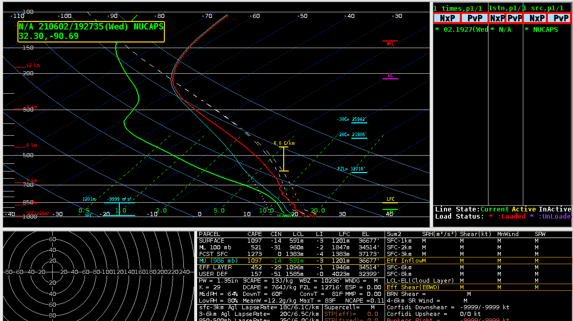
Compared a couple NUCAPS soundings surface conditions to the obs for a couple locations and they look reasonable.

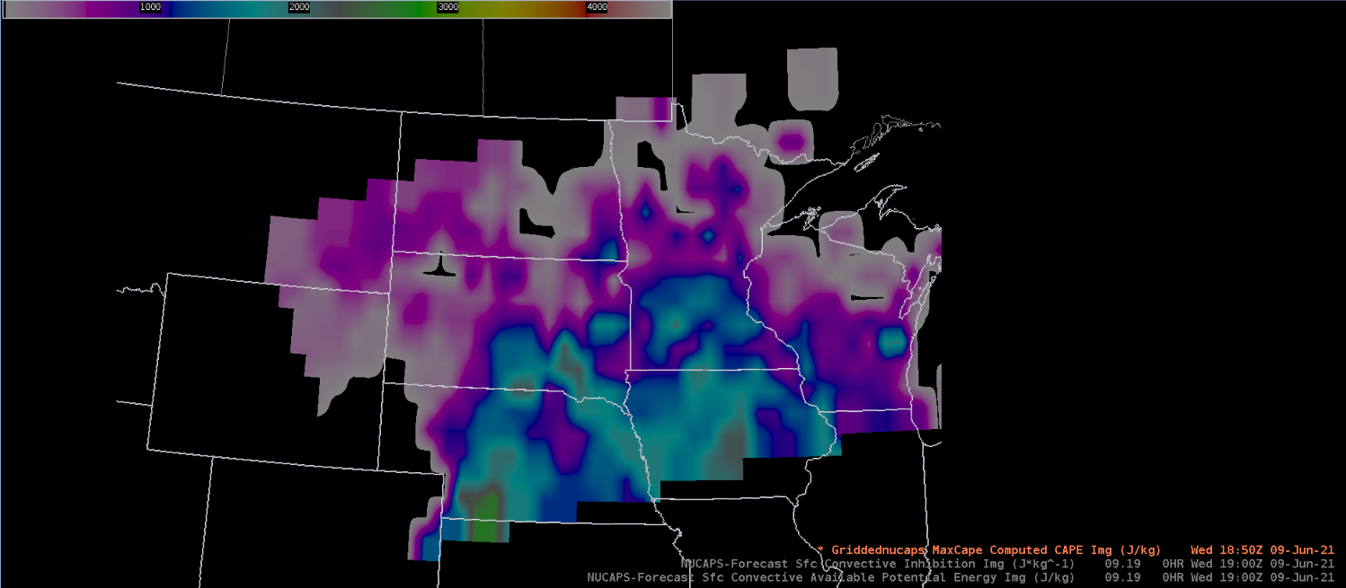
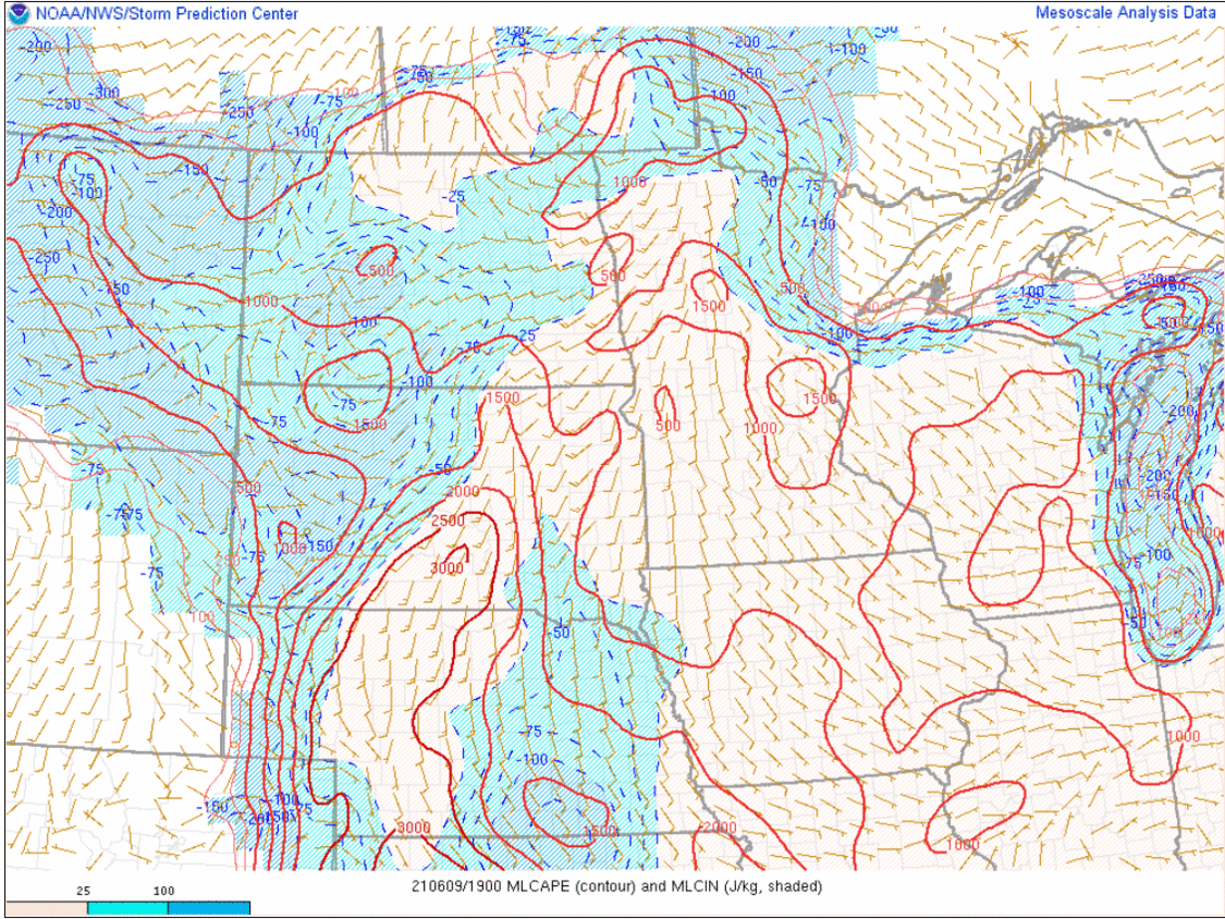
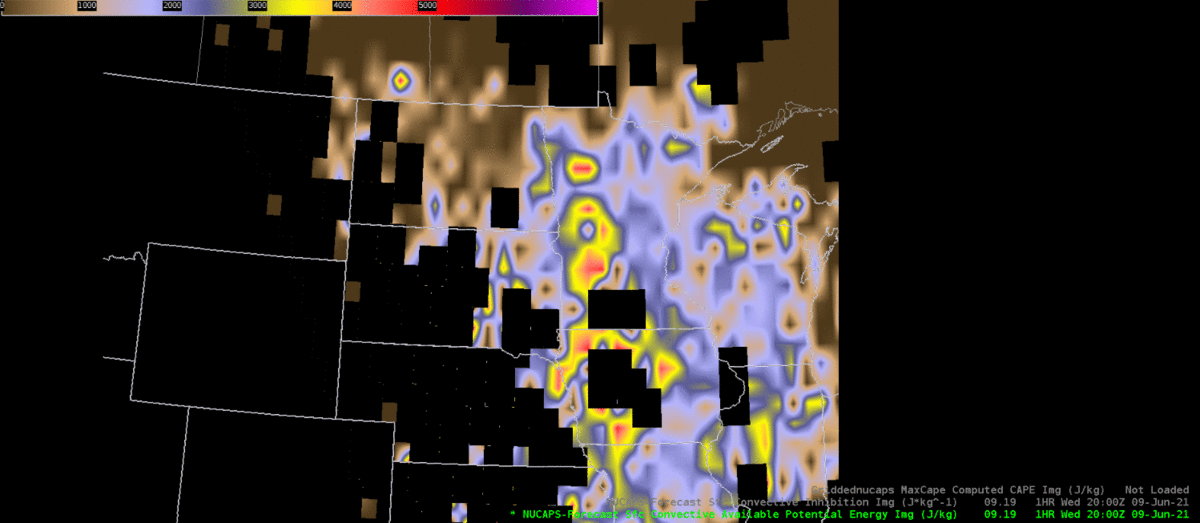
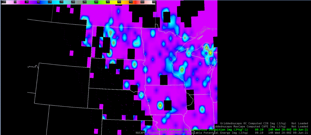
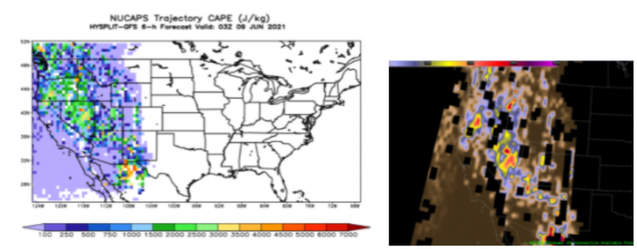
Looking at the forecast CAPE/CIN from NUCAPS, the gridded field for CIN is quite splotchy.  Bulls eyes of much higher CIN seem overdone compared to what is expected during the mid afternoon with full sun and with what the SPC mesoanalysis has.  This would make me question how accurate it is.   Looking at the forecast, there is no consistent trend with the CIN bulls eyes, which lowers my confidence in this field. The CAPE field is more uniform, though still splotchy.  The areas of higher CAPE are more consistent, giving me more confidence in this field than the CIN.  Is there a way to average out this field more to make it smoother?  If so, that would greatly increase my confidence in this parameter and my likelihood of using it in the future.

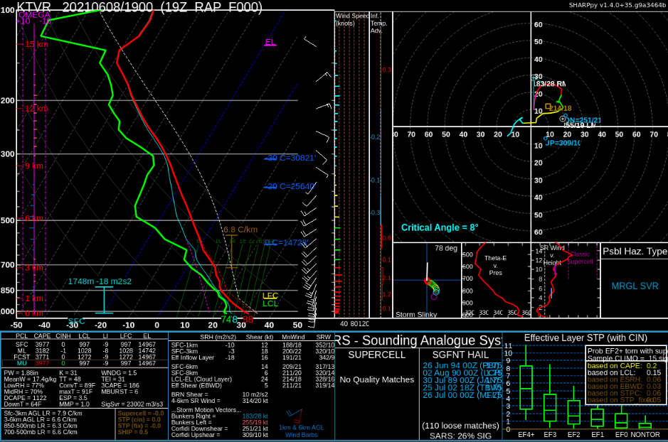
Noticed the surface based CAPE in AWIPS vs. Sharppy was quite a bit higher in Sharppy.

Compared the ML CAPE in a modified NUCAPS sounding in AWIPS and an unmodified NUCAPS sounding in Sharppy and the modified lined up much more closely with the SPC mesoanalysis page.  The the ML CAPE in the unmodified sounding in Sharppy was too low.  Surface based CAPE was actually more representative in the unmodified sounding.

As mentioned earlier, would be nice to compare more than two sounding points for NUCAPS to aid in comparing the environment more easily.

Having the NUCAPS 2m temperature and DP in F instead of C would be much more useable and easier to compare to surface observations.

Noticed the 2m temperature for the gridded NUCAPS was cooler by 5-8 C compared to the observations.  This makes me looks confidence with the CAPE and CIN plots if the surface temperatures are not accurate.  Is there a way to grid the modified NUCAPS data?  When I forecast I like to view parameters in a gridded fashion in the horizontal.  This helps me better understand what is going on with the environment.

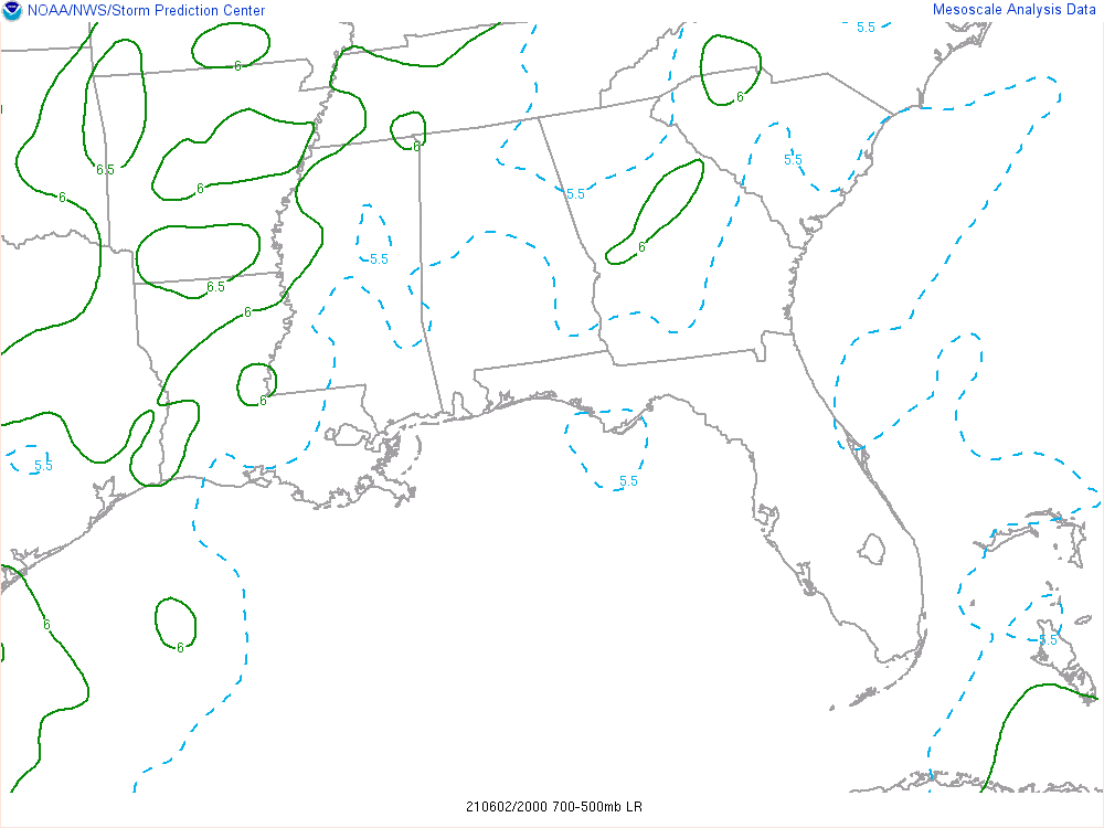
Compared the NUCAPS 700-500mb lapse rates to those on SPC’s mesoanalysis page and found the NUCAPS was close, but on the cool side.

In our data sparse CWA, I can see these soundings as being quite useful, as long as forecasters understand the low levels (assuming below 850mb) are less likely to be representative.

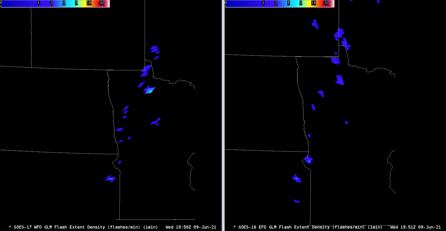
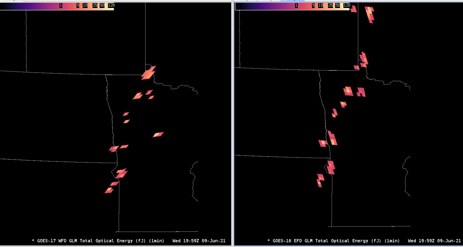
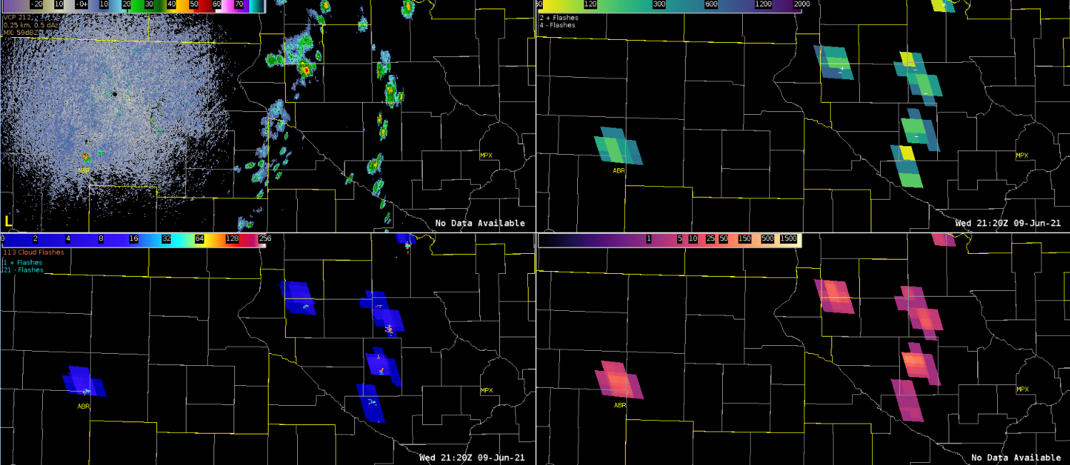
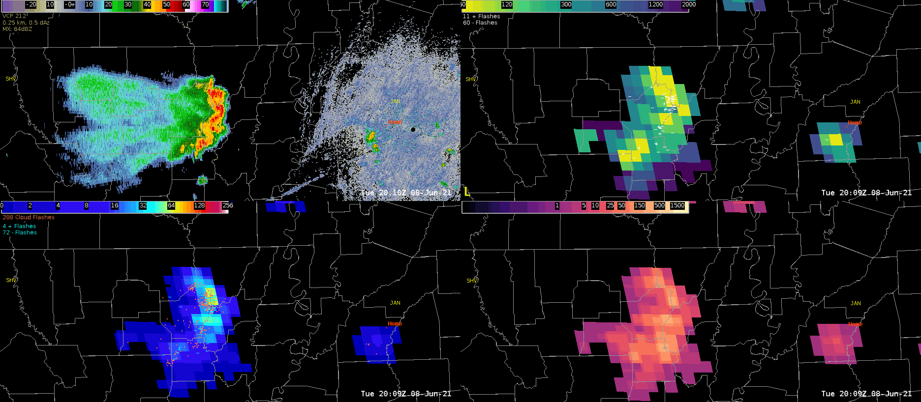
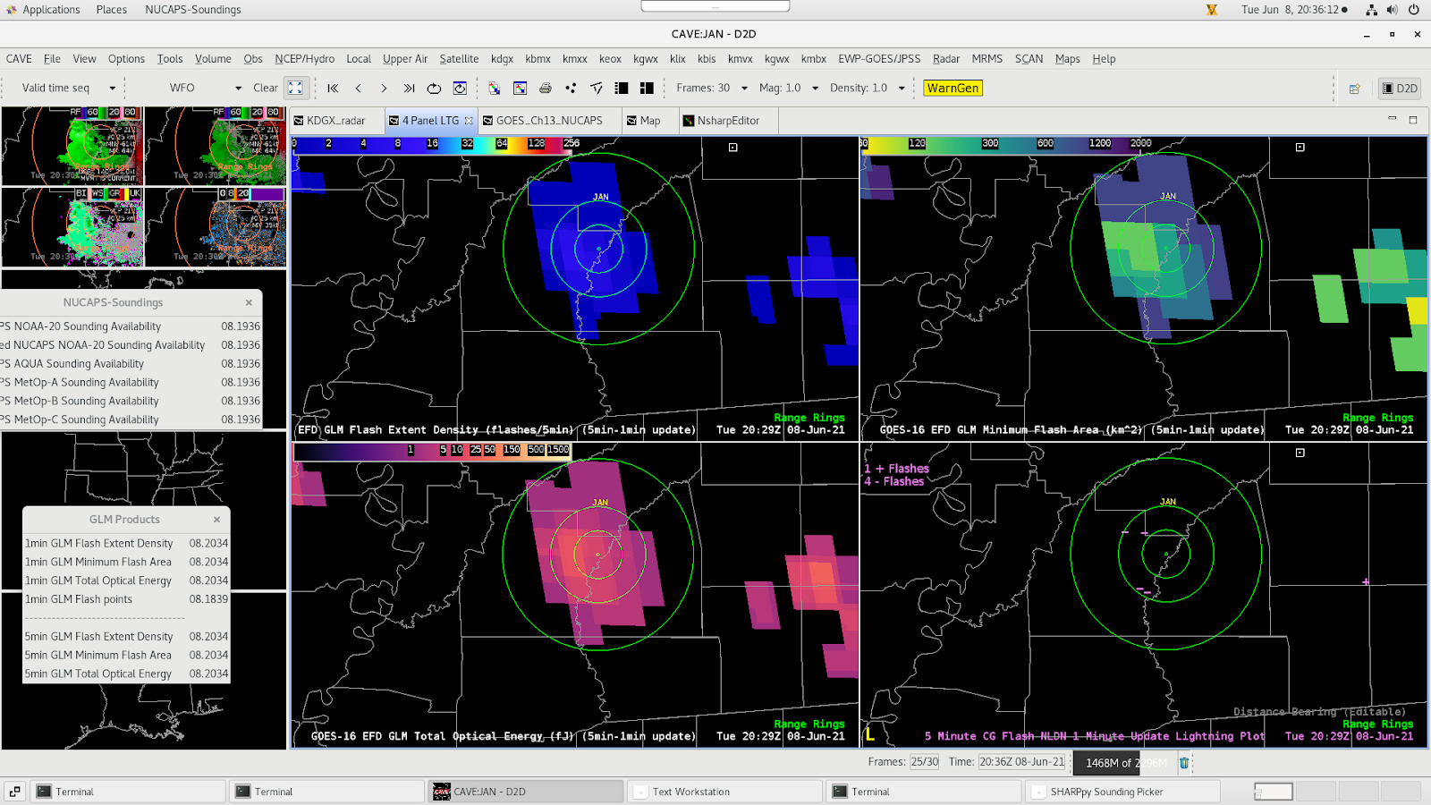
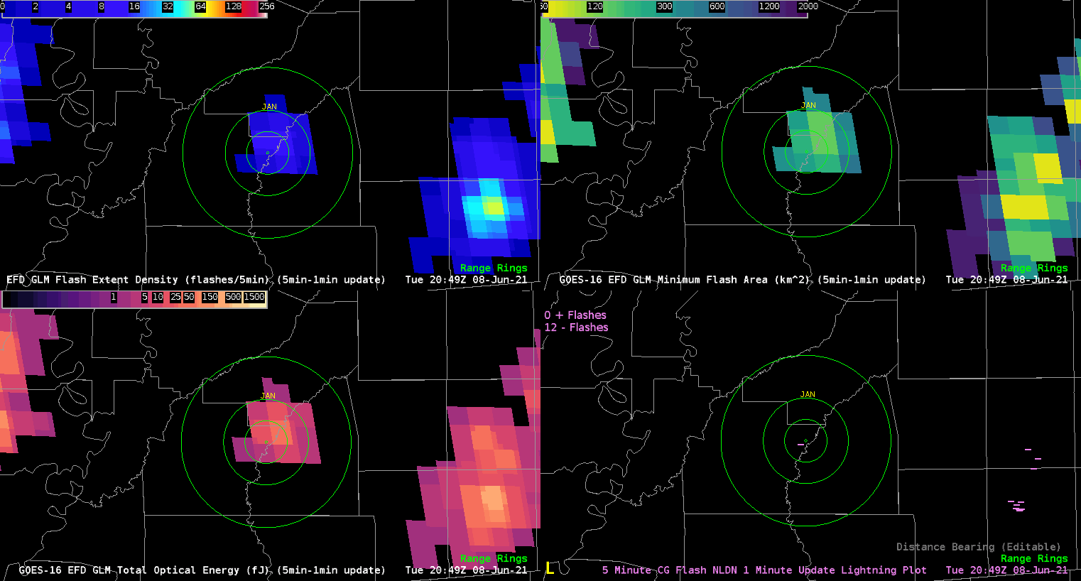
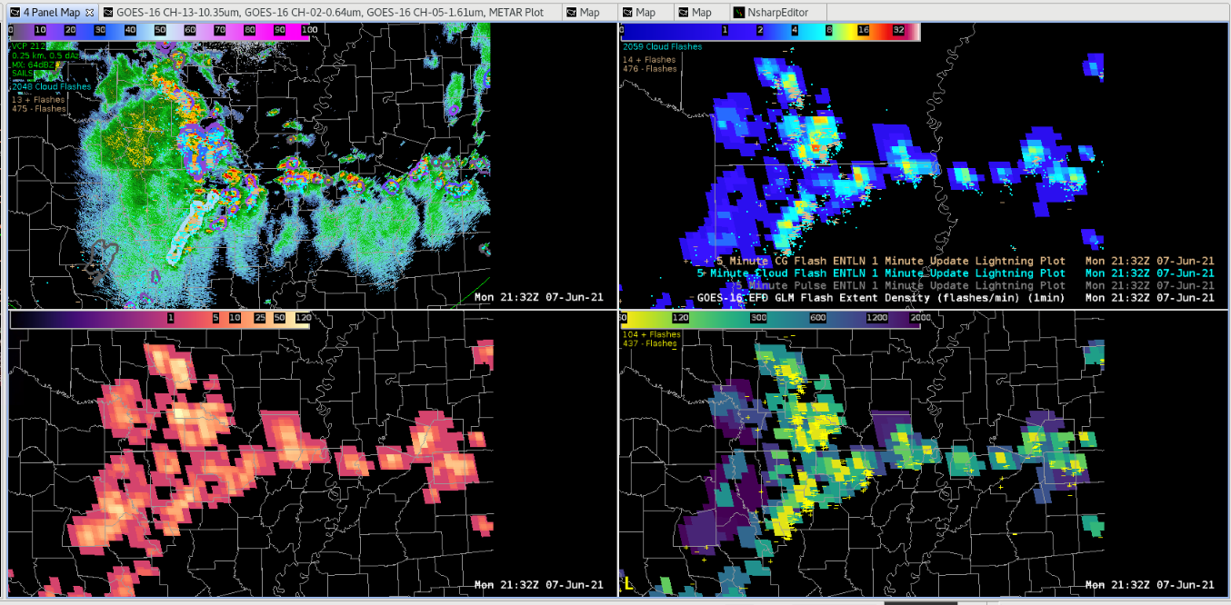
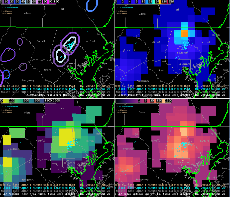
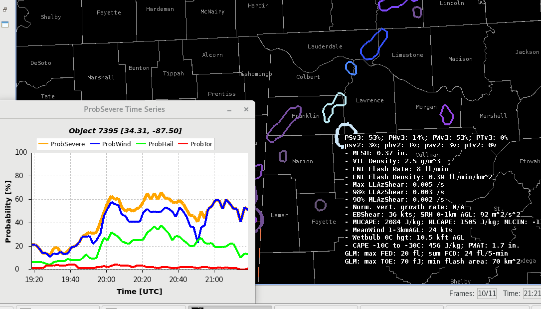
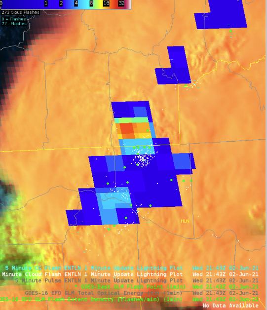
Taking a look at the minimum flash area…

Difficult for me to really see any sort of trend with the 1 minute data.  Nothing really catches my eye.  The 5 minute data is much more easy to see trends.  

As mentioned yesterday, am able to see more valuable information with trends in the storm than with flash density.


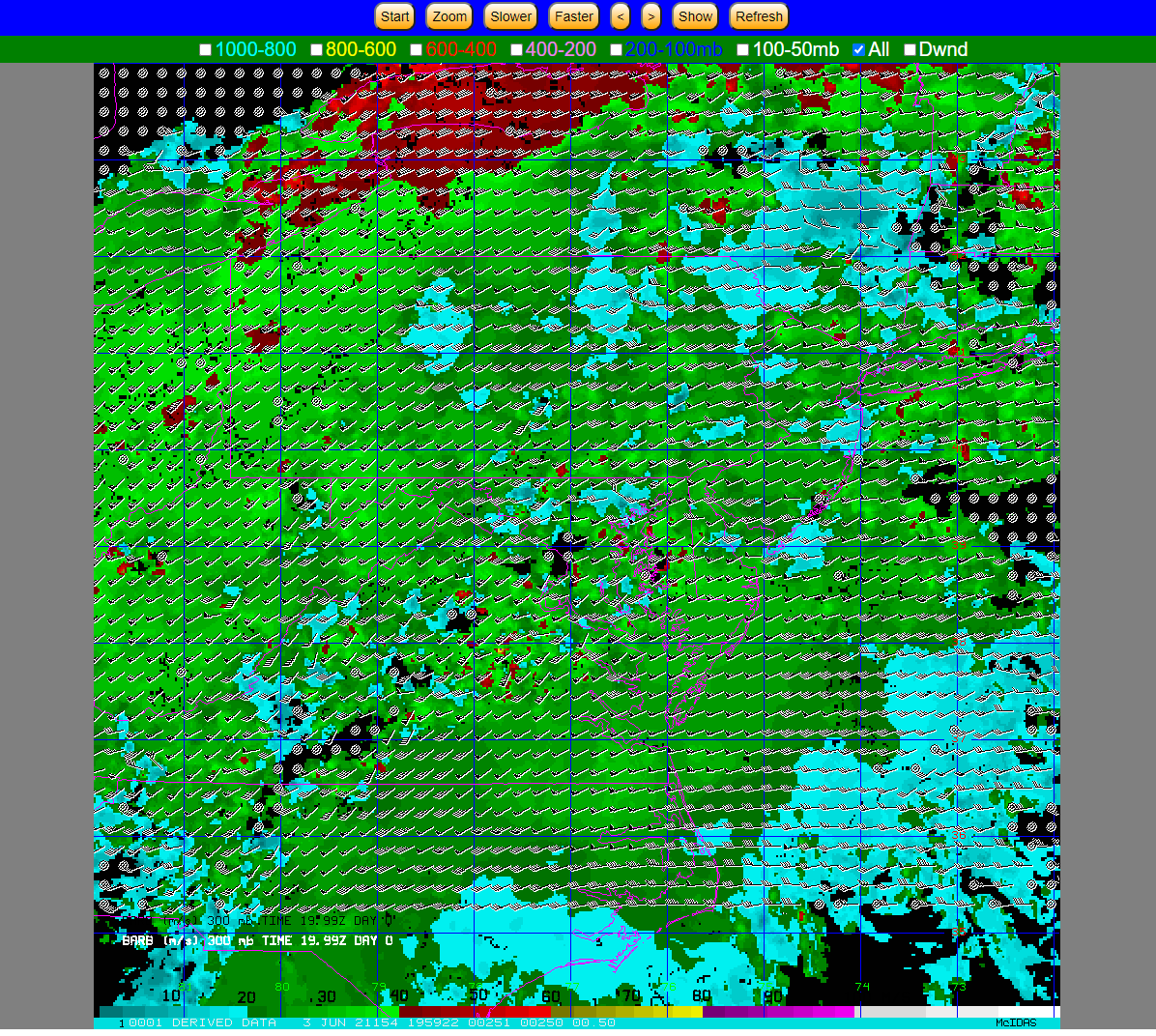
Looking at the optical winds…

The background is a bit too dark.  Can the Lat/Lon be put below the imagery?  Having it above seems to detract from what is being displayed.  Adding state borders, cities, would add to the usability of this product, especially if these labels can be turned on and off.

I like being able to pan the image.

I can see this being handy for monitoring for LLWS for aviation, assuming there are clouds to track.  Could this data be merged with NUCAPS to plot shear and helicity?   

Changing the density of the vectors would be handy.  

Color coding the different levels and matching it to the key is easy to determine what level I am looking at.  

Could this track the speed of dust?  If so, could help determine how strong the winds are in dust storms.

Curious why the pressure levels are broken down into 200mb intervals.  Could the winds also be tied to theta levels to help with isentropic analysis?

Having contours for the winds would help limit information overload as far as what is being shown.  Being able to control the density of the number of wind vectors would help, however that could lose some data.  Contours of the wind vectors, say every 5 or 10 kts, could help summarize what the individual vectors are showing.


-Accas

Sampling of Sub-Severe Convection Across the Southeast

Modified NUCAPS sounding appeared to have a better handle on the environment compared to baseline NUCAPS sounding. However, it also appears it might not be totally representative of the atmosphere given the partly cloudy conditions at the time RTMA data was pulled in. The SPC mesoanalysis page suggested MLCAPE upwards of 2500 J/kg in an uncapped environment.  Using the gridded mid level lapse rate product from NUCAPS we found the data to be representative. It verified well with what was shown in the NUCAPS soundings and matched with the values suggested by the SPC Meso Analysis page.

MODIFIED SOUNDING 1927UTC – WEST HINDS COUNTY, MS
1927UTC BASELINE SOUNDING – WEST HINDS COUNTY, MS
21UTC 700-500MB LAPSE RATES

The NUCAPS mid-level lapse rates were fairly representative when compared to the SPC mesoanalysis page. This was further evidence that large hail was probably not going to be in the cards for the Jackson area today, but marginally severe wind gusts would be something to watch.

16 UTC 700-500MB NUCAPS GRIDDED LAPSE RATES, SAMPLE NEAR THE SOUNDING DATA POINT

Prob Severe version 2 vs version 3, particularly in prob severe wind:

In this event, the prob severe there was a sig wx statement and severe thunderstorm warning put out by the Huntsville office. Around that time, the prob severe was increased specifically for the prob severe wind component. The version 2 had a prob severe value of 3% while the version 3 had a 53%.  Version 3 better captured the significance of the storm with a 40 mph gust reported around the same time.  This is significant since we were also discussing how filtering lower prob severe thresholds would be useful in decluttering the operational screen. We could have missed this event if that was the case (with version 2).

Based on this experience, we can see the vast improvement in the wind component of prob severe version 3.

21:16 UTC ProbSevere Sample (note V2 versus V3 differences in sample).
Local Storm Report of a measured 41mph wind gust in Colbert County AL, just north of the contoured ProbSevere storm.
1 Minute FED overlaid with ENTLN 5 minute (1 minute update) and GM Flash Point

GLM Observation:

Saw a steady lightning jump depicted in the GLM FED correlated with a storm that NWS Huntsville issued a Severe Thunderstorm Warning on. Several mPING reports of wind damage (assuming sub-severe with no LSRs issued as of this time) which raises confidence that storms are intensifying. Perhaps the most interesting thing about this screenshot is seeing the parallax-correction in action when looking at the Flash Points.

Optical Wind:  

Still difficult to tell where you are geographically.  Suggestions to perhaps swap the lime green grid with the state outline colors.

Additionally, the time stamp gets cut off if you zoom in on the product and occasionally gets covered by the wind barbs themselves. Perhaps a floating time stamp would be better for this instance.

Time stamp for the image above.

A note about the timestamps:

The time stamps attached to the wind barbs appear to be formatted incorrectly, showing times like 21.97Z, note the actual time correctly formatted shown in the image below was actually 21:58Z.

– Groot and Dwight Schrute

Tags: None

GLM Flash Point Product

The GLM Flash Point is a unique addition to the GLM suite of products.  It’s parallax corrected, which is nice.  But the points seem to tell you less data per minute than the FED.  In this example there are eight points for the Sterling/Irion County storm.  However, you need to mouse over each point to get more data (flash duration and area).  By comparison, the FED quickly tells you this is an electrically active storm.  In a warning environment, with limited screen space, and where every second counts, the FED tells you a lot more very quickly than the Flash Points.

– Champion

Tags: None