
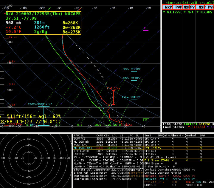
Looked at the modified NUCAPS sounding for and the low levels, below 700mb, were un representative (had an inversion when SPC mesoanalysis had no CINH), however the sky had roughly 80% cloud cover.

Looking at the NUCAPS forecast, the holes in the output field due to the cloud cover. The lack of data was in a bad location, preventing us from seeing the instability potential for a line of storms coming in from the west. The gridded format was actually better to use in this case as it helped fill in the gap.

The interpolated data is easier to visualize gradients in the variables, but our experience was that some important data was filtered out by having this turned on.
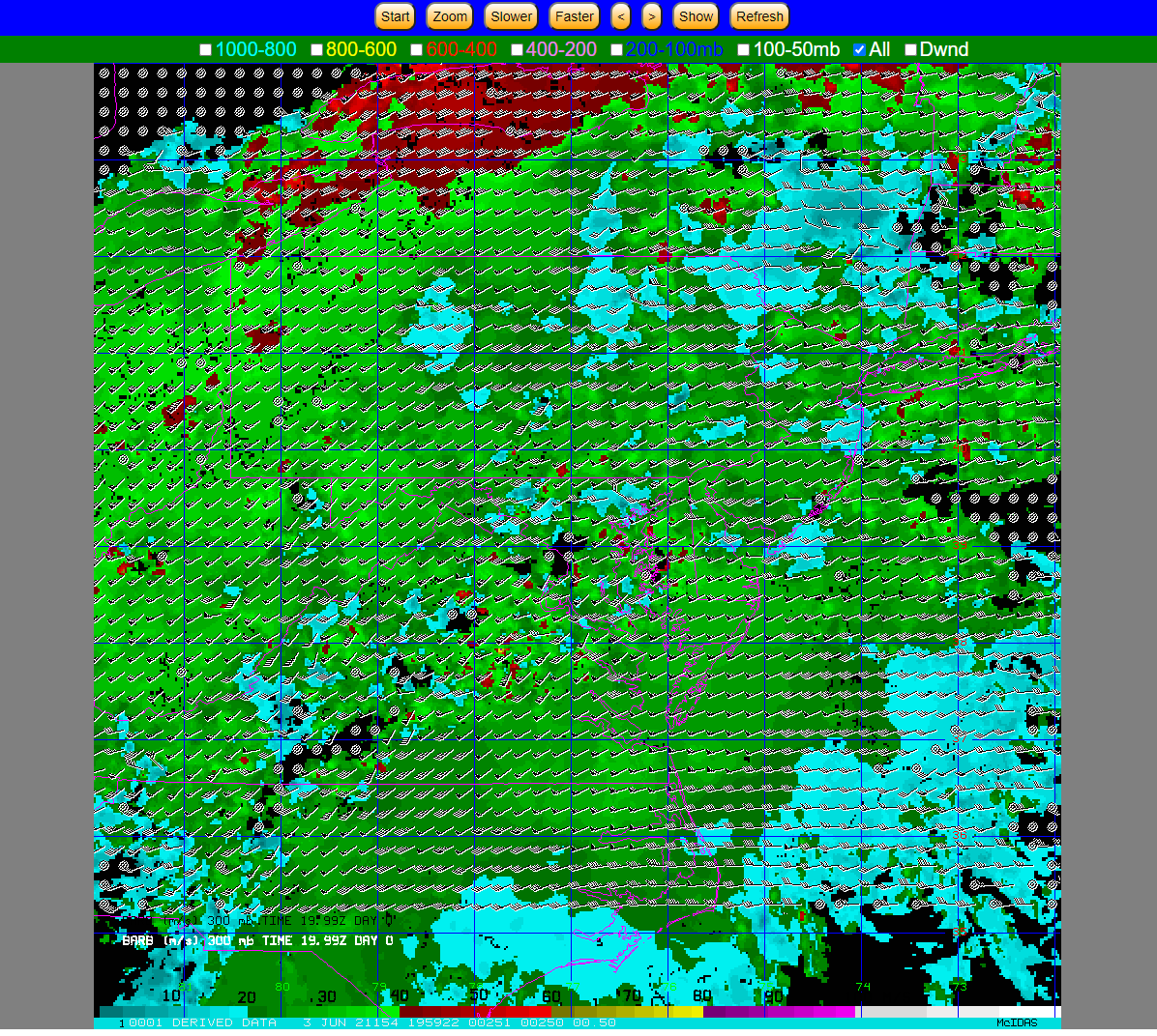
The time in the lower left is 19.99z. A key for the “all” field would be helpful to understand what I am looking at.

Having the CWA borders is handy, however having it as it’s own layer would be more helpful, and separating out the CWA borders from the state borders.
Can storm names be used to correlate the time series (F6, D3) and also have the names plotted in AWIPS for the storms I am looking at a time series of; would be more beneficial than having the lat/lon
-for example, click for a time series of one storm triggers a storm ID to show up in the time series and in AWIPS
-I click another storm and another time series shows up with the storm ID in the time series and in AWIPS allowing me to see which time series goes to which storm

If prob severe and its time series could be put into GR that would greatly improve DSS services when outside the office. The AWIPS thin client is sloooow, so being able to have the same ability, or similar ability to interrogate storms as in the office would greatly help improve the quality of DSS when deployed.
Prob severe version three continues to look more reasonable for severe wind than version two
Noticed an increasing 5 minute trend in the minimum flash area that was reflected in the FED about 5 minutes later. Seeing the sustained increase in one minute minimum flash area caused me to pay more attention to that storm than I did earlier due to the sustained growth
While monitoring a storm with FED and minimum flash area, the FED suddenly went down. The same trend was not seen in the minimum flash area as easily. Maybe the minimum flash area is more useful tool for monitoring the growth of storm while the FED is better suited for monitoring the overall trend in storm strength and sudden weakening.
Downward trends in FED for one of the storms matched what was being seen on satellite of the storm updraft becoming more ragged as it weakened due to entraining dry air.
-would be great to have lightning data such as FED plotted in a time series as well so trends are more easily seen
The stronger storm we were monitoring (same as in the screenshot below), prob severe version 3 was higher than version 2 for 15 minutes atleast. Looking closer this was due to the hail category being higher than version two; version three was also higher than version two in the wind category, but not nearly as much. Toward the end of our time version two was higher due to higher probabilities in the wind category. Interesting.

We monitored this particular cell on and off throughout the afternoon and tried to gain a better understanding of the minimum flash area. We noticed a close cluster of negative strikes, which really helped as a visual aide for what the GLM was seeing. The GLM MFA was able to isolate the core of the storm really well. We combined this with ProbSevere, and watched the probabilities on this storm increase which was a further confidence booster that the storm was intensifying in addition to what was seen by GLM and ENTLN.
– Accas and Groot