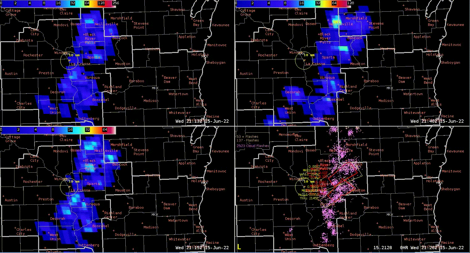
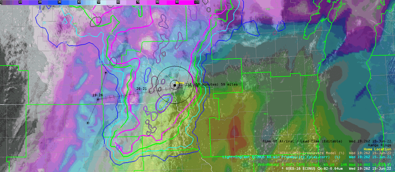
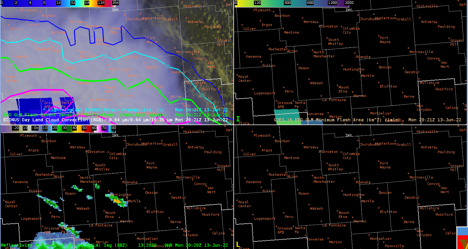
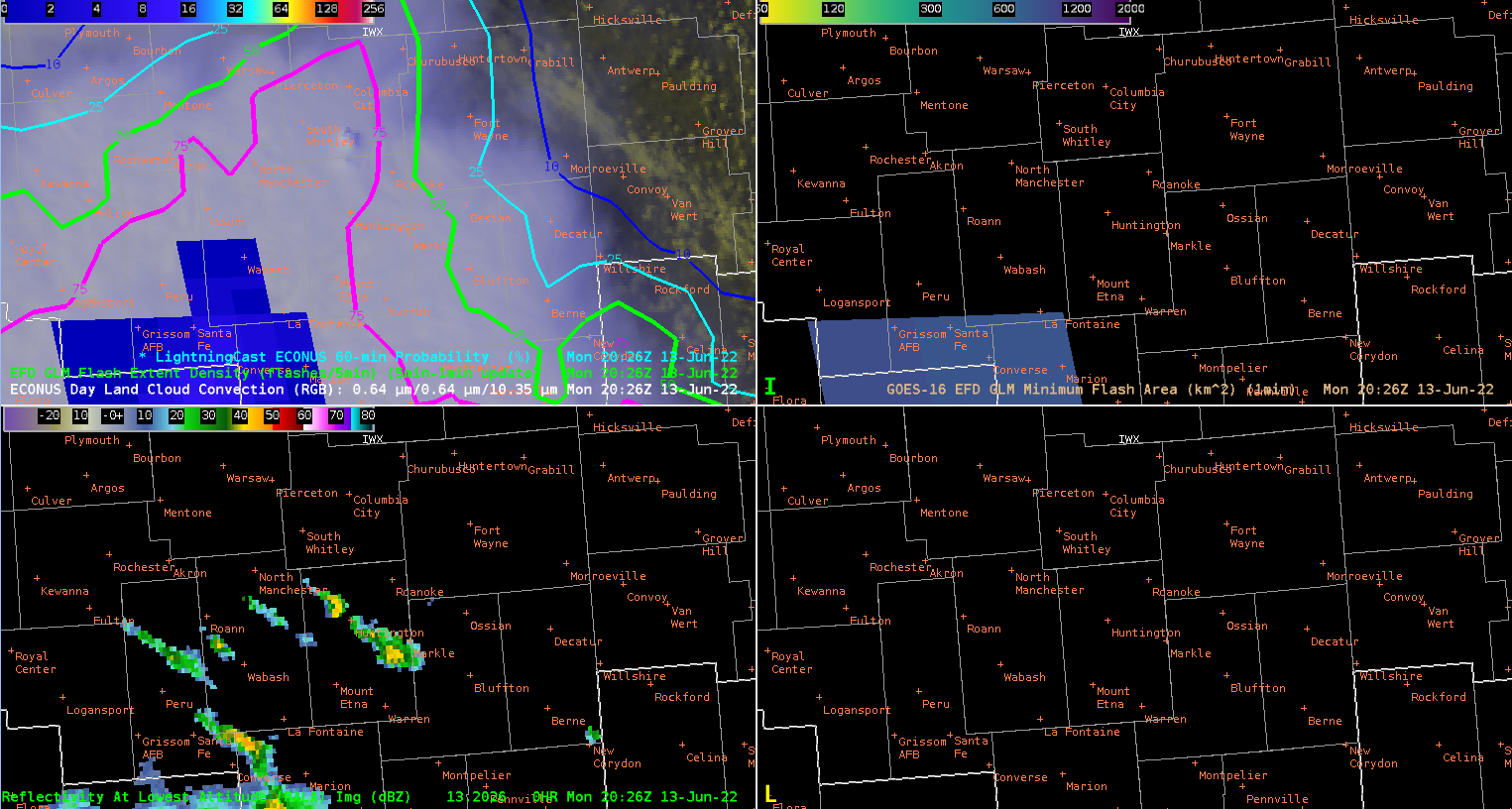
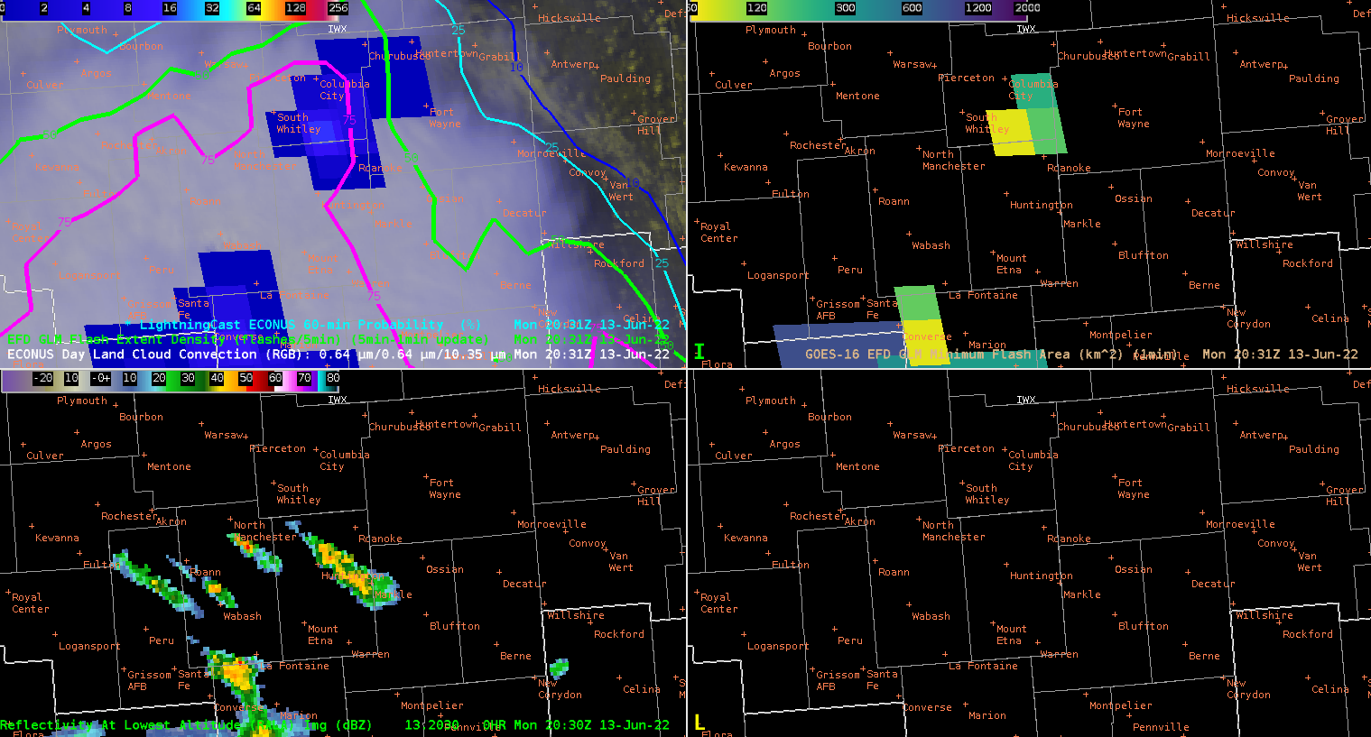
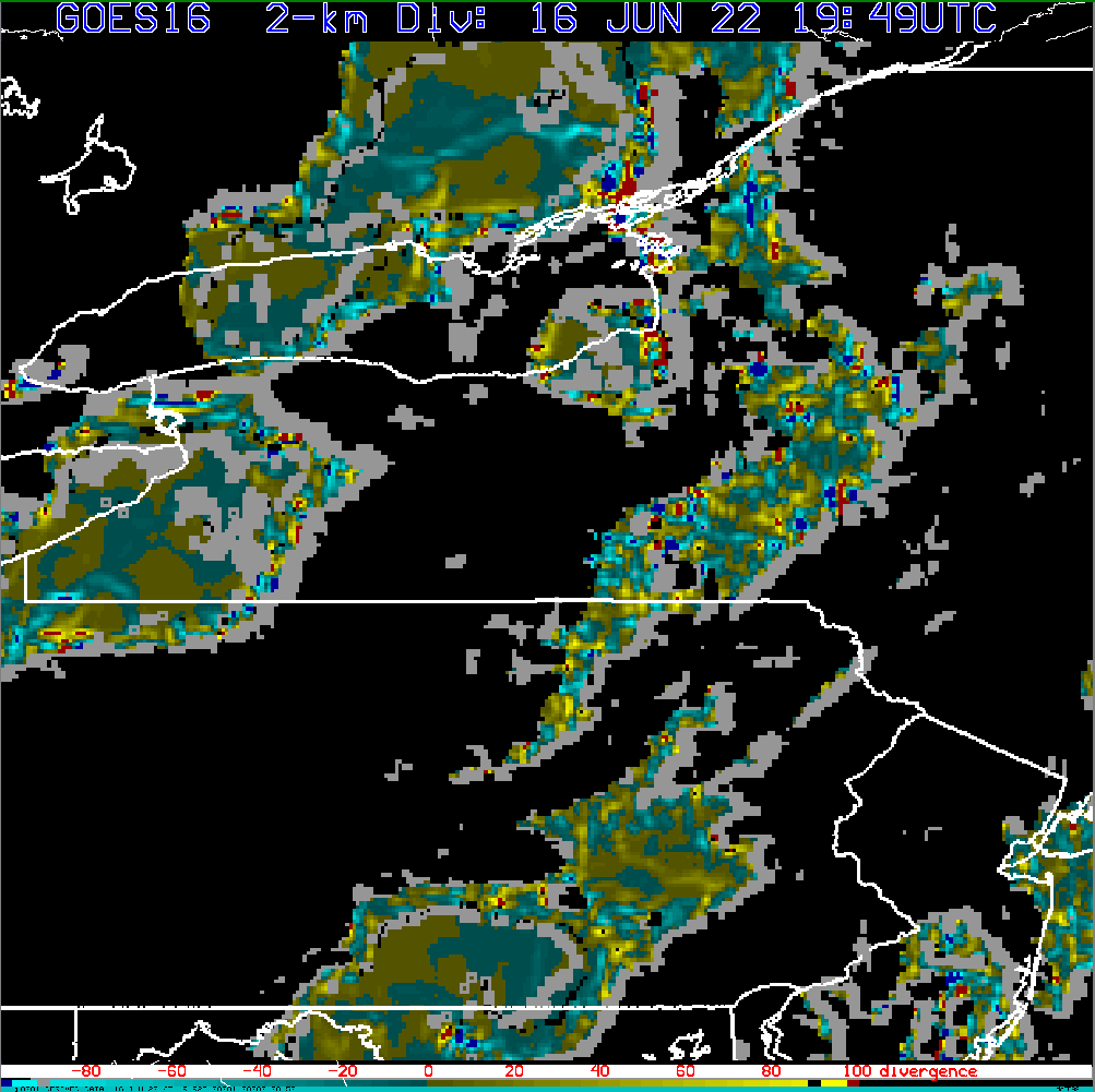
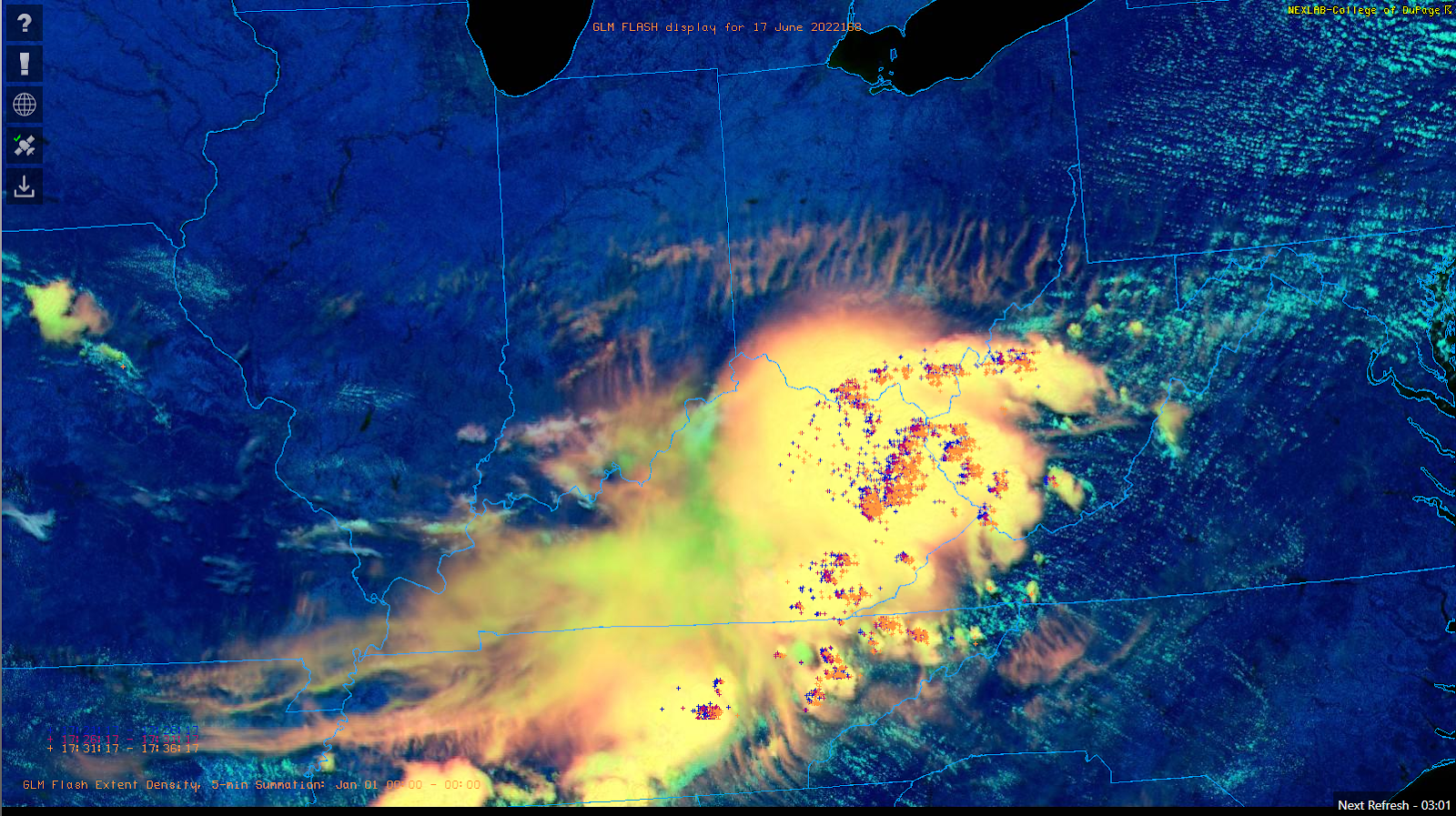
Convection developed rapidly to the south of the main area of convection in an area of high instability. This was first picked up by higher probabilities in the LightningCast data. There was some rapid cumulus development that was picked up well by the algorithm. Probabilities went well above 75% around 5 minutes or so from the first GLM detection. NUCAPs data indicated MLCAPEs of around 2000 J/Kg in this area supporting the quick upscale growth.
Convection developed rapidly to the south of the main area of convection in an area of high instability. This was first picked up by higher probabilities in the LightningCast data. There was some rapid cumulus development that was picked up well by the algorithm. Probabilities went well above 75% around 5 minutes or so from the first GLM detection. NUCAPs data indicated MLCAPEs of around 2000 J/Kg in this area supporting the quick upscale growth.

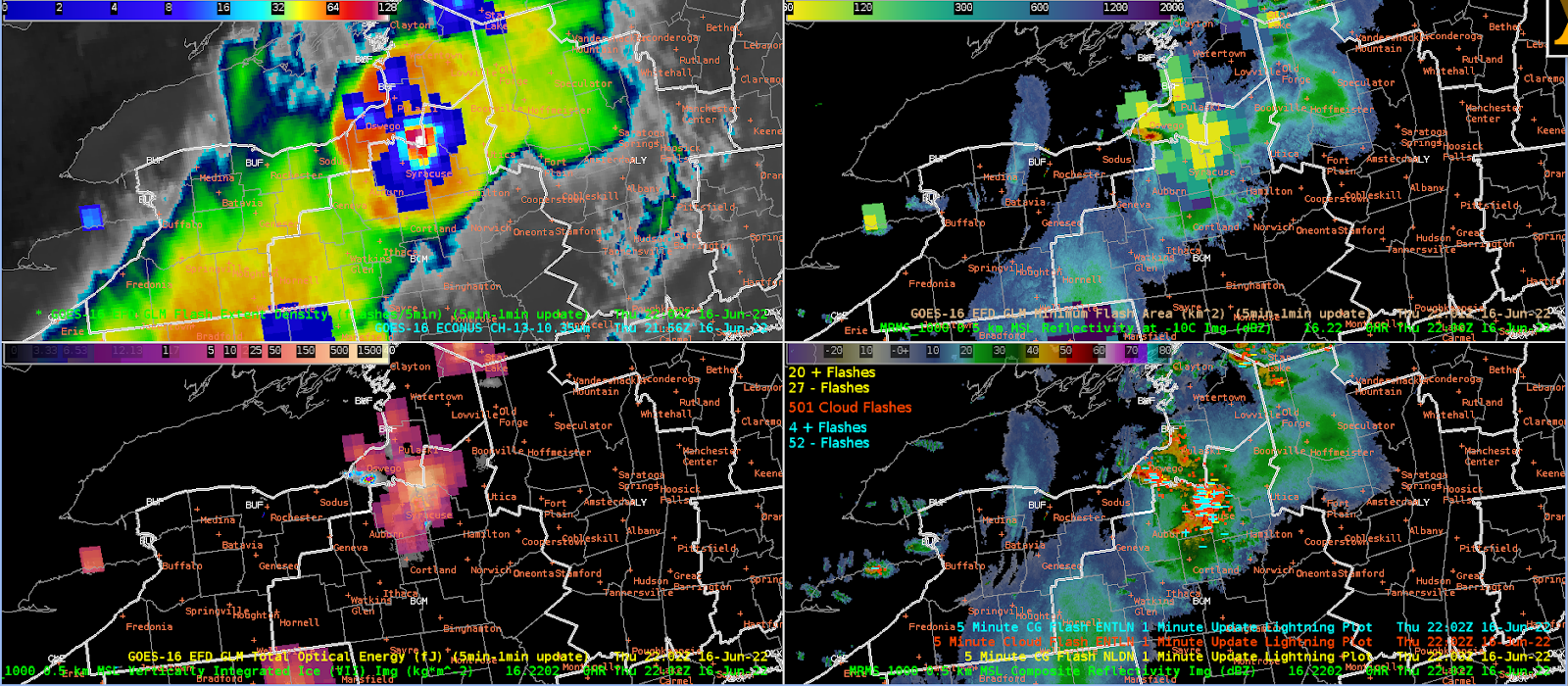
LightningCast and GLM at 2131 UTC
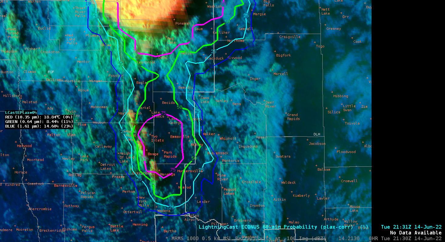
DCP RGB and LightningCast 2131 UTC

MRMS -10 Reflectivity and LightningCast first GLM detection at 2135 UTC

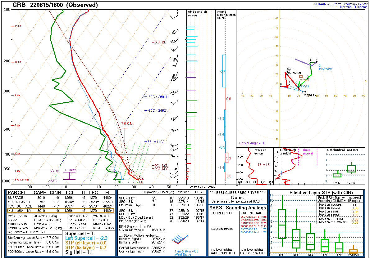
So let’s take a look at some NUCAPS soundings as we had three overpasses right before the convection initiated in the above examples. Here is the first overpass with the sounding point selected with the red arrow:
NUCAPS Sounding at 1823 Z


Not too shabby with a MLCAPE value of 2094 J/kg. (And why mixed-layer? Hank likes ML because very few times do parcels start at the surface for SB, and MUCAPE is just fun to look at).
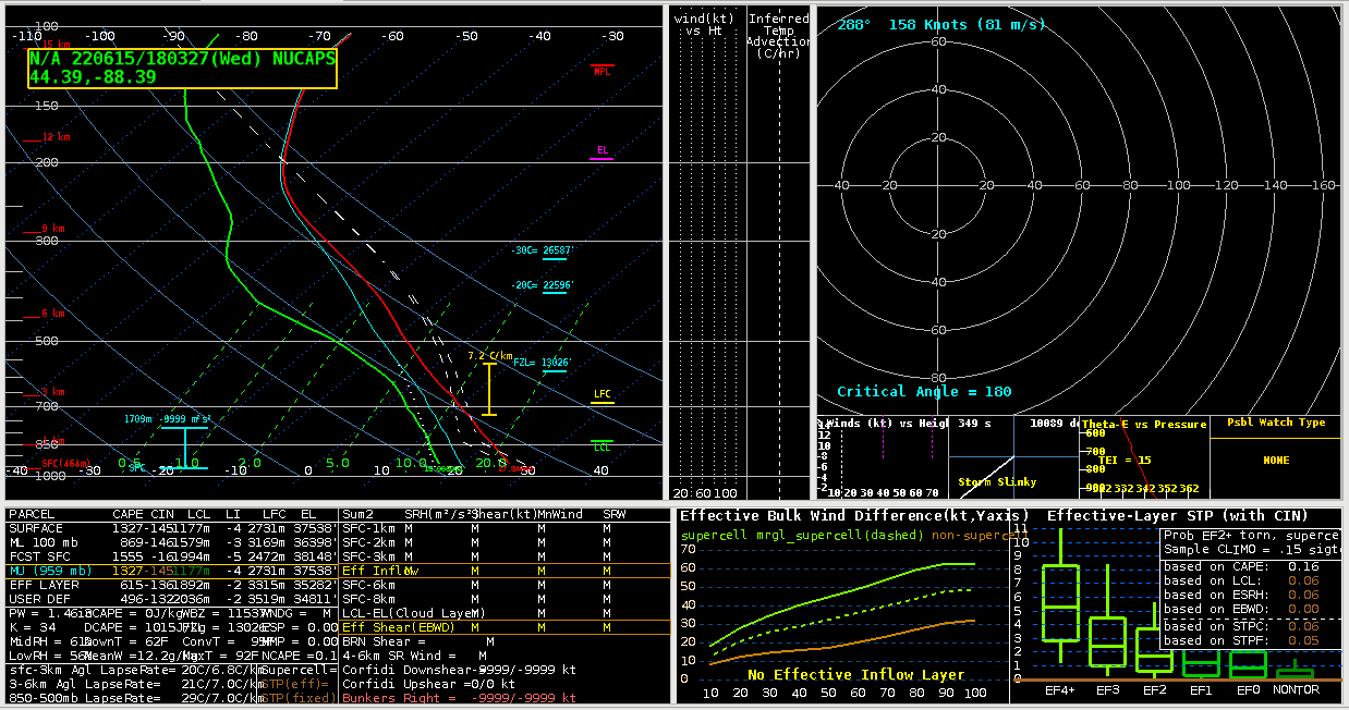
The next overpass was 2003 UTC (about an hour and a half after the previous overpass) to see if the environment has changed much:


MLCAPE of 1235. Hmmmm…that’s quite a drop in MLCAPE compared to previous overpass. Two things to remember; this is on the edge of the field-of-view (matter of fact, the eastern edge). Luckily we have a Modified NUCAPS for the same profile point which adjusts the boundary layer:

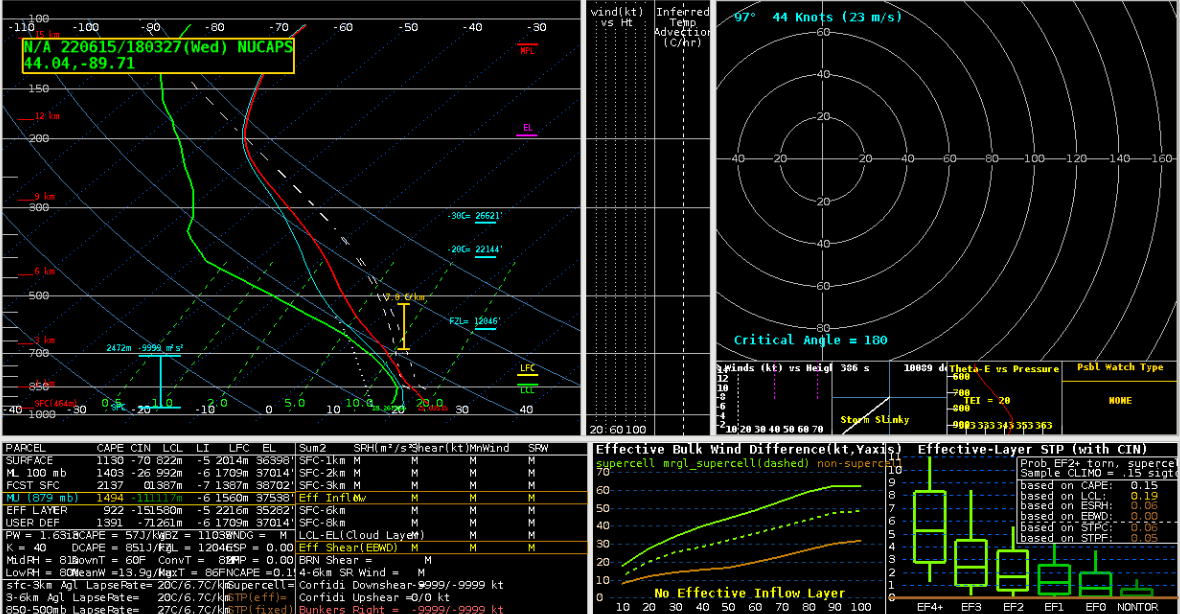
Yeah, that looks much more reasonable based on observational trends (few clouds to change the mid-atmospheric profile, increasing surface T/Td conditions) with 2185 J/kg MLCAPE. But wait, there’s more! We also have a:
NUCAPS AQUA Overpass


This was almost directly under NADIR so we should have much better profile retrieval. Sure enough, MLCAPE value is almost 3000 J/kg in between the 1823 and 2003 UTC NOAA-20 sounding retrievals.
How does this all tie into the weather for FGF today? This is what the SPC Mesoanalysis graphics had for 2100 UTC MLCAPE values:
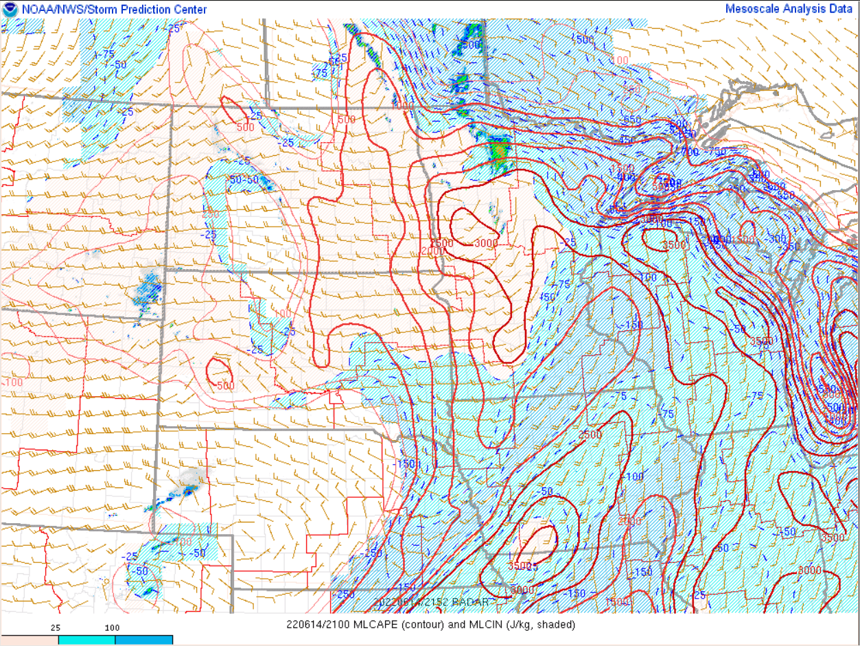
They all combine to increase confidence on what conditions COULD be in areas where the models are saying one thing and an observational system is indicating potential reality (remember, it’s still a remote sensing platform with their own set of issues). In our case, the bulls-eye of 3000 J/kg in east central Minnesota is likely real and needs to be an area to watch…and that is where the Lightning Cast product at the start of our post indicated the potential for new activity to develop. Pretty cool stuff…
– Marty McFly/Hank Pym


 \
\