Creating Verification Numbers Part 2: Grid point scores for one event

In order to illustrate the kinds of measures we can get from this method of warning verification, let’s first look at a single storm event.  The chosen storm will be the 27 April 2011 long-tracked tornadic supercell that impacted Tuscaloosa and Birmingham, Alabama.  This was a well-warned storm from the perspective of traditional NWS verification.

It helps to first look at the official NWS verification statistics for this event.  The storm produced two verified tornadoes along its path within the Birmingham (BMX) County Warning Area (CWA).  The BMX WFO issued 6 different Tornado Warnings covering this storm over 4 hours and 22 minutes (20:38 UCT 27 April – 01:00 UTC 28 April), from the AL-MS border northeastward to the AL-GA border.  Here’s a loop showing the NWS warnings in cyan, and the path of the mesocyclone centroid overlaid.  In the loop, it may appear that more than 6 different warning polygons were issued.  Instead, you are seeing warning polygons being reduced in size via their follow-up Severe Weather Statements (SVS) in which the forecasters manually remove warning areas behind the threats.

warn-NWS-loop-fast1

All 6 warnings verified in the traditional sense – each contained a report of a tornado, and both tornadoes were warned.  There were no misses and no false alarms.  Thus, the Probability Of Detection = 1.0, the False Alarm Ratio = 0.0, and the Critical Success Index = 1.0.  Boiling it down further, if we use the NWS Performance Management site, we can also determine how many of the 1-minute segments of each tornado were warned.  It turns out that not every one segment was warned, as there was a 2-minute gap between two of the warnings (while the storm was southwest of Tuscaloosa – you can see the warning flash off in the above loop).  So there were 184 minutes warned out of the total of 186 minutes of total tornado time, giving a Percent Event Warned (PEW) of 0.99.  Still, these numbers are very respectable.

Now, what do the geospatial verification statistics tell us?  We’ll start by looking at the statistics using a 5 km radius of influence (“splat”) around the one-minute tornado observations.  For this 2×2 table, I am not applying the Cressman distance weighting to the truth splats, and I’m using the composite reflectivity filtering for the correct nulls:

ctable_tcl_0011

Remember that the values represent the count of 1 km2 x 1 minute grid points that met one of the 4 conditions in the 2×2 table. If we compute the POD, FAR, and CSI, we get:

POD = 0.9885
FAR = 0.9915
CSI = 0.0085

The POD looks very similar to the PEW computed using the NWS method. But the FAR and CSI are much much different. The FAR is huge, and thus the CSI is really small! What this tells us that for each one minute interval of the 4 hours and 22 minutes of warning for this event, over 99% of the grid points within the warning polygons were not within 5 km of the tornado at each one minute interval, accumulated. Is this a fair way to look at things? It is one way to measure how much area and time of a warning is considered false.  The big question is this – what would be considered an acceptable value of accumulated false alarm area and time for our warnings?  Given the uncertainties of weather forecasting/warning, and the limitations of the remote sensors (radar) to detect tornadic circulations, I don’t think we can ever expect perfection – that the warnings perfectly match the paths of the hazards.  But this should be a method for determining if our warnings are being issued too large and too long in order to “cast a wide net”.

One way to analyze this is to vary the size of the “splat” radius of influence around each one-minute tornado observation.  For example, if we were to create the above 2×2 table and stats using a 10 km “splat” size (instead of 5 km), the numbers would look like this:

ctable_tcl_0021

POD = 0.9702
FAR = 0.9141
CSI = 0.0857

Note that the FAR is starting to go down, from 0.99 to 0.91.  But the POD is also starting to lower slightly.  Why, because now we’re requiring that the warnings cover the entire 10 km radius around each one minute tornado “splat”, so more of the observation area is starting to get missed by warnings.

Is 5 or 10 km the correct buffer zone around the tornadoes?  Or is it some other value?  Let’s look at the variation in POD, FAR, CSI, and the Heidke Skill Score (HSS; uses the CORRECT NULL numbers) across varying values of splat size, from 1 km to 100 km at 1 km intervals (the x-axis shows meters on the graph):

podfarcsihss_0011

This graph might imply that, based on maximizing our combined accuracy measures of CSI and HSS, that the optimal “splat” radius should be around 25-30 km.  Instead, this probably shows that the average width of the warnings issued that day were about 25-30km wide, and if given a requirement to warn within 25-30 km of the tornadoes, the NWS warnings would be considered good.  So we’re still left with the question – what is the optimal buffer to use around the tornado reports?  This is probably a question better answered via social science.  And, given that number, what is an acceptable false alarm area/time for the warning polygons?  In other words, what would our users allow as an acceptable buffer, and can meteorologists do a decent job communicating that this buffer is needed to account for various uncertainties?

What about grid locations away from the tornado but will be impacted at a later time?  They are downstream of the tornado headed toward them. Should they be counted toward the false alarm numbers? My answer is no and yes. I will tackle the ‘no’ now, and the ‘yes’ answer will come much later in this blog.

Greg Stumpf, CIMMS and NWS/MDL

Tags: None

Creating Verification Numbers Part 1: The “Grid Point” Method

Now that we have our one-minute forecast grids (warnings), our one-minute observation grids (“splatted” tornado locations), and our additional third grid to filter for CORRECT NULL forecasts (median filtered composite reflectivity), let’s combine them to fill our single 2×2 contingency table, shown here:

ctable_not-fuzzy1

At each one-minute forecast interval, we can create these grid point values:

HIT:  The grid point is warned AND the grid point is within the splat range of a tornado.

MISS:  The grid point is not warned AND the grid point is within the splat range of a tornado

FALSE:  The grid point is warned AND the grid point is outside the splat range of any tornado.

CORRECT NULL:  All other grid points (outside warnings and outside tornado observations).

Viewing this graphically (the cyan CORRECT NULL area is supposed to fill the entire domain in this figure):

score_grid

If we want to limit the number of grid points counted as CORRECT NULL, we can incorporate the third composite reflectivity grid:

CORRECT NULL:  The grid point is not warned AND the grid point is outside the splat range of any tornado AND the grid point has a composite reflectivity value > 30 dBZ.

NON-EVENT:  The grid point is not warned AND the grid point is outside the splat range of any tornado AND the grid point has a composite reflectivity value < 30 dBZ.

Viewing this graphically (the cyan CORRECT NULL area is only within the “storm area” in this version):

score_grid_cn

If we choose to score using a fuzzy representation of the observation based on the Cressman distance weighting scheme, the 2×2 table might look like this:

ctable_fuzzy1

And the scoring categories become:

HIT:  A value between 0 and 1 based on the Cressman weight value.  At the center of the observation splat, this is 1.  At the farther range of the splat, this is 0.  The value is between 0 and 1 for locations between these two ranges.

MISS:  A value between 0 and 1 based on the Cressman weight value.  At the center of the observation splat, this is 1.  At the farther range of the splat, this is 0.

FALSE:  1 – HIT.  This value is 1 when grid is completely outside the splat range of any tornado observation.  Within the splat range of a tornado observation, FALSE + HIT = 1.

CORRECT NULL:  1 – MISS.  This value is 1 when grid is completely outside the splat range of any tornado observation.  Note that the grid point must also have a composite reflectivity value > 30 dBZ. Within the splat range of a tornado observation, CORRECT NULL + MISS = 1.

NON-EVENT:  The grid point is not warned AND the grid point is outside the splat range of any tornado AND the grid point has a composite reflectivity value < 30 dBZ.

Viewing this graphically (using a different, but an actual event – 17 June 2010 Wadena, MN):

score_grid_cn_fuzzy

We can then run our 2×2 statistics on each one-minute interval during a warned tornado event and accumulate them for the entire event.  The results can be somewhat surprising, and they will need some interpretation.  That will be the subject of the next blog entry.

Greg Stumpf, CIMMS and NWS/MDL

Tags: None

Geospatial Verification Technique: Getting on the Grid

To consolidate the verification measures into one 2×2 contingency table and reconcile the area versus point issues, we place the forecast and observation data into the same coordinate system.  This is facilitated by using a gridded approach, with a spatial and temporal resolution fine enough to capture the detail of the observational data.  For the initial work that I am doing, I am using a grid resolution of 1 km2 × 1 minute, which should be fine enough to capture the events with the smallest dimensions, namely tornado path width.  Tornado paths, and hail and wind swaths typically cover larger areas (and are not point or line events, as so depicted in Storm Data!).

The forecast grid is created by digitizing the warning polygons (defined as a series of latitude/longitude pairs), and just turning the grid value to 1 if inside the polygon, and 0 if outside the polygon.  The grid has a 1 minute interval, so that warnings appear (disappear) on the grid the exact minute they are issued (canceled/expired).  Warnings are also “modified” before they are canceled/expired via use of Severe Weather Statements (SVS), and at those times, the warning polygon coordinates are changed.  These too are reflected in the minute-by-minute changes in the forecast grid.  Note that the forecast grid is currently represented as deterministic values of 0 and 1, but can easily be represented as any value between 0 and 1 to provide expressions of probability.  We won’t jump the gun on that and leave that subject to future blog entries.

warngrid-fig
Fig 1. Example warning grid. Grid points inside the warning are assigned a value of 1 (cyan), and points outside the warning are assigned a value of 0 (black).

The observation grids are created using either ground truth information, ground truth data augmented by human-determined locations using radar and other data as guidance, or radar proxies, or a combination of all of these.  As with the forecast grids, the values can be deterministic (only 0 and 1 – either under the hazard or not at that location and time) or fuzzy/probabilistic (e.g., location/time is not certain, or use of radar proxies which is also not certain).

For the purposes of my initial exercises, I will look at the verification of Tornado Warnings by tornado or radar-based mesocyclone observations for a specific storm case, the long-tracked tornadic supercell that affected Tuscaloosa and Birmingham Alabama on 27 April 2011 (hereafter, the “TCL storm”).  While it’s important to note that under some situations (the heavy workload of many storms or insufficient staffing levels), Tornado Warning polygons are sometimes drawn to encompass all of the storm threats, including the hail and wind threat along with the tornado threat, but we will ignore that for now and assume that the Tornado Warnings are verifying only tornado events.  Here’s a loop of the radar data, and the storm of interest ends up near the just crossing the AL-GA border on the upper right of the picture at the end of the loop.

cmpref-loop

To create my observation grid, I “truth” the tornado and mesocyclone centroid locations using radar data, radar algorithms, and damage survey reports.  I wrote a Java application that will convert the centroid truth data into netcdf grids at the 1 km2 × 1 minute resolution.  This application first interpolates the centroid locations at even one minute intervals (e.g., 00:01:00, 00:02:00, being hh:mm:ss).  Then, for each one-minute centroid position, I create a “splat” that will “turn on” grid values within a certain distance of the centroid position (e.g., 5 km or 10 km).  The reason for the “splat” is to 1) account for small uncertainties in the timing and position of the centroids and 2) to allow for a buffer zone around which one may feel a location is “close enough” to the tornado to warrant a warning.  Finally, the “splat” consists of values between 0 and 1, with 1 being at the center of the splat, and values decreasing to 0 at the outer edge using an optional Cressman distance weighting function.  This provides “fuzziness” to the observation data, probabilistic observations in a sense.  The closer you are to the centroid location, the greater likelihood that the tornado was there.  This loop shows my tornado observation grid for the TCL storm.  Note that there were two tornadoes in Alabama from this storm (tornadoes #44 and #51 on this map provided by the NWS WFO Birmingham AL), hence the reason the truth “flashes out” in the middle of the loop.  Also note that we will not treat the tornado path with a straight path moving at a constant speed from its starting point to its ending point, as is done today with traditional NWS warning verification.

warn-torn-loop1
Fig 2. Loop of tornado centroid locations interpolated to one minute intervals, converted to the grid, “splatted” by 10 km, with the Cressman distance weighting, for the TCL storm. Red indicates a distance of 2.5 km or less from the centroid, yellow 2.5-5 km, and black 5-10 km.

There is one more optional grid that is created to help define the observation data set.  When determining a CORRECT NULL (CN) forecast, if using every grid point outside of each warning polygon and each observation splat, the number of CN grid points would overwhelm all other grid points (tornadoes, and even tornado warnings are rare events), skewing the statistics (Marzban, 1998).  So we would like to limit the number of CN grid points to exclude those points where it is obvious that a warning should not be issued there – namely grid points which are away from thunderstorms.  Multiple-radar composite reflectivity (maximum reflectivity in the vertical column) is used for determining which grid points to use to calculate CN.  Optionally, one can choose the reflectivity value for the threshold of inside or outside a storm (I set this to 30 dBZ), and whether or not the reflectivity field should be smoothed using a median filter (I set this to true).  See here:

cmpref_med_2
Fig 3.  An example grid used to determine areas where CNs are calculated. Set to 1 (blue) if median-filtered composite reflectivity values are >= 30 dBZ, and 0 (black) where not. Where ever black, no verification statistics are computed unless under a warning or observation grid.

In the next blog entry, I’ll show what is done with all of these grid layers to compute the 2×2 table statistics.

ADDENDUM:  Up to this point, I haven’t explained my motivations for developing a geospatial warning verification technique.  In short, some of our Hazardous Weather Testbed (HWT) spring exercises with visiting NWS forecasters had them issuing experimental warnings using new and innovative experimental data sources and products during live storm events.  In order to determine if these innvoative data were helping the warning process, we compared the experimental warnings to a control set of warnings – those actually issued by the WFOs for the same storms on the same days.  We soon began to understand that the traditional warning verification techniques had some shortcomings, and didn’t completely depict the differences in skill between the two sets of warning forecasts.  In addition, the development of these techniques has me buried in Java source code within the Eclipse development environment – two major components of the AWIPS II infrastructure.  Finally, I hope to take information I’m learning from this exercise to start developing new methodologies for delivering severe convective hazard information and products within the framework of the current AWIPS II Hazard Services (HS) project, being designed to integrate several warning applications such as WarnGen and help pave the way for new techniques.  My hope is that my work pays off in several ways, from more robust methods to determine the goodness of our warnings from a meteorological and services perspective, to new methods of delivering hazard information, and finally to new software for the NWS warning forecaster, all in the name of furthering the NWS mission to protect lives and property.

REFERENCES:
Marzban, Caren, 1998: Scalar measures of performance in rare-event situations. Wea. Forecasting, 13, 753–763.

Greg Stumpf, CIMMS and NWS/MDL

Tags: None

Warning Verification Pitfalls Explained – Part 3: Let’s go fishing.

Continuing from the previous blog entry, because only one storm report verification point is required to verify a warning polygon area, note that a single point can be used to verify a polygon of any size or duration! As shown in figure below, each of these two polygon examples would be scored as area HITs using the traditional NWS verification methods, the small short warning and the large long warning.  But note that the larger and longer the warning provides greater likelihood of having a severe weather report in the warning, and a greater chance of having multiple storm reports in the warning, resulting in multiple point HITs.  Since the calculation for POD uses the 2×2 contingency table for points (POD2), a forecaster issuing larger and longer warnings should inevitably be rewarded with a larger average POD of all their warnings.

howmanyhits1

If any warning area ends up not verifying (no report points within the area), then that warning area gets counted as a false alarm.  The False Alarm Ratio (FAR) is calculated using the 2×2 contingency table for polygon areas (FAR1).  This means that no matter how large, or how long in duration a warning area is, that warning polygon area gets counted as only one false alarm!  Therefore, there is no false alarm penalty for making warnings larger and longer, and as shown above, improves the chances of a higher POD.  On top of all this, if the warning is issued with a very long duration and well before anticipated severe weather, this increases the chances of having a larger lead time.  If that warning never verifies, there is no negative consequence on the calculation of lead time, because it never gets used.

howmanyfas

Extrapolating this “out to infinity”, a WFO need only issue one warning covering their entire county warning area (CWA) for an entire year.  If there are no reports for the entire year, then only one false alarm is counted.  If there is at least one report that year, then a HIT is scored for that warning, and each report point is scored as a HIT.  In addition, the later in the year those reports occur, the larger the lead time would be, and measured in days, weeks, or months.  Imagine those incredible stats!

And so we’ve got the second pitfall of NWS warning verification…it would be an advantage to any forecaster trying to increase their odds of better verification scores to just make warning polygons larger and longer, what I call “casting a wider net”.

Is this better service?  Is it better to increase the area of the warning in order to gain hits and reduce the chance of a false alarm?  This of course will be natural tendency of any forecaster hoping to gain the best verification scores, and ends up being completely counter to the intention of storm-based warnings, that being the reduction in the size of warnings and greater warning precision and specificity!  Issuing fewer larger and longer warnings also reduces the workload.  Note too that even if the large and long warnings verify, there is a tremendous amount of false alarm area and false alarm time away from the hazard areas in these warnings, but that never gets measured by the present verification system.

The next blog entries will address how we can address these pitfalls with an improved warning verification methodology that will better reward precision in warnings, and provide a host of other benefits, including ways to measure the goodness in new warning services techniques.

Greg Stumpf, CIMMS and NWS/MDL


Tags: None

Warning Verification Pitfalls Explained – Part 2: 2x2x2!

How are warning polygons verified?  Remember that a warning polygon describes an area within which a forecaster thinks there will be severe weather during the duration of the warning, in other words, the swath over which the current threat is expected to cover.  This concept of the “swath” will be explored in later blog entries, but for now, we will consider it the entire area of the warning.  In order for the warning polygon to be verified, the warning area need only contain a single storm report point.

So, backing up a bit, if there is a severe weather report point falling outside any polygons, that report point is counted as one MISS.  And if a warning area (the polygon) contains no severe weather reports, the warning area is considered one FALSE ALARM.  See an issue yet?

miss-fa2

What about HITs?  If a severe weather report point is inside a warning polygon, then that report point is counted as one HIT.  And, if a warning area (the polygon) contains at least one report point, that warning area is considered a HIT.  But which HIT value is used for NWS verification.  The answer is:  both!

hit1

By now, you should begin to see the issues with this.  First, since the NWS offices are responsible for verifying their own warnings, they need only find a single severe weather observation at a single point location to verify the polygon, even though severe weather affects areas.  Hail falls in “swaths” with width and length.  Tornadoes follow paths with width and length (although usually the width is below the precision of a warning polygon, usually < 1 km).  And wind damage can occur over broad areas within a storm.  These three phenomena rarely, if ever, occur as a point! So, the observational data used to verify areal warnings is usually lacking in completeness.

Second, we are using point observations to verify an areal forecast.  Shouldn’t an areal forecast be verified using areal data?  After all, the forecaster felt that severe weather was possible in the entire area of the polygon.

(As an aside, another issue to consider is that the observation point usually does not represent the location and time of the first severe weather occurrence with the storm.  Lead times are usually calculated to be the difference between the time of the observation and the time of warning issuance.  Since these observations may indeed be recorded at some time after the onset of severe weather with the storm, the lead time ends up being recorded as being much longer than it probably was. We’ll get to this issue in a later blog entry.)

So let’s go back to our 2×2 contingency table introduced in the previous blog entry.  If we consider the 2×2 table for the warning areas (the polygons), we would have:

ctable1

far1

Note that I’ve highlighted the A and B cells.  These are the values that are used to calculate the False Alarm Ratio (FAR) for warnings, it is based on the area forecasts.  Since this comes from this first 2×2 table, we will call the False Alarm Ratio, FAR1.

Now let’s consider another 2×2 table, this time for the severe weather report points:

ctable2

pod2

Note that I’ve highlighted the A and C cells this time.  These are the values that are used to calculate the Probability Of Detection (POD) for warnings, it is based on severe weather report points.  Since this comes from this second 2×2 table, we will call the Probability Of Detection, POD2.  Also note that both types of HITS, A1 and A2, are being used.

Finally, the NWS calculates a Critical Success Index (CSI) to combine the contributions POD and FAR into one metric.  But here is the flaw.  The CSI is computed using the version of the formula that is a function of POD and FAR, however, they plug in POD2 and FAR1 into that formula.  After algebriac manipulation, it can be shown that their version of CSI does not equal the equation of CSI as a function of HIT, FALSE ALARM, and MISS (A, B, and C in the 2×2 table).

csi_star

And thus we have the first pitfall of NWS warning verification…the metrics include elements from two 2×2 tables….2×2 x2!

Greg Stumpf, CIMMS and NWS/MDL

Tags: None

Warning Verification Pitfalls Explained – Part 1: Getting started

Several years ago (in 2005), we hosted our first user group workshop on severe weather technology for NWS warning decision making.  This workshop was held at NWS headquarters in Silver Spring, MD, and was attended by NWS management, severe weather researchers, technology specialists, and a “user group” of meteorologists from the field – local and regional NWS offices.  The main objective of this workshop, and the second one that followed in 2007, was to review the current “state of the science and technology” of NWS severe weather warning assistance tools, to identify gaps in the present methodologies and technologies, to gain expert feedback from the field (including “stories” from the front lines), to discuss the near-term and long-term future trends in R&D, and for field forecasters and R&D scientists to help pave the direction for new technological advances.  Our invitations sought enthusiastic attendees who were interested in setting an aggressive agenda for change.  We invited Dr. Harold Brooks (NSSL) to give a seminar at the workshop about how the NWS might go improving the system it uses to verify severe weather warnings.  Many of the ideas I will present were borne out of Harold’s original presentation, and I will build upon them.

So, to start, let’s look at how NWS warnings are verified today.  As many of you know, the NWS transitioned to what is now known as polygon-based warnings about four years ago.  Essentially, this means that warnings are now supposed to be drawn as polygons that represent the swath in which the forecaster thinks severe weather will occur during the duration of the warning, without regard to geo-political boundaries.  In the past, warnings were county-based, even though severe storms don’t really care about that!  It’s better to call the system “storm-based warnings”, since after all, counties are just differently-shaped polygons.

storm-based-warnings

But what really changed was not the shape of the warnings, but how warnings were verified.  No longer was it required that each county covered in a warning received at least one storm report.  Now, only one storm report is required to verify a single polygon warning.  This sounded attractive since it meant that if a small storm-based warning touched several small portions of multiple counties, that there was no need to find a report in each of those county segments, reducing the workload required to gather such information.  But, as I will show, there are flaws in that logic.

How are forecasts verified for accuracy?  One of the simplest ways to do this is via the use of a 2×2 contingency table.  Each of the four cells in the matrix are explained:  A verified forecast is called a HIT (cell A), and represents when an event did happen when the forecast said it would happen.  An unverified forecast is called a FALSE ALARM (cell B) when a forecast was issued, but an event did not happen.  An event that went unforecasted is called a MISS (Cell C).  And finally, wherever and whenever events did not happen, when there was a forecast of no event (or no forecast at all), that is called a CORRECT NULL (Cell D).

ctable

Also from this table, one can derive a number of accuracy measures.  The first is called Probability Of Detection (POD), which is the ratio of verified forecasts (HIT) to the number of all forecasts (HIT + MISS).  Another is the False Alarm Ratio (FAR) or Probability Of False Alarm (POFA), which is the ratio of false forecasts (FALSE ALARM) to all forecasts of an event (HIT + FALSE ALARM).  Finally, one can represent the combination of both POD and FAR into the Critical Success Index (CSI), which is the ratio of HIT to the sum of all HIT, MISS, and FALSE ALARM.  CSI can be written both as a function of A, B, and C, and through algebraic manipulation, a function of POD and FAR.

csi1

In the next post, I will explain how NWS warnings are verified today, and how they use the 2×2 table and the above measures to derive their metrics.

Greg Stumpf, CIMMS and NWS/MDL

Tags: None

Experimental Warning Thoughts – Intro

Hello readers!

This is the first post of an indefinite series dedicated to my thoughts about short-fused warnings for severe convective weather, namely tornadoes, wind, hail.  My purpose for these blog posts is to express some of my observations and ideas for improvements for the end-to-end integrated United States severe weather warning system.  These include the decision-making process at the National Weather Service (NWS) weather forecast office (WFO) level, the software and workload involved with the creation of hazardous weather information, the dissemination of the information as data and products, and the usage and understanding of the information by a wide customer base which includes the general public, emergency managers and other government officials, and the private sector which has the ability to add specific value to the NWS information for their customers with special needs.

Many of these thoughts will originate with me, but others will be derived by my colleagues who will be acknowledged whenever possible.  In fact, I see no reason why guests should not be welcome to post here as well.  I also hope that these blog posts will generate discussion, either here in the form of comments, or elsewhere on various fora and email list servers.  It is my desire that the information and dialog generated here will be considered by weather services management toward a goal of continually improving the way weather information services are provided by the government and their public and private partners.  Some of what I will present might be controversial, and I reserve the right to change my opinion at any time when a convincing argument is presented, since after all, I’m not perfect.  I’m also not much of a writer, but there are a lot of us out there in the blog world today, so why not?

There are some that think the NWS warning services are working wonderfully.  One could state fabulous accuracy numbers, such as a very low number of missed severe weather events and some very respectable lead times on major tornado events.  One could show that the severe storm mortality rate is quite low in the U.S., well, maybe perhaps before 2011.  Do we just chalk up the record death counts of this year to just bad luck and unfortunate juxtaposition of tornadoes and people, or is it possible there is continued room for hazard information improvement?  I’m going to try to make some points that our perception of how accurate our warnings are is based on some flawed premises in the way warnings are verified.  I’m also going to present some concepts that were born out of discussion and experimentation at the NOAA Hazardous Weather Testbed (HWT) with many colleagues at the National Severe Storms Laboratory (NSSL) and the NWS that show some promise toward improvement.

So, without further adieu, I will follow this with another post, and see how things proceed from here.

Greg Stumpf, CIMMS and NWS/MDL

Tags: None

The EWP2011 Thank You Post

Here is our Thank You post for EWP2011, conveying our appreciation to the hard work and long hours put in by our forecasters, developers, and other participants for our spring experiment.  Even though we had a short experiment this year owing to a “slight decrease” in funds, the four weeks were successful nonetheless.  We had several noteworthy events, the biggest probably being the 24 May 2011 Central Oklahoma tornado outbreak, when our participants were asked to leave the HWT area to go to the NWS storm shelters on the first floor as a tornado dissipated just 2 miles away and debris rained on the building.   Our AWIPS1 software worked very well this year, owing to the fact that AWIPSII was still not yet ready for primetime.  And the software worked better than ever – of course with most bugs finally being fixed by the end of the experiment.

The biggest expression of thanks goes to our two AWIPS/WES gurus “on loan” from the NWS Warning Decision Training Branch, especially Darrel Kingfield, as well as Ben Baranowski early on (who left WDTB before the start of the experiment).   In addition, we had help from the Norman NWS forecast office from Matt Foster.  Both Darrel and Matt put in tons of effort getting our AWIPSII system up and running until we found the fatal memory leak that put our AWIPSII aspirations on hold.  Greg Stumpf provided AWIPS1 support to format and import the experimental data sets from various sources.

These scientists brought their expertise to the experiment to help guide live operations and playback of archive cases for each of the experiments:

For the Warn-On-Forecast 3D Radar Data Assimilation project we’d like to thank the principle scientists, Travis Smith and Jidong Gao, as well as their support team of Kristin Kuhlman and Kevin Manross (all from CIMMS/NSSL), and David Dowell (GSD).

For the OUN WRF project, they included principle investigators Gabe Garfield (CIMMS/NWS WFO OUN) and David Andra (NWS WFO OUN).

For the GOES-R Proving Ground experimental warning activities, including the Pseudo- Geostationary Lightning Mapping (pglm) array experiment, our thanks go to principle scientists Chris Siewert (CIMMS/SPC) and Kristin Kuhlman (CIMMS/NSSL), along with Wayne Feltz (UW-CIMSS), John Walker (UAH), Geoffrey Stano (NASA/SPoRT), Ralph Petersen (UW-CIMSS), Dan Lindsey (CSU-CIRA), John Mecikalski (UAH), Jason Otkin (UW-CIMSS), Chris Jewett (UAH), Scott Rudlosky (UMD), Lee Cronce (UW-CIMSS), Bob Aune (UW-CIMSS), Jordan Gerth (UW-CIMSS), Lori Schultz (UAH), and Jim Gurka (NESDIS).

We had undergraduate students helping out in some real-time support roles including monitor real-time severe weather reports.  They included Alex Wovrosh (Ohio University), as well as Ben Herzog, Brandon Smith, and Sarah Stough (all CIMMS/NSSL).

Next, we’d like to thank out four Weekly Coordinators for keeping operations on track: Kristin Kuhlman, Kevin Manross, Travis Smith, and Greg Stumpf.

We had much IT help from Kevin Manross, Jeff Brogden, Charles Kerr, Vicki Farmer, Karen Cooper, Paul Griffin, Brad Sagowitz, and Greg Stumpf.

The EWP leadership team of Travis Smith and David Andra, along with the other HWT management committee members (Steve Weiss, Jack Kain, Mike Foster, Russ Schneider, and Steve Koch), Stephan Smith, chief of the MDL Decision Assistance Branch, and Steve Goodman of the GOES-R program office, were instrumental in providing the necessary resources to make the EWP spring experiment happen.

Finally, we express a multitude of gratitude to our National Weather Service and international operational meteorologists who traveled to Norman to participate as evaluators in this experiment (and we also thank their local and regional management for providing the personnel). They are:

Jerilyn Billings (WFO Wichita, KS)

Scott Blair (WFO Topeka, KS)

Brian Curran (WFO Midland/Odessa, TX)

Andy Taylor (WFO Norman, OK)

Brandon Vincent (WFO Raleigh, NC)

Kevin Brown (WFO Norman, OK)

Kevin Donofrio (WFO Portland, OR)

Bill Goodman (WFO New York, NY)

Steve Keighton (WFO Blacksburg, VA)

Jessica Schultz (NEXRAD Radar Operations Center)

Jason Jordan (WFO Lubbock, TX)

Daniel Leins (WFO Phoenix, AZ)

Robert Prentice (Warning Decision Training Branch)

Pablo Santos (WFO Miami, FL)

Kevin Smith (WFO Paducah, KY)

Rudolf Kaltenböck (Astrocontrol, Vienna, Austria)

Bill Bunting (WFO Fort Worth, TX)

Chris Buonanno (WFO Little Rock, AR)

Justin Lane (WFO Greenville, SC)

Chris Sohl (WFO Norman, OK)

Pieter Groenemeijer (European Severe Storms Laboratory, Munich, Germany)

Many thanks to everyone, including those we may have inadvertently left off this list. Please let us know if we missed anyone. We can certainly edit this post and include their names later.

The EWP2011 Team

Tags: None

Forecaster Thoughts – Chris Sohl (2011 Week 4)

I think that both operational forecasters and program developers benefit from the opportunity to interact with each that the EWP 2011 program provided. Forecaster participants are introduced to new tools that are becoming available. Not only do they have an opportunity to make a preliminary evaluation of each tool but also to explore how they might be incorporated into an operational setting. It was a plus having folks knowledgeable about the new tools available to answer questions and to suggest possible ways in which forecasters might use the tools. This interaction should result in a better product by the time the new tools are delivered to the entire field.

Some of the datasets explored in EWP 2011 included convective initiation schemes and storm top growth. Based on my initial impressions gained over a period of working only a few days with the data, the UAH CI product seemed to have a greater FAR with CI compared to the UW product which itself seemed to be too conservative. While a high FAR with the UAH product might at first glance seem like a poorer performance, I think it may still provide  useful information (for example, getting a sense on how the cap strength might be evolving).

In the short amount of time that I had to look at the satellite-derived theta-e/moisture fields, I saw enough to keep me interested in spending more time evaluating with these products. The opportunity to discuss possible product display methodologies with Ralph Petersen was helpful.

The 3D-VAR dataset looked very interesting and seems to have potential to provide useful information. There were some issues where the strongest updrafts appeared to be in the trailing part of the storm and it might be interesting to see if that behavior was strictly an artifact of the algorithm or a function of the variability of the updraft strength at various levels in the storm. I would also like to have more opportunity to examine some of the other fields (vorticity, etc.) in several different storms to see if there might be a signal which could provide the forecaster a heads-up regarding what kind of  short-term storm evolution might be expected.

I appreciate that some of the participating organizations continue make much of their data available on-line following the conclusion of the spring experiment. Not only does this help me not forget about the new product some 6 months later, but rather allows me to further explore how I might better include the new datasets  into my shift operations. It is possible that a further review of  a product that initially seemed to have minimal value to me in an operational sense ends up providing more utility than I originally thought.

Chris Sohl (Senior Forecaster, NWS Norman OK – EWP2011 Week 4 Participant)

Tags: None

Week 4 Summary: 6-10 June 2011

EWP2011 PROJECT OVERVIEW:

The National Oceanic and Atmospheric Administration (NOAA) Hazardous Weather Testbed (HWT) in Norman, Oklahoma, is a joint project of the National Weather Service (NWS) and the National Severe Storms Laboratory (NSSL).  The HWT provides a conceptual framework and a physical space to foster collaboration between research and operations to test and evaluate emerging technologies and science for NWS operations.  The Experimental Warning Program (EWP) at the HWT is hosting the 2011 Spring Program (EWP2011).  This is the fifth year for EWP activities in the testbed.  EWP2011 takes place across four weeks (Monday – Friday), from 9 May through 10 June.  There are no operations during Memorial Day week (30 May – 3 June).

EWP2011 is designed to test and evaluate new applications, techniques, and products to support Weather Forecast Office (WFO) severe convective weather warning operations.  There will be three primary projects geared toward WFO applications this spring, 1) evaluation of 3DVAR multi-radar real-time data assimilation fields being developed for the Warn-On-Forecast initiative, 2)  evaluation of multiple CONUS GOES-R convective applications, including pseudo-geostationary lightning mapper products when operations are expected within the Lightning Mapping Array domains (OK, AL, DC, FL), and 3) evaluation of model performance and forecast utility of the OUN WRF when operations are expected in the Southern Plains.

More information is available on the EWP Blog:  https://hwt.nssl.noaa.gov/ewp/internal/blog/

WEEK 4 SUMMARY:

Week #4 of EWP2011 was conducted during the week of 6-10 June and was the final week of the spring experiment.  It was another pretty “average” week for severe weather, certainly paling in comparison to Week #3.  During this week, NSSL and the GOES-R program hosted the following National Weather Service participants:  Bill Bunting (WFO Fort Worth, TX), Chris Buonanno (WFO Little Rock, AR), Justin Lane (WFO Greenville, SC), and Chris Sohl (WFO Norman, OK).  We also hosted special guest Dr. Pieter Groenemeijer, Director of the European Severe Storms Laboratory near Munich, Germany, for several of the days.  Pieter was visiting both sides of the HWT to learn about the process in order to develop a similar testbed for the ESSL in 2012.

The real-time event overview:

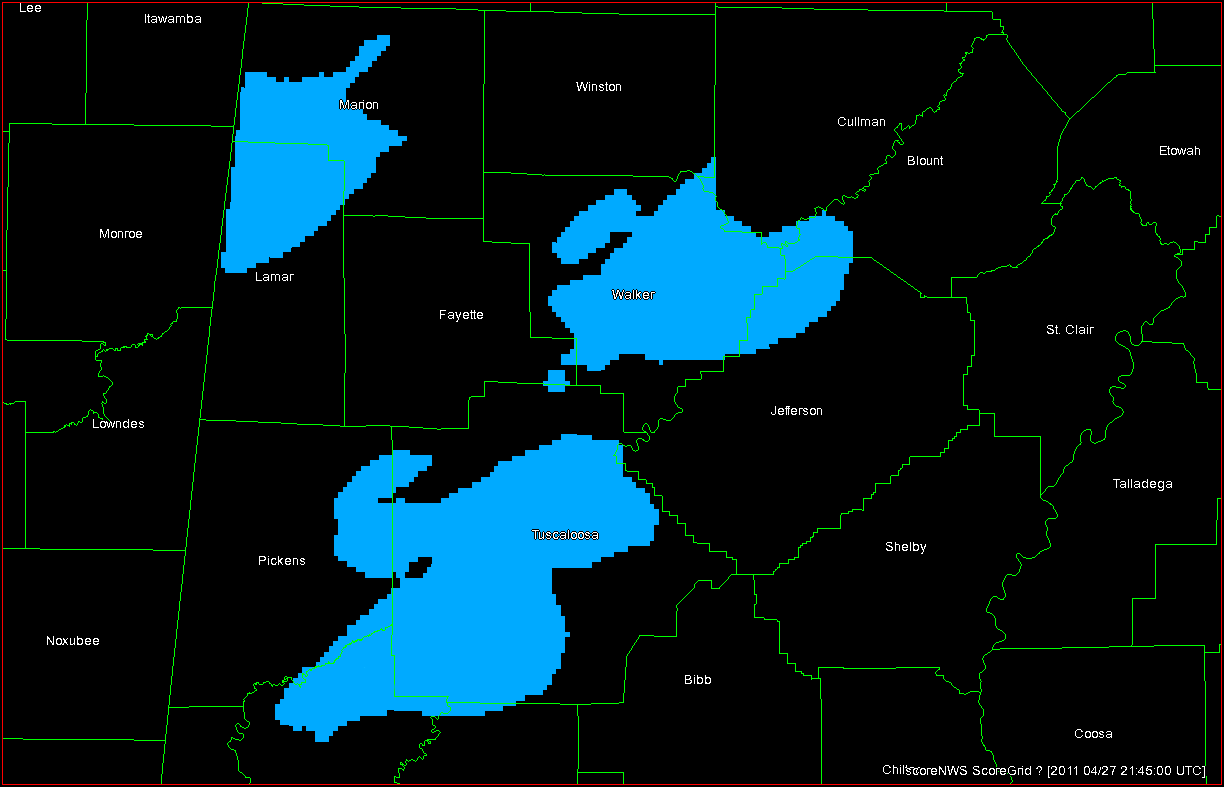
7 June: Failure of CI over eastern ND and northern MN; late action on post-frontal storms in central ND.

8 June: Squall line with embedded supercell and bow elements over eastern IA and southern WI.

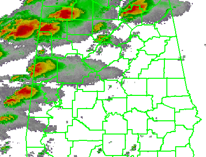
9 June: Afternoon squall line over southern New England and NY; evening supercells western OK and southern KS.

The following is a collection of comments and thoughts from the Friday debriefing.

NSSL 3D-VAR DATA ASSIMILATION:

One major technical issue was noted but not diagnosed.  It appeared that at times, the analysis grids were offset from the actual storms, so it is possible that there were some larger-than-expected latency issues with the grids.

It was suggested to add a “Height of maximum vertical velocity” product.  However, we hope to have the entire 3D wind field available in AWIPSII.  We also hope to have a model grid volume browser, similar to the radar “All-Tilts” feature within AWIPSII.  We used the WDSSII display for the wind vector displays.  The forecasters noted that the arrows were plotted such that the tail of the arrow was centered on the grid point.  It should be changed to the middle of the arrow.

The vorticity product was the deciding factor on issuing a Tornado Warning for the Thursday storm north of Wichita.

Bad data quality leads to bad 3DVAR.  In particular, it was noted several times that side-lobe contamination in the inflow of storms was giving false updraft strengths.  Improper velocity dealiasing is also detrimental to good 3DVAR analysis.  There is an intensive data quality improvement effort ongoing as part of the WOF project.

The downdraft product occasionally took a maximum “downdraft” at the upper levels of the storm and projected it to the surface.  There’s not a lot of continuity, and it is difficult to discern consistent features associated with the storms.

Would also like to use the products with less classic type storms, like low-topped convection, microbursts, etc.

David Dowell, who was visiting from GSD this week, is working on a next-generation assimilation using Kalman filtering, but requires more CPU power.  Jidong Gao at NSSL might create a blended technique (with Dowell) that requires less CPU power, something like a 3.5DVAR, which uses 3DVAR for hot-start analysis with radar and model analysis background, and then runs a cloud model out 5 minutes based on that and use it for the first guess on the next analysis, and so on.  This means we would be able to get more fields like T and P for cold pools, downdraft intensity and location, for storm types other than supercells.

OUN-WRF:

There were very few opportunities to evaluate OUN WRF data this week.  Our only event within the domain was on Thursday with a late domain switch for evening half of activities within OK and KS, but convection was already on-going and evaluation concentrated on other experimental EWP products.  The model suggested a few more storms that weren’t there.  One of our forecasters who use the data during regular warning operations in their WFO commented that the updraft helicity product helps with predicting storm type, but that it tends to overproduce cold pools and outflow.

GOES-R Nearcast:

The Nearcast principle investigator, Ralph Peterson, was on hand this week.  He posed the following questions to the forecasters:  Did you find the Nearcast products useful to ID the areas likely for convection initiation, and to predict the timing and location in pre-convective atmosphere.

The Nearcast products were primarily used during the early parts of the day to facilitate the area forecast discussion and afternoon/evening warning location decisions.  One forecaster noted that the Nearcast data behind squall lines becomes less useful with time due to intervening cloud cover.

The forecasters were asked if it would be useful to provide extended forecast hours but at the expense of greater data smoothing.  They liked to have the higher-resolution data to as far out as it is useful to have it.

The forecasters were also asked if they would have used the observation/analysis alone without the forward extrapolation, and the answer was that it wouldn’t have been as useful, since it is better to see how the current environment will evolve.

Showed an arch of destabilization between 2200-0300 across the eastern halves of OK and KS… storms formed on the western edge of this gradient and forecaster did not expect the storms to diminish anytime soon and thus increased warning confidence… stronger wording regarding hail/wind potential in warning was issued.

There seemed to be small scale features in the fields, areas of relative maximum that were moving around… would be nice to compare to radar evolution and see how those areas affected the storm structure.

Helped understand why convection occurred and where it would occur… definitely the 1-6 or 1-9 hour timeframe was the most useful aspect of it.

Having a 4-panel set up of the individual layers in addition to the difference field to help increase the understanding of the product.

The color-table in AWIPS was poor… Also, the values were reversed from those in NAWIPS and on the web. The individual layers of PW were also not available in AWIPS.

GOES-R Convective Initiation (UW and UAH):

The forecasters were asked if they compared the two CI products side-by-side.  The UAH product is more liberal in detections, has a higher resolution (1 km), and uses visible satellite data during daytime mode.  The UW product is more conservative in detections, has a 4 km resolution, uses only IR data, and masks output where there is cirrus contamination.

During the daytime, most forecasters were able to spot initiation in the visible satellite data, and thus the CI products were not all that useful for heads-up.  They did mention there could be value during nocturnal events, but the EWP doesn’t operate after dark, so we couldn’t test.

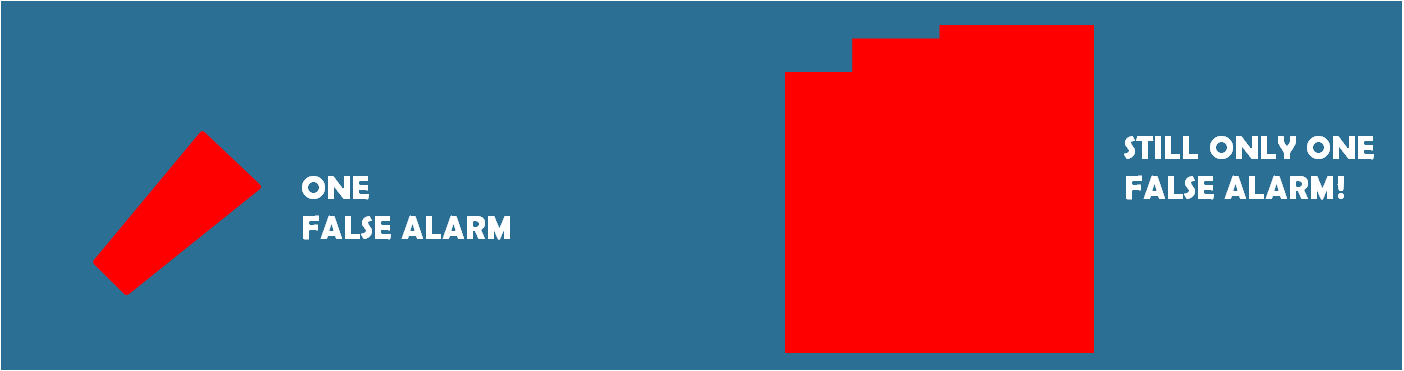
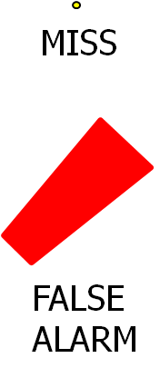
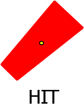
The notion of probabilistic output was once again brought up.  Instead of a product that was “somewhere in the middle” of good detections and false alarms, a probabilistic product could be more useful.  And a comment was made to bring both groups together to product a single probabilistic product.

In some cases, the products failed to trigger on clumps of cumulus that looked similar to other clumps that were receiving detections.

One forecaster raised a concern about consistency with respect to the FAA using the product for air routing.  If the CI product was automated and used by FAA, how would that conflict with human-created TAFs and other products?

A forecaster found that the UW cloud-top cooling rates useful to look for the timing of the next area of developing convection.

Even though CI didn’t always occur… false hits were useful in identifying clouds trying to break the cap.

GOES-R OTTC:

The one day we would have expected a lot of Overshooting Top detections, Thursday over Kansas, there were lots of missed detections.  Otherwise, the forecasters felt that they could ID the overshooting tops well before the algorithms, except perhaps at night (when we don’t operate).  Chris Siewert mentioned that the spatial resolution of current imager is too great (4x4km), and OT detection works better on higher-res data sets.  The temporal refresh rate also affects detection; sometimes feature show up between scans.

GOES-R pGLM:

We only had one half of an event day to view real-time pGLM data, the Thursday evening OK portion of our operations. Some of the storms to the east had higher flash rates, but this was an artifact of the LMA network’s detection efficiencies.  Flash rates would pick up a short time before increases in reflectivity.

One forecaster has access to real-time LMA data in the WFO and had some comments. They get a lot of calls wanting to know about lightning danger for first and last flash and stratiform rain regions.  It is also good for extremely long channel lightning – might get a rogue hit well away from main core, and sometimes anvils well downstream of main core can get electrically active.

There are more GOES-R details on the GOES-R HWT Blog Weekly Summary.

OVERALL COMMENTS:

The challenge, which was good, was integrating that info with all the other data sets, but also on how to set up the workstations, and best practices to use it.  Need six monitors!

Need pre-defined procedures.  Forecasters used the “ultimate CI” procedure heavily and liked to see what we think they should be combining to help enhance the utility of the products. (However, it is not always clear to the PIs which procedures would be best, as the experimental data has not yet been tested in real-time).

Like the two shifts.  Get to experience both types, a nice change.

I sometimes got too tied into warning operations rather than looking at experimental products.  It’s Pavlovian to think about the “issuing warnings” paradigm. (We tried to emphasize that getting the warning out on time wasn’t a priority this year, but using the warning decision making process to determine how best to use the experimental data sets, but “comfort zone” issues inevitably rise up.)

Training would have been better if done prior to visit, using VisitView or Articulate, and spend training day on how to use products rather than coming in cold.

Two weeks is nice, but April-May is a tough time to add another week, or even one or two X shifts for pre-visit training.

I went through most of training on web before visiting, it was abstract.  But once here, went through it again in a different light.

EFP interaction was tough – it was too jammed at the CI desk.  We felt more like an “add-on” rather than an active participant.

The joint EFP/EWP briefings were too long, and covered aspects we didn’t care about.  There were competing goals.  We should have done it in 15 minutes and moved on.  Need microphones for briefing.  Didn’t need to hear hydro part.  Need to set a time guideline at briefing for all groups.  Also, the information being provided was more academic than pure weather discussion.

The HWT needs more chairs.  Also, two separate equal sized rooms would be better than the current layout.

A LOOK AHEAD:

EWP2011 spring experiment operations are now completed.

CONTRIBUTORS:

Greg Stumpf, EWP2011 Operations Coordinator and Week 4 Weekly Coordinator

Chris Siewert, EWP2011 GOES-R Liaison (from the GOES-R blog)

Tags: None