
In order to illustrate the kinds of measures we can get from this method of warning verification, let’s first look at a single storm event. The chosen storm will be the 27 April 2011 long-tracked tornadic supercell that impacted Tuscaloosa and Birmingham, Alabama. This was a well-warned storm from the perspective of traditional NWS verification.
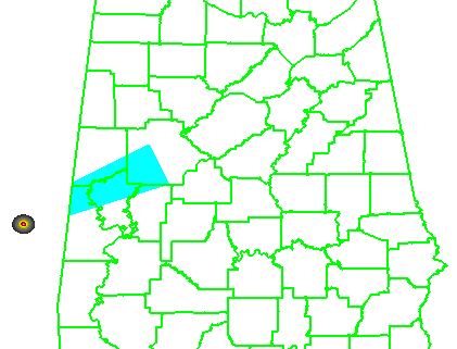
It helps to first look at the official NWS verification statistics for this event. The storm produced two verified tornadoes along its path within the Birmingham (BMX) County Warning Area (CWA). The BMX WFO issued 6 different Tornado Warnings covering this storm over 4 hours and 22 minutes (20:38 UCT 27 April – 01:00 UTC 28 April), from the AL-MS border northeastward to the AL-GA border. Here’s a loop showing the NWS warnings in cyan, and the path of the mesocyclone centroid overlaid. In the loop, it may appear that more than 6 different warning polygons were issued. Instead, you are seeing warning polygons being reduced in size via their follow-up Severe Weather Statements (SVS) in which the forecasters manually remove warning areas behind the threats.
All 6 warnings verified in the traditional sense – each contained a report of a tornado, and both tornadoes were warned. There were no misses and no false alarms. Thus, the Probability Of Detection = 1.0, the False Alarm Ratio = 0.0, and the Critical Success Index = 1.0. Boiling it down further, if we use the NWS Performance Management site, we can also determine how many of the 1-minute segments of each tornado were warned. It turns out that not every one segment was warned, as there was a 2-minute gap between two of the warnings (while the storm was southwest of Tuscaloosa – you can see the warning flash off in the above loop). So there were 184 minutes warned out of the total of 186 minutes of total tornado time, giving a Percent Event Warned (PEW) of 0.99. Still, these numbers are very respectable.
Now, what do the geospatial verification statistics tell us? We’ll start by looking at the statistics using a 5 km radius of influence (“splat”) around the one-minute tornado observations. For this 2×2 table, I am not applying the Cressman distance weighting to the truth splats, and I’m using the composite reflectivity filtering for the correct nulls:
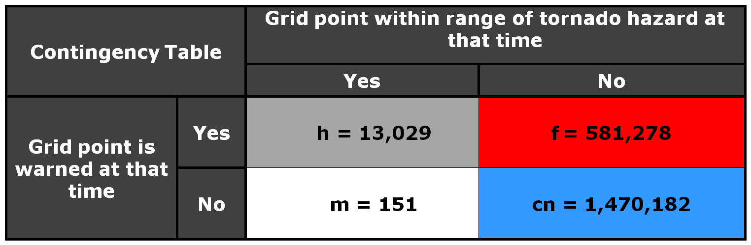
Remember that the values represent the count of 1 km2 x 1 minute grid points that met one of the 4 conditions in the 2×2 table. If we compute the POD, FAR, and CSI, we get:
POD = 0.9885
FAR = 0.9915
CSI = 0.0085
The POD looks very similar to the PEW computed using the NWS method. But the FAR and CSI are much much different. The FAR is huge, and thus the CSI is really small! What this tells us that for each one minute interval of the 4 hours and 22 minutes of warning for this event, over 99% of the grid points within the warning polygons were not within 5 km of the tornado at each one minute interval, accumulated. Is this a fair way to look at things? It is one way to measure how much area and time of a warning is considered false. The big question is this – what would be considered an acceptable value of accumulated false alarm area and time for our warnings? Given the uncertainties of weather forecasting/warning, and the limitations of the remote sensors (radar) to detect tornadic circulations, I don’t think we can ever expect perfection – that the warnings perfectly match the paths of the hazards. But this should be a method for determining if our warnings are being issued too large and too long in order to “cast a wide net”.
One way to analyze this is to vary the size of the “splat” radius of influence around each one-minute tornado observation. For example, if we were to create the above 2×2 table and stats using a 10 km “splat” size (instead of 5 km), the numbers would look like this:
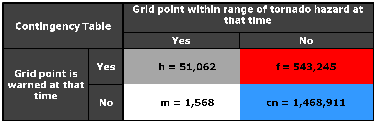
POD = 0.9702
FAR = 0.9141
CSI = 0.0857
Note that the FAR is starting to go down, from 0.99 to 0.91. But the POD is also starting to lower slightly. Why, because now we’re requiring that the warnings cover the entire 10 km radius around each one minute tornado “splat”, so more of the observation area is starting to get missed by warnings.
Is 5 or 10 km the correct buffer zone around the tornadoes? Or is it some other value? Let’s look at the variation in POD, FAR, CSI, and the Heidke Skill Score (HSS; uses the CORRECT NULL numbers) across varying values of splat size, from 1 km to 100 km at 1 km intervals (the x-axis shows meters on the graph):
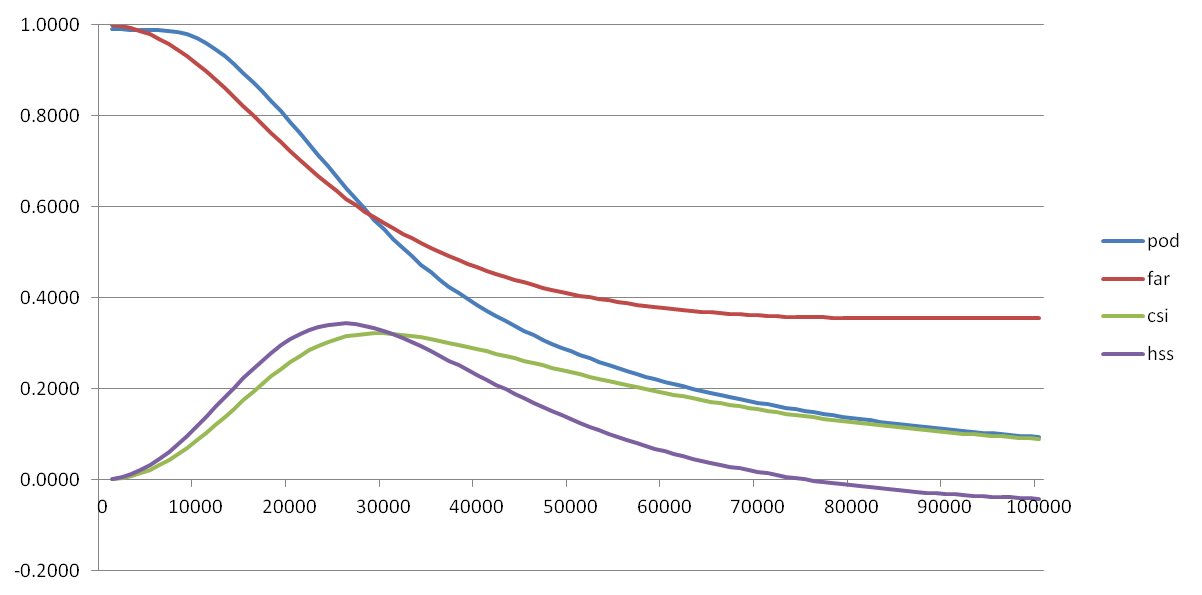
This graph might imply that, based on maximizing our combined accuracy measures of CSI and HSS, that the optimal “splat” radius should be around 25-30 km. Instead, this probably shows that the average width of the warnings issued that day were about 25-30km wide, and if given a requirement to warn within 25-30 km of the tornadoes, the NWS warnings would be considered good. So we’re still left with the question – what is the optimal buffer to use around the tornado reports? This is probably a question better answered via social science. And, given that number, what is an acceptable false alarm area/time for the warning polygons? In other words, what would our users allow as an acceptable buffer, and can meteorologists do a decent job communicating that this buffer is needed to account for various uncertainties?
What about grid locations away from the tornado but will be impacted at a later time? They are downstream of the tornado headed toward them. Should they be counted toward the false alarm numbers? My answer is no and yes. I will tackle the ‘no’ now, and the ‘yes’ answer will come much later in this blog.
Greg Stumpf, CIMMS and NWS/MDL