The Life and Death of a Gulf Storm Through the Eyes of Experimental Products

In this case of a rapidly developing storm, GLM data was leaned on to issue a SVR Warning on what otherwise may have been a marginal storm. AllSkyLAP showed the storm was developing in an area of MLCAPE values over 2000 J/kg, and ProbWind model had rapidly increased to ~50%. GOES-16 1-minute imagery showed rapidly cooling cloud tops, with a sharp increase in lightning activity. Given GLM values comparable to other severe storms on the day a SVR warning was placed on the storm. The warning was sent out relatively early to try to capitalize on lead time.


Radar w/ ProbSevere:

IR-Sandwich:

Flash Event Density:

Minimum Flash Area:

Event Density:

Total Optical Energy (too fast, whoops!):

AllSkyLAP CAPE:

ProbWind Model Increase:


UPDATE: Shortly after warning on the storm, it completely fell apart after failing to become rooted in the boundary layer and all indicators (i.e., ProbSevere, GLM imagry) dropped to null. Initial warning was shamefully cancelled.

Really living up up to my name!


Radar w/ProbSevere:

Flash Event Density:

ProbWind Model Increase:


#ProtectAndDissipate


Scale (and color table choice) is Everything

Big flashes taking place in the stratiform region of the departing MCS across the eastern third of Texas.  A LOT of big flashes:

But that doesn’t tell the full story; there are a LOT of big flashes but they are being masked by the scaling of Flash Area.  Right now the scale runs from 64 km2 to 2000 km2.  What happens if we bump that max side up to 4000 km2?

There we go, a bit better discrimination on the big-side of the scale!  It may be hard to see but there is one “white” flash in there; a slightly larger 4600 km2 flash southeast of DFW.

That. is. Yuuuuuuuuuuge.

So, lesson of the day; check the values of flash size (or any flash component).  See if there are values past the end of the current color scale.  Right click on the appropriate product, select Change Colormap , and bump that up some.  May be able to pull out a bit more information than what comes as the default.  Once again however…YMMV.

-Dusty

Here’s an exciting non-case. Hooary!

In this example, Houston County in the far Northern HGX CWA was in horrible radar coverage with 0.5 degree radar scans over 12kft AGL. With the success of GLM FED predicting severe storms earlier in the day this was used to give confidence NOT to issue a warning for this area, despite slight bowing in the sloppy reflectivity and an abundance of activity in the ENTLN network.

#ProtectAndDissipate

GLM Activity In Developing Line of Storms

The outflow from the main line of storms was moving west and combined with a strong cell which was spawned off the dryline, resulting in a strong line of storms forming where the two converged. Something that was noted was the delay in GLM FED with the developing convection, where flashes could be seen quickly from the ENTLN. Chalked this up to the optical depth of the storm at the time covering the flashed from the GLM given the extent of cloud-to-ground strikes. Later on, a line of increased GLM FED could be seen.

#ProtectAndDissipate


GLM Viewing Angles – what it means

Having both GOES-E and GOES-W GLM data provides some interesting opportunities to compare how the two instrument’s viewing angles impact the data.  Sometimes it does, sometimes it doesn’t.

First case, it confirms the large flash size in a flash across the Texas and Oklahoma Panhandles into Kansas: top image is GOES-W and bottom image is GOES-E.  The white flash is over 2000 km2; G-17 was 2140 and G-16 was 2685.  Not bad!  This was probably a flash extending  from convective cores in northwest Oklahoma back into the anvil region.

But now let’s look at a different flash; this time a bit further south.  The top image is G-16, bottom is G-17.

The white flash in G-16 was shown as a 2262 km2 flash while G-17 in dark red was only 1096 km2.  Why the big difference?  Probably the different viewing angles.  The image below is centered on a strong overshooting top that the flash in question above originated around:

G-16 has a more favorable viewing angle on this flash looking towards the updraft/overshooting top from the southeast.  G-17 may have had some of the weaker portions of the flash blocked by optical depth of the anvil or being underneath a part of the overshooting top.

The implications are that depending on the orientation of the storm to the GLM instruments; checking both will perhaps provide confidence in the evolution of Flash Area and potentially other GLM flash products as well.

-Dusty

ProbSevere Split It

Quick update to a previous post. Like before, the first image shows GLM Event Density and the second shows base reflectivity with ProbSevere. It took ProbSevere’s tracking algorithm around 15-20 minutes to  splitting the storms into multiple ones. I would have been awesome if it happened earlier, but I’m not complaining. It happened quicker than I thought it would.

Will these storms split finally in ProbSevere?

Below are a few images for a long-lived storm in Pecos County that is starting to split. The first image shows GLM Event Density with two separate hot spots while the second image shows base reflectivity  with ProbSevere contours. It will be interesting to see if/when the ProbSevere tracking algorithm will splits the storm into two storms rather than one merged storm.

GLM Data Helpful Far From Radar

GLM data is helpful to me, and visually I find more effective than other point lightning data and giving me storm intensity information as the storms get farther away from the CWA radar and other scopes that can see them. Because of the radar location related to the storms, radar based data sets are becoming less useful at this time.

GLM Data – How To Visualize?

The GLM data is showing a lot of utility and provides useful information on storm trends, intensity, and storm mode.  However, the biggest issue is how to visualize all this information and tie it to the meteorology; the “physics-science” side of things in order to tie everything together.

Here is the first attempt and why:
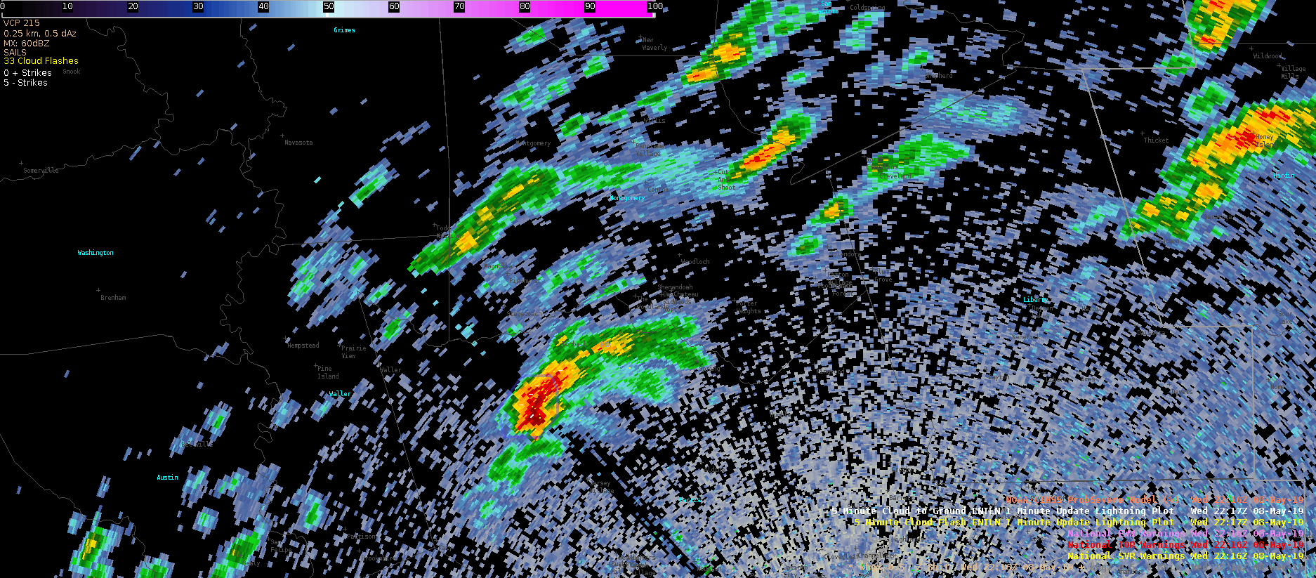
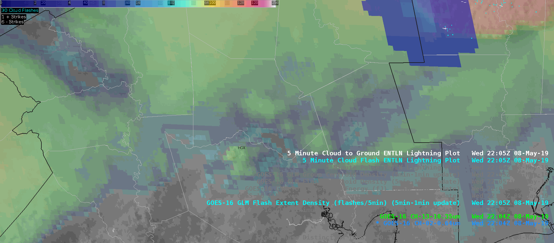
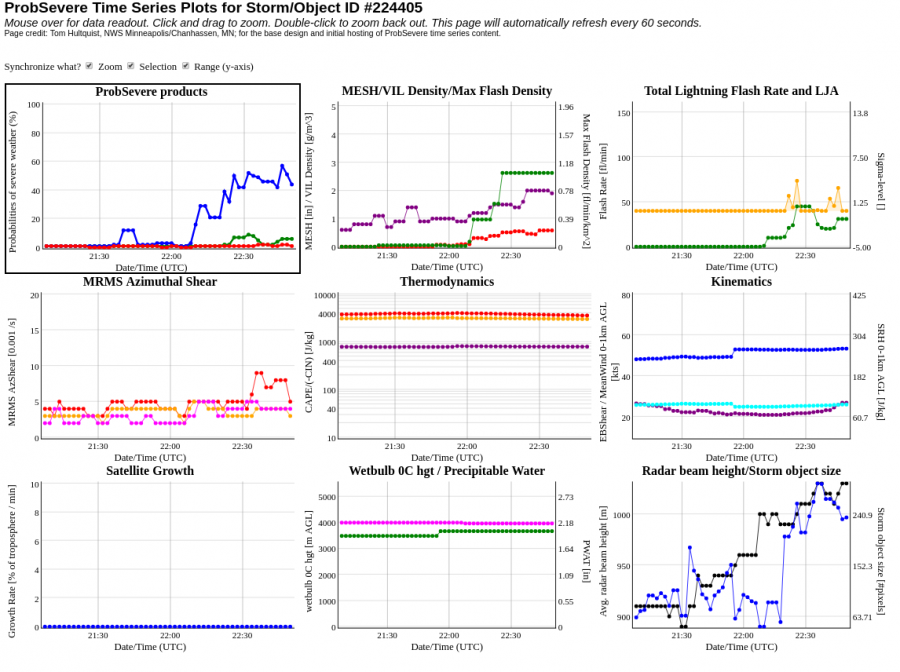
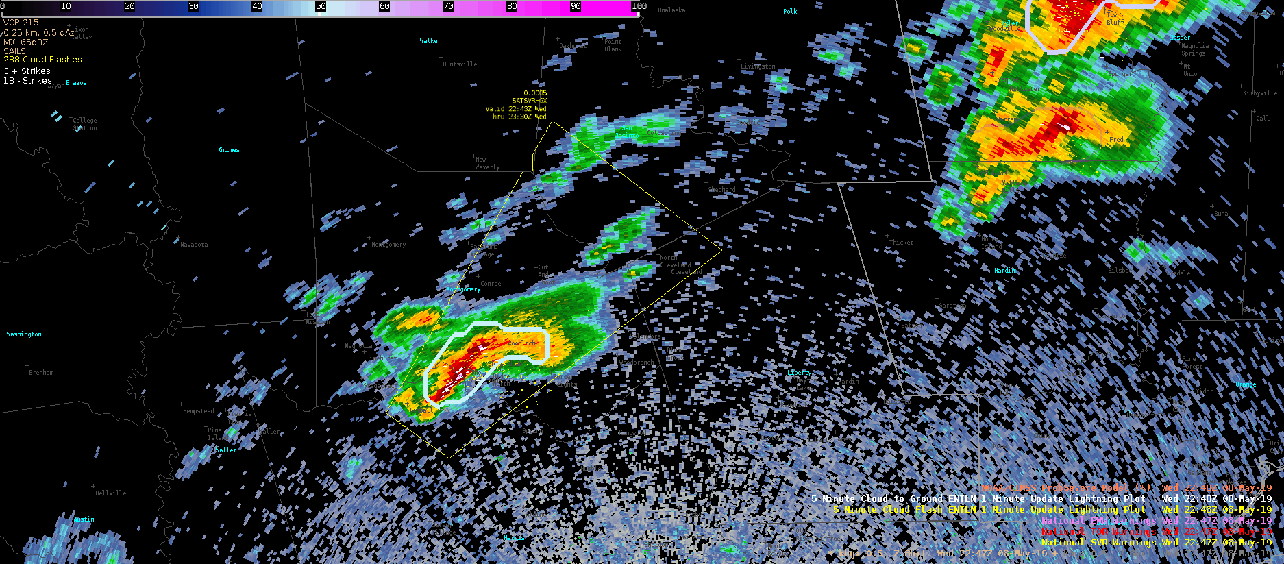
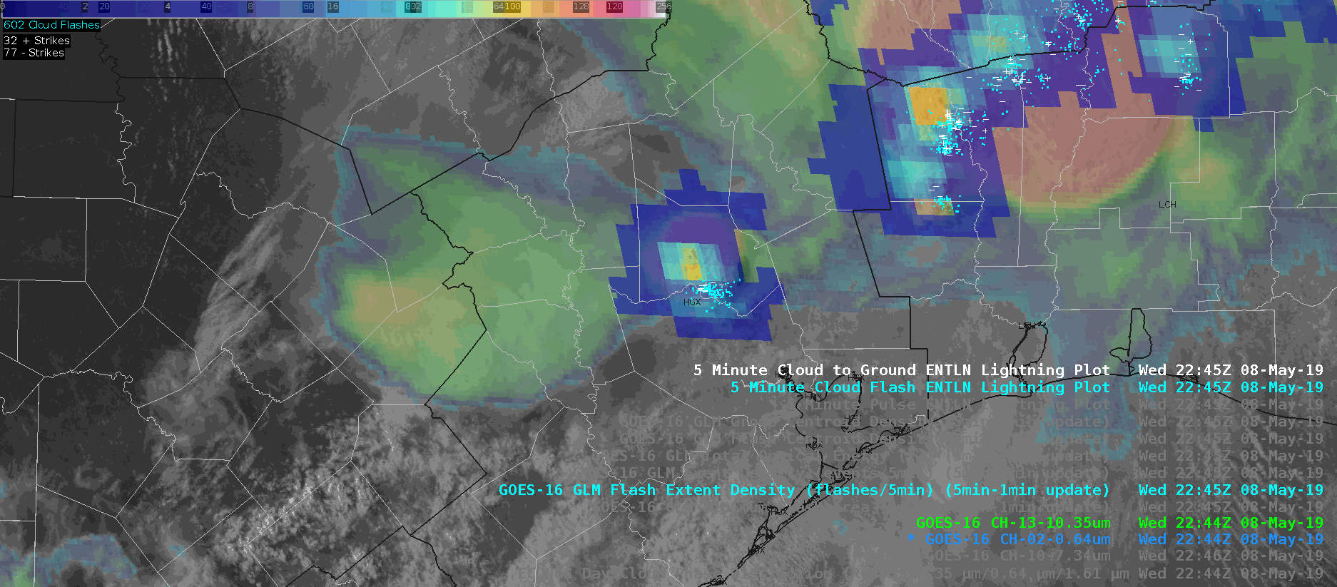
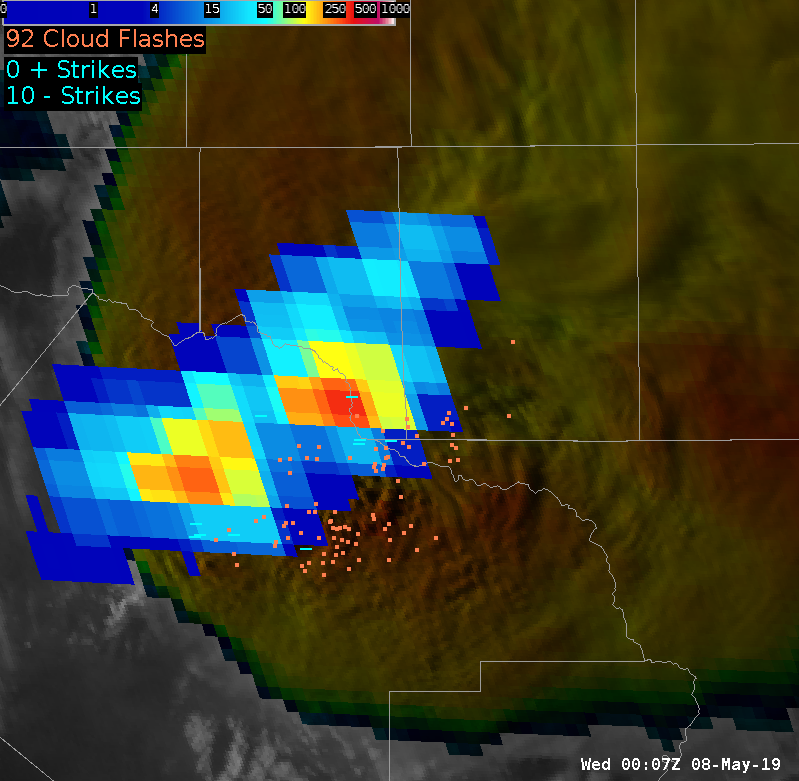
Top left panel – 5-Minute Flash Extent Density with 1-minute updates (enhanced color curve): this is a good way to see trends with the GLM data as it is a 5-minute window updated every minute.  Shows increases/ in lightning flashes with time with a “smoother” display rather than just every 1-minute frame.
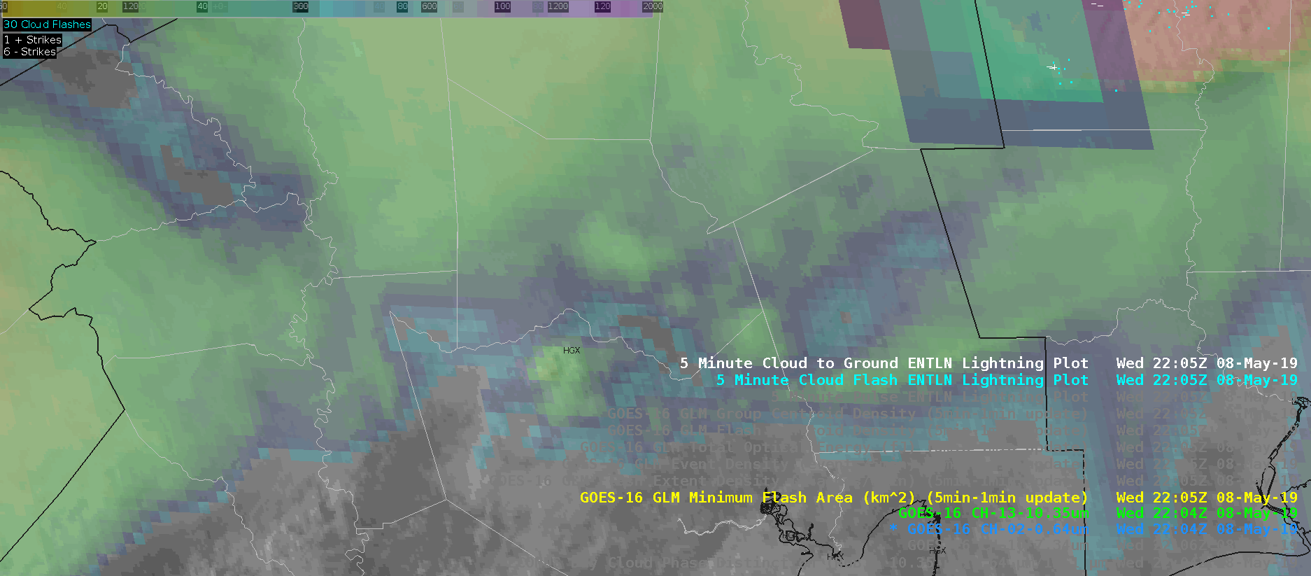
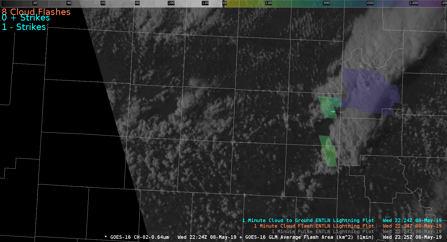
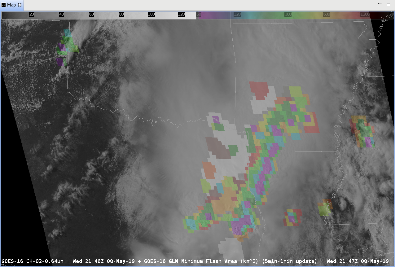
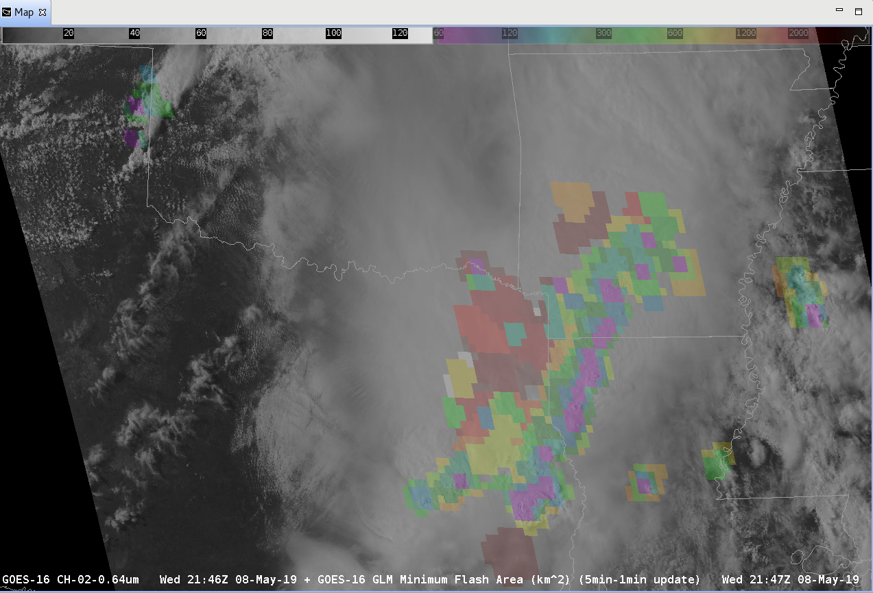
Top right panel – 1-minute Minimum Flash Area (enhanced color curve): shows where the smallest flashes are occurring.  Rough reason; small flashes corresponds to strong updrafts with lots of turbulence limiting the extent to which flashes can develop.  So, small flashes (around or under 100 km2) should correspond to strong updrafts.  Works with both multi-cellular, super cellular, and pulse convection. Don’t use the 5-minute with 1-minute update because the tendency I’ve seen so far is that it can result in an area of small flashes that is way to large for an individual storm updraft as it covers where it has been for the last 5 minutes!

So, how to tie this into the meteorology.  There needs to be some way to show “ground truth” outside of the ground-based lightning detection networks.  So, let’s give this a try:

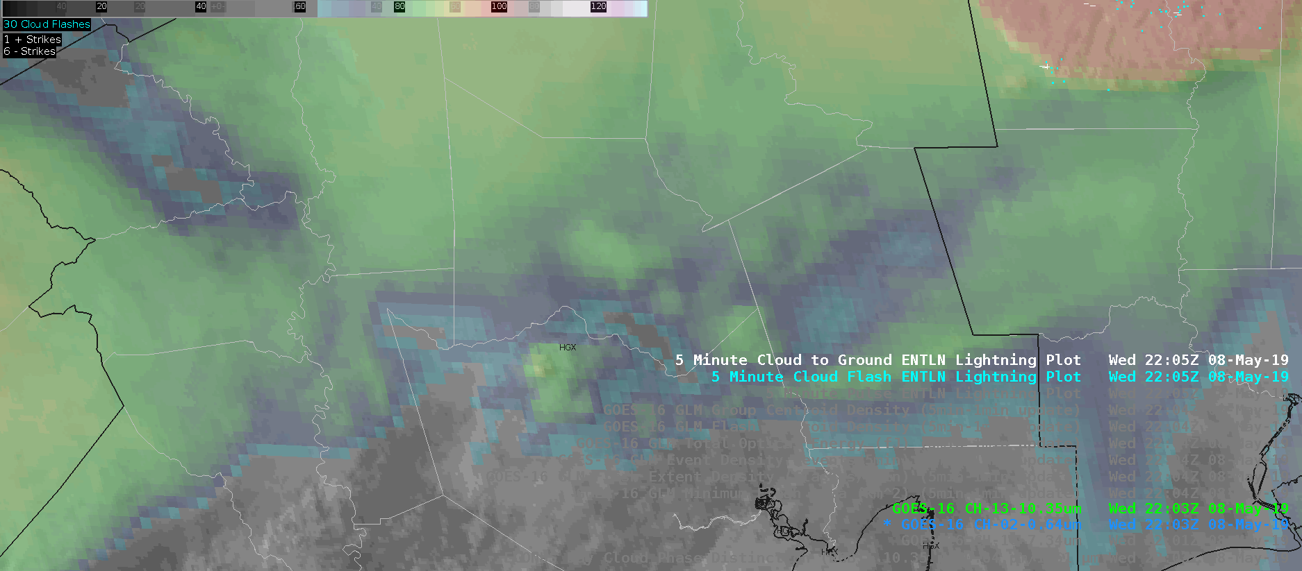
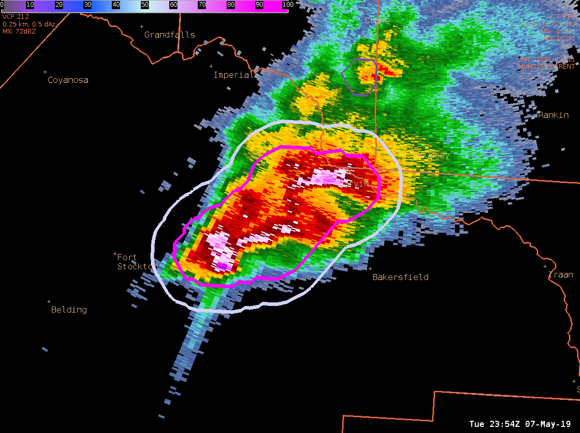
Bottom left panel – MRMS composite reflectivity at -10 C.  This shows strong convective cores that are capable of producing mixed-phased precipitation needed for lightning.  MRMS because it can cover areas with storms that are within the Cone-of-Silence for any given radar.  Going with -10 C gets above the melting level at 0 C and below the -20 C where the majority of particles should be switching over to more ice crystals than liquid and/or large hail.
Bottom right panel – 3 to 6 km Merged Azimuthal Shear.  If done right, this should show when mid-level mesocyclones are starting to strengthen and where rotation would be the strongest.   Strong updrafts that are rotation can help a storm produce small flashes (again, the whole turbulent mixing in and around the updraft thing).

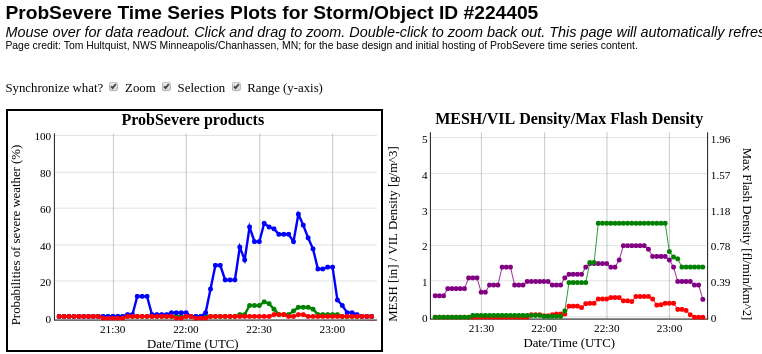
Is this the best way to do this?  No idea!  It’s a start though and as we go through the following 6 frames, you can hopefully see how this plays out.  Watch the southern-most storm have high Flash Extent Density counts while the Minimum Flash Area remains around 60 km2.  Although there isn’t a strong sign of rotation in the AzShear product, the GLM data shows that there is a strong updraft that has maintained strength over the last 6 minutes.

Watching the northern storm, AzShear shows stronger rotation and a quick check of the base data (not shown Z, V, SRM) shows that there was a weak but persistence mesocyclone with the northern storm.  With time, the AzShear product shows strong cyclonic shear with this storm and we start to see the FED increase while flash sizes decrease.  It takes some time but after around 5 minutes, the Minimum Flash Area had bottomed out around 60 km2.

This isn’t perfect by any means.  Another issue to look it is how to incorporate this into warning operations because this is a lot to look at.  At this point, GLM data may be too much to add in a single-person warning situation.

Something to consider…