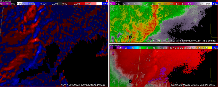
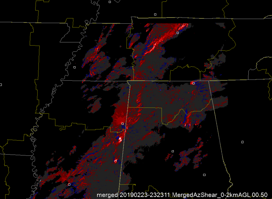
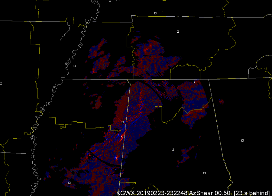
Spectrum Width is (I feel) a seldom used and/or misunderstood product, but one of the uses of it is to view the leading edge of a gust front with messy reflectivity. I think the Az Shear product, especially the single radar version, adds an additional layer to this boundary identification. A forecaster would need to be aware where the radar is with respect to the leading edge as the Az Shear flips whether you are north or south of the radar, but putting the Velocity, SW, and Az Shear together makes that leading edge ID easy. This is important when doing DSS for events for example, identifying and timing out right where the leading edge winds begin. Below are two screenshots one with AzShear, Reflectivity, and SW, and another with AzShear, SW, and Velocity. You can see where the leading edge is in the most norther part of the line in reflectivity (tight gradient that lines up well with SW). In the middle of the reflectivity though it gets messy. While details of the leading edge are still visible in SW, they stand out well in the AzShear, including where a kink the line and a new circulation is developing.
You can see this leading edge of the line in Storm Relative velocity as well (see above). Whether it is for tornadic circulation identification (which SW can also play a role in – high values of Spectrum Width = high turbulence like you’d see around a tight couplet) or for identification of the leading edge of the winds I think a 4 Panel of Reflectivity, Spectrum Width, Velocity, and Single Radar AzShear would be useful and valuable.
-Alexander T.
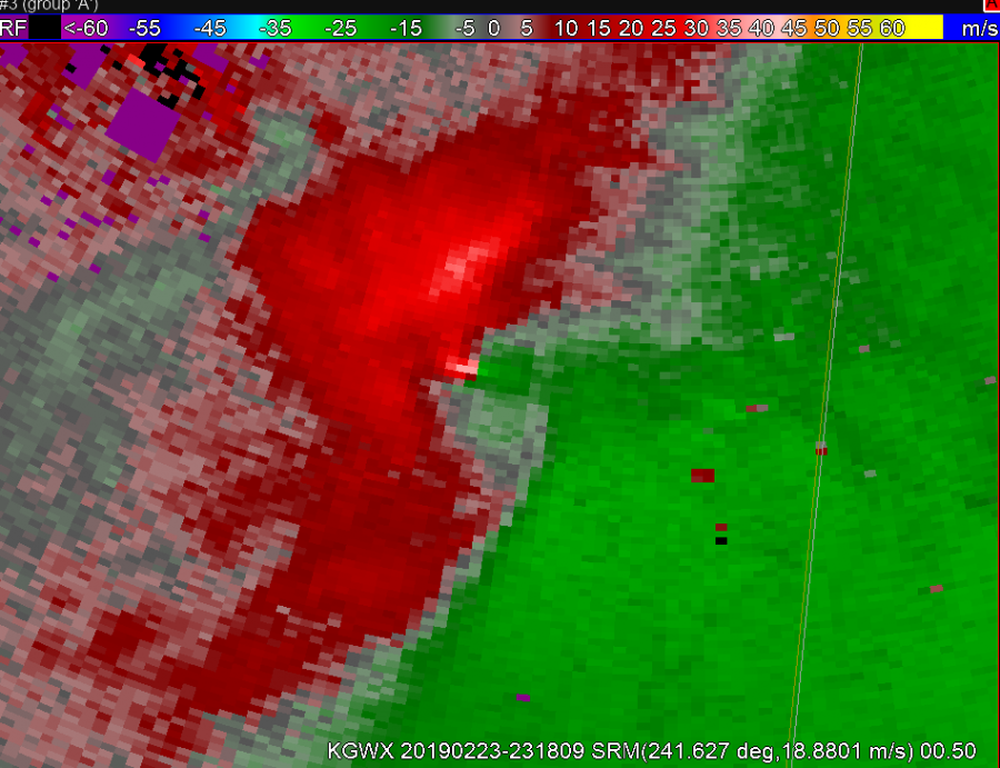
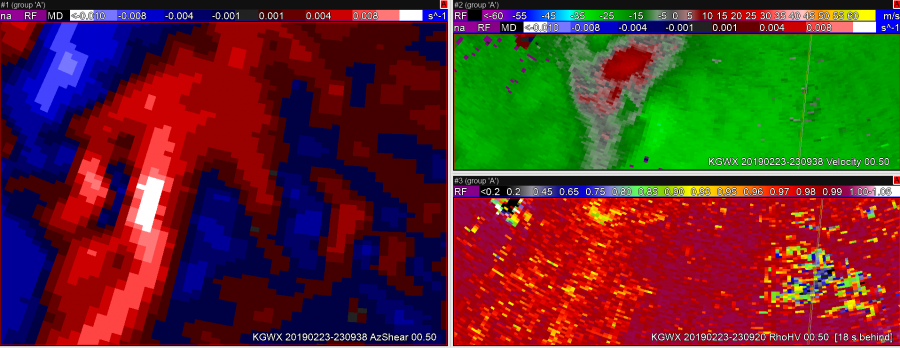 In this first image, the updraft-downdraft convergence zone appears to be a continuous line in AzShear.
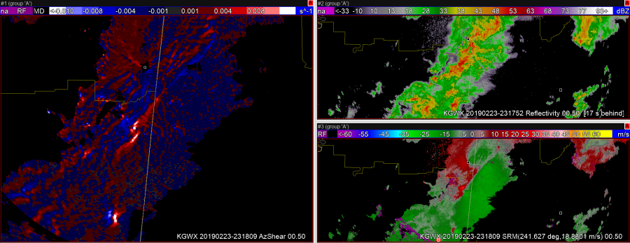
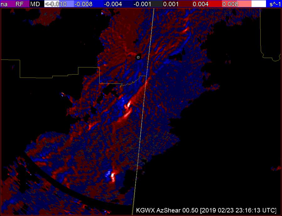
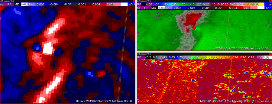 In the second image, you can see the RFD kicking out ahead of the storm right as the velocity couplet intensifies and a TDS appears.
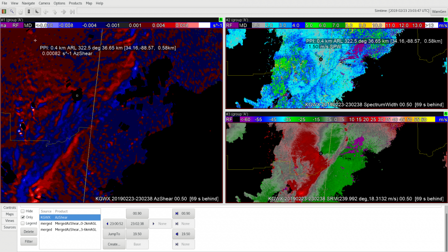
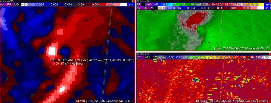 In image 3, it looks like the RFD has pushed well ahead of the tornado, perhaps hinting that the tornado may soon dissipate.
 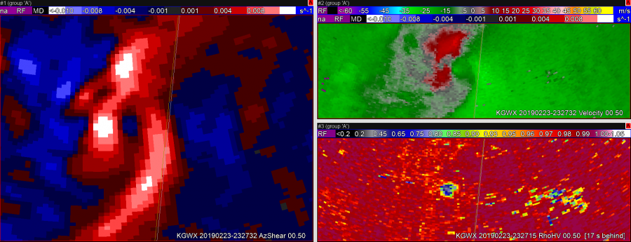 The TDS lingers in this image, but the velocity couplet has weakened.
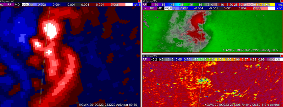 Still have a TDS, but velocity couplet has become very weak.
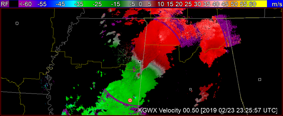 B
B 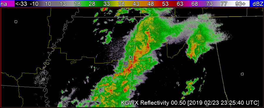 C
C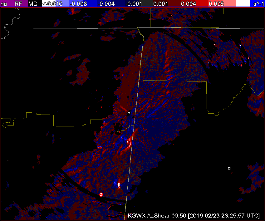
 6
6