
While I’ve been a big fan of the ProbSevere Model for some time now, the default color curve has always been a little challenging for me to differentiate between the different percentages. Trying to find the right balance between the radar color tables and ProbSevere I know can be tough, but here’s my first go at attempting to better differentiate when the percentages move into the next 10% range. Unfortunately, I’m unable to really test this modified color table out since we’re currently not getting radar data in from the Davenport area, so will reassess this once I’m able to overlay the model output with radar imagery. But, just having the colors pop a little more is already helpful to me! Oh, and I’m very appreciative that ProbSevere v.2 now includes the separated values (i.e. ProbWind, ProbHail, ProbTor). Looking forward to testing this out once there’s a case to evaluate with it.
*Note: As of this posting, WFO DVN issued a Severe Thunderstorm Warning.
~Gritty
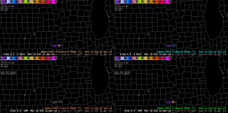
What if you had different color tables for ProbWind (blue scale?), ProbTor (red scale?), and ProbHail (green scale?). That may be overkill at this point, but it would help differentiate which product you have loaded more quickly. I do certainly like the ‘by-10s’ idea for ProbSevere as a whole! I get the struggle with any ‘Prob’ color table to to make it not clash with the radar under it.
-Alexander T.