An official website of the United States government
Here’s how you know
Official websites use .gov A
.gov website belongs to an official government
organization in the United States.
Secure .gov websites use HTTPS A
lock (
) or https:// means you’ve safely connected to
the .gov website. Share sensitive information only on official,
secure websites.
For the initiation of convective storms, I found that the ProbSevere performed the best over the other products available to me today. I have seen over the last couple of days that the best use of ProbSevere is the trend table. The steep increase in these total severe values support radar trends that suggest a warning is necessary. For the initial warning on severe storms, this was the best use.
The only negative to this product was the latency. While the latency was only on the order of 2-5 minutes, this was equivalent to appx. 2 radar scans that indicated to me ahead of time that this storm was strengthening. This can lead to some confusion especially if the storm is quickly pulsing and falling.
Additional upticks were noticed in subsequent SVR issuances throughout the afternoon that provided a nice heads-up in conjunction with the radar data. These were used in the context of the storm maintaining its strength after the storm was warned and again after the storm re-pulsed several minutes later.
It is also worth mentioning that the perceived threat of ProbSevere was also the shared opinion of the forecast (forecaster perceived threat for hail had the highest ProbS. probability). Once the storms reach the “cap” of their ProbSevere, it becomes of little use.
GLM
GLM was useful during convective initiation, but did best for storms that were already at the peak of the ProbSevere threshold. GLM showed additional pulses in a mature storm that had a 90% probability of being severe and added confidence to the warning forecaster that the storm had gained additional strength which manifested itself in larger hail for example.
It was however short-lived as the storm gained additional intensity but did not show the corresponding increase in GLM FED that one would expect. This was explained as a limitation due to the structure of a mature (and severe) thunderstorm.
Min Flash Area also reached its lower values on several storms which provided little to no additional data. Maybe this used in conjunction with total optical energy would be useful, but this yielded no significant results when investigating briefly.
PHS Model
The PHS model was very useful today ahead of convective initiation, but more so in an advective situation.
Instability parameters were observed as ongoing severe storms moved SW toward the established instability gradient. ProbSevere outlined areas are moving SW in the image below across an area of relatively high CAPE and low LIs. This provided useful information about the existence of a boundary and the motion of the storms along with the pre-conditioned environment.
The model did have limitations as the storms became ingested into the later runs of the model and the storms showed developed cold pools. The environment depicted in this situation had become dominated by nearby cold pools of incorrectly placed convection which limited the model’s usefulness.
LightningCast
Not much use of the lightning cast today due to the lack of CI within our CWA, but we did get a chance to look at the advection of lightning. In general, this proved to be a little too slow. It seemed the contours were tight to the storm and storm motion was rather slow, but the lead time on lightning detection was around 30-40 minutes. With an advecting storm, I would have expected this to be rather accurate to the 60 minute threshold that it attempts to achieve, but 30-40 minutes is still VERY useful for DSS and now-casting purposes.
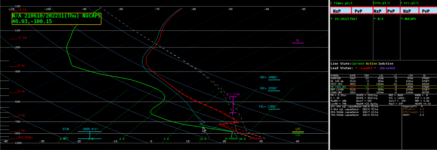
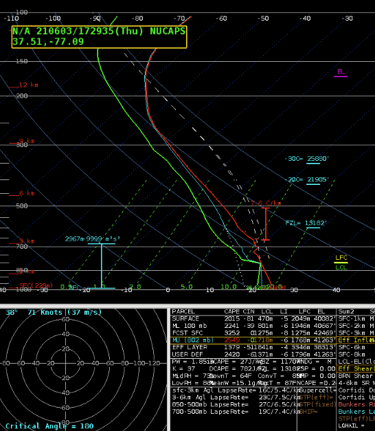
NUCAPS
NUCAPS had some interesting results today, primarily in the way it reported green, yellow, and red data points. Some of the gridded data was unavailable for points with green-retrieval and this was puzzling because it would have indicated a dry slot over the DFW region that was evident in the water vapor and visible satellite. However, the data grid boxes were missing or contaminated with bad data over a mostly clear area. Areas with similar cloud coverage performed as expected. The pop-up skew-t continues to be the best tool in this suite of products, provided the data points are green-retrieval.
Optical Flow Winds
Not much use on the optical flow winds today due to the fact that ongoing convection muddied the data. Overshooting tops were visible for a brief moment, but quickly engulfed in strong storms and expanding anvils. The divergence field is really hard to gather meaningful intel from and the existing platform outside of AWIPS limits its overall usage. A suggestion in our group today was that divergence could be useful if the noise is limited. Perhaps remove values above and below a certain threshold. Instead of widespread values, draw attention to the important outliers.
Had attempted to compare the AWIPS Derived Motion Winds to Bob’s Optical Winds: https://www.ssec.wisc.edu/~rabin/winds/goes16/b13/1/m1/iris/layers_loop.htmlbut encountered eventual CAVE crashes each time. While, on occasion, being able to display and toggle different layers of DMW in AWIPS before crashing, I did find that the Optical winds had much higher resolution wind data than what was available in AWIPS (with max density) and wind directions, by layer, seemed to well agree.
It is my opinion, though, that, while the DMW winds in AWIPS could be useful, they seem resource-intensive and come with a significant likelihood of freezing or crashing the CAVE instance. I find it much quicker and more reliable to view the similar data via Bob’s webpage.
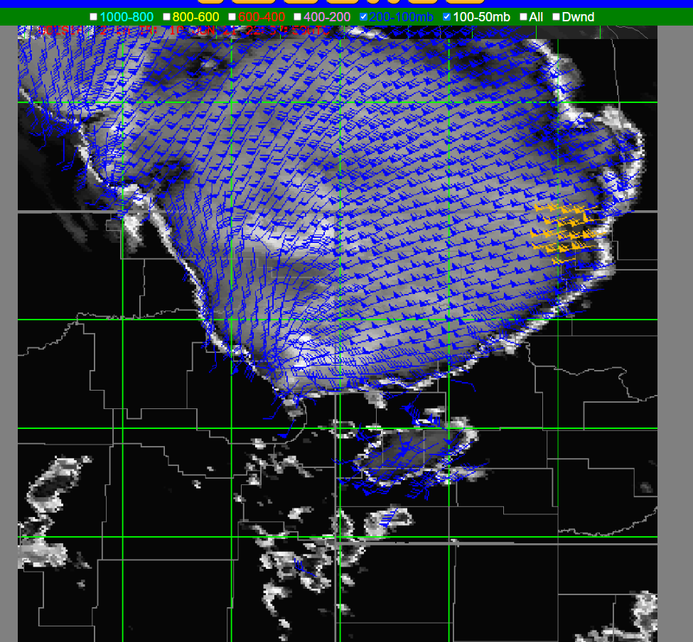
The “All” winds display setting was useful in combining the multiple layers of wind data, however, without a proper understanding that the winds displayed (and subsequently shaded), a user may incorrectly infer regions of convergence/divergence. I found it useful to ‘build’ the wind layers from the top of the atmosphere (100-50mb) down, to see in which layer the winds displayed where located.
Circled in red are areas that one might incorrectly infer the presence of strong speed divergence, when, while divergence may be present, the winds displayed are at different levels of the atmosphere based on the level of the optical wind sensing. Perhaps there is a way to color-code the wind barbs to correlate height / pressure level (Red for surface with a gradient toward blue for 100mb, or so)?
Looking at multiple levels of optical winds can be useful in analyzing the amount of wind shear over an area in near-real time. In this case, the tool shows limited wind shear, so one would expect storms to be a bit more short lived. Would it be possible to add wind shear fields directly into this tool for quicker analysis?
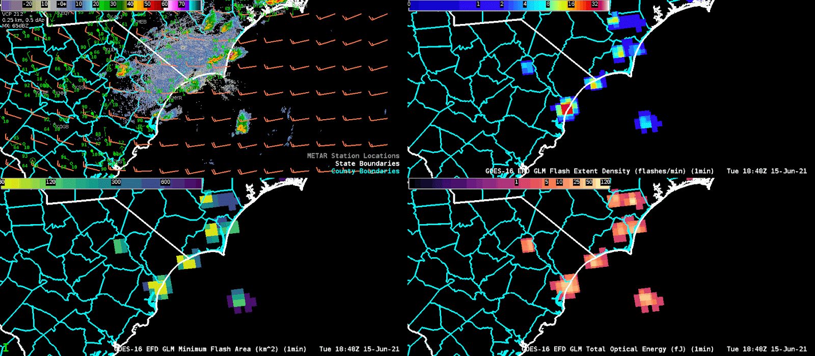
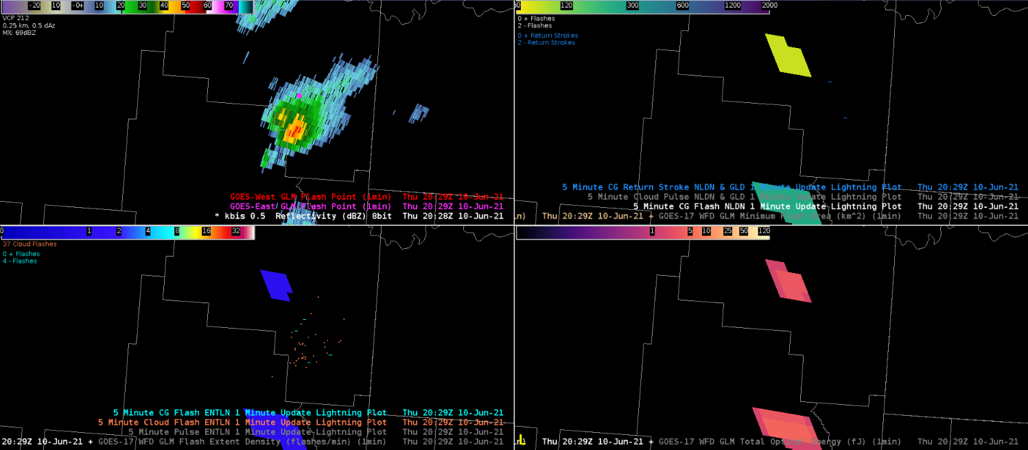
Optical winds for the ILM CWA on 6/15 at 18Z showing little difference in the winds between the 800-600mb and 600-400 mb levels.4 panel of the GLM data at ILM around 19 UTC illustrates Flash Extent Density (top right), Minimum Flash Area (bottom left) and Total Optical Energy (bottom right). We adjusted the colormap of the minimum flash area so that we could identify the updrafts more easily since the minimum flash areas were under 100km^2 and the default map was set to cover images up to 2000km^2. This allowed us to identify which storms featured the strongest updrafts which when combined with data from the Flash Extent Density, we could watch for storms that were strengthening and thus posed a greater need for a warning.
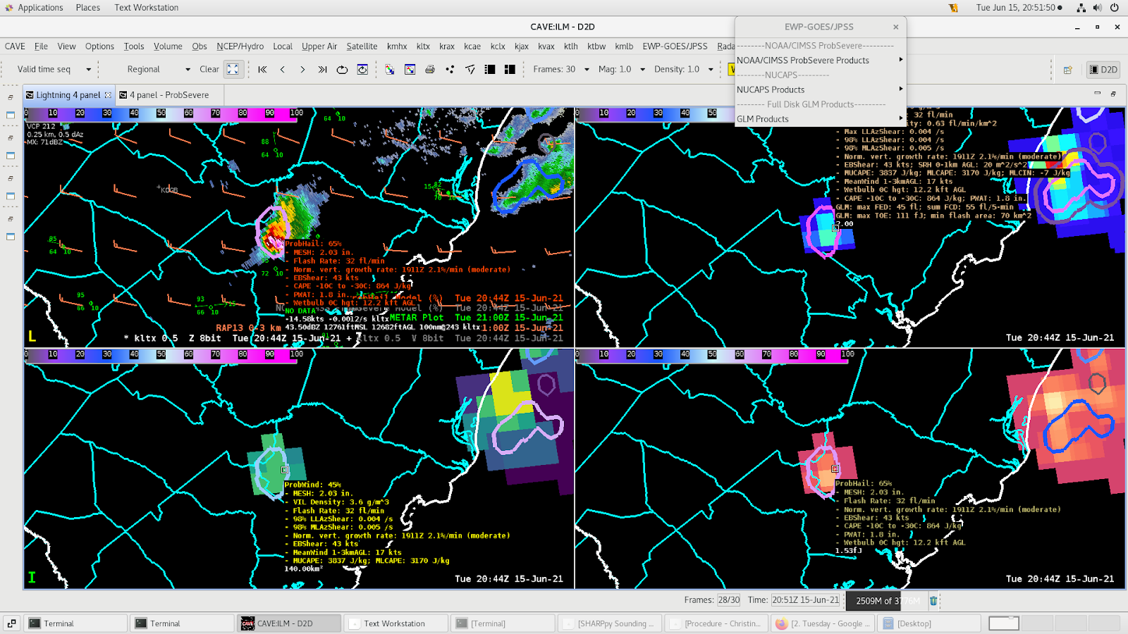
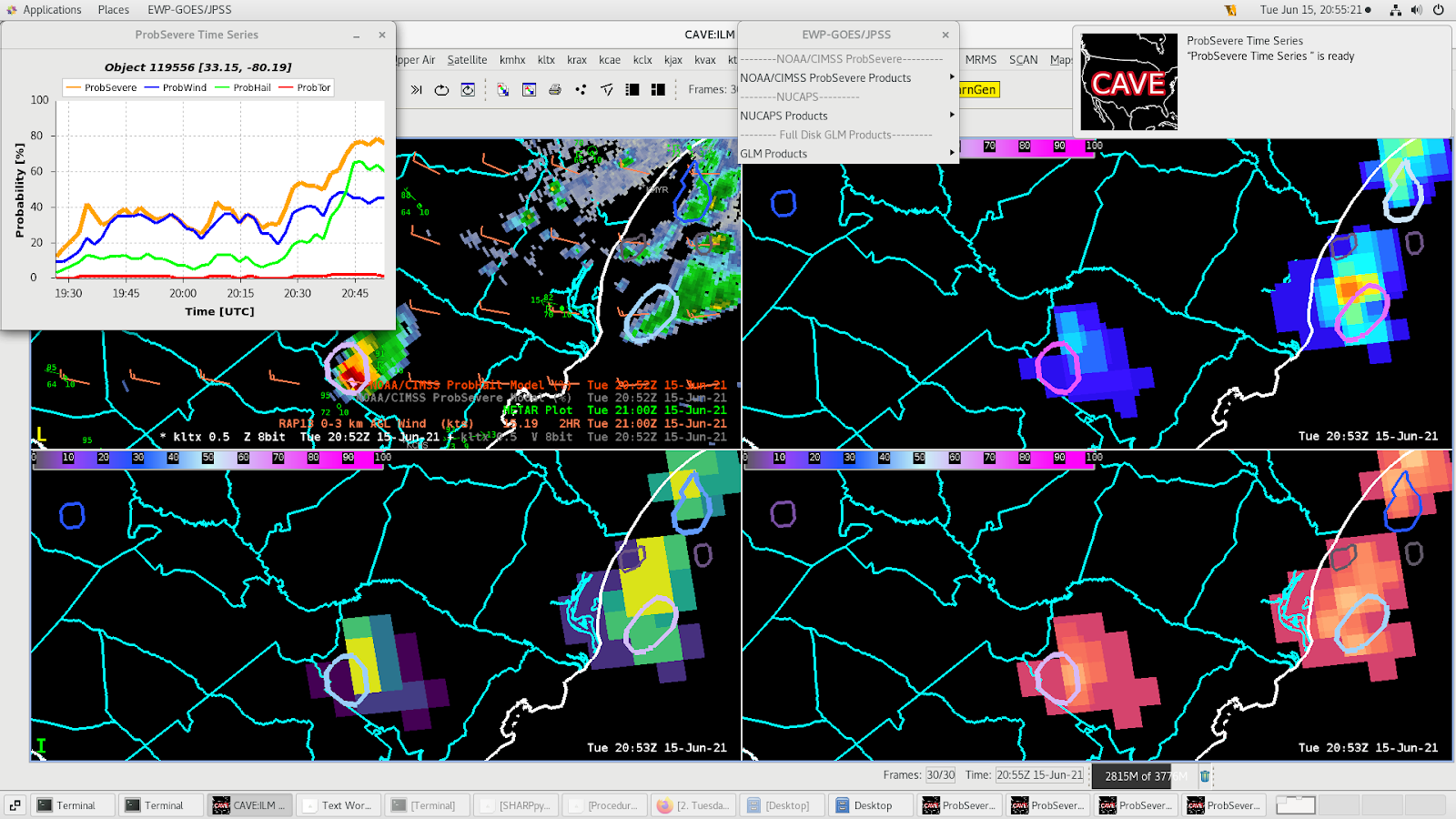
Three Body Scattered Spike & ProbHail
Three body scattered spike is visible in the storm in the top right panel.ProbHail shows values of ~65% when the three body scattered spike appears with MESH values over 2” supporting the likelihood of at least severe size hail in the discrete cell.
Watching the meteogram on this storm, we can see the probhail values jumped up to 65% over the last 15 minutes. It’s probably best to have ProbHail values of 60% or more last for a few volume scans because that suggests the residence time in the hail growth zone is long enough for hail to grow and become 1” in diameter or larger.
Convective storms that developed across northeast Montana showed the speed and direction of the outflow. Note the divergent flow outward from the overshooting top, to the outer parts of the anvil. This image also provides the pressure level associated with the wind speed and direction of the flow aloft. This can help determine the strength and possible intensity as it evolves through the life cycle of the convection storm.
A moderate risk of severe storms capable of producing large hail, damaging wind gusts and tornadoes occurred across the Dakotas. My focus was in the Bismarck, ND CWA where storms were likely initiating in eastern MT and then moving into the very unstable environment across western ND. All of the higher resolution models were a bit late on storm initiation as storms began to fire between 3-4 PM CT. The experiment began around 2 PM CT, which allowed for mesoanalysis of the pre-convective environment.
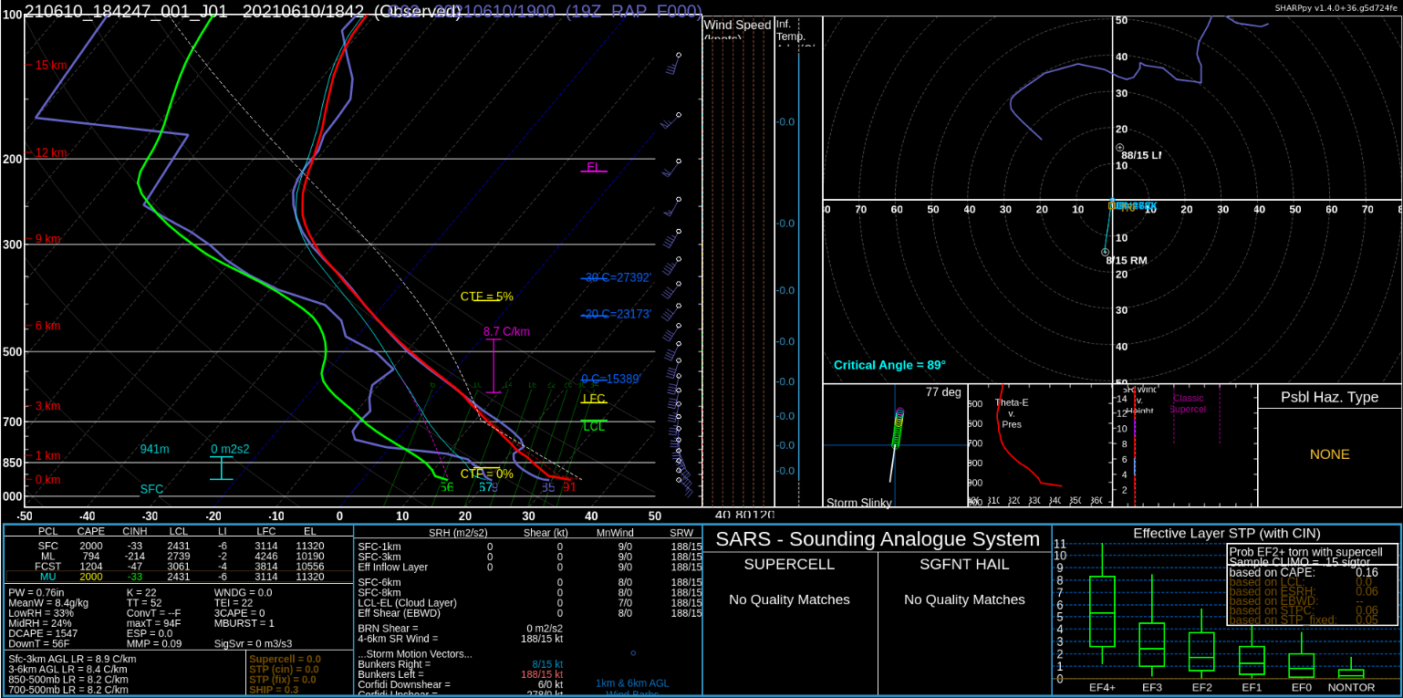
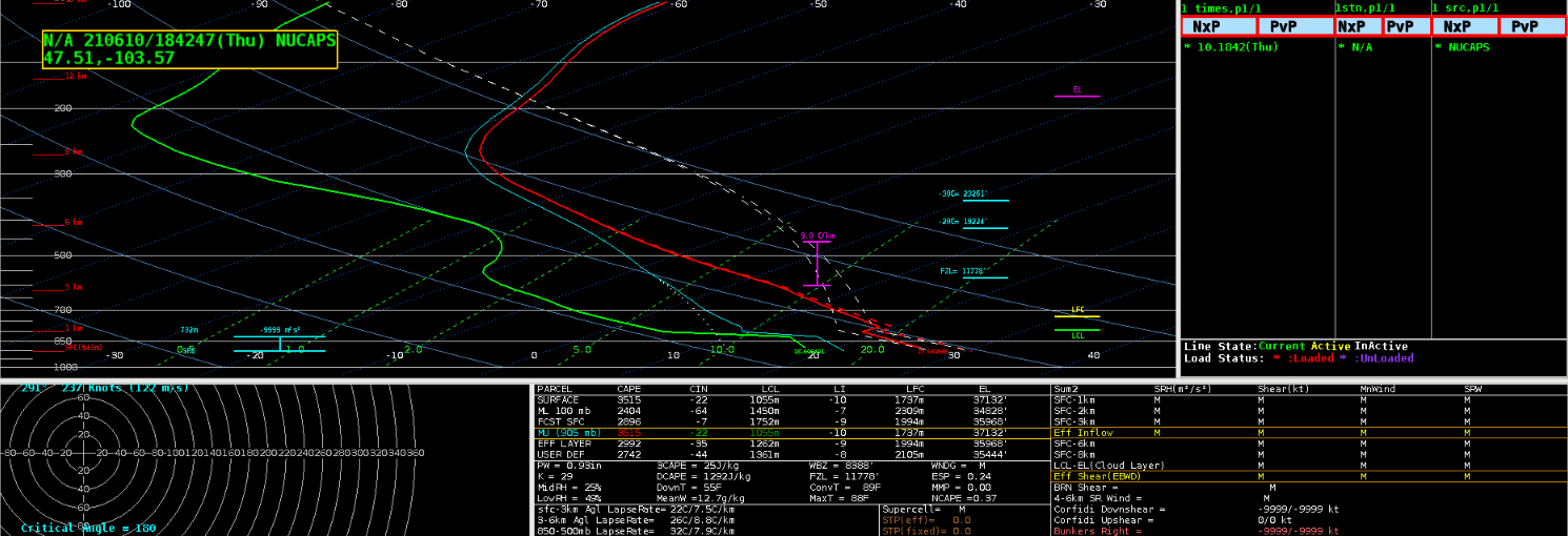
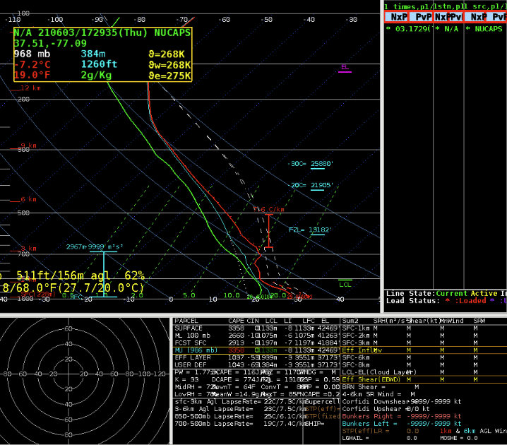
A NUCAPS CONUS NOAA-20 pass occurred at 19z across ND and then again at 20z where the eastern edge of this pass overlapped with the previous pass across western ND. At 19z, a comparison was made between the NUCAPS profile and a nearby RAP sounding at the same time. Below Image 1 shows the locations of the NUCAPS profile versus the RAP sounding. This area was chosen as it was close to where the satellite was showing some potential for convective initiation and was just east of the dryline in the area where the better instability was to be present.
Image 1a shows the location of the chosen 19z NUCAPS profile.Image 1b shows the location of the chosen 19z RAP sounding.
Using sharppy the two profiles were then compared simultaneously. Both Images 2 and 3 show the two profiles, but image 2 will be highlighting the NUCAPS profile and associated instability values and image 3 will highlight the RAP sounding with associated instability parameters. Looking at the two profiles, there is not much difference in the mid to upper levels between the NUCAPS and RAP. However, the NUCAPS profile struggles more with the boundary layer features and temperature/dewpoint. Looking at observations, the current temperatures near that sounding location at 19z was 86 deg F with a dewpoint of 70 deg F. The RAP seemed to initialize these surface values pretty well and the thermodynamic profile east of the dryline, along with a bit of a capping inversion in place. Meanwhile, the NUCAPS profile struggled with the temperature and dewpoint, thus under doing the moisture and instability parameters. The CAPE values are noticeably different with the NUCAPS profile much lower with the instability due to these surface differences.
Image 2 shows the sharppy comparison of the 19z NUCAPS profile (colored) versus the RAP sounding (purple). The parameter values below are calculated based on the NUCAPS profile.Image 3 shows the sharppy comparison of the 19z RAP sounding (colored) versus the NUCAPS profile (purple). The parameter values below are calculated based on the RAP sounding.
After seeing the discrepancies with the observed surface values versus the NUCAPS profile, I decided to grab the modified NUCAPS profile for the same location for comparison. Image 4 shows this modified sounding with a 10 degree difference between the non-modified surface temperature. The modified sounding shows a 82 deg F surface temperature, while the original NUCAPS profile had 91 deg F. With the cooler surface temperature the modified sounding showed a similar inversion to the RAP sounding between 750-800mb. The dewpoint temperature also was better representative of the actual surface dewpoint, which helped increase the instability parameters significantly. NUCAPS profiles tend to be a tad lower on the CAPE values, so the fact that the RAP is still about 1000 J/kg higher is not a surprise. However, with no RAOB sounding available and comparing the RAP with the modified NUCAPS profile there is quite a bit of similarity between the two in terms of the thermodynamic profile. Lastly, as storms begin to fire in the next hour or so and no RAOB profiles closeby, it might be useful to compare and utilize the temperature heights (0, -10, -20, and -30 deg C) for radar interrogation as storms initiate. Knowing the RAP and modified NUCAPS profiles were similar then the heights from the temperature levels could also be compared. The RAP does show higher heights than the modified NUCAPS profile, so this is something to keep in mind and monitor as storms fire along the dryline.
Image 4 shows the 19z modified NUCAPS sounding plotted with NSHARP.
Keeping with the theme of NUCAPS, there was another pass at 20z further west (as mentioned at the beginning) that overlapped the 19z pass in parts of western ND. This included the town of Bismarck, where the office put out a special 20z RAOB sounding. Bismarck was a bit further east than the previous sounding, but was still in the very favorable environment. Images 5 and 6 show the comparison between the NUCAPS sounding at 20z and the RAOB Bismarck special sounding at the same time. Similar results can be seen between the observed sounding and NUCAPS profile where the CAPE values are again lower in the satellite derived sounding. This time the NUCAPS profile did a much better job with the surface temperature and despite the temperature profile being a bit smoother due to lack of detail in the boundary layer, the profile was overall pretty similar to the RAOB temperature profile. The dewpoint profile on the NUCAPS was much drier at the surface and therefore had a bit of a drier boundary layer than the observed sounding, which is likely why the CAPE values are also a bit lower.
Image 5 shows the sharppy comparison of the 20z NUCAPS profile (colored) versus the Bismarck RAOB sounding (purple). The parameter values below are calculated based on the NUCAPS profile.Image 6 shows the sharppy comparison of the 20z Bismarck RAOB sounding (colored) versus the NUCAPS profile (purple). The parameter values below are calculated based on the Bismarck RAOB sounding.
Once again the modified NUCAPS profile was compared (Image 7 below). The modified profile did a better job at showing the moisture in the boundary layer and attempted to pick up the dry layer at 650mb, which was actually at 700mb on the RAOB profile. Unfortunately, the temperature was too low and therefore the modified NUCAPS temperature profile shows a very sharp capping inversion that was unrealistic. Overall, the CAPE values did increase with the modified sounding versus the original NUCAPS profile and were closer to the observed sounding. Twice it has been noted that the heights of the temperature levels were closer between the non-modified NUCAPS profiles with the model/observed soundings. There may be some calculation in the modified sounding that is causing the heights to be lower and maybe unrealistic. In scenarios where there is a RAOB sounding, that is the best picture of the atmosphere you can get but it is great to compare the NUCAPS profiles for comparison to future events and potential trends in the satellite derived soundings.
Image 7 shows the 20z modified NUCAPS sounding plotted with NSHARP.
As storms began to initiate across eastern MT, both G16 and G17 GLM were utilized to look for lightning instances in the growing storms. Having both satellites can be super helpful, especially when one viewing angle may not see the strike, while the other does. This happened several times during storm initiation where one satellite would pick up a strike, while the other displayed nothing. Images 8-9 show this occurring twice in two different storms where each satellite picked up a strike that the other did not. As mentioned before, the viewing angle may not be in a good position for the satellite to see the storm’s top and therefore the strike is not bright enough to be detected. Along those lines, the scattering properties in the cloud are also not visible by the angle of the satellite’s view point and could cause the satellite to miss a strike. Lastly, there is a quality assurance that occurs for each product and if the strike wasn’t strong or long enough then the pixel could have been tossed out during this quality assurance. This is why it is so important to utilize both satellites when possible and it is a best practice to err on the side of whichever satellite is showing more lightning is probably more accurate.
Image 8 shows local radar and GLM flash points (top left), GLM minimum flash area and NLDN/GLD CG strokes (top right), GLM flash extent density and ENTLN CG/IC flashes (bottom left), and GLM total optical energy (bottom right). This image shows the G17 flash point and corresponding GLM gridded products, while G16 does not pick up on a flash point or any GLM lightning.Image 9 shows local radar and GLM flash points (top left), GLM minimum flash area and NLDN/GLD CG strokes (top right), GLM flash extent density and ENTLN CG/IC flashes (bottom left), and GLM total optical energy (bottom right). This image shows the G16 flash point and corresponding GLM gridded products, while G17 does not pick up on a flash point or any GLM lightning.
ProbSevere version 2 and 3 were compared through the afternoon. The trend continued with version 2 remaining about 20-30% higher in all categories except the tornado probs. Version 3 has leaned towards being slightly higher than version 2 when it comes to tornado probabilities. ProbSevere time series was utilized to track the southernmost storm along the line of storms headed into western ND during the mid afternoon hours. Both radars were pretty far away on either side of the storms, with Glasgow’s radar being slightly closer. The lowest elevation scan was at around 13000-14000 feet when velocity began showing a strong mesocyclone. Image 10 shows the time series of ProbSevere and the readout comparing version 3 with version 2. All four ProbSevere categories were steadily increasing through the last hour with version 2 remaining higher than version 3. Version 2 shows close to 100% probabilities for all but tornado, making this storm look like a slam dunk due to the environmental parameters. Meanwhile version 3 is slightly lower due to the fact that it can pick up on similar storms that occurred in a similar environment with little to no reports (from storm data). This is where version 3 adds in a bit more information to create more realistic probabilities.
Image 10 shows the ProbSevere readout for the tornadic storm in eastern MT, along with the time series showing steadily increasing probabilities of all threats. Note the lowest elevation scan with radar is at ~13500 feet.
Based on the strong rotation in Image 10, the tornado probabilities were close to 30 percent which is relatively high and should give a forecaster confidence on issuance with a lack of lower level radar scans. Chaser footage also helped to back the need for a tornado warning with images of wall clouds, funnels and more being reported from multiple sources. Image 11 shows the time series for ProbSevere along with multiple other parameters. One thing that was interesting to see was the tornado probability drastically dropped in version 2 but remained steady in version 3. Since version 2 is heavily using az shear, you can see the drop in MRMS az shear (red line on second plot down on the far left), which could be correlated with that probability drop in version 2. Also, the MLCIN is slowly increasing (blue line on second plot down on the far right) and could be playing a bit of a role in this drop as well. This is where version 3 might have a leg up on version 2 when it comes to tornado probabilities.
Image 11 shows the time series of version 2 and 3 of prob severe probabilities along with various other useful parameters.
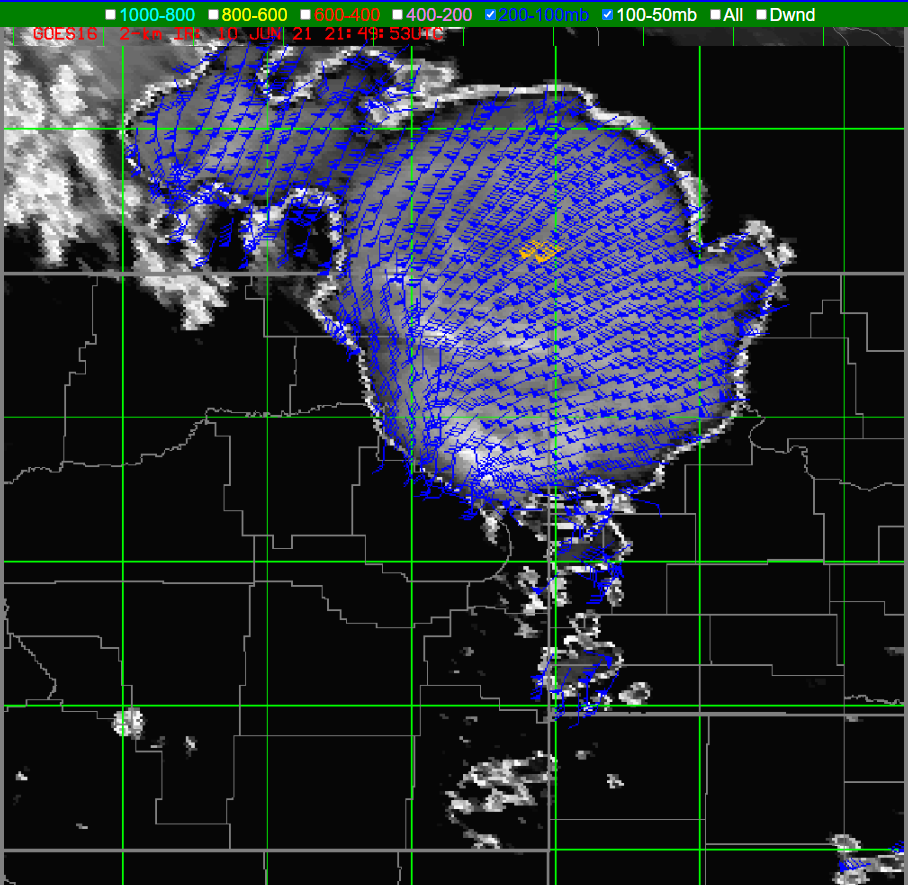
Lastly, the optical winds were utilized to see the winds at the top of the storm. Image 12 shows the optical wind field for 200-100mb. You can see the cooler cloud tops in satellite below the wind field and then the associated diffluence aloft. This is an indication of the very strong supercell that is showing no signs of weakening anytime soon. Also, it is of note that there is another cool cloud top signature a bit further to the northwest associated with another strong supercell with diffluence aloft. The optical wind fields are useful in knowing what is going on aloft and the potential strengthening or even weakening of a storm.
Image 12 shows the 200-100mb layer of optical winds over the supercell in eastern MT.
Today operations were centered over Bismarck, ND, where a large storm complex was in progress much of the day. The storms developed near a warm front, and benefitted from an approaching short wave trough as well as orographic lift and differential heating. You can see the extent of the anvils from storms centered over southern ND and northern SD. This complex dominated the local environment and seemed to take advantage of most of the local instability.
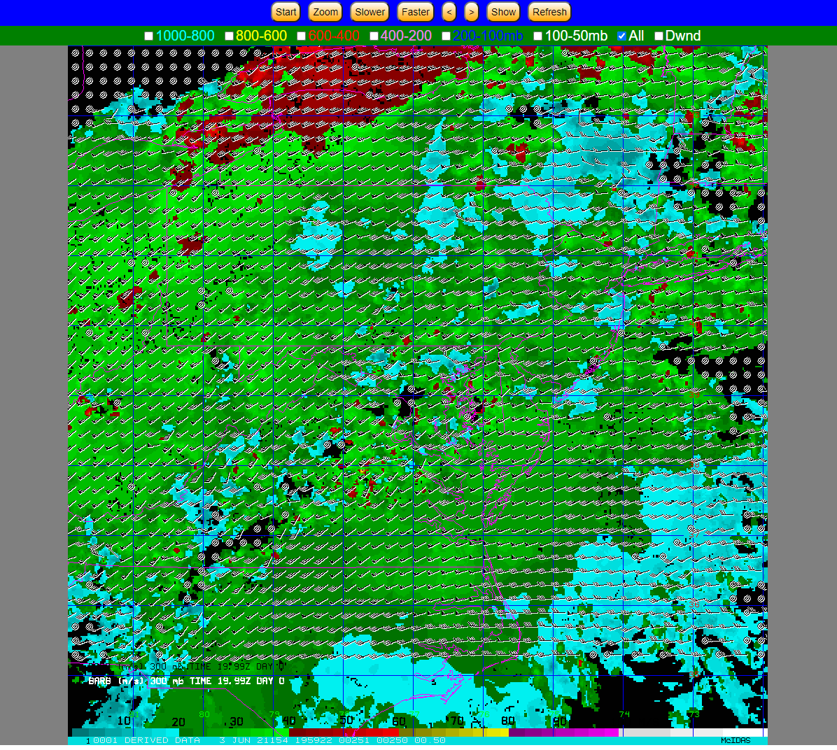
The new optical flow winds tool uses 1-minute imagery from GOES-16/17 ABI imagery to provide high resolution wind estimates at 2-km resolution using an optical flow technique. You can plot the winds in different layers, from 1000-800mb up to 100-50mb. As you can see, it is mainly the higher level winds that were plotted above the anvil plumes, and show the divergence at the higher levels of the storm.
Optical flow winds over storms in southern ND on the afternoon of June 8, 2021.
Taking a look at the SPC mesoanalysis at 300mb for this time, you can see the speeds and directions roughly match the 400-200mb winds plotted on the optical flow plots.
SPC 300mb analysis including heights, divergence, and winds at 2100Z.
Winds closer to the surface did not plot as much, mainly owing to the dense cloud cover the satellite was seeing. After some discussion, surface plots were added to the 1000-800mb layer, which helped to orient forecasters. Forecasters still need to mentally adjust the satellite imagery which was overlaid for parallax.
Optical winds with station plots added.
I think the optical wind flow could be useful to investigate storm strength and maintenance. It could be helpful in both warning operations and for IDSS purposes. The storm complex in question lasted for at least 12 hours, and produced wind damage, large hail, and torrential rains leading to flash flooding.
Looked at the modified NUCAPS sounding for and the low levels, below 700mb, were un representative (had an inversion when SPC mesoanalysis had no CINH), however the sky had roughly 80% cloud cover.
NUCAPS Base SoundingNUCAPS Modified Sounding, Same Location as Above
Looking at the NUCAPS forecast, the holes in the output field due to the cloud cover. The lack of data was in a bad location, preventing us from seeing the instability potential for a line of storms coming in from the west. The gridded format was actually better to use in this case as it helped fill in the gap.
Interpolated CAPE NUCAPS Imagery
The interpolated data is easier to visualize gradients in the variables, but our experience was that some important data was filtered out by having this turned on.
The time in the lower left is 19.99z. A key for the “all” field would be helpful to understand what I am looking at.
Having the CWA borders is handy, however having it as it’s own layer would be more helpful, and separating out the CWA borders from the state borders.
Can storm names be used to correlate the time series (F6, D3) and also have the names plotted in AWIPS for the storms I am looking at a time series of; would be more beneficial than having the lat/lon
-for example, click for a time series of one storm triggers a storm ID to show up in the time series and in AWIPS
-I click another storm and another time series shows up with the storm ID in the time series and in AWIPS allowing me to see which time series goes to which storm
If prob severe and its time series could be put into GR that would greatly improve DSS services when outside the office. The AWIPS thin client is sloooow, so being able to have the same ability, or similar ability to interrogate storms as in the office would greatly help improve the quality of DSS when deployed.
Prob severe version three continues to look more reasonable for severe wind than version two
Noticed an increasing 5 minute trend in the minimum flash area that was reflected in the FED about 5 minutes later. Seeing the sustained increase in one minute minimum flash area caused me to pay more attention to that storm than I did earlier due to the sustained growth
While monitoring a storm with FED and minimum flash area, the FED suddenly went down. The same trend was not seen in the minimum flash area as easily. Maybe the minimum flash area is more useful tool for monitoring the growth of storm while the FED is better suited for monitoring the overall trend in storm strength and sudden weakening.
Downward trends in FED for one of the storms matched what was being seen on satellite of the storm updraft becoming more ragged as it weakened due to entraining dry air.
-would be great to have lightning data such as FED plotted in a time series as well so trends are more easily seen
The stronger storm we were monitoring (same as in the screenshot below), prob severe version 3 was higher than version 2 for 15 minutes atleast. Looking closer this was due to the hail category being higher than version two; version three was also higher than version two in the wind category, but not nearly as much. Toward the end of our time version two was higher due to higher probabilities in the wind category. Interesting.
We monitored this particular cell on and off throughout the afternoon and tried to gain a better understanding of the minimum flash area. We noticed a close cluster of negative strikes, which really helped as a visual aide for what the GLM was seeing. The GLM MFA was able to isolate the core of the storm really well. We combined this with ProbSevere, and watched the probabilities on this storm increase which was a further confidence booster that the storm was intensifying in addition to what was seen by GLM and ENTLN.