GLM Storm Intensification

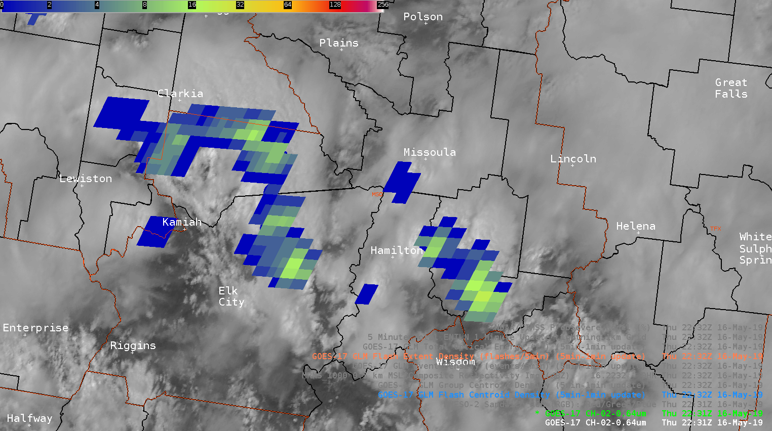
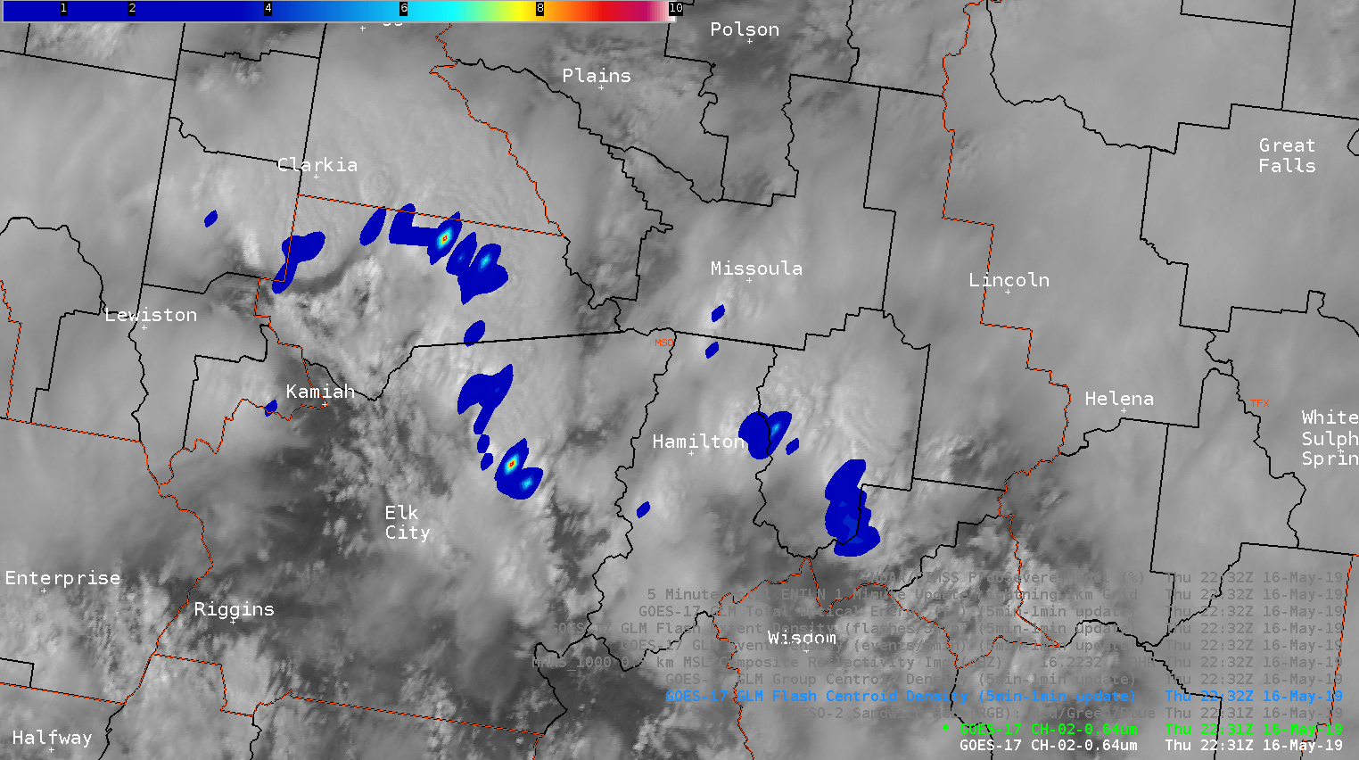
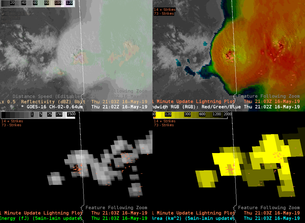
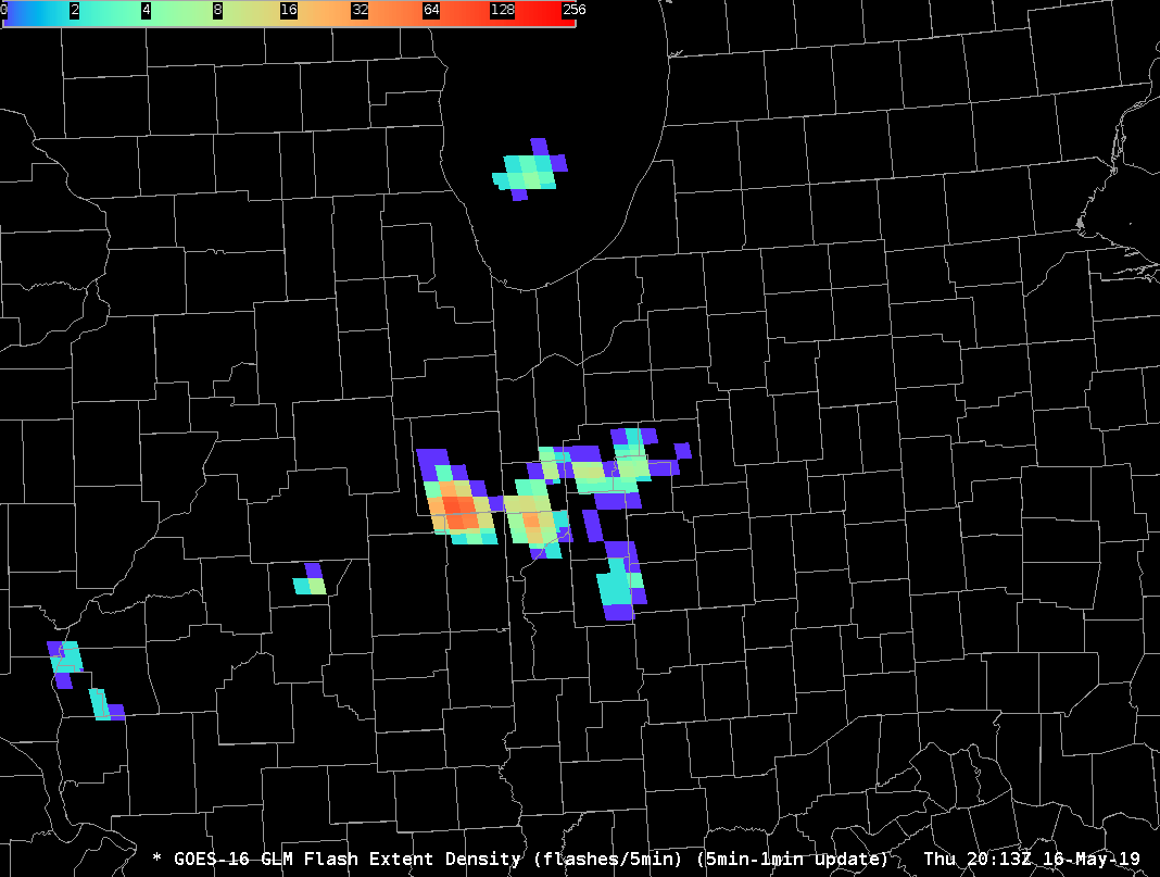
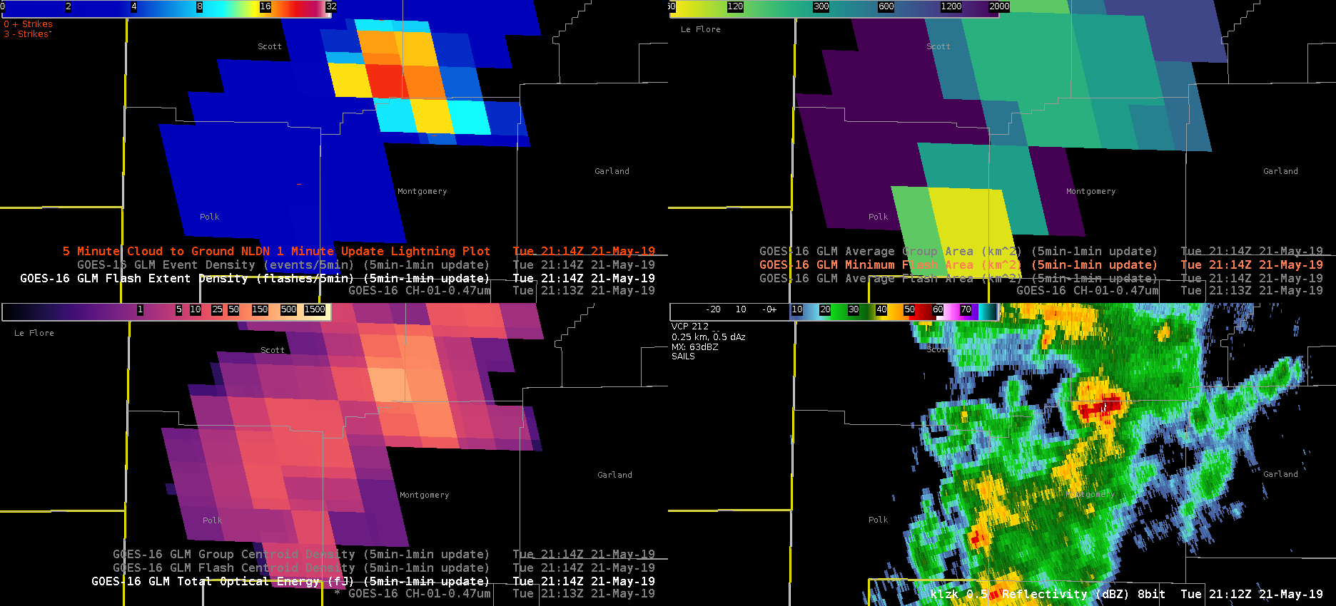
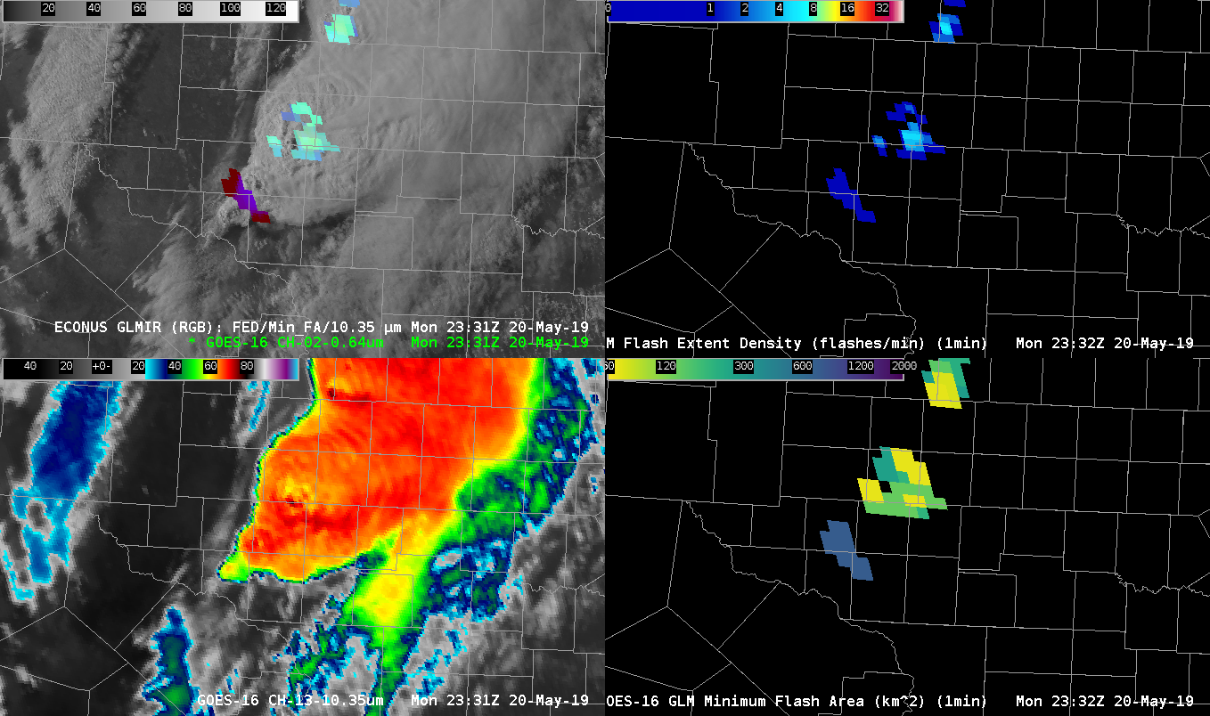
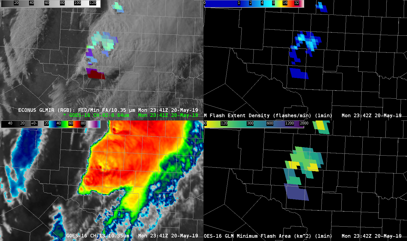
Storms are trending sub-severe across most of our CWA at this hour, but 1 cell behind the initial line started getting its act together. Here is the GLM Flash Extent Density (top left), GLM Minimum Flash Area (top right), GLM Total Optical Energy (bottom left), and KLZK base reflectivity (bottom right) before the cell started intensifying:

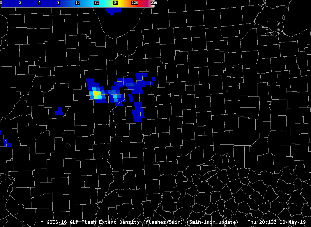
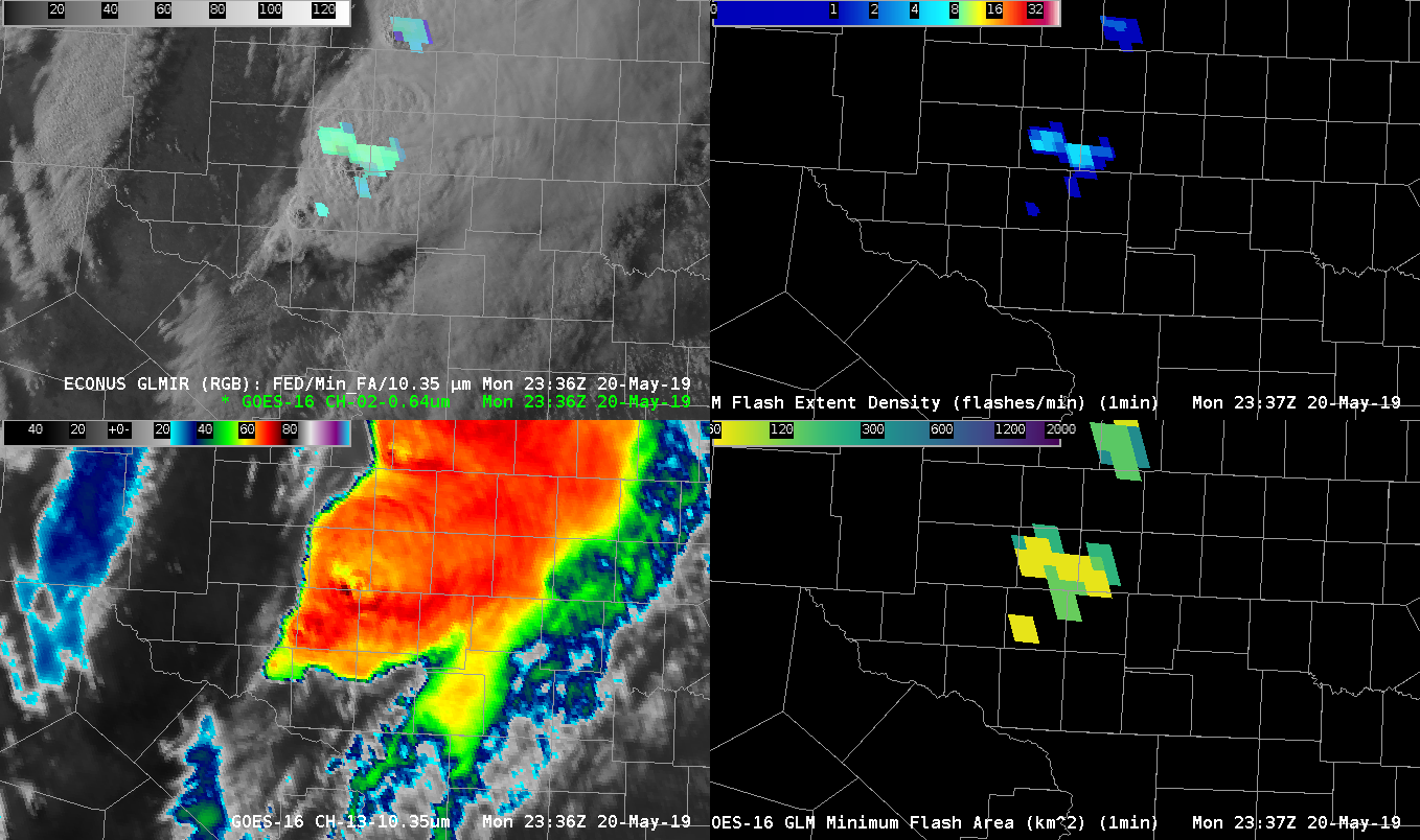
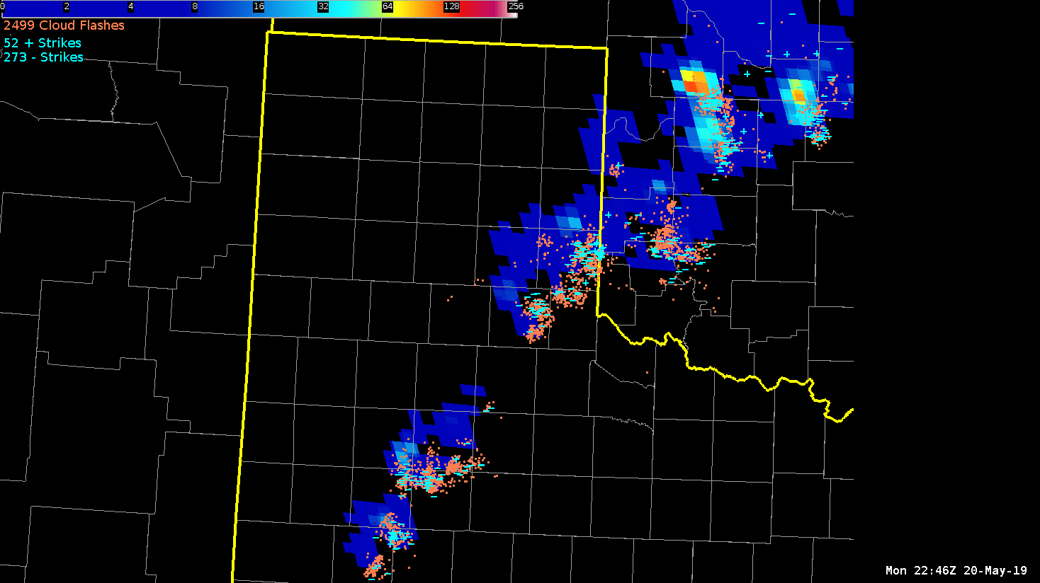
The large FED and MFA bullseye imply the updraft is intensifying on this storm. This proved to be a useful proxy because this was the result 8 minutes later:

This suite of products has a lot of utility for pulse severe events and DSS on-site weather events. -Atlanta Braves

GLM RGB first view…

So, here’s an interesting concept…GLM data merged with GOES-16 IR (10.3 um) to create an RGB.  I think I like it!  Data fusion concepts like this are increasingly important in data-heavy AWIPS, especially during severe weather events and for situational awareness activities.  So, this RGB uses Flash Extent Density as the Red component, Minimum Flash Area as the Green component, and 10.3 um imagery from GOES as the Blue component.  The RGB has been tailored such that high FED results in increased red values, while Minimum Flash Area is reversed with respect to green colors (lower values equal increased green) and the IR temperatures from the 10.3 um band are also reversed so that lower temperatures result in higher blue colors.  So, for example, the end result is that high FED, low minimum flash area and cold IR temperatures result in brighter colors (near white) that physically indicate intense lightning, collocated with intense updrafts and cold cloud tops.  Meanwhile, anvil-type lightning (cold cloud tops, generally low FED and high minimum flash area result in colors more towards purple.  Colors leaning towards reds, yellows are relatively young, but intense convection in new, warmer convective cloud tops.  This shows up well, watching young convection feeding into an area of ongoing convection at the tail end of the convective complex today.  Ok…I’m writing this at the tail end of activities today, so I had to rush through this.  =)

Kris

Poor Correlation: GLM vs. Ground-Based Lightning Networks

Lightning data in the Texas panhandle late this afternoon showed low correlation between GLM output and data from ground based lightning networks. The output from the GLM flash extent density product appears underdone when compared to data from ENTLN, which has numerous areas of clustering in the vicinity of stronger thunderstorm updrafts. Meanwhile, the GLM flash extent density data shows low values and not much variance within the same general vicinity.  The problem does not appear as significant in western Oklahoma where the GLM flash extent density product shows much higher values in concert with clustering in the ENTLN data. It is difficult to pinpoint what might be causing this issue just by looking at the data alone.  Dave Grohl

Comparison of ENTLN and GLM Lightning Data

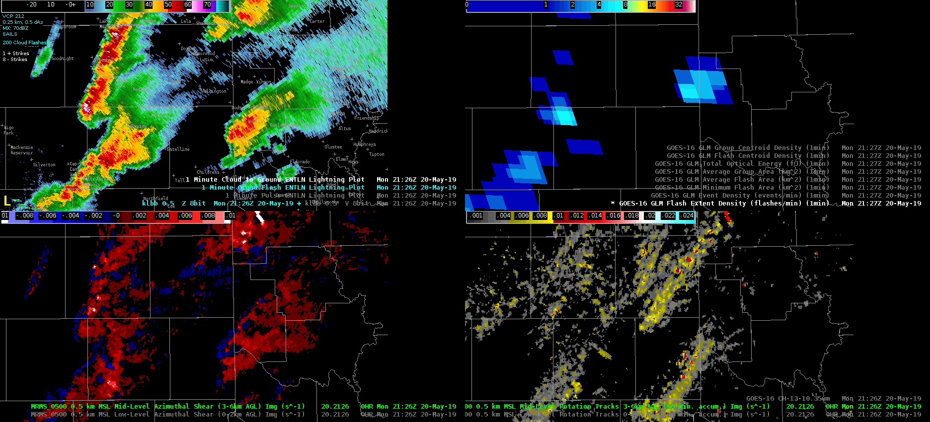
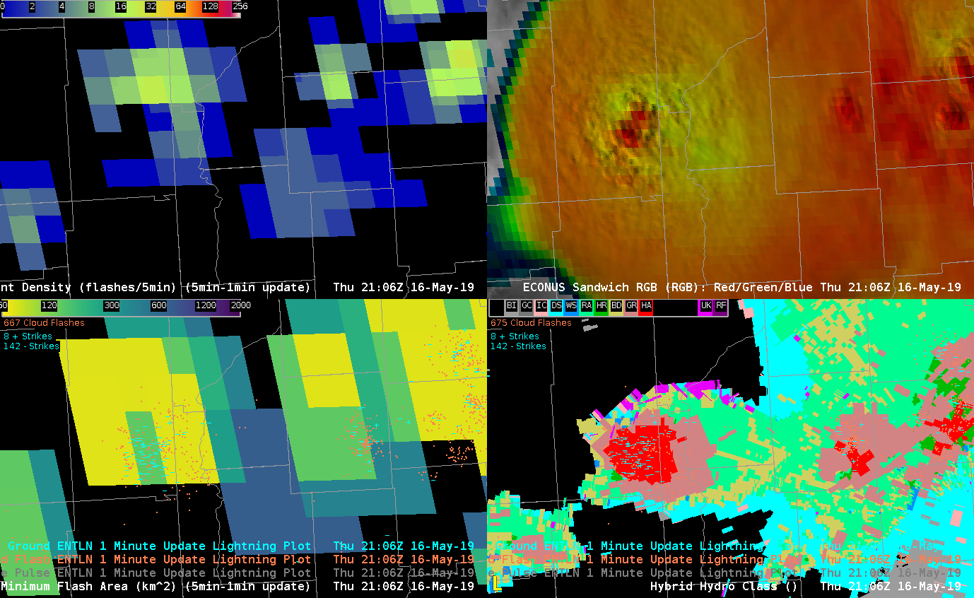
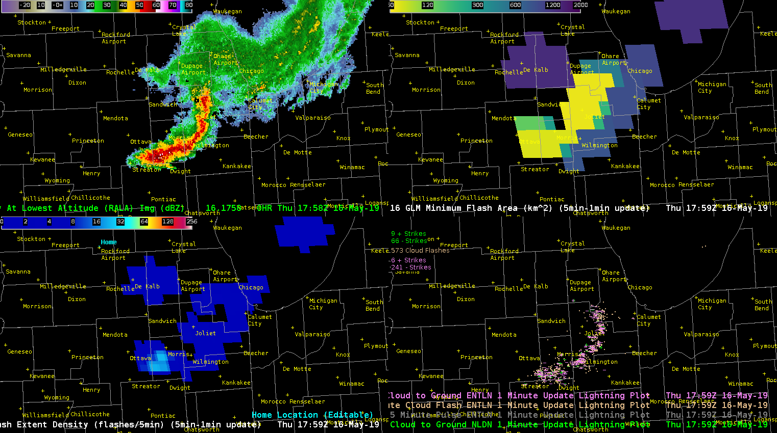
Storm of interest is the supercell NW of Childress, TX.  Increase in ENTLN lightning occurred before a substantial increase in the 0-2 km and 3-6 km MRMS azimuthal shear. The signal in the GLM flash extent density product was muted in comparison to ENTLN data. ProbTor went from 12% at 2124Z to 52% at 2130Z.  At 2140Z, ProbTor peaked at 91%, which corresponded with the maximum 0-2 km MRMS azimuthal shear (0.20 S-1) associated with this rotation track. I frequently use the ENTLN data in operations and am trying to incorporate GLM products.

So far, the most useful GLM components, largely because of their visual representation and relationship to updraft growth rate or intensity, are the flash extent density and total optical energy.  These two products helped me maintain situational awareness on individual storm intensity trends.  Plotting the flash extent density and total optical energy in a four panel with GOES IR imagery and base radar data, I can quickly decipher which storms pose the greatest risk for severe weather.  Roy

GLM Flash Event Density vs Centroids

Viewing some marginal severe storms in northern Idaho from GOES 17 in this example. In the first image is the traditional Flash Extent Density product. However, have modified the color curve (User -> Awips -> GLM_FED_DC) to provide some enhancement to the lower values as detection efficiency seems to remain lower over ID/MT as we have found in MT/WY in previous days. While this is overall helpful in picking out some stronger storms, the large 8km grid boxes take up a lot of screen real estate when viewing over background satellite imagery.  Also the strongest storms are somewhat lost in the lightning data of the surrounding storms.

As an experiment, tried loading up the Flash Centroid Density Product. By turning on the interpolation and setting the max value to 10, this really helped to isolate and highlight the strongest cells. Of note is the cell moving toward the north, west of Missoula. Picking out the lightning jump in this storm was easier viewed on this Flash Centroid Density product, and comparing its strength to surrounding storms was also easier. It is also helpful that the product has overall small footprint.

— warmbias —

FED Gives Precursor to Strenthening Supercell, but…

Watching the last storm in the line that is still in Illinois, the Flash Extent Density values started climbing rapidly (between 1947Z and 2020Z), which suggested to me that I should start paying attention to it. Upon interrogation, the velocity started to change from being more convergent to rotational, and eventually it appeared that a tornado was likely per the KIND radar. Interestingly, that was when the FED fell rapidly (2022Z).

Clockwise from Top Left: 0.5 KIND Reflectivity, 0.5 KIND SRM, 0.5 KIND Vel, FED

There was also an increase in FED after the tornado signature became less intense, but when it wrapped up again, the FED decreased again (not shown).

Interestingly, I also looked at these same data with the new color curve that Jonathan and Kristin worked on today, and the increase and decreases in FED were not as clear, and I don’t think it would have drawn my attention as quickly. Perhaps the lower values need to be more muted or less bright, but still within the same the rainbow color curve.

Clockwise from Top Left: 0.5 KIND Reflectivity, 0.5 KIND SRM, 0.5 KIND Vel, FED

-Tempest Sooner

5-min FED Colormaps

Testing a new colormap for FED using the Rainbow colormap in Python.  The first image depicts the modified 5-min FED with the modified colormap.  There is more variation on the lower end of the 5-min FED.  Will this colormap depict the variation in the more intense convection. The second image is the original 5-min FED colormap.  – Jonathan Wynn Smith (ESSIC/UMD)

IDSS Usage from GLM/Minimum Flash Area

An MCS shifting southeastward across northern IL was producing quite a bit of lightning, and much of it was moving through the southwest portion of the line per Flash Extent Density. From a IDSS standpoint, the Minimum Flash Area and FED proved that it’s necessary to look at both GLM products and ground based lightning products to see the “total” picture. The GLM products captured a larger flash that extended out into the stratiform area behind the main line that is not seen in the ENTLN and NLDN products. This information can be especially important for Airport Weather Warnings and/or outdoor venues. You can easily see that the flash extends almost back to the Rockford Airport, while the main line and most of the flashes are ~80 miles away. In other words, areas near Rockford Airport are not out of the woods yet for lightning.

Clockwise from top left: RALA, Minimum Flash Area, NLDN and ENTLN Lightning Plot, Flash Extent Density

-Tempest Sooner