Precise Threat Area Identification and Tracking Part II: Threats-In-Motion (TIM)

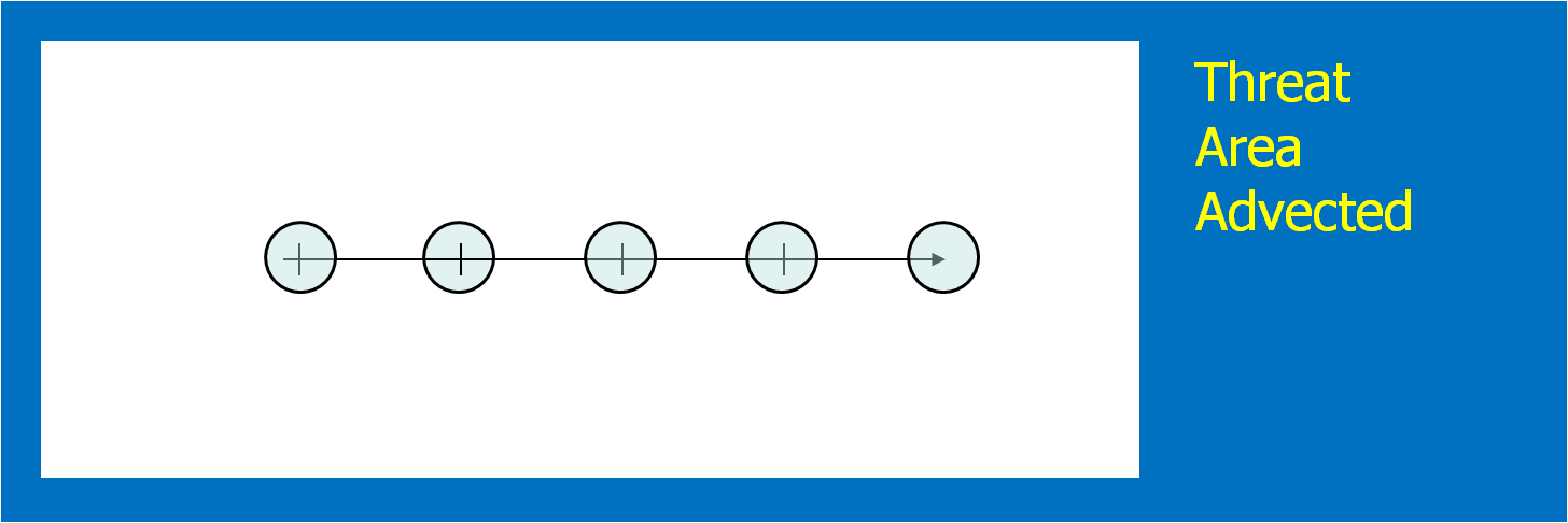
Here I’m going to describe the “Threats-In-Motion”, or TIM concept that was presented at the 2011 National Weather Association Annual meeting.  Essentially, once a digital warning grid is created using the methodology presented in the previous blog entry, the integrated swath product would start to translate automatically.  The result would be that the leading edge of the polygon would inch downstream, and the trailing edge would automatically clear from areas behind the threat.  We hypothesize that this would result in a larger average lead time for users downstream, which is desired.  In addition, the departure time of the warning should approach zero, which is also considered ideal.  The concept is first illustrated with a single isolated long-tracked storm for ease of understanding.  Later, I will tackle how this will work with multi-cell storms, line storms, and storms in weak steering flow.

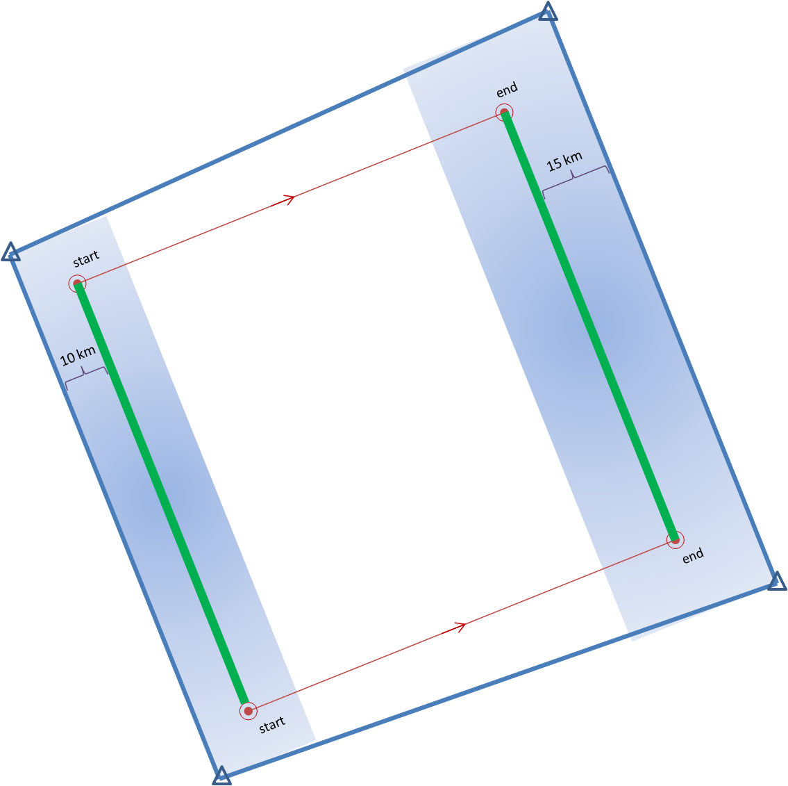
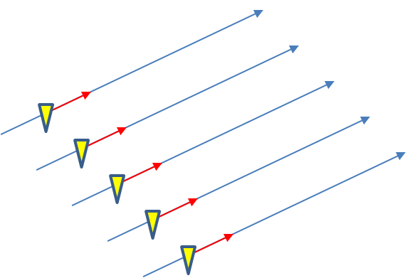
Why are Threats-In-Motion desired?  Let’s look at the way most warning polygons are issued today.  Threats that last longer than the duration of their first warning polygon will require a subsequent warning(s).  Typically, the new warning polygon is issued as the current threat approaches the downstream end of its present polygon or when the present polygon is nearing expiration.  This loop illustrates this effect on users at two locations, A and B.  Note that only User A is covered by the first warning polygon (#1), even though its location is pretty close to User B’s location.  Note too that User A gets a lot of lead time, about 45 minutes in this scenario.  When the subsequent warning polygon (#2) is issued, User B is finally warned.  However, User B’s lead time is only a few minutes, much less than User A who may only live a few miles away.

TIM-loop-1-slow2

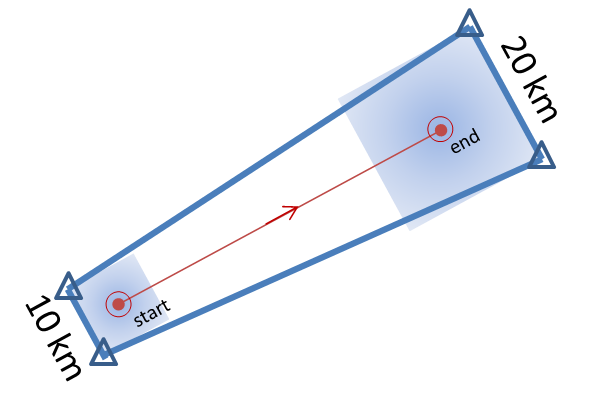
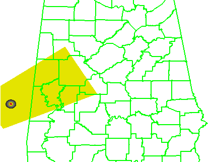
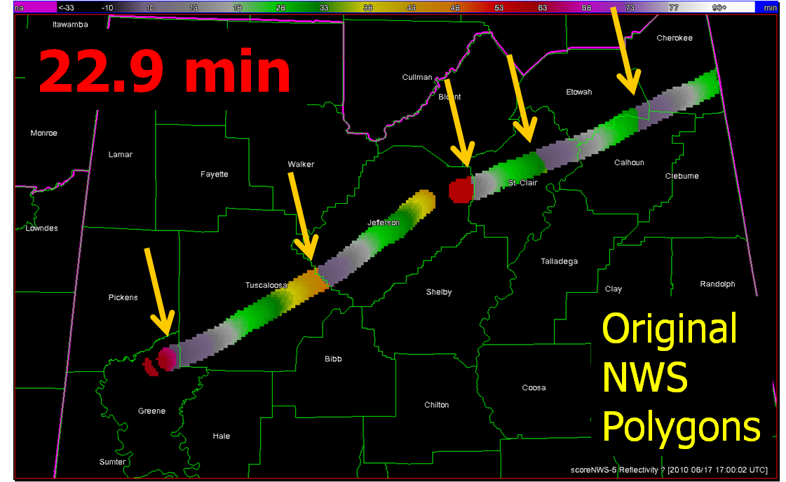
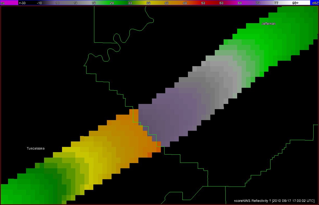
What if a storm changes direction or speed. how are the warnings handled today.  Warning polygon areas can be updated via a Severe Weather Statement (SVS), in which new information is conveyed and the polygon might be re-shaped to reflect the updated threat area.  This practice is typically used to remove areas from where the threat already passed, thus decreasing departure time.  However, NWS protocol disallows the addition of new areas to already-existing warnings.  So, if a threat areas moves out its original polygon area, the only recourse is to issue a new warning, sometimes before the original warning has expired.  You can see that in this scenario:

TIM-loop-2

Note that a 3rd polygon is probably required at the end of the above loop too!

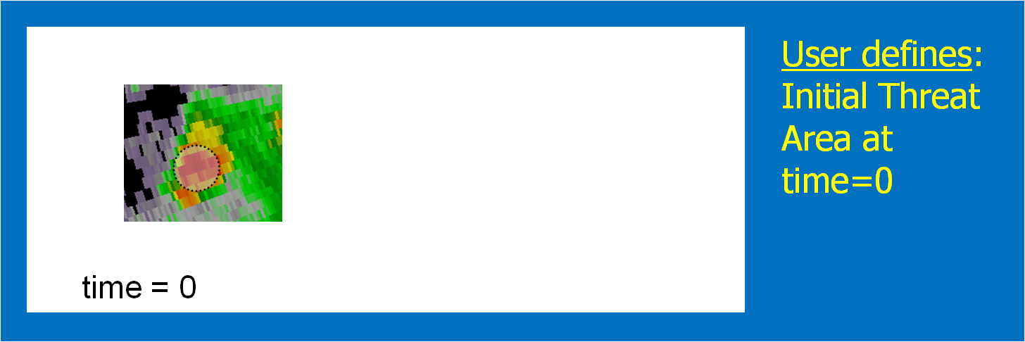
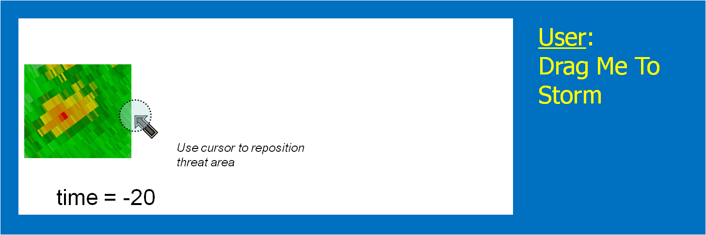
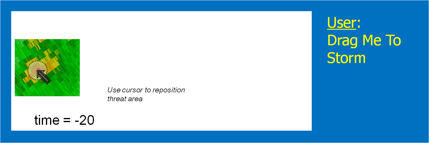
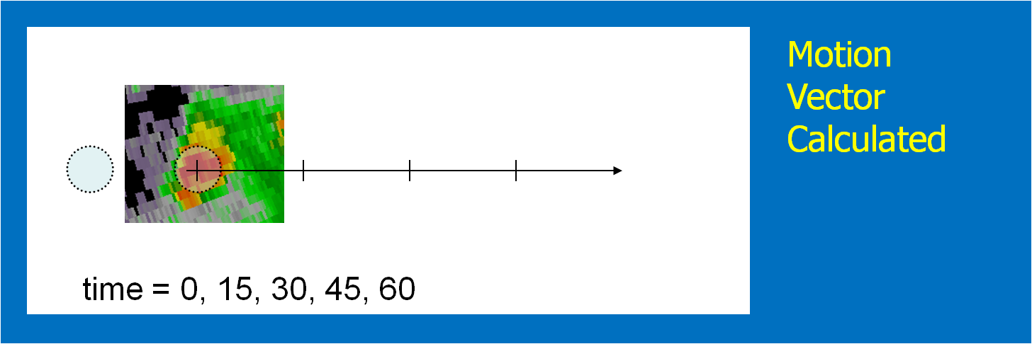
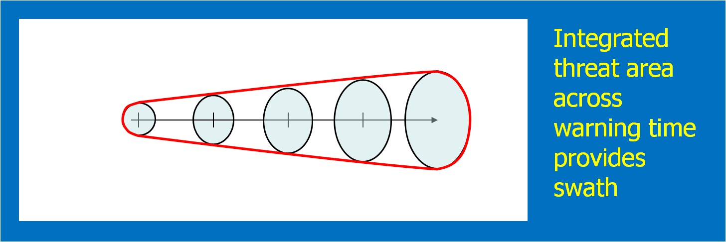
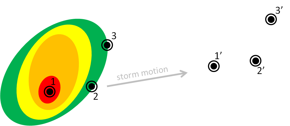
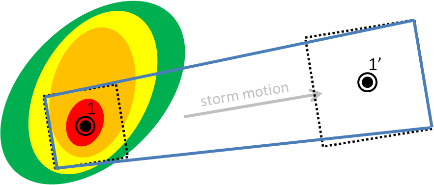
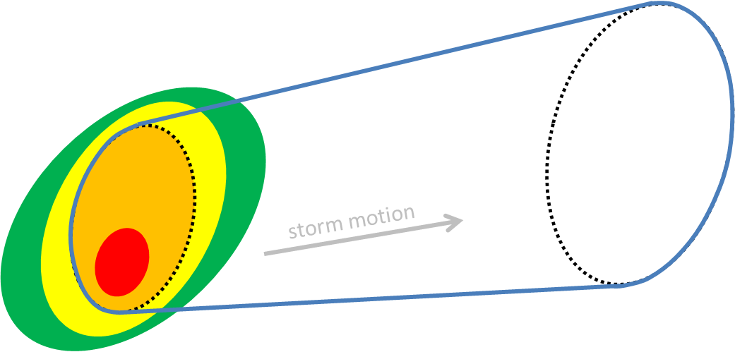
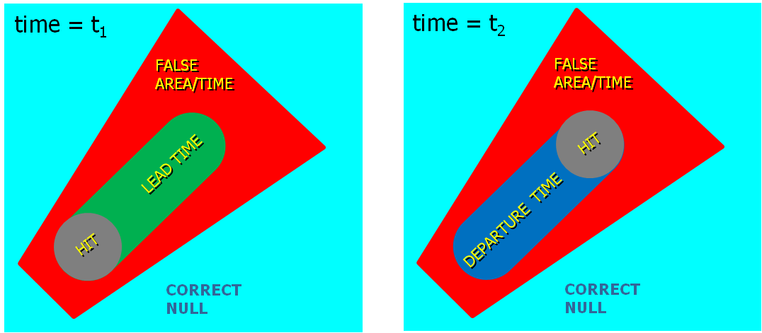
In the past entry, I introduced the notion of initial and intermediate forecasted threat areas.  The forecasted areas can update rapidly (one-minute intervals), and the integration of all the forecast areas results in the polygon swath that we are familiar with today’s warnings.  But, there is now underlying (digital) data that can be used to provide additional specific information for users.  I will treat these in later blogs:

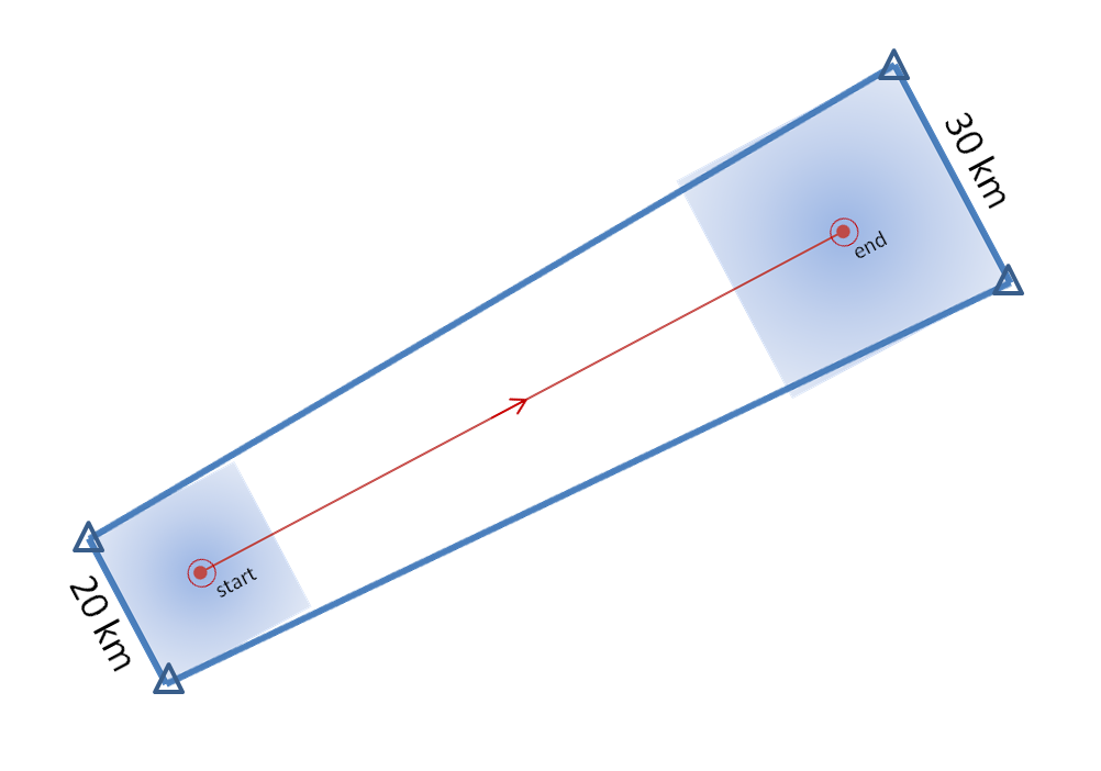
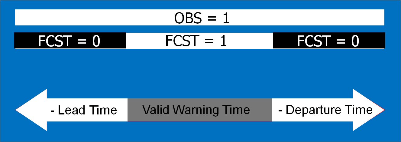
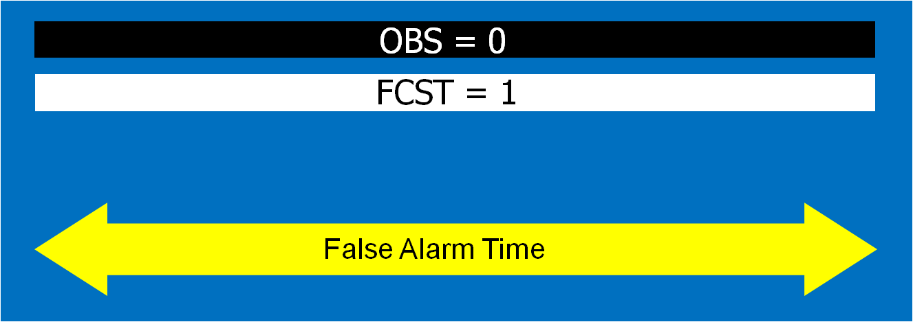
  • Meaningful time-of-arrival (TOA) and time-of-departure (TOD) information for each specific location downstream within the swath of the current threat.
  • Using the current positions of the forecasted threat areas to compare to actual data at any time to support warning operations management

But what about “Threats-In-Motion” or TIM?  Here goes…

Instead of issuing warning polygons piecemeal, one after another, which leads to inequitable lead and departure times for all locations downstream of the warning, we propose a methodology where the polygon continuously moves with the threat.  Our scenario would now look like this:

TIM-loop-3

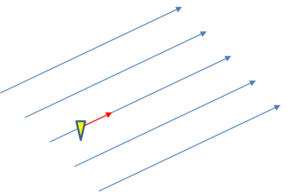
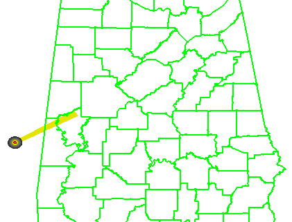
Note that User A and User B get equitable lead time.  Also note that the warning area is cleared out continuously behind the threat areas with time.  And here is the TIM concept illustrated on the storm that right turned.

TIM-loop-4

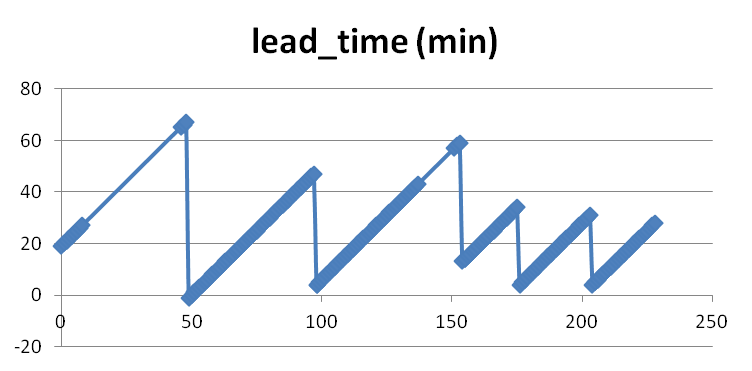
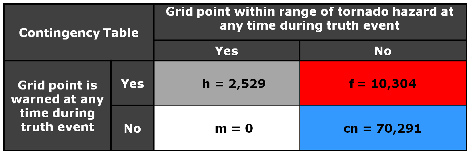
Now let’s test the hypotheses stated at the beginning of this entry.  Does TIM improve the lead time and the departure time for all points downstream of the threat?  If yes, what about the other verification scores introduced with the geospatial verification system, like POD, FAR, and CSI?  The next blog entry will explore that.

Greg Stumpf, CIMMS and NWS/MDL

Tags: None

Precise Threat Area Identification and Tracking Part I: Let’s get digital

We will now introduce a new approach to creating convective weather hazard information which was first tested at the NOAA Hazardous Weather Testbed (HWT) with visiting NWS forecasters in 2007 and 2008.  The new warning methodology varies in complexity and flexibility, but we will first present the basic concepts first.  In this approach, the forecaster still determines a motion vector and chooses a warning duration.  However, instead of tracking points and lines, the forecaster outlines the probable severe weather threat area at the current time, and inputs motion uncertainty.  From this information are derived high-resolution rapidly-updating geospatial digital hazard grids.  These grids are used to generate a wide variety of useful warning information, including warning swaths over a time period, meaningful information for time of arrival and departure for any location within the warned area, and probabilistic information based on the storm motion uncertainty.

First, let’s tackle the subject of this entry, “let’s get digital”.  Right now, the official warning products are still transmitted as an ASCII text product, and all the pertinent numerical information in the warning like begin and end times, polygon lat/lon coordinates, and other information needs to be “parsed” out of the text product in order for various applications to take advantage of them (e.g., iNWS mobile alerting).  This is an archaic method to deliver information, especially in this day and age of digital technology.  Various options are being explored to improve the data delivery method, including encoding the warning information into the Common Alerting Protocol (CAP) format.  While we feel this is an improvement, it is not going to be sufficient to completely convey all the possible modes of hazard information that can be created and delivered.  For example, the polygon information is still encoded as a series of lat/lon points within the CAP formatted files.  But what if the polygon is comprised of complex boundaries or curved edges?  Or what if we want to include intermediate threat area information at specific times steps during the warning?  Considering that we’ve made the argument for gridded warning verification, we feel that hazard information should be presented as a digital grid, more easily exploitable by today’s technology.  You’ll understand why in a little bit…

So first addressing how a forecaster determines a current threat, instead of choosing points or lines and trying to decide where to place these points within the storm hazard areas, we feel that the warnings should be based on the tracking of a threat area.  Here are the proposed steps in this new warning process.  For each step, I’ve also added a snippet of ideas for “more sophistication” that I may explore further in later blog entries.

1.  The forecaster outlines the current threat area.

For our HWT exercises, we gave the forecaster two options, a) draw a free-hand multi-sided polygon, or b) fit the current threat area with and ellipse.  (The latter was offered because it is easier to project an area described by a known mathematical function, than it is for a free-hand polygon area).  Where is the threat outline drawn?  That is currently up to the forecaster to make their best determination where the severe weather currently resides in the storm.  They can make use of radar and other data as well as algorithms for their decisions.  Fig. 1 illustrates an initial threat area defined as a circular area.  A circle is chosen to illustrate the effect of some of the later concepts below.

[More sophistication:  The threat area is currently a deterministic contour (inside = yes or 100%, outside = no or 0%), but because we are entering data digitally, this initial threat area could be a probabilistic grid.  For now, to keep it simple, we’ll just go with “you’re either in or you’re out”.]

threatareawarn_011
Figure 1.

2.  Determine the threat motion vector.

The motion vector could be determined using today’s WarnGen method of “Drag Me To Storm”.  This is done by finding a representative location in the storm to track on the current radar volume scan, and then stepping back to a past volume scan (Fig. 2; 20 minutes in the past) and dragging the point to the same feature (Fig. 3).  The distance and orientation between the current and past points would define the motion vector (Fig. 4).  This is how we did it during our HWT exercises.

[More sophistication:  Determine the motion vector by stepping the radar data back in time and repeating the process in step 1, drawing another threat hazard area.  Then, an application such as the K-Means segmentation algorithm developed by NSSL could determine the motion vector betwen the two threat areas, or even a high-resolution two-dimensional motion field.]

threatareawarn_02
Figure 2.
threatareawarn_031
Figure 3.
threatareawarn_04
Figure 4.

3.  Choose a warning duration.

This is usually easy – how long does the forecaster want the warning to extend.   The initial threat area is then projected to the final position.  In addition, the threat area is projected to every time step between the warning issuance time and the warning duration time.  We used a time interval of one minute in the HWT experiment.  Figure 5 shows the projected threat area at 15-minute intervals; the intermediate intervals are not shown.  Remember this aspect of the methodology!  It has great implications, which I will explain soon.

[More sophistication:  Typically, Severe Thunderstorm Warnings and Tornado Warnings rarely exceed 60 minutes, even if the forecaster is tracking a well-defined long-tracked supercell that has a high certainty of surviving past 60 minutes – simply due to NWS warning protocol. The warning duration could be “indefinite” until the hazard information blends upscale with information from nowcasts and forecasts.  How?  We’ll get to that later.]

threatareawarn_05
Figure. 5

4.  Determine the uncertainty of the motion estimate.

This could be approached in a number of different ways.  For the HWT experiments, the forecasters simply chose a range of symmetric speed and direction offsets.  For example, ±30° and ±5 kts.  Although we didn’t offer this choice during the 2007-8 HWT experiments, the offsets could be asymmetric (e.g., + 30°, -10°, +5 kts, -8 kts).  Fig. 6 shows an example offset for motion uncertainty.  Figs. 7 and 8 show how speed and direction uncertainty (respectively) affect the shape of the translating initial threat area in time.  Speed (direction) uncertainty stretches the initial threat area parallel (perpendicular) to the motion vector.

[More sophistication:  The motion uncertainty could come from a theoretical model of storm motion behavior, such as Bunkers’ storm motion estimate for right-turning supercell thunderstorms, or a statistical model such as the Thunderstorm Environment Strike Probability Algorithm (THESPA) technique (Dance et al., 2010; see their Eq. 1).]

threatareawarn_061
Figure 6.
threatareawarn_071
Figure 7.
threatareawarn_081
Figure 8.

Once the above four quantities have been chosen by the forecaster, we can then generate a downstream “swath” that will be affected by the translating threat area.  The swath is simply the total integration of all of the one-minute interval translating threat areas during the duration of the warning (Fig. 9).

threatareawarn_091
Figure 9.

Here’s a better way to visualize the above static figure.  Figure 10 shows a loop of the translating threat area over the forecast interval.  The moving threat areas, integrated over the duration of the warning, providing the swath.

Test014
Figure 10.

Note that the resulting “polygon” is exactly tied to the parameters of the warning as determined by the forecaster.  The resulting integrated polygon cannot (and should not) be editable.  The forecaster can only control the shape and position of the swath by changing the input parameters used to create the swath in order to ensure those values are always correlated with the integrated downstream swath.

The base digital grids that can be created in this process are the current threat area and the forecasted one minute translating threat areas out to the duration of the warning.  For our HWT experiments, we used a resolution of 1 km2, which is the same resolution I employ within my geospatial warning verification methodology.  The forecasted one-minute interval threat grids can be used to create time-of-arrival and time-of-departure grids as well, which given the motion uncertainty information, can be expressed as a range of times (the range interval would decrease as the threat grew closer).  In addition, the integrated swath can also be saved as a digital grid.  The swath product can also be contoured to provide a series of lat/lon points that are analogous to today’s polygon warnings.  Metadata can also be added to the grids in the form of qualitative descriptions of the event, much like what is added to the WarnGen template output (e.g., “A TORNADO WITH DEBRIS WAS REPORTED AT HWY 9 AND JENKINS”).

The above four items were all that were required to create our digital hazard grids for the 2007-2008 HWT experiments.  How does this compare to the way forecasters issue warnings today using AWIPS WarnGen software?

  • A current threat area is drawn, versus a point or line.
  • Motion uncertainty is added.

That’s not much more than is currently input from the forecaster today.  Although it is slightly more information and workload, there are numerous benefits to this technique, which will be tackled in the next blog entry.

This concept isn’t the only way a current threat area can be forecasted.  In this methodology, the threat area expands based on forecaster input of motion uncertainty.  However, the uncertainty could also be based upon statistical analyses a la Dance et al. (2010; a Gaussian model).  Or, as we begin to approach the Warn-On-Forecast era, the extrapolated downstream threat areas might be enhanced by ensemble numerical model output to allow for discrete propagation, cell mergers, splits, growth, decay, and any other types of non-linear evolution of convective hazards.  The concepts presented here will form the framework for these future improvements.

Greg Stumpf, CIMMS and NWS/MDL

Tags: None

Limitations of WarnGen polygons Part III: But my threat area isn’t a 20 km square

WarnGen limits the user to only one default choice for the initial or projected threat areas.  The same parameters (10km, 15km) are always used.  Of course, the meteorologist can actually change these areas by manually editing the default polygon points.  The back end of the warning can be edited to conform to the shape of the current threat area.  The front end of the warning can also be edited to conform to the projected future shape of the warning area.  But recall that once you start to edit the points in the polygon, you have now decoupled the motion vector and duration from the warning.  In fact, the point position and motion vector happen to be transmitted in the warning text.  When the forward portions of the warning are changed without adjusting the motion vector and/or duration of the warning, it becomes possible for a sophisticated user to project the current position based on the motion vector and discover that the forecast future position may not even lie within the warning polygon swath.  Confusion could reign!

warntext

What about the placement of the point or line?  Where should these go?  Let’s just look at the point placement, the “Drag Me To Storm” position.

dragmetostorm

This point is used to represent the “storm”.  But does this get placed at the centroid of the storm (option 1)?  Or is it placed on the leading edge of the storm along the centroid motion vector (option 2)?  Or the most forward portion of the echo (option 3)?  Or elsewhere?  This point is used to project the future location of the threat at the end of the warning, and also to compute the “pathcast” information.  But if the point doesn’t actually represent the full spatial extent of the threat, wouldn’t the resulting polygons and pathcasts be incorrect?  For example, if using the centroid of the storm, the severe weather might commence before reaching the centroid of the storm, and the polygons and pathcasts would be lag in time.

drag_me_11

So let’s say for example we track using the storm centroid.  Without editing the default polygon, you can see that a portion of the storm threat might be missed using the default box sizes.  One could manually edit the polygon, but this would be done entirely qualitatively.  How could this be done quantitatively?

drag_me_31

In either case, the storm hazard isn’t a point, but it is a two-dimensional area.  In a way, WarnGen provides a 2D threat area, but it is a perfect square 20 km on each side.  No storm actually has those dimensions.  It therefore makes more sense that we should be defining 2D threat areas, and projecting 2D threat areas at future positions, like so (assuming the orange contour represents the spatial extent of the severe weather in this storm):

drag_me_4

In addition, the future threat area defaults to a set expansion rate (exactly 150% its original size), and there is no direct way for the forecaster to quantify how much the threat area will expand, or how the projected area should be modulated to account for motion uncertainty or storm evolution.

We’ll show you one method in which we can address these shortcomings of WarnGen next, a proposed method for creating the short-fused convective hazard grids that does a better job at quantifying and directly coupling current and projected threat areas, motion, and motion uncertainty.  In addition, this new warning generation methodology can provide intermediate threat area locations within the entire swath of the warning, plus one other major benefit:  Threats-In-Motion (TIM), to be described very soon in this blog.

This is the first step in a proposed new hazard information delivery methodology that we feel will naturally dovetail toward the future “Warn-On-Forecast” paradigm of using numerical ensemble guidance to predict storm evolution beyond simple detection and extrapolation of threats.

Greg Stumpf, CIMMS and NWS/MDL

Tags: None

Limitations of WarnGen polygons Part II: Slide to the right.

Let’s address the second and third shortcomings of WarnGen, (b) There is no way to adjust the motion vector for uncertainty.  This must be done as a guess by manually editing the polygon vertices; (c) There is no way to change the default choice for the initial or projected threat areas.  The same parameters (10km, 15km) are always used, and a square area is always the default.

In WarnGen, the forecaster can only choose one motion vector, and is limited to only one expression of uncertainty in the motion – the increase in the size of the warning area to a square with an area 225% larger than the initial threat area square.  What if the forecaster determines that the storm is moving into an environment that is supportive of an evolution to a supercell, and the storm slows its forward speed and turns to the right (increasing azimuth in the motion vector)?  The practice that is typically being suggested is to edit the vertices of the polygon to include more area to the right of the motion vector:

warngen_addrightturn

But how does the forecaster determine how far to the right to re-position the vertex?  It’s another guess!  Just click the vertex, drag it until it “looks about right”.

What would be the more robust way to determine how far to stretch the polygon?  By being able to input information about the motion uncertainty in the form of a possible variance in the motion vector.  For example, if the forecaster thinks a storm has a chance to slow and move to the right of the current motion vector based on the “30R75” technique (30 degrees to the right, 75% of the speed), then that information could be input to determine the possible locations of the threat area at the extrapolated final position of the threat.  Here, I’ll only show the default threat position, and the 30R75 threat position:

warngen_addrightturn_correct

This looks similar to the “skewed coffin technique” offered by Nietfeld, but in this case, the position of the second solution is based on actual motion uncertainty numbers input by the forecaster, rather than a guess.

This is still not the ideal solution for determining the swath shape based on storm motion vector uncertainties.  We’ll get to that soon.

Greg Stumpf, CIMMS and NWS/MDL

Tags: None

Limitations of WarnGen polygons Part I: Our storm escaped!

In the next set of blog entries, you are going to hear a lot more opinion and ideas of where some of us in the National Weather Center (NWC) community in Norman think we can begin to exploit technology to improve the way the NWS delivers hazardous convective weather information to its customers.  It should be noted that these ideas are still in the process of being vetted across many disciplines:  meteorology, technology, social science, ergonomics, etc.  It has been a challenging process, namely because the resources to carry this out have been hard to come by.  But we have been able to exhibit some of these ideas to NWS forecasters via the NOAA Hazardous Weather Testbed (HWT) and a social science stakeholder workshop and gained their valuable feedback.  Our overarching goal is to improve the digital communication of hazard information to provide the best decision support services to the entire spectrum of users that the government serves.

So let’s continue by examining some of the shortcomings of the WarnGen function in AWIPS.  Bear in mind that these comments are not meant to disparage the excellent work that the developers have done, but to highlight how we can evolve into an improved and more robust system to deliver hazardous weather information.  Many of our concepts have been introduced at the first two Integration Hazard Information Systems (IHIS) workshops and are being considered by the GSD developers as the framework for the IHIS software is developed.

As you recall from earlier blog posts, WarnGen creates its default polygons thus:

1.  Forecaster drags a point or line to a location on the storm at the current time

2.  Forecaster steps the radar data back in time and drags the point or line to a location on the storm at some past time

3.  The distance and bearing between the two points/lines, along with the time difference of the two radar frames, is used to determine a motion vector for that storm.

4.  The forecaster selects a warning duration.

5.  The point/line is extrapolated to its calculated position based on the motion vector and warning duration.

6.  Around the initial point/line is drawn a 10 km buffer to represent the current threat area (20 km back side for point warnings).

7.  Around the extrapolated point/line is drawn a 15 km buffer to represent the forecast threat area (30 km front side for point warnings).

8.  The back corners of the current threat area are connected to the forward corners of the forecast threat area to create default polygon.  See here again, for a point-based polygon:

title=

9.  This polygon can then be edited by adding, deleting, or modifying any of the vertices (the triangles in the above figure).

10.  The warning polygon is transmitted with accompanying text.

Here’s a list of some of the shortcomings to this process:

a.  If any of the vertices of the polygon are changed, the polygon is no longer coupled to the motion vector, duration, and the initial and projected threat location.

b.  There is no direct way to quantify motion uncertainty.  This must be done as a guess by manually editing the polygon vertices.

c.  There is no way to change the default choice for the initial or projected threat areas.  The same parameters (10km, 15km) are always used.

d.  Information about the intermediate threat area locations is not part of the warning.  The polygon represents only the swath of the threat swept out through the duration of the warning.

e.  If the storm changes its predicted evolution (motion vector, grows, shrinks, splits, etc), there is no way to adjust the polygon swaths without (in most cases) having to issue another polygon to account for the change.

Let me first address limitation (a).  Let’s take a look at a situation that we’ve observed a number of times with warnings, and is actually taught as a “best practice”.  A warning polygon is issued that covers two counties.  The downstream end of the polygon extends not too far into the next county.  The warning forecaster does not have enough confidence that the storm will remain severe into the end of that county, so the forecaster “clicks off that county” (this can be done within Warngen – counties can be removed or added at the click of a mouse.)  The warning is then transmitted.  See anything wrong here?

Let’s look at this in pictures.  Here’s the original warning polygon, with the county borders included.  Let’s assume that this warning is in effect for 60 minutes:

countyclick_before

And here is the new warning polygon after County B has been “clicked off”:

countyclick_after

I’ve left the background extrapolated threat point and area on the second figure.  Note that the warning polygon was edited and then transmitted.  An important step was omitted!  Assuming that storm moves exactly as extrapolated, where will that storm be in 60 minutes?  Located at the end point.  When will that warning polygon expire?  When the storm is located at the end point.  Is the storm inside the polygon?  No! The storm exited the polygon well before the polygon expired.  If the forecaster was relying on an alerting application (such as SevereClear) to announce that the warning was nearing expiration, the forecaster may get the alert well after the storm as already exited the polygon, and the storm becomes unwarned!  The storm escaped its cage and is on the loose!

Some warning forecasters will account for this issue before transmitting the polygon by reducing the duration of the warning.  But how is the new duration chosen?  How does the forecaster know exactly at what time the storm will be at the end of the shortened warning?  They really don’t, and they have take a guess.

How should the warning be adjusted for uncertainty of duration?  Not by editing the polygon, which should represent the accumulated swath of all the extrapolated positions of the threat area from the current time, through all intermediate positions, to the final position.  Instead, it should be done by adjusting the duration of the warning, thus affecting the final extrapolated position of the threat.  Here’s the same warning with a 40 minute duration (note that even though I slightly clipped the county, I don’t advocate this in the purest sense):

countyclick_after_correct1

Yes, this can all be done carefully using WarnGen, but we have a better idea how the warnings swaths should be created.  This new idea will also address the other shortcomings, which I will describe next.

Greg Stumpf, CIMMS and NWS/MDL


Tags: None

Examining warning practices for QLCS tornadoes

In the previous post, I examined the affects of warnings with more area on a single isolated long-tracked tornadic storm.  Now let’s look at a typical event that can comprise multiple tornadoes from independent mesocyclonic circulations, namely tornadoes along the leading edge of a Quasi-Linear Convective System (QCLS).  These are typically more challenging than supercell tornadoes to warn for because their existence, timing, and location can be more uncertain.  An example QLCS system with 5 vortices along the leading edge of the gust front is depicted here:

qlcs_example_annot

How are these situations warned for today?  Well, the strategies vary from WFO to WFO and from warning forecaster to warning forecaster.  In some instances, the large uncertainty of the event and sometimes high workload encourage forecasters to “cast a wide net” over the entire leading edge of the QLCS system with a single large and long Tornado Warning in hopes of not missing any tornado that might occur.  However, this may result and large areas falsely warned for considerable amounts of time. But if there are no tornadoes, it’s only one false alarm.  One of the pitfalls of our current warning verification system!

In other instances, forecasters might be more conservative and wait until a signature becomes apparent, and issue a smaller more-precise Tornado Warning for just that particular circulation.  However, in these instances, sometimes the warnings come late, resulting in either small lead times, or negative lead times with some or all of the portions of the tornadoes being missed.

Let’s look at how both warning methodologies stack up when verified geospatially for a simulated QLCS event.  For the simulation, I created 5 parallel mesocyclone tracks that were 40 km apart, each starting and ending at the same time with a 60 minute duration and moving with the same motion vector (about 25 m/s from the southwest to the northeast).  As with the Tuscaloosa case, I used the mesocyclone centroid locations to determine the storm motion vector and position of the warning polygons, simulating a storm motion forecast with perfect skill using careful radar analysis.

I ran two warning methodologies.  In each case, the warnings expire after their intended duration and are never modified using the Severe Weather Statement (SVS) reduction method during their durations.  The warnings start at the same time in each scenario.

1warn: Issue one large warning using the default AWIPS WarnGen “line warning” polygon with an expiration time of 60 minutes.  To create the warning, a line is drawn from the centroid of the first mesocyclone to the centroid of the fifth mesocyclone at the beginning time of the warning.  This line is projected ahead 60 minutes using the storm motion vector.  A 10 km buffer is drawn surrounding the beginning line and a 15 km buffer is drawn around the ending line.  These are the same parameters used to create the default AWIPS WarnGen polygons for line warnings.  The far corners of each buffer are connected to create a four-sided polygon.  This is the “cast the wide net” scenario.

warngen240_line1

5warn: Issue five small warnings centered on each of the five individual mesocyclones.  The warning durations are set for 30 minutes (half the duration).  The warning polygon sizes are based on a 5 km buffer (10 km back edge) around the starting point of each warning, and a 10 km buffer (20 km front edge) around the projected ending point of each warning.  Note that these are smaller than the default buffer sizes, and are chosen so to simulate a more precise warning for what are typically short-lived tornadoes.  This is the “high precision” scenario.

warngen240-10-203

I then vary the outcome, the verification of the tornado events, in two ways:

1torn: Only one tornado: The middle (third) mesocyclone produces a tornado 10 minutes after the warnings were issued, lasting exactly 10 minutes.  The other four mesocyclones are non-tornadic.

1torn5

5torn: Five tornadoes:  All five mesocyclones produce a tornado 10 minutes after the warnings were issued, each lasting exactly 10 minutes.

5torn3

The four scenarios are illustrated in the figure below.  In each case, the dark regions inside the polygons represents the area swept out by the simulated tornadoes with a 5 km splat radius added.

qlcs_scenarios
Top left: Scenario 1warn-1torn; Top right: Scenario 1warn-5torn; Bottom left: Scenario 5warn-1torn; Bottom right: Scenario 5warn-5torn.

Let’s first consider the traditional warning verification stats for these four scenarios:

1warn-1torn:  POD 1.0, FAR 0.0, CSI 1.0

5warn-1torn:  POD 1.0, FAR 0.8, CSI 0.2

1warn-5torn:  POD 1.0, FAR 0.0, CSI 1.0

5warn-5torn:  POD 1.0, FAR 0.0, CSI 1.0

All but one of the scenarios results in prefect warning verification.  Scenario 5warn-1torn, 5 precise warnings and only one tornado, results in 4 “false alarms”.

Now, how do these scores compare to using geospatial warning verification, where only one 2×2 table is used, and large false alarm area and times are considered poor performance?  Using the “grid point” verification method:

1warn-1torn:  POD 1.0000, FAR 0.9993, CSI 0.0007

5warn-1torn:  POD 1.0000, FAR 0.9942, CSI 0.0058

1warn-5torn:  POD 1.0000, FAR 0.9966, CSI 0.0034

5warn-5torn:  POD 1.0000, FAR 0.9709, CSI 0.0291

And using the “truth event” verification method:

1warn-1torn:  POD 1.0000, FAR 0.9894, CSI 0.0106

5warn-1torn:  POD 1.0000, FAR 0.9544, CSI 0.0456

1warn-5torn:  POD 1.0000, FAR 0.9471, CSI 0.0529

5warn-5torn:  POD 1.0000, FAR 0.7726, CSI 0.2274

Using each of these verification methods, the scenarios in which 5 separate precision warnings are issued have lower FARs and higher CSIs versus the large long-duration warning decisions for both the 1-tornado event and the 5-tornado events respectively.  In addition, there is the obvious difference in the scores when comparing the aggregate false alarm times for each scenario:

1warn-1torn:  FAT 1,101,120 km2-sec

5warn-1torn:  FAT 123,660 km2-sec

1warn-5torn:  FAT 1,054,020 km2-sec

5warn-5torn:  FAT 100,110 km2-sec

The 5 precision warnings result in total false alarm times that are about 1/10th of the large long-duration warnings.  So even given the case that 5 precision warnings are issued and only one tornado results, the time and area under false alarm is greatly reduced.

From a services standpoint, in the 5 precision warning case, there will be 5 separate alerts, 4 resulting in no tornado.  However, for the large warning scenario, there may only be “one alert”, but 10 times the area and time receiving the alert result in no tornado.  How do we deal with the issue that there will be more false alerts for the precision warning method?  We change the way we alert! More later…

ADDENDUM:  Jim LaDue of the NWS Warning Decision Training Branch (WDTB) wrote an excellent position paper describing why we should not adopt a practice to avoid issuing Tornado Warnings (and instead use Severe Thunderstorm Warnings) for the perceived notion that QLCS tornadoes are weak (EF0 and EF1).  Makes for excellent reading!

Greg Stumpf, CIMMS and NWS/MDL

Tags: None

The Benefits of Geospatial Warning Verification

Geospatial warning verification addresses both of the pitfalls explained in earlier blog entries by consolidating the verification measures into one 2×2 contingency table.  The verified hazards can be treated as two-dimensional areas, of which they are – storm hazards do not affect just points or lines!  We can include the correct null forecasts in the measures.  This method provides a more robust way to determine location-specific lead times as well as new metrics known as departure time and false time.  In addition, the method will reward spatial and temporal precision in warnings and penalize “casting a wider net” by measuring false alarm areas and false alarm times, which may contribute to a high false alarm perception by the public.

How might we measure the effect of the last issue addressed?  Let’s take our Tuscaloosa example and see what the effect of varying the warning size and duration has on our verification numbers.  I will only present a few test cases here, because I want to eventually explore this further with a different storm case that isn’t comprised of a single long-tracked isolated storm.

I developed a method which will take my truthed mesocyclone centroid locations and use them to compute the storm motion vector as specific warning decision points along the storm track.  Starting from the initial warning decision point from the BMX WFO on the TCL storm (2038 UTC 27 April 2011), I created warning polygons using the default AWIPS WarnGen polygon shape parameters.  Namely, the current threat point is projected to its final position using the motion vector and a prescribed warning duration.  A 10 km buffer is drawn around the starting threat point resulting in the back edge of the warning being 20km.  A 15 km buffer is drawn around the ending threat point resulting in the back edge of the warning being 30km.  The far corners of each box are then connected to create the trapezoid shape of the default warning polygon.

warngen2403

I used a 60-minute warning duration since the NWS warnings were also about 60 minutes in duration for the TCL storm.  I have a re-warning interval of 60 minutes, so that a new warning polygon is issued as the hazard location is nearing the downstream end of the current warning polygon.  Because of the buffer around the projected ending point of the threat, each successive warning will have some overlap with the previous warning, which is considered a best warning practice.  None of the warnings will be edited for shape based on any county border, because we want to test the effect of warning size and duration without any other factors influencing the warning area.  A loop of the warning polygons with the mesocyclone path overlaid:

warn-6060x10-loop1

Here is the 2×2 table using a 5 km radius of influence (“splat”) around the one-minute tornado observations, I am not applying the Cressman distance weighting to the truth splats, and I’m using the composite reflectivity filtering for the correct nulls:

ctable_tcl_004

And the grid point method scores are:

POD = 0.9827

FAR = 0.9771

CSI = 0.0229

The FAR and CSI are slightly better than the NWS warnings.  However, I’m not trying to compare this method to the actual warnings, but rather as a start to determine the effect of larger and longer warning polygons.  So, let’s try that now.  Instead of using starting and ending box sizes of 20 and 30 km respectively for our default WarnGen polygon, let’s cast a wider net and quadruple that to 80 and 120 km.  The polygon loop would look like this:

warn-6060x40-loop

And the 2×2 table and scores like this:

ctable_tcl_0051

POD =1.0000

FAR = 0.9962

CSI =0.0038

What was the effect of the larger longer polygons?  Well first, there were no missed grid points, and the POD = 1.  But the number of false alarm grid points increased by a factor of about 7, and thus the FAR went up and the CSI went down.  Recall that the number of false alarm grid points represents the number of 1 km2 grid points accumulated for each minute of data, so the false alarm area and time are much larger, even though these warnings verified perfectly.

So let’s take this in the opposite direction and make our warning polygons smaller.  We’ll use starting and ending box sizes of 6 and 10 km respectively.  The loop:

warn-6060x3-loop1

and the numbers:

ctable_tcl_0061

POD = 0.6668

FAR = 0.9422

CSI =0.0561

We’ve significantly reduced the false alarm area, but we also negatively affected the POD.  About 1/3 of the tornado grid points were missed because the warnings were too small.

Now, let’s run the “Truth Event” statistics on all three scenarios:

3 km:  pod 0.6390, far 0.3041, csi 0.4995, hss 0.6563, lt 32.8, dt 27.4, ft 61.8

10 km: pod 0.9968, far 0.6780, csi 0.3217, hss 0.4619, lt 39.0, dt 32.1, ft 71.3

40 km:  pod 1.0000, far 0.9164, csi 0.0836, hss 0.1015, lt 73.2, dt 46.7, ft 114.6

The 3 km warnings have the best CSI and HSS.  This appears that the geospatial verification scheme is rewarding more precise polygons.  But there is a problem…there is also a pretty low POD, which means that portions of the tornadoes are not being warned.  That’s not good, and reflective of the Doswell “asymmetric penalty function” where forecasters are harmed more by missed tornadoes than false alarms.  Why is this so?  Because our warnings are being issued for 60 minute durations and 60-minute re-warning intervals.  That means for these narrow warnings, if the storm motion deviates after the warning is issued, then there is no chance to re-adjust the warning to account for the storm motion changes.  Hence, a larger warning would capture these changes.

One might wonder – how can we balance precision and high POD?  I will treat this issue in a later blog, but for now, the next entry will continue to look at the issues of casting a wider net as it pertains to a very hot topic right now – how to warn for Quasi-Linear Convective System (QLCS) tornadoes.

Greg Stumpf, CIMMS and NWS/MDL


Tags: None

Creating Verification Numbers Part 5: Distribution of “Truth Event” statistics

We can dissect the stats a little more.  First, let’s look at the overall distribution of LEAD TIME (LT), DEPARTURE TIME (DT), and FALSE TIME (FT) for all truth events to get an idea about the range of values.  The following histograms depict the distribution of values for each grid point.  These graphs show a lot more information than the average values for each presented in the last blog post.

lt_nws

For LEAD TIME (LT), you can see that for some of the grid points, there were some negative lead times, and a fair number of grid points with lead times below 10 minutes.  Also note the few grid values above 55 minutes.  These were caused by the start of the two tornadoes forming at the very far ranges of the warnings covering their storms.  Looking at the lead times for just the starting time of those two tornadoes, the numbers end up being fantastic:  65 minutes and 57 minutes respectively, according to the NWS Verification statistics.  But as we are showing here, it is important to consider the lead time between warning issuance and tornado impact at each specific location along the path of the tornado, and for some of those, the numbers don’t reflect as good a level of success as those two numbers above.   We will explore this further in just a second.

dt_nws

For DEPARTURE TIME (DT), we can see that warnings were cleared out anywhere from 0 minutes to as much as about 35 minutes after the threats had passed.  Should warnings remain in effect for so long?  The clearing of warning polygons via Severe Weather Statements (SVS) serves this purpose, but it is a manual process that does not have a standard protocol from WFO to WFO, and sometimes isn’t done when workload is too demanding.  Also note a few data points in the negative area – these are warnings that were cleared too early – the threat was still affecting those locations.  However, recall that our threat locations have a 5 km splat radius around them; these data points come from the very back end of some of these splats at the early stages of the first tornado.

ft_nws

The FALSE TIME (FT) distribution looks much different than the other two, it is more “disjointed”.  The main reason for this is because these values are based on the warnings and not the one-minute updating tornado threat locations, so there will be discontinuities associated with each change in the warning polygons, which comes about every 15 minutes as new warnings are issued or current warnings are reduced in size via SVS.  But note that there are some locations that are falsely warned for over 60 minutes!  This is even though the storm-based polygon warnings were technically not false alarms according to traditional NWS warning verification methods.

Because our data are geospatial, we have the luxury of looking at the geospatial distribution of the LT, DT, and FT values on a map!  Let’s start with the LEAD TIME (LT) graphic:

LT-NWS-map

What you are seeing here are the LEAD TIME values at specific locations along the path of the two tornadoes, with the 5 km “splat” buffer added (no values are recorded outside the path of the threat).  Pay particular attention to the five yellow arrows.  We’ll zoom in on one of them:

lt_discontinuity

What we are seeing here is a discontinuity in LEAD TIME at this location of the tornado path.  Values at the far end of Tuscaloosa County are 47 minutes, while at adjacent grid points downstream in Jefferson County, the lead times on the tornado path were only 3 minutes.  These inequitablies are the result of warnings being issued one after the other, with the threats nearing the end of one warning polygon before the next downstream polygon is issued.  This is evident in the NWS polygon warning loop I showed in a previous blog entry.  There are five of these discontinuities in the path of both tornadoes from this storm.  These five discontinuities represent the downstream end of the first five polygons that were issued by the NWS on this storm (the 6th polygon warning expired on the AL-GA state line, so the discontinuity is not seen because I didn’t include the grid points within Georgia).  The same five discontinuities are also seen if we plot the one-minute tornado segment lead times available from the NWS Verification database:

TCL_lead time

The graphical DEPARTURE TIME map:

warnNWS_DT

More discontinuities are seen here because in addition to the new warnings being issued, there were the numerous removals of the back ends of the polygons via the SVSs.

This final graphic depicts the FALSE TIME (FT) per grid locations.  Values only exist where warning polygons were in effect outside the path of the tornado plus the 5km splat.

warnNWS_FT

There is quite a bit of area that is falsely warned (assuming the 5 km buffer around the tornado), and many of these areas are warned for over 60 minutes.  Note each warning polygon and subsequent SVS edit becomes evident on this graphic.  Note too that for the second tornado the warning polygons are placed with the tornado path to the right of center (as viewed toward the storm motion direction), which indicates that the warning forecaster probably started using the Tornado Warnings to cover the entire severe threat (wind, hail) and not just the tornado threat.

Next up, a summary of the benefits of geospatial warning verification, and then an exercise illustrating the second pitfall of “casting the wider net”.

Greg Stumpf, CIMMS and NWS/MDL

Tags: None

Creating Verification Numbers Part 4: “Truth Event” scores for one event

Now that I’ve outlined how “Truth Event” scoring is accomplished, how well did it do for the Tuscaloosa-Birmingham long-track supercell event from 27 April 2011?  Recall that a “truth event” is defined as a continuous time period a specific grid point is under a warning(s) and/or a tornado observation(s) surrounded by at least one minute of neither.  What are the various quantities that can be calculated for each truth event?  Beginning with these values:

twarningBegins = time that the warning begins

twarningEnds= time that the warning ends

tobsBegins = time that the observation begins

tobsEnds= time that the observation ends

Given these various times, the following time measures can be calculated for each truth event:

LEAD TIME (lt): tobsBegins twarningBegins [HIT events only]
DEPARTURE TIME (dt): twarningEnds tobsEnds [HIT events only]
FALSE TIME (ft): twarningEnds – twarningBegins [FALSE events only]

Then we can take all the truth events and add up the number of HIT EVENTS, FALSE EVENTS, MISS EVENTS, and CORRECT NULL EVENTS, and put them into our 2×2 contingency table.  As before, I am using a 5 km radius of influence (“splat”) around the one-minute tornado observations, not applying the Cressman distance weighting to the truth splats, and I’m using the composite reflectivity filtering for the correct nulls:

ctable_tcl_0031

First note that the raw numbers in this 2×2 table are much smaller than those from the “Grid Point” method of scoring.  Recall that the first scoring method counted each grid point as a single data point at each one minute time step.  For the “Truth Event” scoring, multiple grid values at multiple time steps are combined into a single truth event.  Also note that there are no truth events categorized as a MISS EVENT.  That means that every grid point within a 5km radius of the two tornado paths were at one period during the event covered by a warning.  Remember that there was a 2-minute gap in the warnings when the tornado was southwest of Tuscaloosa.  However, since those grid points were eventually warned, they were considered HIT EVENTs, but their lead time ends up being negative.

Here are the various numbers for the truth events:

POD = 1.0000

FAR = 0.8029

CSI = 0.1971

HSS = 0.2933

When comparing these to the grid point style of scoring, there seems to be improvement in all areas.  But note that these are based the fact that each truth event is considered equal, no matter how long that event was.  A one-minute false alarm and a 60-minute false alarm are each counted as one false alarm.  Sounds like one of our original traditional warning verification pitfalls.  But we have information about the time history of each truth event, and can extract even more information out of them.  This is where the time measures come in.  Computing the average of the various time measures for all grid points:

Average Lead Time (lt) = 22.9 minutes

Average Departure Time (dt) = 15.2 minutes

Average False Time (ft) = 39.8 minutes

Now we can get a more complete picture of how well the warnings did for all of the specific geographic locations.  From the NWS Warning verification data base, the average lead time for all the one-minute segments for both tornadoes with this storm is 22.1 minutes.  This is very close to that number above, because our gridded verification data also has one minute intervals, but we are also counting grid points within 5 km of the tornado at each minute, which increases the number of data points by about 80x.  Also remember that the ground truth I used was more spatially-precise than a straight line connecting the start and end positions of the tornado, and more temporally-precise in that the one-minute locations are not based on an equal division of the straight path between end points.

Regarding DEPARTURE TIME, this is new metric that can be calculated.  In this case, each grid point affected by the 5km tornado “splat” remains, on average, under a Tornado Warning for an extra 15.2 minutes even though the tornado threat has already cleared.

And with FALSE TIME, we can now extract information back out of the truth event numbers to tell us that our warnings may be too large or too long.  In this case, of the grid points warned but not affected by the tornado, on average, these grid points were “over-warned” by 39.8 minutes.  And to get a representation of the approximate False Alarm Area, 10,304 square kilometers of ground were falsely warned for at least one minute.

In the next blog post, we will dissect the truth event statistics a little more, looking at various numerical and geospatial distributions.

Greg Stumpf, CIMMS and NWS/MDL

Tags: None

Creating Verification Numbers Part 3: The “Truth Event” method

There are several drawbacks of the “Grid Point” method that we need to address.  First, how do we account for grid points that are downstream of an observation event that are expected to be covered by that event on a future grid?  Should these be considered false alarm grid points?  And how about grid points that are behind an event that has already passed that location?  Second, the previous method has no easy way to compute lead times for specific grid point locations.  To address these issues, we’ve developed the second method of geospatial warning verification, namely the “Truth Event” method.

A “truth event” is defined as a continuous time period a grid point is under a warning(s) and/or a tornado observation(s) surrounded by at least one minute of neither:

FALSE EVENT: If grid point remains in “false” condition throughout event (only forecast grid becomes “> 0”).  These grid points do not receive an observation of a hazard, but were warned.

MISS EVENT: If grid point remains in “miss condition” throughout event (only observation grid becomes “> 0”).  These grid points were not warned, but received an observation of a hazard.

HIT EVENT: If grid point experiences a “hit condition” for at least 1 minute during event (fcst and obs are both “> 0”).  These grid points were warned AND received an observation of a hazard.

“Hit Events” can then be comprised of several different scenarios.  The most common scenario would be this: 1) a warning is issued for a particular grid point, 2) a hazard observation impacts that grid point after warning issuance, 3) the hazard observation leaves the grid point while the warning remains in effect, and 4) the warning expires or is cancelled for that grid point.  For these scenarios, the grid points will be in FALSE condition prior to and after the hazard passes over that location.  For the Truth Event method, these conditions are not considered FALSE, but instead are depicted as “LEAD TIME” and “DEPARTURE TIME”, respectively.  To see this graphically:

leadtime

Hopefully this makes some sense.  What you are seeing above are two snapshots of the grids at two times, t1 and t2. Let’s say we were to look at the “truth event” for one of the grid points in the figure, perhaps one that is right near the letter “L” in “LEAD TIME” on the t1 image on the left:

truth-event-011

The truth event is defined by starting and ending time of the warning.  Since the warning was issued prior to the observation impacting the grid point, you get positive LEAD TIME.  This verification method rewards larger lead time.  Although there is some discussion about how much lead time might be “too much”, we will table that discussion for now, and revisit it on a later blog entry.  Note that if an observation impacts a grid point prior to a warning, then we can measure negative LEAD TIME, which is considered not good.  But if an observation impacts a grid point that is never warned, then no LEAD TIME is recorded.  This differs from the current NWS verification method, which records a zero (0) LEAD TIME for missed events.

This verification method also allows us to analyze a new kind of metric which we will call DEPARTURE TIME.  This is the amount of time that a grid point remains under a warning after the threat has already passed by.  Ideally, the DEPARTURE TIME should be zero – the warning is canceled or expires immediately just after the threat has passed.  Positive DEPARTURE TIME, as shown in the above examples, is chosen to represent the condition when the warning remains in effect after the threat has passed (a FALSE condition, in a sense).  Negative DEPARTURE TIME is chosen to represent the condition when the warning has expired before the threat has passed (a MISS condition, in a sense).  This truth event scenario depicts negative LEAD TIME and negative DEPARTURE TIME, the warning was late plus the warning was canceled too early:

truth-event-02

We can also analyze a third kind of metric which we will call FALSE ALARM TIME.  This is for truth events that remain in FALSE EVENT condition through their time period.  The time line of that kind of truth event is shown here:

false-event-01

More soon…

Greg Stumpf, CIMMS and NWS/MDL

Tags: None