
We can dissect the stats a little more. First, let’s look at the overall distribution of LEAD TIME (LT), DEPARTURE TIME (DT), and FALSE TIME (FT) for all truth events to get an idea about the range of values. The following histograms depict the distribution of values for each grid point. These graphs show a lot more information than the average values for each presented in the last blog post.
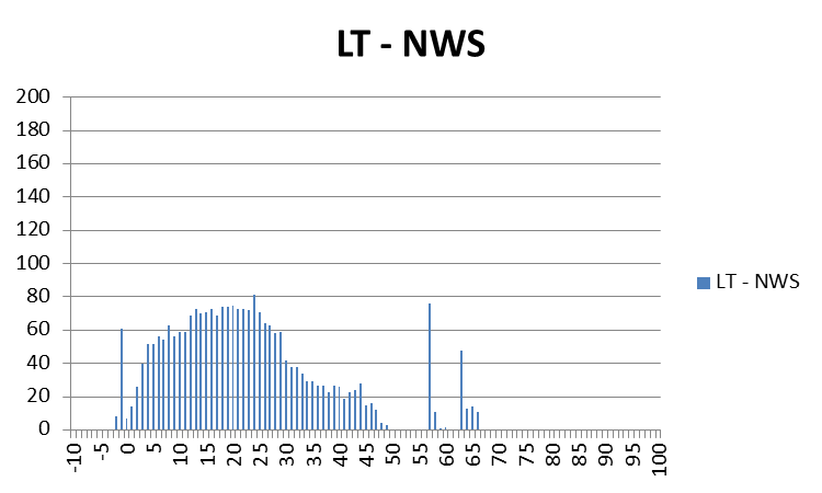
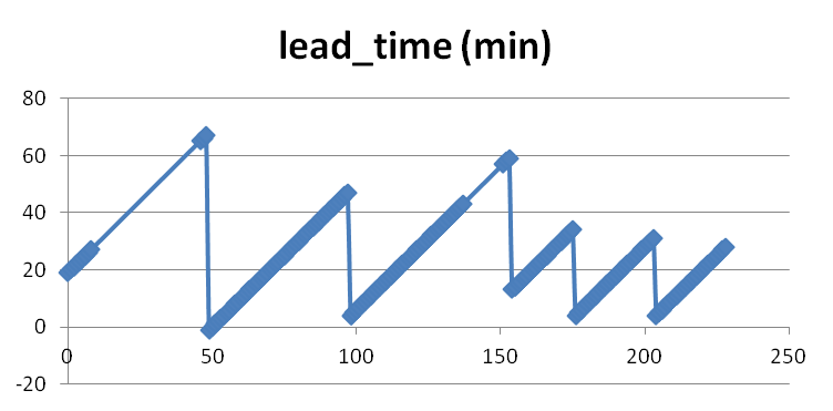
For LEAD TIME (LT), you can see that for some of the grid points, there were some negative lead times, and a fair number of grid points with lead times below 10 minutes. Also note the few grid values above 55 minutes. These were caused by the start of the two tornadoes forming at the very far ranges of the warnings covering their storms. Looking at the lead times for just the starting time of those two tornadoes, the numbers end up being fantastic: 65 minutes and 57 minutes respectively, according to the NWS Verification statistics. But as we are showing here, it is important to consider the lead time between warning issuance and tornado impact at each specific location along the path of the tornado, and for some of those, the numbers don’t reflect as good a level of success as those two numbers above. We will explore this further in just a second.
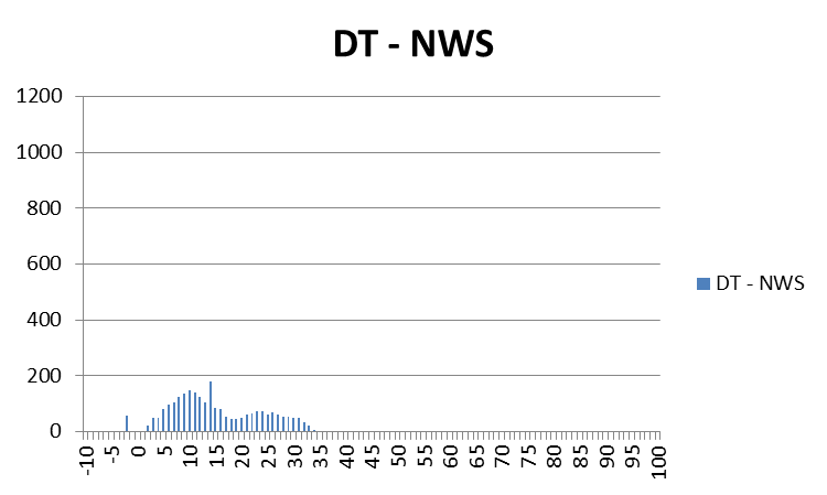
For DEPARTURE TIME (DT), we can see that warnings were cleared out anywhere from 0 minutes to as much as about 35 minutes after the threats had passed. Should warnings remain in effect for so long? The clearing of warning polygons via Severe Weather Statements (SVS) serves this purpose, but it is a manual process that does not have a standard protocol from WFO to WFO, and sometimes isn’t done when workload is too demanding. Also note a few data points in the negative area – these are warnings that were cleared too early – the threat was still affecting those locations. However, recall that our threat locations have a 5 km splat radius around them; these data points come from the very back end of some of these splats at the early stages of the first tornado.
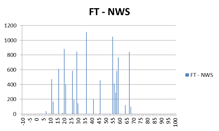
The FALSE TIME (FT) distribution looks much different than the other two, it is more “disjointed”. The main reason for this is because these values are based on the warnings and not the one-minute updating tornado threat locations, so there will be discontinuities associated with each change in the warning polygons, which comes about every 15 minutes as new warnings are issued or current warnings are reduced in size via SVS. But note that there are some locations that are falsely warned for over 60 minutes! This is even though the storm-based polygon warnings were technically not false alarms according to traditional NWS warning verification methods.
Because our data are geospatial, we have the luxury of looking at the geospatial distribution of the LT, DT, and FT values on a map! Let’s start with the LEAD TIME (LT) graphic:
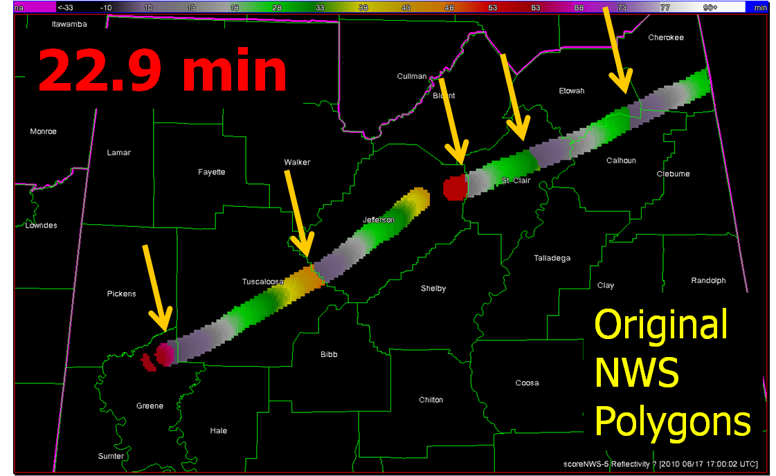
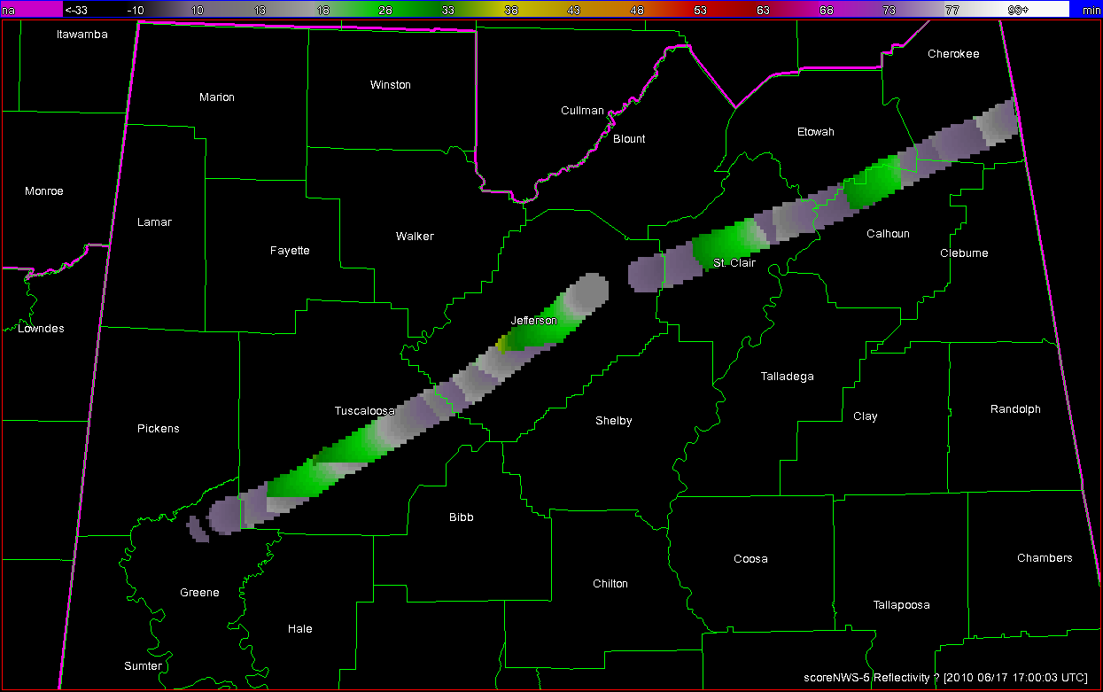
What you are seeing here are the LEAD TIME values at specific locations along the path of the two tornadoes, with the 5 km “splat” buffer added (no values are recorded outside the path of the threat). Pay particular attention to the five yellow arrows. We’ll zoom in on one of them:
What we are seeing here is a discontinuity in LEAD TIME at this location of the tornado path. Values at the far end of Tuscaloosa County are 47 minutes, while at adjacent grid points downstream in Jefferson County, the lead times on the tornado path were only 3 minutes. These inequitablies are the result of warnings being issued one after the other, with the threats nearing the end of one warning polygon before the next downstream polygon is issued. This is evident in the NWS polygon warning loop I showed in a previous blog entry. There are five of these discontinuities in the path of both tornadoes from this storm. These five discontinuities represent the downstream end of the first five polygons that were issued by the NWS on this storm (the 6th polygon warning expired on the AL-GA state line, so the discontinuity is not seen because I didn’t include the grid points within Georgia). The same five discontinuities are also seen if we plot the one-minute tornado segment lead times available from the NWS Verification database:
The graphical DEPARTURE TIME map:
More discontinuities are seen here because in addition to the new warnings being issued, there were the numerous removals of the back ends of the polygons via the SVSs.
This final graphic depicts the FALSE TIME (FT) per grid locations. Values only exist where warning polygons were in effect outside the path of the tornado plus the 5km splat.

There is quite a bit of area that is falsely warned (assuming the 5 km buffer around the tornado), and many of these areas are warned for over 60 minutes. Note each warning polygon and subsequent SVS edit becomes evident on this graphic. Note too that for the second tornado the warning polygons are placed with the tornado path to the right of center (as viewed toward the storm motion direction), which indicates that the warning forecaster probably started using the Tornado Warnings to cover the entire severe threat (wind, hail) and not just the tornado threat.
Next up, a summary of the benefits of geospatial warning verification, and then an exercise illustrating the second pitfall of “casting the wider net”.
Greg Stumpf, CIMMS and NWS/MDL