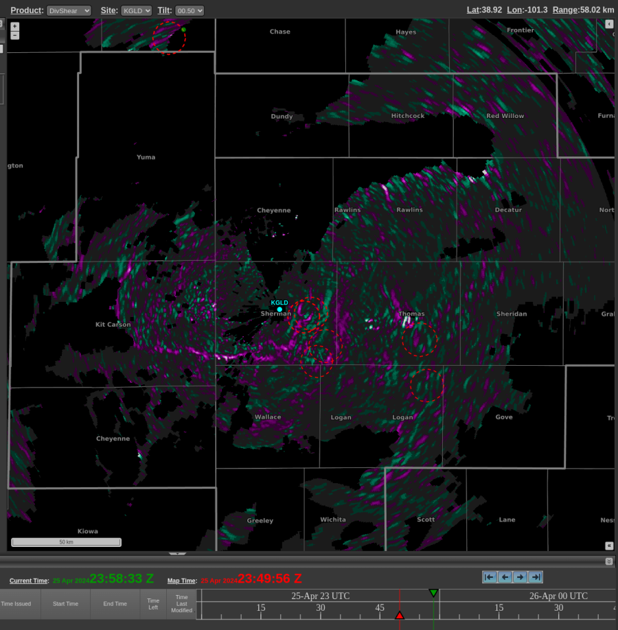
Having a way to just see the highest TORP probability triangle when multiple radars are selected would be beneficial (without having to manually deselect radars).
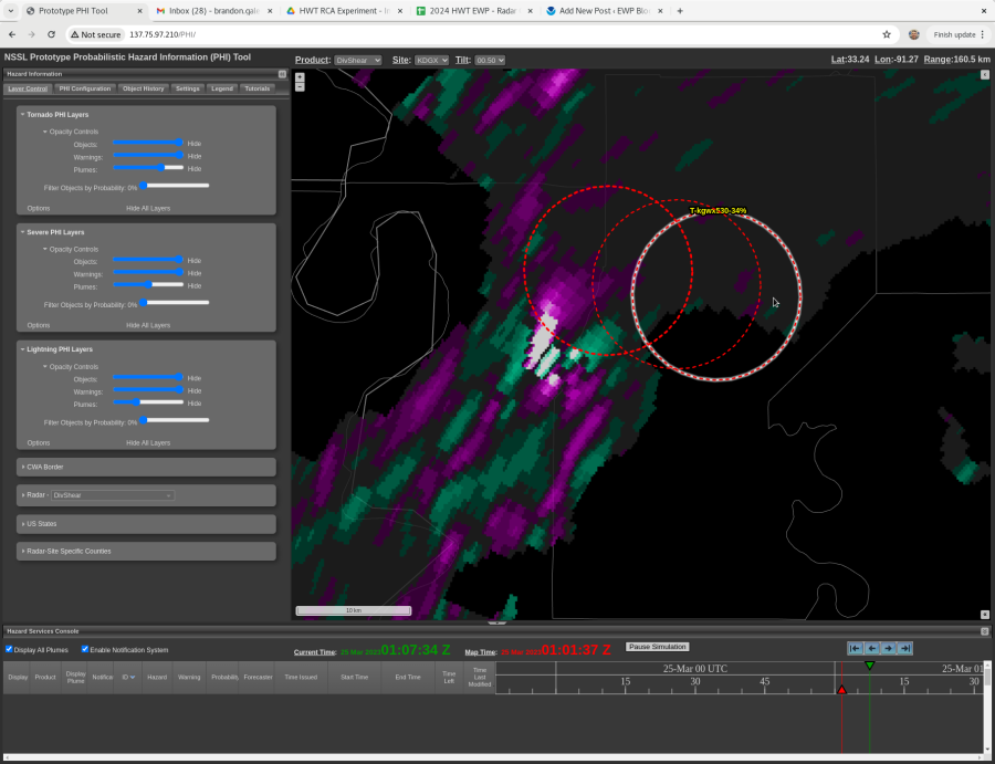

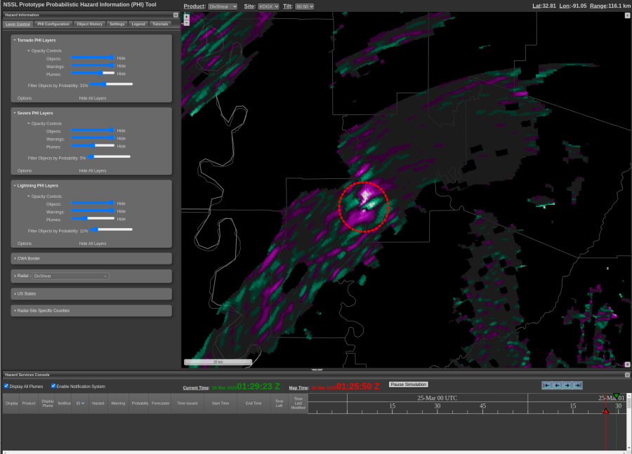
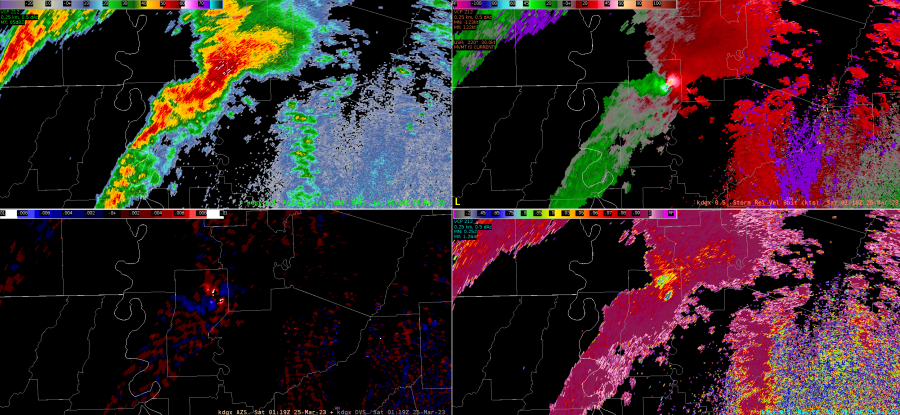
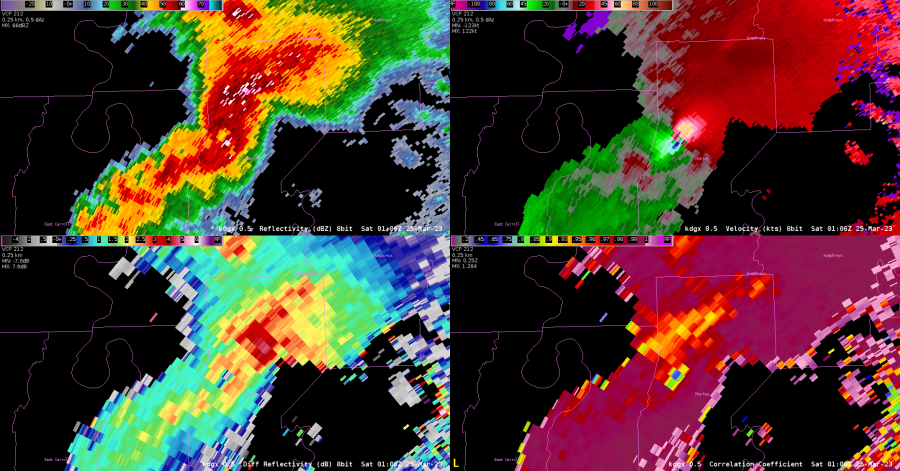
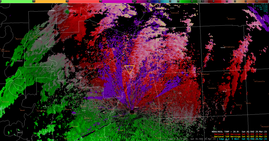
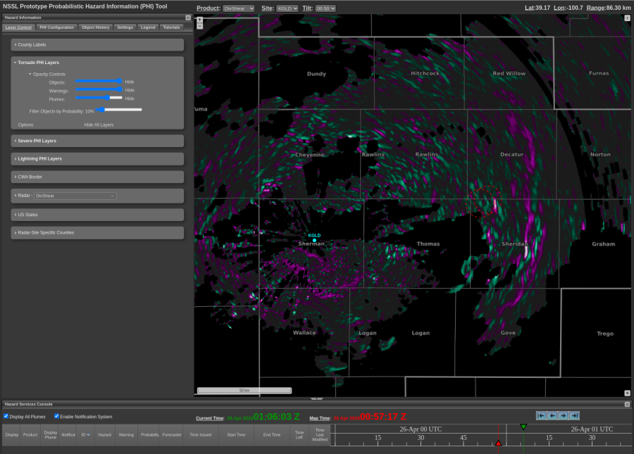
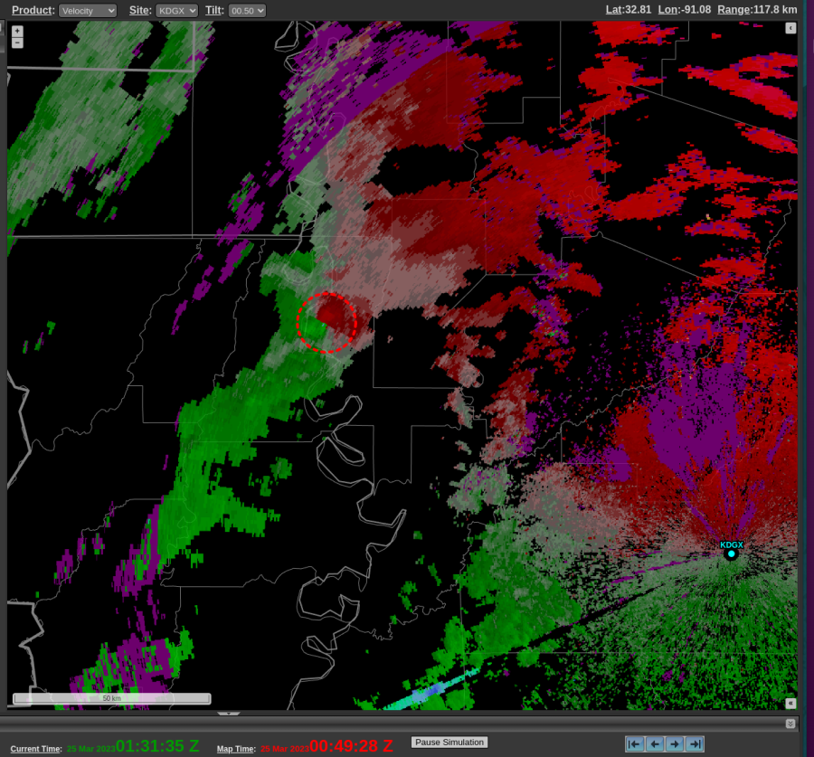
In the above screenshots, a damaging tornado was occurring. The strongest AzShear was within the Tornado PHI circle, but the strongest DivShear was not. In this case, the tornado was obvious from velocity data, but in marginal cases this could possibly lead to some confusion in where to focus attention.

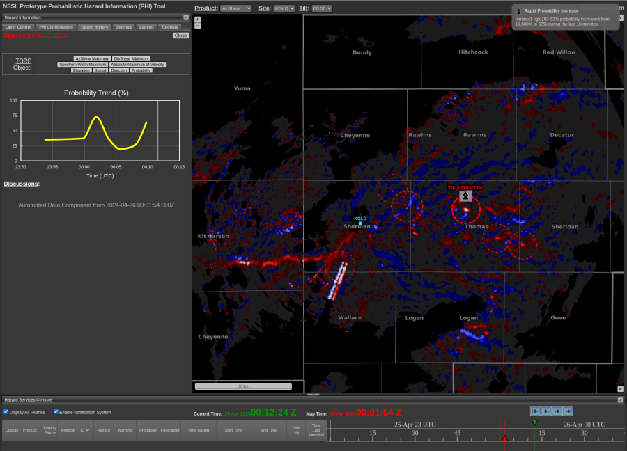
Vrot according to the TORP for this storm was only 33 (not shown here). Turns out this is in m/s and not kts which is more accurate, though kts would be preferred. Either way, the units being displayed would be helpful.
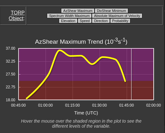
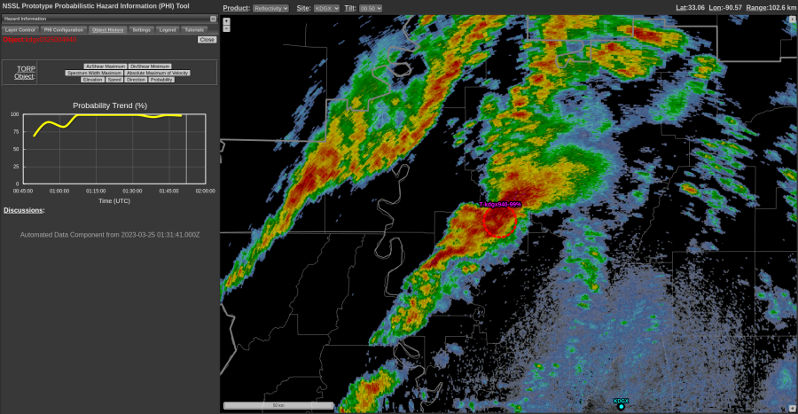
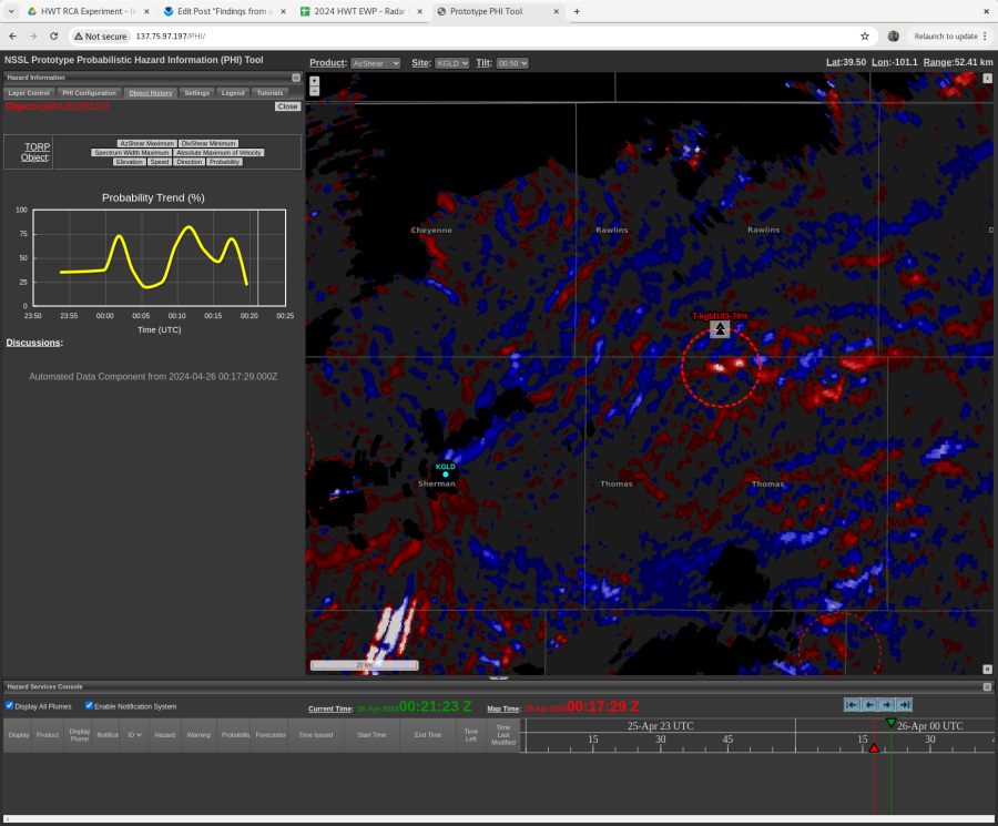
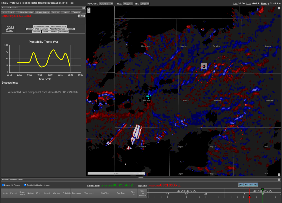
The time series charts are helpful for maintaining situational awareness throughout a storm’s life cycle and knowing what values are extreme, low, etc.

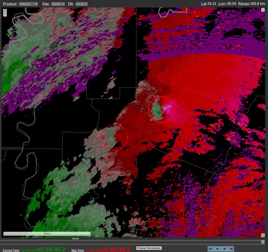
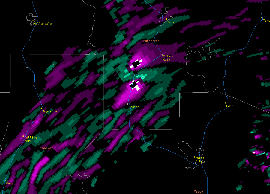
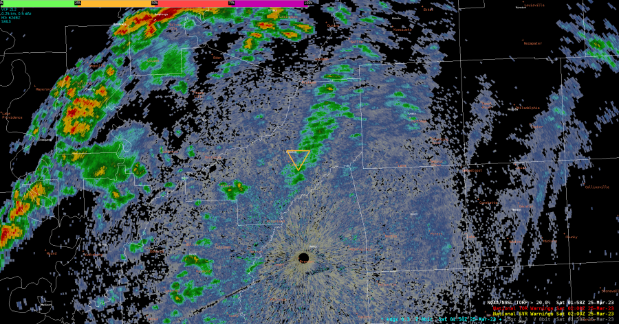
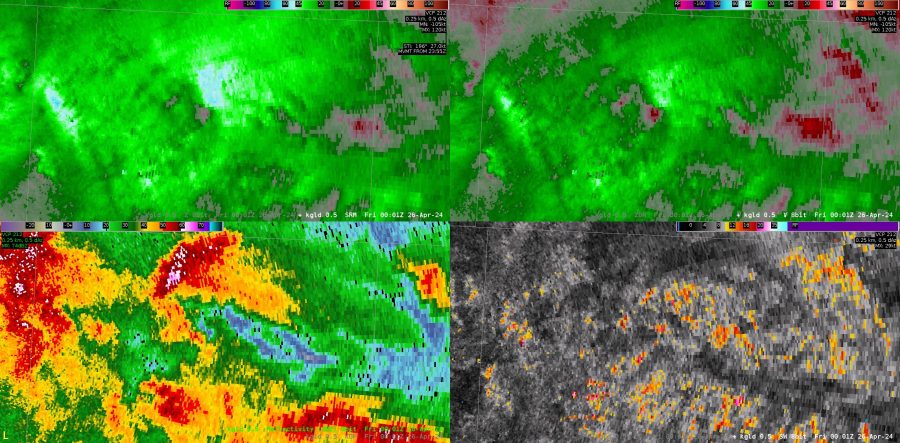
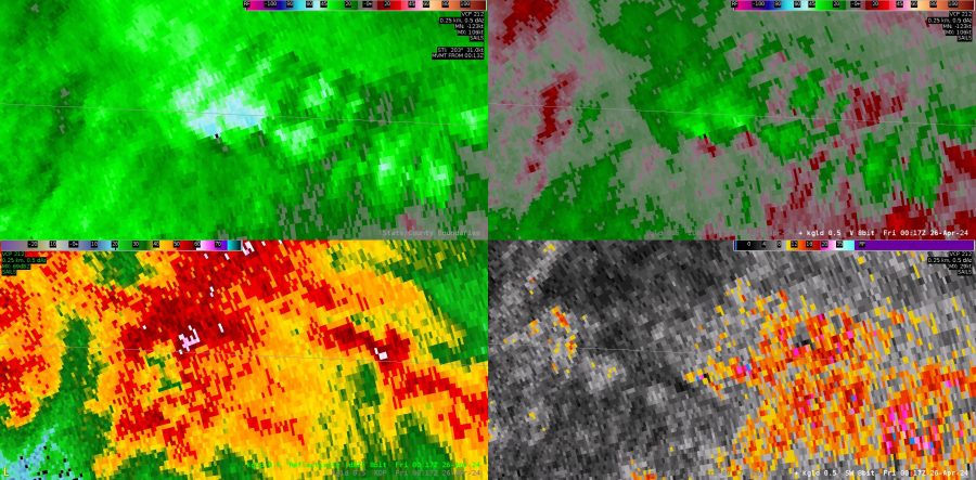
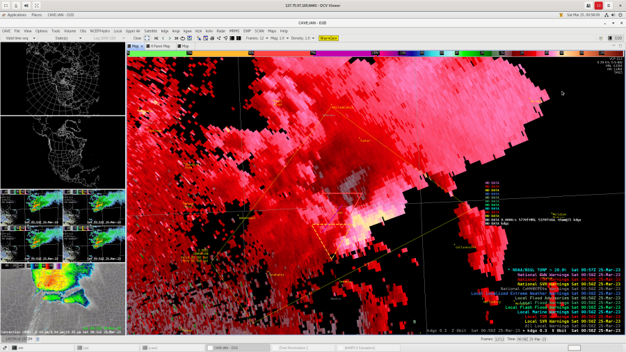
 If a forecaster was looking at a lot of activity going on around the CWA, a weaker velocity signature can be missed, but AzShear jumps out with the high (white) values. This circulation went on to strengthen quickly and to me the AzShear did a better job at showing that earlier in the tornadoes life.