An official website of the United States government
Here’s how you know
Official websites use .gov A
.gov website belongs to an official government
organization in the United States.
Secure .gov websites use HTTPS A
lock (
) or https:// means you’ve safely connected to
the .gov website. Share sensitive information only on official,
secure websites.
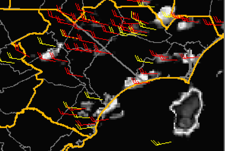
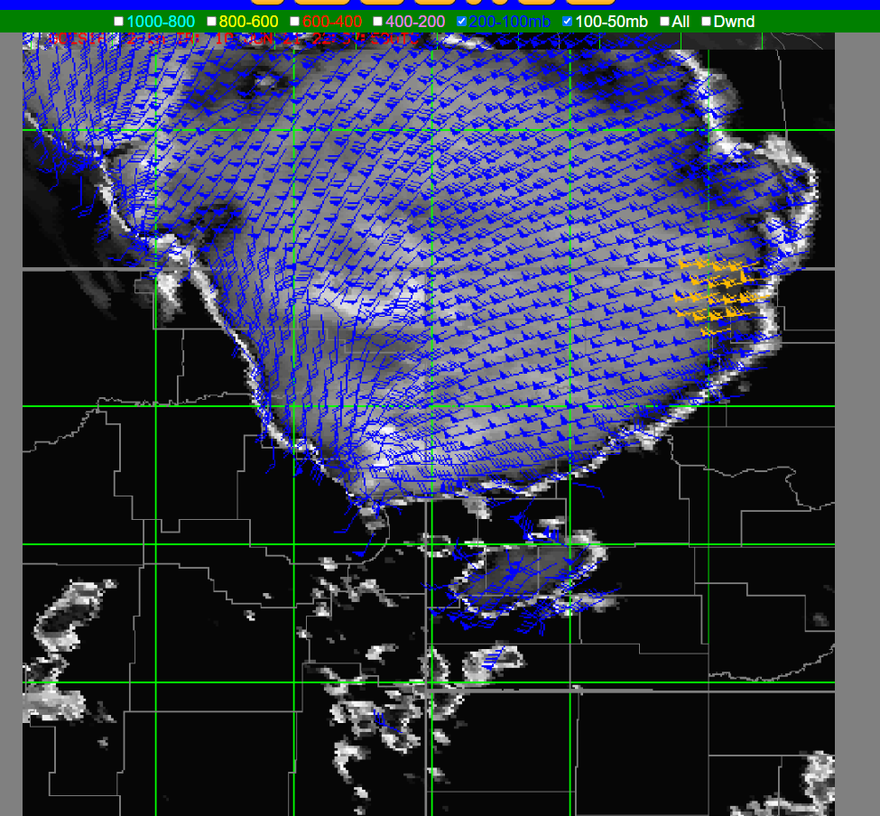
Looking at multiple levels of optical winds can be useful in analyzing the amount of wind shear over an area in near-real time. In this case, the tool shows limited wind shear, so one would expect storms to be a bit more short lived. Would it be possible to add wind shear fields directly into this tool for quicker analysis?
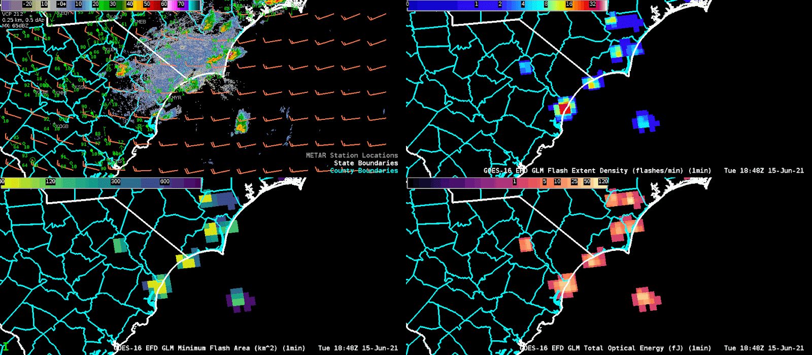
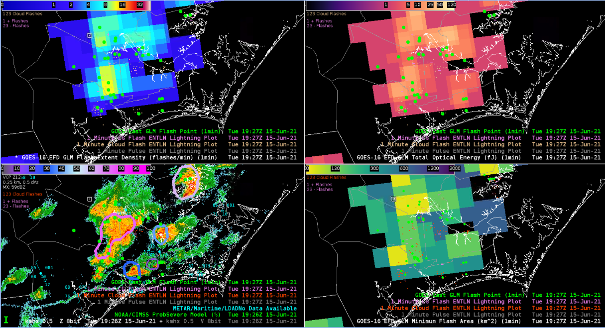
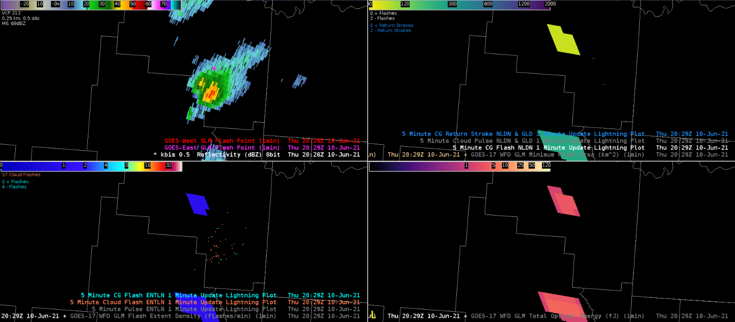
Optical winds for the ILM CWA on 6/15 at 18Z showing little difference in the winds between the 800-600mb and 600-400 mb levels.4 panel of the GLM data at ILM around 19 UTC illustrates Flash Extent Density (top right), Minimum Flash Area (bottom left) and Total Optical Energy (bottom right). We adjusted the colormap of the minimum flash area so that we could identify the updrafts more easily since the minimum flash areas were under 100km^2 and the default map was set to cover images up to 2000km^2. This allowed us to identify which storms featured the strongest updrafts which when combined with data from the Flash Extent Density, we could watch for storms that were strengthening and thus posed a greater need for a warning.
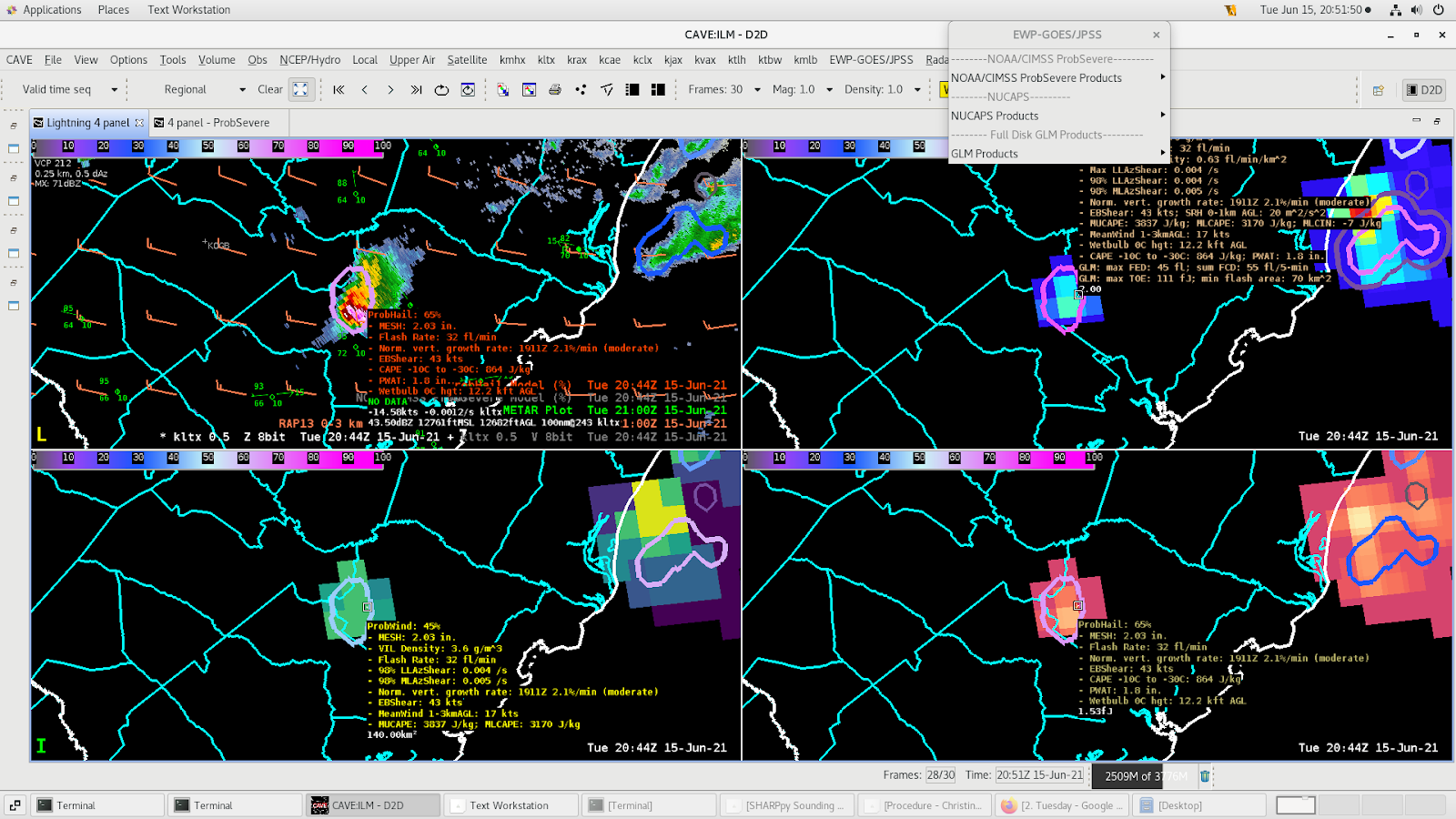
Three Body Scattered Spike & ProbHail
Three body scattered spike is visible in the storm in the top right panel.ProbHail shows values of ~65% when the three body scattered spike appears with MESH values over 2” supporting the likelihood of at least severe size hail in the discrete cell.
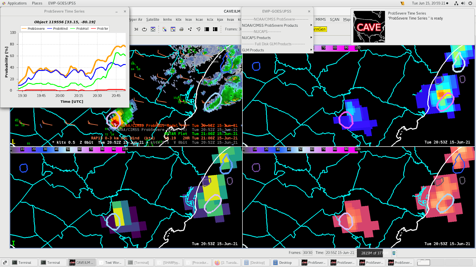
Watching the meteogram on this storm, we can see the probhail values jumped up to 65% over the last 15 minutes. It’s probably best to have ProbHail values of 60% or more last for a few volume scans because that suggests the residence time in the hail growth zone is long enough for hail to grow and become 1” in diameter or larger.
Assessing the various GLM lightning products, I found the MFA and FED particularly useful in correlating the more active thunderstorm core / updraft areas. TOE was useful, but maybe a slight change in color scale may help to better identify those very active convective areas. (perhaps the sharper color gradient change could start at a slightly higher value than currently)
Upper Left: FED img + Flash Point + ENTLN; Upper Right: TOE img + Flash Point + ENTLN Lower Left: Radar img + ProbSev + Flash Point + ENTLN Lower Right: MFA img + Flash Point + ENTLN
The GLM flash point data didn’t show as much ‘clustering’ as I had expected to see, as compared to other surface-based data sources (ENTLN). Is this related to a data display density or a more sensitive surface-based lightning detection? However, due to the parallax correction, the flash point data did line up with fairly well with active convection, although there were a few flash point detections well displaced from any radar reflectivities (see bottom left)–perhaps related to stratiform lightning?
Comparing the Flash Extent Density to base reflectivity in northern Florida, we noticed an area of exceptionally high flash density just north of the best convection. Adding flash points (parallax corrected) to the radar image and they were more where one would expect in the storm. This indicates a parallax issue with the Flash Extent Density. This is a good example of where the flash points can be a good sanity check when interrogating a storm.
Base reflectivity and flash points (left) and five minute Flash Extent Density (right).
Using GLM for an IDSS event allows for great flexibility and confidence in providing warnings for decision makers. In the image below, this shows a complex organization of thunderstorms. In this case, a lightning alert or warning for them. In this case, since the thunderstorm structure is much more complicated, it is unlikely an all clear would be provided for some time. It is likely this would be persistent through the afternoon as the surface front is pushing the sea breeze front back toward the coast and keeping the activity nearly parallel with the coast. In this example, the FED product does provide the forecaster a good idea of the forward extent of the which is to the south and east, despite the fact the upper level winds are pushing the avils to the north. The lightning points are also helpful to get an idea of where the potential return strokes are actually reaching the ground enveing though the GLM “can’t” actually 100% determine this but just based on the probability.
Point flashes also provide the user with an idea of the size and potentially the ability to identify which core the lightning originated from. Not sure how well this will work or if it will work but just a thought. Think more work and or research will be required before we can say one way or the other if this will actually work.
NSHARP – AWIPS (Advantage is being able to see both modified & unmodified soundings
SHARP.py (Advantage is the cleaning picture and able to display two or more soundings on the same backgrounding – Skew-T)
How two passes of the NOAA-20 near the same location can be used to determine the small changes in the atmosphere.
(Green/Red – Moisture/Temperature Profile at the 1842Z Pass)
(Green/Red – Moisture/Temperature Profile at the 2042Z Pass) Note the increase in moisture in the boundary layer which corresponds to the increase in CAPE.
These two comparisons of the soundings within two hours of each pass showed how well the NUCAPS can be used for small differences in atmospheric moisture and instability.
During this time period, there was a pronounced dry-line west of the sounding, and a synoptic scale front approximately 100 miles to the north of this NUCAPS sounding.
Note where the dryline (Cumulus line over northeast Mt) was located and how you can use NUCAPS to show how capped or uncapped the atmosphere becomes in the afternoon with the NOAA-20 passes.
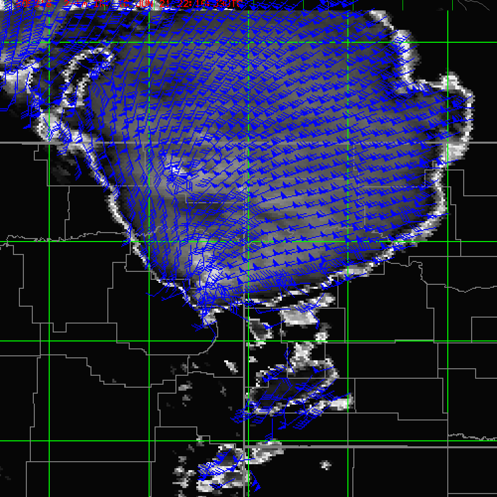
Convective storms that developed across northeast Montana showed the speed and direction of the outflow. Note the divergent flow outward from the overshooting top, to the outer parts of the anvil. This image also provides the pressure level associated with the wind speed and direction of the flow aloft. This can help determine the strength and possible intensity as it evolves through the life cycle of the convection storm.
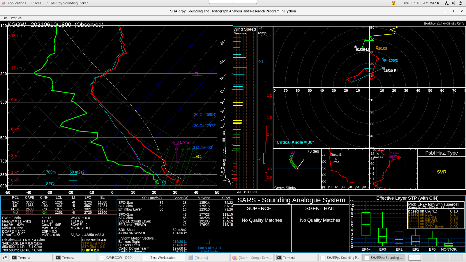
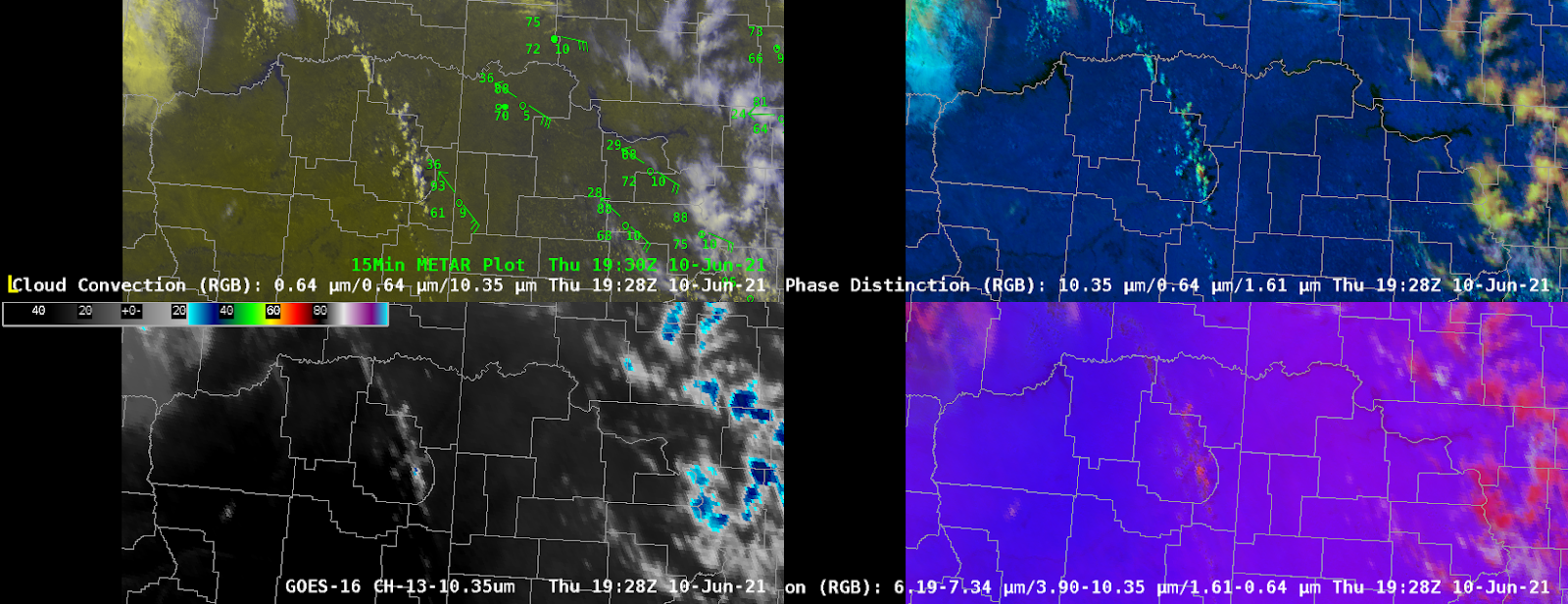
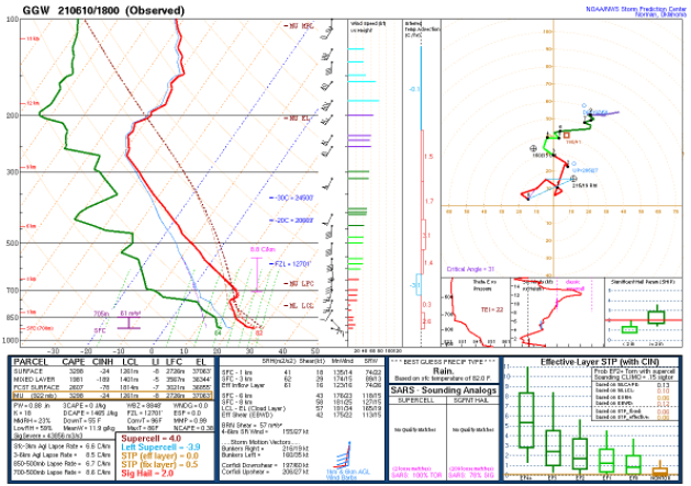
Some members of the 12z Thu Jun 10 HREF run were a bit slow in initiating convection or too far east in developing convection over the Northern Plains. The NSSL WRF-ARW was closest to reality with respect to exact timing and location. A special 18Z RAOB from Glasgow (GGW) MT and the Cloud Phase Distinction RGB proved to be very helpful in showing convection was going to develop earlier than anticipated by the HREF guidance. The 18Z RAOB from GGW (below) showed weak CINH values, while the Day Cloud Phase Distinction RGB (second graphic) showed an agitated cumulus field that was becoming quickly glaciated (single cell with yellow cloud top near the 93/61F sfc obs) indicating deep convective development was imminent.
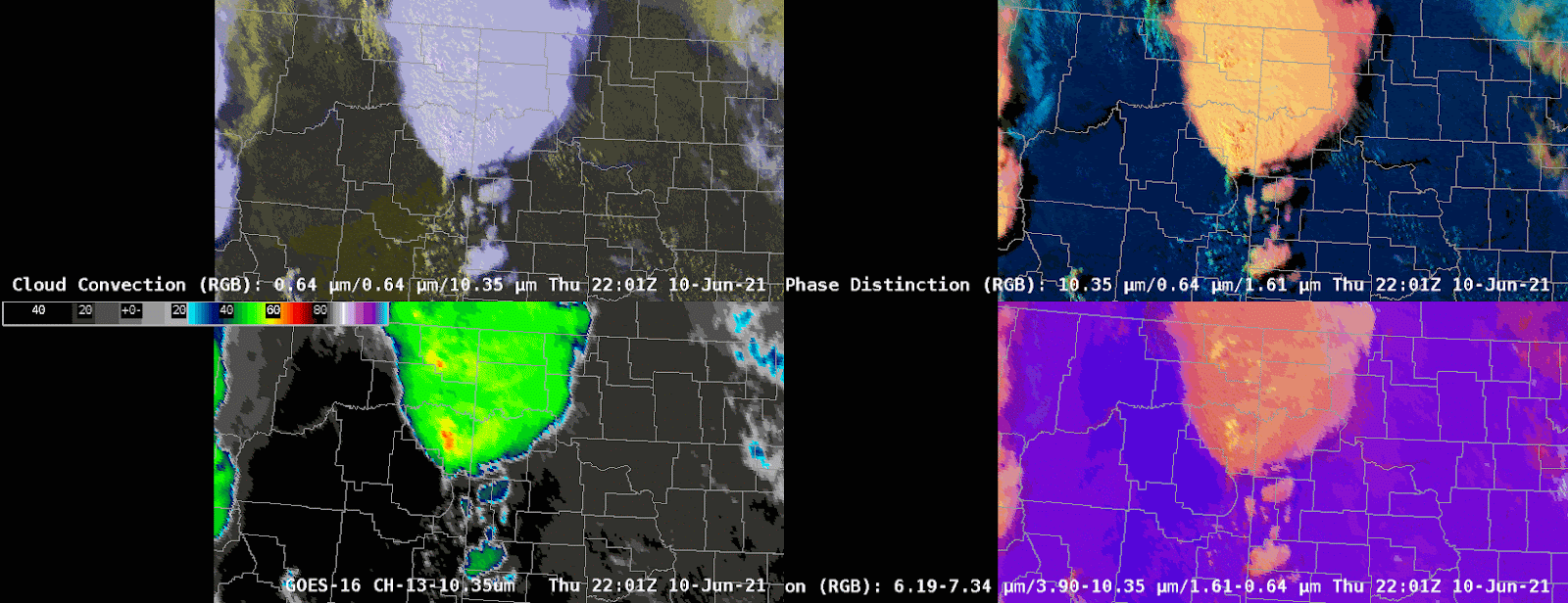
Once deep convection initiated, single channel ‘Clean IR’ imagery and Day Convection RGB became more useful in determining updraft strength. These two products can be extremely useful in severe weather detection and warning decision making especially in absence of radar and/or lightning data or when used combined due to its faster temporal coverage (1-min in meso sector vs 5-min from radar).
The image above shows updrafts getting stronger in the 10.3 micron imagery (bottom left), and on the Daytime Convection RGB (bottom right) by evidence of yellow (red +green) pixels. Inflow feeder bands, a flanking line, towering cumulus above an invigorating RFD or flanking towers, and above anvil cirrus plume are also observed in the Day Cloud Convection and Cloud Phase Distinction RGBs (top panels) indicative of the storms likely being severe. In fact, the ProbSevere v3 and v2 output both indicated a very high probability of severe weather occurring with these storms with values over 90% (purple colors).
Our team was assigned to the Glasgow, MT WFO on this day. The area was primed for explosive convective development, with the “triple point” over the CWA. The dryline, cold front, and warm front were all apparent in radar imagery prior to convective initiation.
Radar reflectivity from KGGW from 1833-1920 UTC 10 Jun 2021. Note how the boundaries are readily apparent with the radar still in Clear-Air mode.
Although the main “action” fired east of the dryline, in NE Montana and eventually NW North Dakota (see SPC Storm Reports), a few robust storms also developed in the highly-sheared environment over the SE corner of the Great Falls, MT CWA.
1200 UTC sounding from Great Falls, MT (KTFX). Note the steep lapse rates aloft and particularly the 67 knots of Surface-6 km shear.
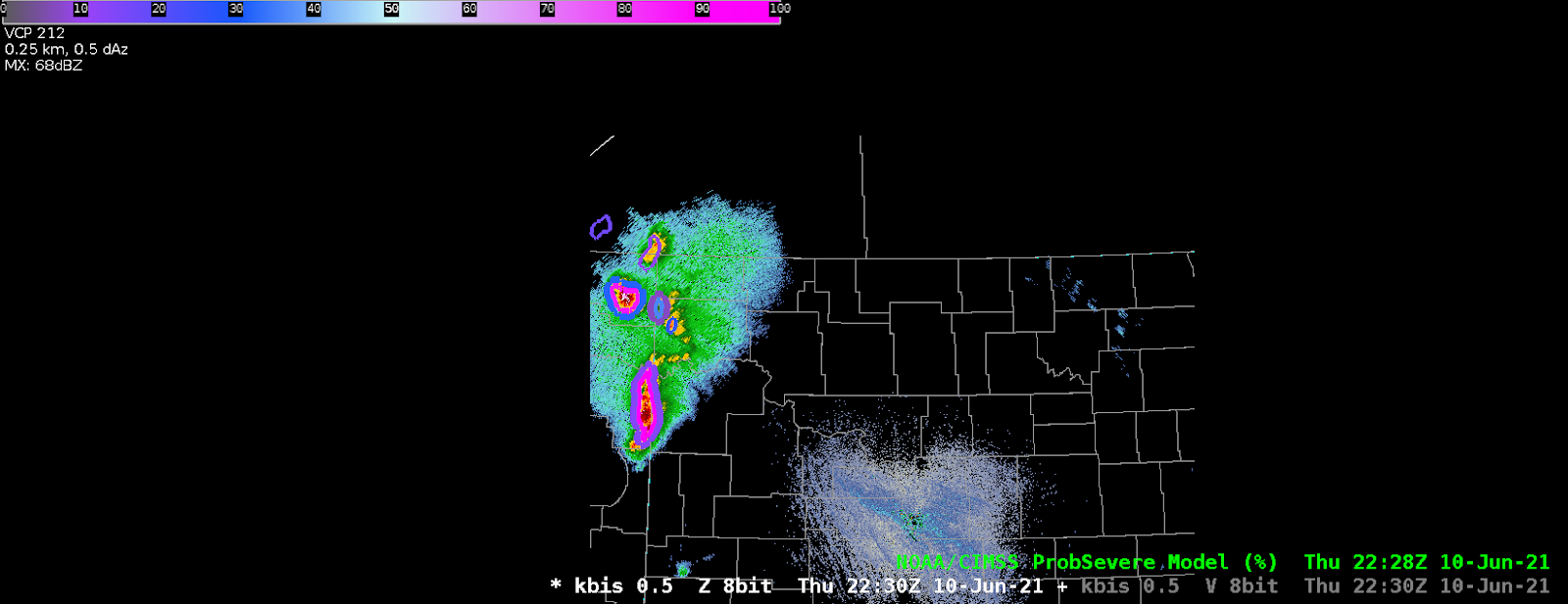
A splitting cell was noted in radar imagery from KBLX (Billings, MT). There was an mPing report of one-inch hail with this cluster of storms.
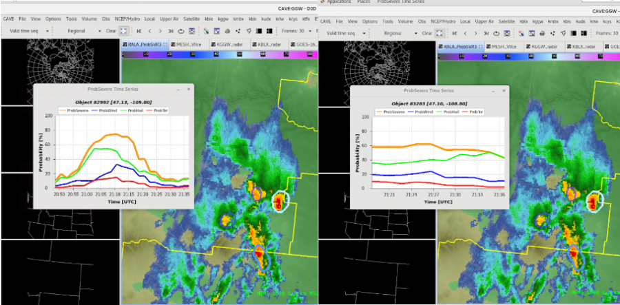
Radar reflectivity loop from KBLX from 2105-2133 UTC 10 Jun 2021. The split can clearly be seen by 2115 UTC.MRMS Reflectivity At Lowest Altitude and ProbSevere3 time-series for the left-splitting (left) and right-splitting (right) storms. Within a couple of minutes of the split, ProbSevere3 correctly predicted that the right storm would become dominant and generally maintain its intensity. Meanwhile, the left-splitter would quickly weaken.
Suppose you were thrown into radar duties without time for a full-on environmental analysis. In an environment conducive to splitting cells, ProbSevere3 can quickly provide guidance allowing the warning forecaster to anticipate which cell will become dominant.
In the HWT this Thursday, we looked at storms which erupted in Montana. The storms took a little while to erode what little cap was there, and formed by early afternoon. There was an impressive MCV centered almost right over the Glasgow radar (KGGW). In addition, there was a short wave approaching from the west, and a frontal system in place complete with a warm sector over Montana.
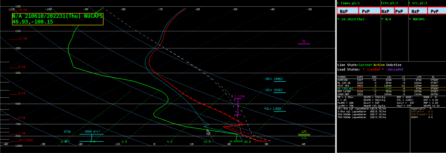
Soundings in the area (Image 1) showed impressive CAPE, DCAPE, ample speed shear, marginal low level lapse rates, and impressive mid level lapse rates. We watched GOES satellite imagery in the area and saw several cells begin to develop all at the same time more or less along the warm front. Supercells eventually developed and moved slowly to the northeast.
Image 1 shows the KGGW sounding from 20210610/18Z.
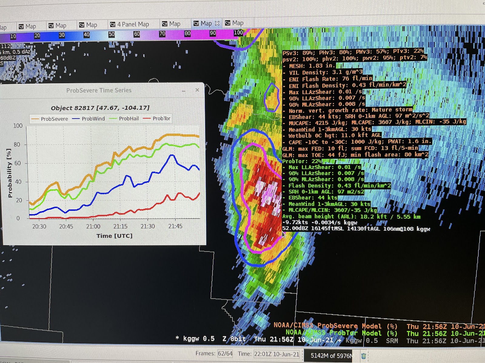
During and after CI we watched how ProbSevere3 responded to the increasing severe threat. Here is a screenshot of one of the storms at 2144Z along with the ProbSevere2 and 3 readouts and the ProbSevere3 time series. This cell northeast of Glasgow showed some of the highest probabilities of the week for both algorithms, including a ProbTor of 22% according to the newer algorithm, and 7% according to the older one.
Image 2 shows storms over Montana and the ProbSevere readouts.
These LP storms were very photogenic- according to Twitter- and went on to produce monster hail larger than baseballs as well as tornadoes. In this instance, ProbSevere3 and 2 did a great job. Since ProbSevere3 is more conservative than 2, it is worth the time for forecasters to compare the 2 algorithms side-by-side once they are both available. This will help them calibrate their thinking as to what amounts usually produce certain amounts of wind damage, hail size, and tornadic activity. For example, just working with ProbSevere3 a few days, I know that a 22% tornado probability and 57% wind threat is very high, at least for supercells in the northern Plains in June.
Image 3 shows the storm reports for June 10, 2021.
As convection initiated, it took ProbSevere3 a while to find an “object”, and thus assign probabilities. It is possible the dry air as well as the heights at which the radar was hitting the storms played a role in us seeing reflectivity before probabilities started to come in. In addition, lightning took a while to develop, and this is also included in the algorithm.
When the storms were just developing and while they were discrete, ProbSevere3 did seem to encircle large areas of the storms and label them as one object. This has to do with the way the algorithm defines an object, and has improved since the last version. Still, it could be confusing to have one probability for several storms. While research continues on this, it underscores the fact that forecasters must use this as a tool in the toolbox and as a confidence-booster, not as an absolute last word on the severity of storms.
A moderate risk of severe storms capable of producing large hail, damaging wind gusts and tornadoes occurred across the Dakotas. My focus was in the Bismarck, ND CWA where storms were likely initiating in eastern MT and then moving into the very unstable environment across western ND. All of the higher resolution models were a bit late on storm initiation as storms began to fire between 3-4 PM CT. The experiment began around 2 PM CT, which allowed for mesoanalysis of the pre-convective environment.
A NUCAPS CONUS NOAA-20 pass occurred at 19z across ND and then again at 20z where the eastern edge of this pass overlapped with the previous pass across western ND. At 19z, a comparison was made between the NUCAPS profile and a nearby RAP sounding at the same time. Below Image 1 shows the locations of the NUCAPS profile versus the RAP sounding. This area was chosen as it was close to where the satellite was showing some potential for convective initiation and was just east of the dryline in the area where the better instability was to be present.
Image 1a shows the location of the chosen 19z NUCAPS profile.Image 1b shows the location of the chosen 19z RAP sounding.
Using sharppy the two profiles were then compared simultaneously. Both Images 2 and 3 show the two profiles, but image 2 will be highlighting the NUCAPS profile and associated instability values and image 3 will highlight the RAP sounding with associated instability parameters. Looking at the two profiles, there is not much difference in the mid to upper levels between the NUCAPS and RAP. However, the NUCAPS profile struggles more with the boundary layer features and temperature/dewpoint. Looking at observations, the current temperatures near that sounding location at 19z was 86 deg F with a dewpoint of 70 deg F. The RAP seemed to initialize these surface values pretty well and the thermodynamic profile east of the dryline, along with a bit of a capping inversion in place. Meanwhile, the NUCAPS profile struggled with the temperature and dewpoint, thus under doing the moisture and instability parameters. The CAPE values are noticeably different with the NUCAPS profile much lower with the instability due to these surface differences.
Image 2 shows the sharppy comparison of the 19z NUCAPS profile (colored) versus the RAP sounding (purple). The parameter values below are calculated based on the NUCAPS profile.Image 3 shows the sharppy comparison of the 19z RAP sounding (colored) versus the NUCAPS profile (purple). The parameter values below are calculated based on the RAP sounding.
After seeing the discrepancies with the observed surface values versus the NUCAPS profile, I decided to grab the modified NUCAPS profile for the same location for comparison. Image 4 shows this modified sounding with a 10 degree difference between the non-modified surface temperature. The modified sounding shows a 82 deg F surface temperature, while the original NUCAPS profile had 91 deg F. With the cooler surface temperature the modified sounding showed a similar inversion to the RAP sounding between 750-800mb. The dewpoint temperature also was better representative of the actual surface dewpoint, which helped increase the instability parameters significantly. NUCAPS profiles tend to be a tad lower on the CAPE values, so the fact that the RAP is still about 1000 J/kg higher is not a surprise. However, with no RAOB sounding available and comparing the RAP with the modified NUCAPS profile there is quite a bit of similarity between the two in terms of the thermodynamic profile. Lastly, as storms begin to fire in the next hour or so and no RAOB profiles closeby, it might be useful to compare and utilize the temperature heights (0, -10, -20, and -30 deg C) for radar interrogation as storms initiate. Knowing the RAP and modified NUCAPS profiles were similar then the heights from the temperature levels could also be compared. The RAP does show higher heights than the modified NUCAPS profile, so this is something to keep in mind and monitor as storms fire along the dryline.
Image 4 shows the 19z modified NUCAPS sounding plotted with NSHARP.
Keeping with the theme of NUCAPS, there was another pass at 20z further west (as mentioned at the beginning) that overlapped the 19z pass in parts of western ND. This included the town of Bismarck, where the office put out a special 20z RAOB sounding. Bismarck was a bit further east than the previous sounding, but was still in the very favorable environment. Images 5 and 6 show the comparison between the NUCAPS sounding at 20z and the RAOB Bismarck special sounding at the same time. Similar results can be seen between the observed sounding and NUCAPS profile where the CAPE values are again lower in the satellite derived sounding. This time the NUCAPS profile did a much better job with the surface temperature and despite the temperature profile being a bit smoother due to lack of detail in the boundary layer, the profile was overall pretty similar to the RAOB temperature profile. The dewpoint profile on the NUCAPS was much drier at the surface and therefore had a bit of a drier boundary layer than the observed sounding, which is likely why the CAPE values are also a bit lower.
Image 5 shows the sharppy comparison of the 20z NUCAPS profile (colored) versus the Bismarck RAOB sounding (purple). The parameter values below are calculated based on the NUCAPS profile.Image 6 shows the sharppy comparison of the 20z Bismarck RAOB sounding (colored) versus the NUCAPS profile (purple). The parameter values below are calculated based on the Bismarck RAOB sounding.
Once again the modified NUCAPS profile was compared (Image 7 below). The modified profile did a better job at showing the moisture in the boundary layer and attempted to pick up the dry layer at 650mb, which was actually at 700mb on the RAOB profile. Unfortunately, the temperature was too low and therefore the modified NUCAPS temperature profile shows a very sharp capping inversion that was unrealistic. Overall, the CAPE values did increase with the modified sounding versus the original NUCAPS profile and were closer to the observed sounding. Twice it has been noted that the heights of the temperature levels were closer between the non-modified NUCAPS profiles with the model/observed soundings. There may be some calculation in the modified sounding that is causing the heights to be lower and maybe unrealistic. In scenarios where there is a RAOB sounding, that is the best picture of the atmosphere you can get but it is great to compare the NUCAPS profiles for comparison to future events and potential trends in the satellite derived soundings.
Image 7 shows the 20z modified NUCAPS sounding plotted with NSHARP.
As storms began to initiate across eastern MT, both G16 and G17 GLM were utilized to look for lightning instances in the growing storms. Having both satellites can be super helpful, especially when one viewing angle may not see the strike, while the other does. This happened several times during storm initiation where one satellite would pick up a strike, while the other displayed nothing. Images 8-9 show this occurring twice in two different storms where each satellite picked up a strike that the other did not. As mentioned before, the viewing angle may not be in a good position for the satellite to see the storm’s top and therefore the strike is not bright enough to be detected. Along those lines, the scattering properties in the cloud are also not visible by the angle of the satellite’s view point and could cause the satellite to miss a strike. Lastly, there is a quality assurance that occurs for each product and if the strike wasn’t strong or long enough then the pixel could have been tossed out during this quality assurance. This is why it is so important to utilize both satellites when possible and it is a best practice to err on the side of whichever satellite is showing more lightning is probably more accurate.
Image 8 shows local radar and GLM flash points (top left), GLM minimum flash area and NLDN/GLD CG strokes (top right), GLM flash extent density and ENTLN CG/IC flashes (bottom left), and GLM total optical energy (bottom right). This image shows the G17 flash point and corresponding GLM gridded products, while G16 does not pick up on a flash point or any GLM lightning.Image 9 shows local radar and GLM flash points (top left), GLM minimum flash area and NLDN/GLD CG strokes (top right), GLM flash extent density and ENTLN CG/IC flashes (bottom left), and GLM total optical energy (bottom right). This image shows the G16 flash point and corresponding GLM gridded products, while G17 does not pick up on a flash point or any GLM lightning.
ProbSevere version 2 and 3 were compared through the afternoon. The trend continued with version 2 remaining about 20-30% higher in all categories except the tornado probs. Version 3 has leaned towards being slightly higher than version 2 when it comes to tornado probabilities. ProbSevere time series was utilized to track the southernmost storm along the line of storms headed into western ND during the mid afternoon hours. Both radars were pretty far away on either side of the storms, with Glasgow’s radar being slightly closer. The lowest elevation scan was at around 13000-14000 feet when velocity began showing a strong mesocyclone. Image 10 shows the time series of ProbSevere and the readout comparing version 3 with version 2. All four ProbSevere categories were steadily increasing through the last hour with version 2 remaining higher than version 3. Version 2 shows close to 100% probabilities for all but tornado, making this storm look like a slam dunk due to the environmental parameters. Meanwhile version 3 is slightly lower due to the fact that it can pick up on similar storms that occurred in a similar environment with little to no reports (from storm data). This is where version 3 adds in a bit more information to create more realistic probabilities.
Image 10 shows the ProbSevere readout for the tornadic storm in eastern MT, along with the time series showing steadily increasing probabilities of all threats. Note the lowest elevation scan with radar is at ~13500 feet.
Based on the strong rotation in Image 10, the tornado probabilities were close to 30 percent which is relatively high and should give a forecaster confidence on issuance with a lack of lower level radar scans. Chaser footage also helped to back the need for a tornado warning with images of wall clouds, funnels and more being reported from multiple sources. Image 11 shows the time series for ProbSevere along with multiple other parameters. One thing that was interesting to see was the tornado probability drastically dropped in version 2 but remained steady in version 3. Since version 2 is heavily using az shear, you can see the drop in MRMS az shear (red line on second plot down on the far left), which could be correlated with that probability drop in version 2. Also, the MLCIN is slowly increasing (blue line on second plot down on the far right) and could be playing a bit of a role in this drop as well. This is where version 3 might have a leg up on version 2 when it comes to tornado probabilities.
Image 11 shows the time series of version 2 and 3 of prob severe probabilities along with various other useful parameters.
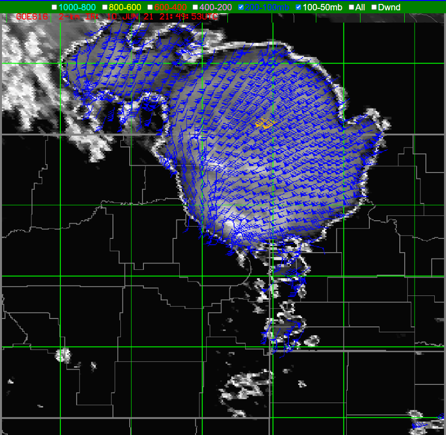
Lastly, the optical winds were utilized to see the winds at the top of the storm. Image 12 shows the optical wind field for 200-100mb. You can see the cooler cloud tops in satellite below the wind field and then the associated diffluence aloft. This is an indication of the very strong supercell that is showing no signs of weakening anytime soon. Also, it is of note that there is another cool cloud top signature a bit further to the northwest associated with another strong supercell with diffluence aloft. The optical wind fields are useful in knowing what is going on aloft and the potential strengthening or even weakening of a storm.
Image 12 shows the 200-100mb layer of optical winds over the supercell in eastern MT.