Visualizing Lightning Data

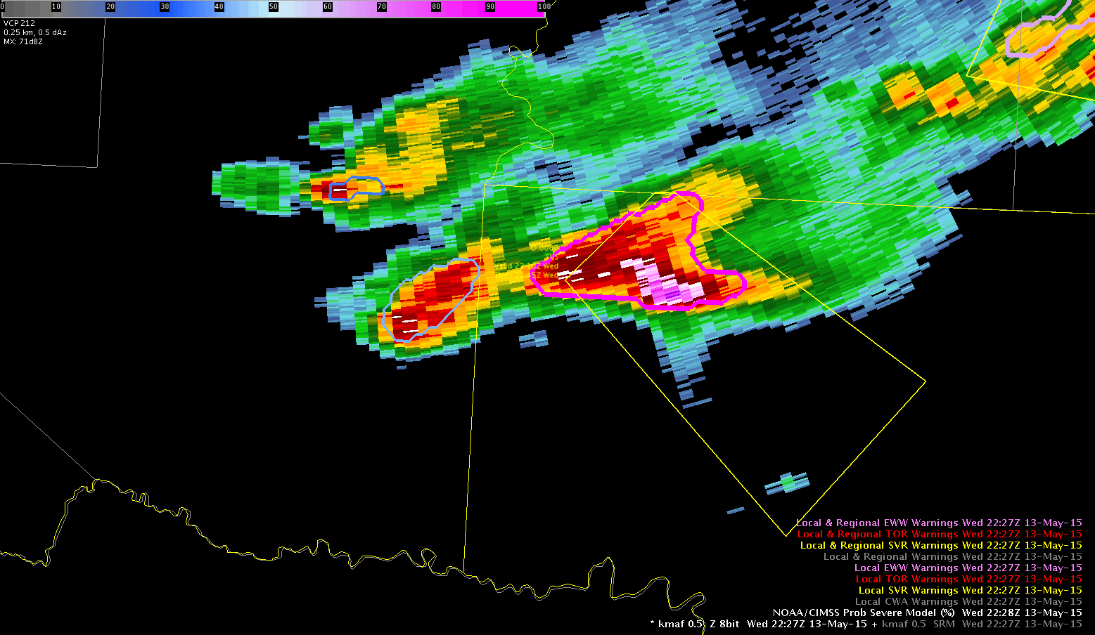
Here is an example of a display that I tried today that seemed to really help with analysis. I liked it since it kept the time series on the side and allowed for interrogation of the other data sets in a larger main editor and at the same time I could quickly glance at the lightning time series to determine the trends in lightning data. In the display, the northern cell goes with the top right time series and the southern cells goes with the bottom right time series.

LTG-TS-Grid-Display

Ertel


Tags: None

ENI Cell Merger Rapid Change in Rate/Area

One thing to keep in mind when looking at the ENTLN total lightning time series graphs is that you must pay attention to if there are any cell mergers in the lightning tracking or the change in flash rate could be misleading. Here is an example where it appears that the storm intensified and then weakened, but in reality the algorithm merged to storms together and then separated them. You can see this on on the time series graph for Pt11 at ~2037 UTC where the cell area rapidly increases at the same time that the lightning rate increased. This was followed by a rapid decrease in lightning flash rates and cell area as the algorithm resplit the cell. Note that radar data clearly indicated that the cells were two separate cells the entire time. Pt11

Looking at the cell polygons over the course of a few minutes also shows this well.

ENIBefore
Before ENTLN algorithm merged cells
ENIAfter
ENTLN algorithm merged cells into 1 giant cell
ENILater
ENTLN algorithm now splits cells apart
Tags: None

Lightning Jump Sample

Image 1.  The Lightning Jump showed a 2 sigma at 2358Z (left image) in southwest TX.  The cell was in the process of strengthening at that time (right image).  19

Image 2.  Within 10 minutes the storm strengthened and showed a TBSS.

18

Will note this is using 0.5 degree and is 18,000 ft AGL about 130 nm away from the radar.

Image 3.  The Lightning Jump increased to a 4 sigma at 0010Z (left image).  A few minutes later this was reflected in the radar (right image).20

-Champion

Tags: None

Overshooting Tops and ENI Flash Rate

Just noticed that in one scan, there are what appear to be overshooting tops with the peak in intensity of flash rate in a cell, but the GOES-R OT product isn’t registering any pixels.

no_OT

Now go to the next scan, the Flash rate has decreased but now there are overshooting tops registering on the OT product.

OT_weaker_cell

I thought the OT product was supposed to detect the overshooting tops either when they first form, or before, not several scans after they appear to form in the visible satellite. ???

However, the ENI raw data points do correspond to the cell flash rate trends from scan to scan.

~Regina Phalange

Tags: None

ProbSevere in Warning Decision Making…Part 2

Here is another example where ProbSevere rapidly increased form 18% to 94% (click image to animate):

ProbSevere2The normalized vertical growth rate and the glaciation rate were both strong. In this case, I was confident enough to use the ProbSevere by itself to issue a severe thunderstorm warning. I started drawing the warning polygon prior to the highest percentage coming from ProbSevere. In the end, my polygon was issued nearly coincident with the highest probabilities.

Polarimetric Researcher

Tags: None

Overshooting Tops Observations

SJT had two instances of overshooting tops during the day today. Vigorous storms have been ongoing in or near the cwa through the afternoon and early evening. There have been clouds over these areas where overshooting tops detection has been indicated. In the instance below, you will see the overshooting tops detection showing red markers.  This happens only after there appears to be overshooting tops observed on the visible satellite.  Are the red markers indicating and outgrowth? Or is the red marker indicating new tops about to form. This seemed like a less likely scenario as the storm continued. Follow the next three graphics to see the tops indicated on vis with the red markers emerging.

UFFSU


top1

top2

top3

Tags: None

Need to Expire DTA Example

Here is an example where a DTA needs to be expired when the cell weakens.

2315-2345

This first image is from 2315z and it was looking good and properly tracking the storm.

DTA1

BUT….the storm took a hard right and now here at 2345…this doesn’t exactly look correct…

Suggestion- if the storm weakens down a category, the alert needs to be expired. You can see that the alert dropped a level on the line track but I didn’t have the other colors overlaid so you can’t see that polygon. I was focused on the DTA.

DTA2

Here is a radar loop of the progression.

DTA


Lauren13

Tags: None

ProbSevere in Warning Decision Making

Here is an example where ProbSevere increased from 20% to 97% within 18 minutes (2218 to 2240 UTC) (click image to animate):

ProbSevereWarningA three-body scatter signature (TBSS) developed at the end of this time frame, indicating the presence of hail aloft.

By 2248 UTC, MRMS indicated 65.5 dBZ at -20C:

MRMS_ProbSevereThis is another example where the rapidly increasing ProbSevere indicated an intensifying storm. A severe thunderstorm warning was issued for the storm.

Polarimetric Researcher

Tags: None