ENTLN Lightning vs. -20C Reflectivity

Here is an example of ENTLN Lightning Plot compared to -20C reflectivity from MRMS:

ENTLN_Lightning -20C_ref
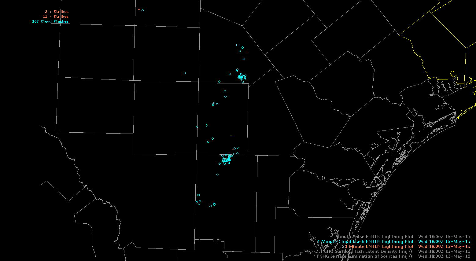
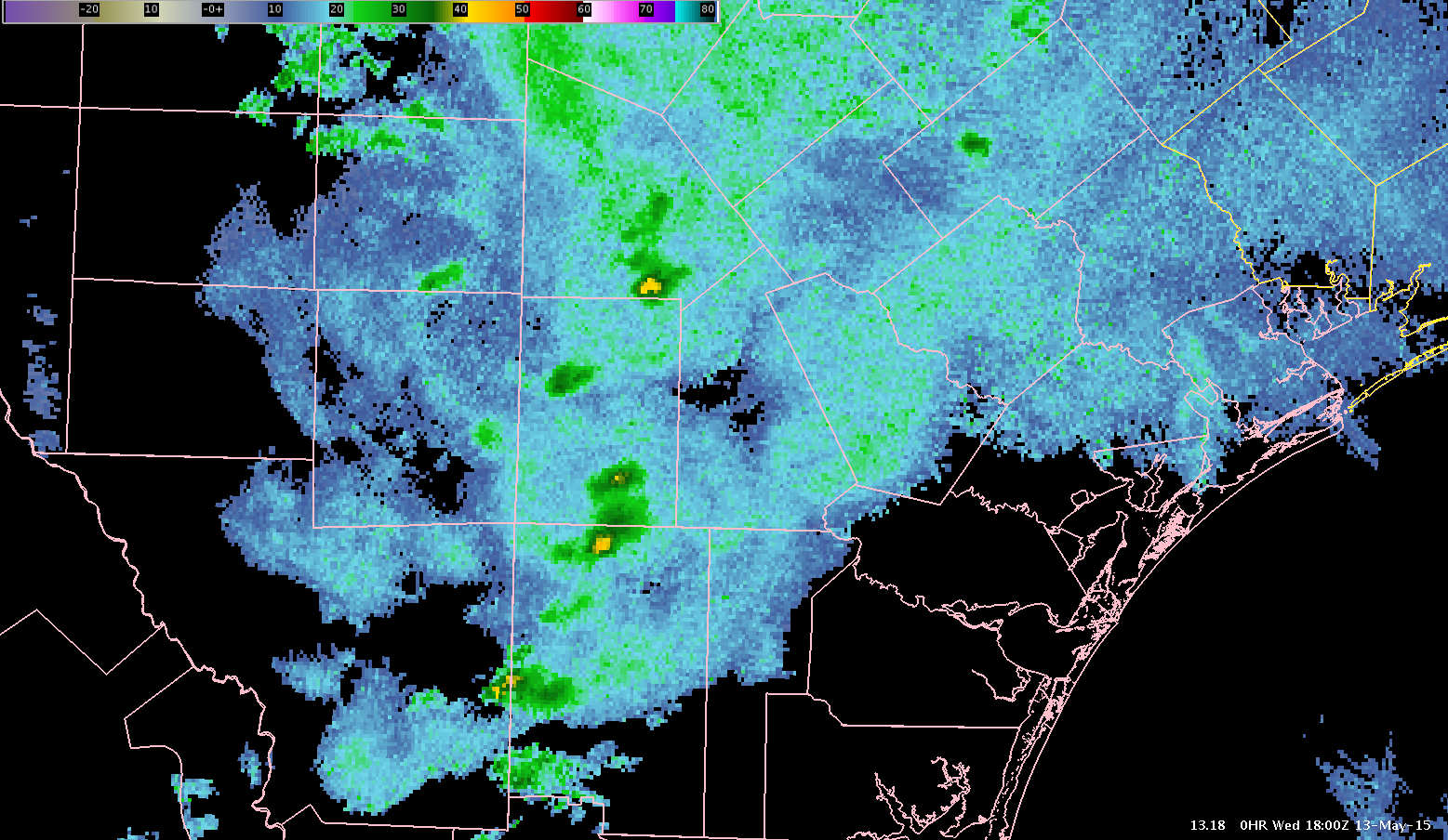
There appears to be nice correlation between lightning and reflectivity aloft (which makes physical sense). In this example, the highest concentration of lightning is associated with >40 dBZ at -20C. A ramp up in lightning could be indicative of larger reflectivity aloft, which would suggest an intensifying updraft.

Polarimetric Researcher

Tags: None

Daily Summary: Week 2, Day 2

Today wins the distance award as we split up across the country to diagnose convective initiation in various environmental regimes. In the morning, forecasters started in Sterling, VA (LWX), Tampa Bay (TBW), and Pocatello, ID (PIH). Our LWX team used a suite of the GOES-R LAP and CI products to diagnose the near-storm environment and convective potential along/ahead of the cold front across the Appalachian mountains today. With minimal convection in the late afternoon hours, they were moved to Denver/Boulder, CO (BOU) to evaluation the pGLM color curves of some very marginal convection . Out PIH team also spent a good part of the day diagnosing CI and evaluating ENTLN tools and trends as a region of instability on the westward side of the upper-level ridge moved into the area. Our TBW team stayed quite busy with sub-severe seabreeze thunderstorms occurring across most of central FL throughout the day. ProbSevere and the suite of GOES-R products were used actively to target and prioritize regions with promising CI potential throughout the day.

-Darrel Kingfield, CIMMS/NSSL Research Associate & Week 2 EWP Coordinator

Tags: None

GOES-R Convective Initiation Nighttime Transition

The GOES-R Convective Initiation seems to have issues at nighttime. This even occurs with the use of infrared satellite data in the algorithm.

Here are a couple images from the transition from day to night:

CI_Day CI_Night

From these images, it seems the convective initiation algorithm is probably more useful during the day. The coarser resolution of the infrared satellite data could possibly explain this problem.

Polarimetric Researcher

Tags: None

LMA Color Tables

This wasn’t the best day to look at LMA color tables because there weren’t many strong storms. I have used Flash Density in Huntsville  on strong storms so I am familiar with the default colormap. Below is an example of a weak storm with the LMA 1 vs LMA Default color table.

So here is LMA 1. One positive about this is because the scale between 0-10 has a lot of colors so those levels stand out quite a bit. This is useful in pulse storms and weaker storms. Above that you can see it is more graduated.

LMA1


Here is the same cell but with the default. You can see under 10 or so, it just looks white and doesn’t show any pinpoint of the updraft or much variation under 10.

LMAdefault

So I think that LMA 1 is good for weak storms but then LMA default for stronger storms!


Lauren13 (and Regina)


Tags: None

Lower Max Values for Gridded LTG Data in West?

As expected, the max value on gridded lightning data will likely need to be location specific and might even need to be adjusted based on time of year or even type of storm to better visualize storm trends. I can see how this would quickly become complex and would require local research that might only be done at offices with someone interested in ltg data. Regardless, as has been discussed ad nauseam, changing the max value needs to be easier for forecasters. Simply adjusting the color map is not a long term fix!

300 Max
300 Max Value
50 Max Value
50 Max Value
Tags: None

First DTA over PIH

Finally got a cell to exceed 25 flashes/min (only lasted for a minute or two), which triggered a DTA (since there is a lower threshold in the west).

DTA

At the same time, ProbSevere was near the highest we had seen all day at ~36% with MESH of 0.83 in.

ProbSevere

The OT algorithm also began to indicate a possible OT with the storm at roughly the same time.

OT

Hard to say which of these products was the first to key in on the intensification as they all started showing signs at approximately the same time. However, the lightning time series does show a rapid increase just prior to 2245 (lightning jump?).

TimeSeries

Issued a SPS based on the experimental products and base radar data.

Ertel

Tags: None

Lightning Data, Alerts Comments

Monitoring the ongoing thunderstorms, Earth Networks continue to supply helpful lightning data.  This is a good supplement to watch indicating future thunderstorm growth or at least some pulsing. The lightning flash data drops out, much like a missed satellite frame. Interestingly enough, there are a couple other troubling notes. Multiple lightning lines (streamers of history) are located in the same circled area. What exactly does this mean to the forecaster? Additionally, four areas inside the circle are showing flash rates above 25 strikes per minute. It is confusing to an operational forecaster and takes time to interpret data that should be straightforward. The display has to be massaged to increase ease and usability. At 2315z there is a circle inside a circle…. and a dangerous thunderstorm alert inside a thunderstorm alerts.

UFFSU

EN Circle in circle

Tags: None