
For my presentation at the 2011 NWA Annual Meeting in Birmingham, I wanted to introduce the concept of geospatial warning verification and then apply it to a new warning methodology, namely Threats-In-Motion (TIM). To best illustrate the concept of TIM, I’ve been using the scenario of a long-track isolated storm. To run some verification numbers, I needed a real life case, so I chose the Tuscaloosa-Birmingham Alabama long-track tornadic supercell from 27 April 2011 (hereafter, the “TCL storm”), shown in earlier blog posts, and I’ll repeat some of the figures and statistics for comparison. This storm produced two long-tracked tornadoes within Birmingham’s County Warning Area (CWA).
The choice of that storm is not meant to be controversial. After all, the local WFO did a tremendous job with warning operations, given the tools and they had and within the confines of NWS warning policy and directives. Recall the statistics from the NWS Performance Management site:
Probability Of Detection = 1.00
False Alarm Ratio = 0.00
Critical Success Index = 1.00
Percent Event Warned = 0.99
Average Lead Time = 22.1 minutes
These numbers are all well-above the national average. We then compared these numbers to those found using the geospatial verification methodology for “truth events”:
CSI = 0.1971
HSS = 0.2933
Average Lead Time (lt) = 22.9 minutes
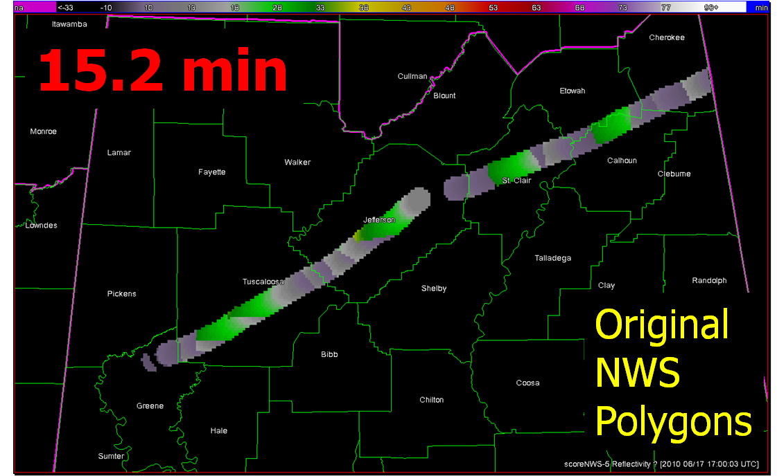
Average Departure Time (dt) = 15.2 minutes
Average False Time (ft) = 39.8 minutes
And recall the animation of the NWS warnings I provided in an earlier blog post:

What if we were to apply the Threats-In-Motion (TIM) technique to this event? Recall from this blog entry that I had developed a system that could automatically place the default WarnGen polygons at the locations of human-generated mesocyclone centroids starting at the same minute that the WFO issued its first Tornado Warning on the storm as it was entering Alabama. I used a re-warning interval of 60 minutes. If you adjust the re-warning interval to one minute (the same temporal resolution of the verification grids), you now have a polygon that moves with the threat, or TIM. The animation:

Let’s look at the verification numbers for the TIM warnings:
CSI = 0.2345
HSS = 0.3493
Average Lead Time (lt) = 51.2 minutes
Average Departure Time (dt) = 0.8 minutes
Average False Time (ft) = 23.1 minutes
Comparing the values between the NWS warnings and the TIM warnings visually on a bar graph:

All of these numbers point to a remarkable improvement using the Threats-In-Motion concept of translating the warning polygons with the storm, a truly storm-based warning paradigm. Let’s also take a look at how these values are distributed in several ways. First, let’s examine Lead Time. The average values for all grid points impacted by the tornado (plus the 5 km “splat”) are more than doubled for the TIM warnings. How are these values distributed on a histogram:


For the TIM polygons, there are a lot more values of Lead Time above 40 minutes. How do these compare geospatially?


Note that the sharp discontinuities of Lead Time (from nearly zero minutes to over 40 minutes) at the downstream edges of the NWS warnings (indicated by yellow arrows in the top figure) are virtually eliminated with the TIM warnings. You do see a few discontinuities with TIM; these small differences are caused by changes in the storm motions at those warned times.
Moving on to Departure Time, the average values for all grid points impacted by the tornado (plus the 5 km “splat”) are reduced to nearly zero for the TIM warnings. How are these values distributed on a histogram:


And geospatially:

With the TIM polygons, the departure times across the path length of both tornadoes is pretty much less than 3 minutes everywhere. Whereas, the NWS polygon Departure Times are much greater, and there are some areas still under the NWS warning more than 30 minutes after the threat had passed.
Finally, looking at False Alarm Time distributions both on histograms and geospatially:


There are some pretty large areas within the NWS polygons that are under false alarm for over 50 minutes at a time, even though these warnings verified “perfectly”. In comparison, the TIM warnings have a much smaller average false alarm times for areas outside the tornado path (about a 42% reduction). However, there are a number of grid points that are affected by the moving polygons for just a few minutes. How would we communicate a warning that is issued and then canceled just a few minutes later? That is food for future thought. I’ve also calculated an additional metric, the False Alarm Area (FAA), the number of grid points (1 km2) that were warned falsely. Comparing the two:
NWS FAA = 10,304 km2
TIM FAA = 8,103 km2
There is a 21% reduction in false alarm area with the TIM warnings, much less than the reduction in false alarm time. The reduction in false alarm area is more a function in the size of the warning polygons. The WarnGen defaults were used for our TIM polygons, but it appears that the NWS polygons were made a little larger than the defaults.
So, for this one spectacular long-tracked isolated supercell case, the TIM method shows tremendous improvement in many areas. But there are still some unanswered questions:
- How will we deal with storm clusters, mergers, splits, lines, etc.?
- How could TIM be implemented into the warning forecaster’s workload?
- How would the information from a “TIM” warning be communicated to users?
- How will we deal “edge” locations under warning for only a few minutes?
Future blog entries will tackle these.
Greg Stumpf, CIMMS and NWS/MDL