GREMLIN versus Radar

Overall, GREMLIN performs fairly well with the zoomed out shape of the precipitation returns compared to radar, but perhaps a bit larger extent. Picks up on a few heavier cells moreso versus heavier stratiform rain. Since the overall radar mosaic of GREMLIN looks so close to current radar, it would increase my confidence in using it for the big picture (especially if the radar data were to go out for some reason).

GREMLIN vs radar reflectivity 2010Z through 2058Z 20 May 2024
Focusing on the two cells in the west… it’s interesting because it looks like GREMLIN resolves both cells fairly well initially but follows the evolution of the southern cell for a time a bit better than the northern cell. In this instance, I couldn’t say much about confidence (sort of cancels out). But, it would be important to make sure to take into account the environment and also maybe use multiple tools in addition to GREMLIN to help with confidence.
Zoomed in GREMLIN vs radar reflectivity 2010Z through 2058Z 20 May 2024

Forecaster Cumulus

Waiting For Convection To Go

While looking for thunderstorm initiation, my eyes are turned towards anything that informs me whether convection will develop further or decay. There have been several things to note while waiting for instability to move into the region.

The main forecast challenge is the favorable ingredients to produce severe convection has to be advected into the region. The WRF with PHS data demonstrates that initial convection intensifies later in the day as better instability arrives across the region on the bottom right panel. This also corresponds with better dynamics noted across the others entering eastern Colorado. Model reflectivity on the bottom right increases as a result of better forcing over time. Until then, it’s monitoring at what point things actually start turning the corner and using the new tools available to find that point.


And so far, the things found have been what it’s not. So here are some things being observed in this period of waiting. At the beginning of the day, one of the things I noticed was related to the OCTANE detecting warming and cooling. As clouds moved off snowy foothills, it was apparent on the viewer where water clouds appeared warmer than the snow surface, and caused a pocket of cooling to appear on the eastern foothills once satellite could see the frozen snow, and warming whenever a cloud layer shifted overhead obscuring the snow. In the middle of convection, this would probably be irrelevant, but just a thing to note while we wait.


I like the idea of mashing together several products that we’re testing at once. So, I’ve applied the LightningCast, WRF with PHS CAPE, and GLM. The idea will be to monitor how the storm is pulsing compared to with what information is provided from PHS. It’ll also help track in what area LightningCast is lighting up and whether it is heading towards a favorable or unfavorable environment. With LightningCast aiming for detection within an hour, it began highlight a cell that corresponded with favorable instability. The combination of these two helped me hone in on this cell as being more likely to produce lightning than a similar LightningCast to the northwest. The 10% contour formed just before 20z, and steadily increased leading up to the first flashes on GLM roughly 30-40 minutes later. Nicely done!
While waiting, a small cell caught my eye. The area was almost completely clear, and showed very dark on visible imagery, to being cloud covered near Palmer. This made it appear this was about to blow up, but then you can see the OCTANE tool quickly reverse course once it becomes clear it will not develop and it begins to come down on visible.
Off to our west, there were a couple cells. Analyzing the tool on GREMLIN, the southern cell was less intense on GREMLIN compared to MRMS, and reversed for the storm to the north. However, neither are particularly intense, but it does indicate to keep a watchful eye and use other products like GLM to assess intensity.
As we move past 22Z and how the WRF with PHS data, it has done an excellent job forming the convection near the Denver Airport, but by Shamrock/Leader/Adena, that cell has not formed. This is creating a region of spurious data due to convective feedback. Some of the model appears to drive convection by the cold pool from this storm meeting instability advecting in from the east. It then focuses on this cell over the others, but this appears unlikely to verify at this point given how it is performing so far. By 00z, the 0-3km SRH bullseye creeps above 1600 m2/s2 moving towards Fremont. I won’t put the image of the new cycle that just came in, but the bullseye got more dramatic over 2000 m2/s2. Not sure if how much those magnitudes are in the realm of possibility.
One of the interesting behaviors lately has been a few storms forming in the cold pool as we approach 23Z. There has been convection developing on the western side of decaying cells. This has me thinking about how this would look for backbuilding precipitation. Would it have this look of the cool purples remain anchored in place while reds for new convection continuously appear to upstream that rides atop the areas of divergence? The signals may not appear robust, since there may not be fast storm motions.
Looking back at LightningCast, I have noted the known limitation of the forecast trying to bridge separate pieces of convection. The gap seems quite large though, and I wonder if there may be other means to QC the LightningCast with existing radar without making it slow to process. Or we can trust that the human eye is capable of noting that radar will confirm the lack of reflectivity at -10 C or higher.

That’s all I have today!

Kadic

OCTANE – IR Example of CI and Divergence

Found an example showing the application of OCTANE using IR – convective initiation and eventually divergence. Can see this in the color differences in the speed (NE) and direction (NW/SE) IR panels in the top left and top right in the image below, but also the cloud top divergence panel (bottom left). Could use the products alone (especially the direction panel), but I like seeing all three together to have the whole picture.

OCTANE (from AWIPS) using IR showing CI and divergence (20 May 2024)

Forecaster Cumulus

GLM Probabilities of 10 Flashes Followed By More Intense Convection

While more intense convection has been slow to develop in southeastern, the LightningCast probability for >10fl started to increase as synoptic forcing improved. About 13 minutes later (image below), the GLM flash extent density increased to around 30 flashes per 5 minutes, which was well signaled by LightningCast. While the probability depicted by LightningCast wasn’t terribly high (to around 15 percent initially), the upward trend in probability did signal the potential.


-Joaq

Color Curves Reign Supreme in OCTANE Products

OCTANE Night Direction and Speed Products

Today’s challenge was to try and see if we could draw out features better in both the OCTANE Night direction and speed products. The night products rely on IR satellite imagery and the lower resolution washes out a lot of the features we can normally see in daytime imagery. The easiest way to try and attain this was to first play around with the color curves in the IR brightness temp (CH-13-10.35um) overlay. Adjusting the colormap starting with black at 40 to white at -45 back to black at -80 then interpolating the ‘Alpha’.

Original OCTANE Night Color Curve – Direction

New OCTANE Night Color Curve – Direction


Original OCTANE Night Color Curve – Speed


New OCTANE Night Color Curve – Speed

HWT Day 4: Freed from MCS

Supercells of Midland, TX

As always, the first thing I did when I sat down this afternoon is AWIPS is immediately start fooling with the color tables. Today’s chimera was a combination of OCTANE Cloud Top Divergence and Cooling with MRMS Reflectivity at -20° C. MRMS was modified to only show values that exceeded 40DBZ to interrogate the relationship between cloud top divergence and highest reflectivity. At this point in the week, I’m throwing science against the wall to see what sticks.

My primary radar was MAF with MESH overlay for estimated hail size greater than two inches. Taking a look at MAF sounding this morning, it’s giving me big hail vibes and I wanted to see how MESH correlated with the convergence signatures from OCTANE.


Spice Level: Cayenne  🌶🌶🌶

At first glance of the Midland sounding I’m drawn to the fact that we have a substantial amount of CAPE (~3000J/KG). A little bit of a CAP at 700MB should be quickly overcome as there is a pretty good clearing in the clouds over most of Midland’s CWA. Lapse rates from 7-500MB is nearly 9C/KM, with a pair of dry layers from 8-500MB and between 5-300MB. Our hodograph, while not perfect, is generally a straight line from left to right.  Effective shear is around 45kts. My conclusion: hail. Possibly big hail, and we may have a chance of some splitting cells at some point today.

One of the cool things we noticed that the OCTANE Divergence/Cooling product picked up a splitting super cell around 15 minutes before the radar did. This was really cool and could be an excellent way of identifying splitting supercells and getting out warnings with an extra 10 minutes of lead time.


The inverted images on the OCTANE DIV/COOL product I think does a good job of highlighting areas in which those storms have entered an environment in which they are ready to split. Studying splitting supercells using sat imagery may give us abetter understanding of when storms are more likely to split.

Thanks for accepting me into this HWT! I got a lot out of it and am excited for what satellite can do for ops in the future!

-Charmander

Making it how I like it- A look at different ways to view OCTANE

Below I want to provide some (4) examples of how I wanted or needed to adjust the OCTANE products to make the displays work best for me.
The two below graphics are of the octane direction product. Notice a difference between the two? The one on the bottom should look more sharp. The difference was normalizing the reflectivity of the red visible satellite channel (CH 2) so that the visible imagery comes out sharper. While done automatically o nthe CIRA slider product, it is not yet functional in AWIPS. This is a reminder that if you are using this product in AWIPS (currently) you need to keep manually updating the sharpness.


Here is another example from the speed product where the top image has not been normalized for the zenith angle and the bottom one has been.


This is definitely a feature that I would want to see included before release on AWIPS because while it is not an inconvenience to adjust it, it is easily forgotten in the midst of warning operations.
Example two of making OCTANE look how I like it.
While trying to learn how to interpret the direction product from OCTANE, I was offered the barb alternative available on the CIRA slider. I was not a fan. While the direction product has been the most difficult to interpret


Example three of making OCTANE look how I like it.

Here I changed the bottom left of the octane 4-pannel. This was the Divertgence and cooling product. I was discussing with the developer how my eyes were tiring looking at the cyan field after a shift (bottom image) and that I thought it was washing out the divergence and the cooling fields some. We remedied this by lowering the saturation on the cloud top height field. I thought 45 percent saturation was preferred because I was cautioned that going any lower would not allow a forecaster to differentiate the cooler convective cloud tops and the white Red-visible cloud tops of lower clouds.


Example four of making OCTANE look how I like it.
I was struggling to interpret and use the direction tool, which I believe to be on me and not on the tool. To try and remedy this, I was playing around with the color scheme of the direction parameter. The top display shows the regular color scale from the developers and on the bottom is the one I provided input to create. The reason I went for this color comboe


-Kilometers

Using GREMLIN/OCTANE alone to Assess Mesoscale Conditions and Monitor Storm Intensity

Quick MesoAnalysis Comparison

Using the OCTANE speed sandwich we were able to quickly assess the SPC mesoanalysis of upper level winds entering our CWA. The SPC mesoanalysis indicated upper level winds of around 100 kt spreading through the Big Bend part of TX ahead of an upper level trough. This analysis was quickly confirmed by the OCTANE speed sandwich data. High cirrus was streaming into the region ahead of ongoing convection and was sampled at 105 kt in the OCTANE data. This real time analysis supports the objective analysis by SPC and yields higher confidence in the data.
Image 1: The OCTANE speed sandwich showing velocities >100 kt across the Big Bend region of TX spreading into the southern parts of the SJT CWA.
 
Image 2: The SPC mesoanalysis of 300 mb winds indicating a 100 kt upper jet spreading into the Big Bend region of TX.
 
 
GREMLIN/OCTANE to Monitor Convection without Radar
 
We were tasked with monitoring convection across the SJT CWA with an ongoing DSS event in San Angelo. While convection remained to our west and east, there were a few thunderstorms that developed across the northern part of our CWA. We did not have radar data, but were able to use OCTANE speed/direction products to assess storm strengthening trends though the afternoon. In combination with the GREMLIN radar emulation, we were confident in our assessment of storm strength even without supporting radar/MRMS data.

Image 3: The two storms of concern are to the north of San Angelo and are noticeable in the speed/direction imagery. There were a couple notable periods of cloud top cooling and increased divergence, but the uniformity in the mid/upper level wind speeds and direction increases confidence that these storms are either maintaining intensity or weakening.


Image 4: The GREMLIN data showing two distinct cells across the northern part of the CWA. These storms maintained intensity for about 30 minutes without any noticeable change in the OCTANE data. As the OCTANE wind speeds decreased, the GREMLIN data showed that the storms diminished overall.

 
These two products (OCTANE speed/direction and GREMLIN) used together can increase confidence in warning/decision makingparticularly in the absence of radar/MRMS data. While there are some latency concerns with GREMLIN, further testing of these data should be continued.

Making Four Panels into one with GLM Data Quality

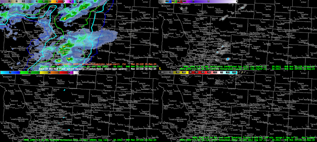
When we started the testbed the GLM products were being displayed on a a four panel display (GIF. 1). This display works fine to find areas of poor data quality, like where the white and yellow pixels pop up in the top left of image 1. However, in it’s four panel setup, I felt that the display took up too much space. As a group, we worked to merge them into a single panel.


Image 1: GLM data quality suite, with Data Quality in the upper left, Background image i nthe upper right, Day cloud phase in the bottom left overlaid with GLM flash density, and the Ch.2 Red visible in the bottom left. Please note that the background image has an erroneous color curve on this display; it is usally closer to the red visible in brightness.

Below are examples of single panel displays created. In general, folks preferred the display in GIF two, but I thought there were ways for ways to merge the two designs. My desire would be to have the GLM background image provide texture to the data quality product like in GIF three, but to have the data quality product maintain the sharp good/bad color curve shown in GIF two. Even more preferred is a color bar like in GIF four, where the “could be poor” but not nearly or fully saturated values are highlighted in another color (red in this example).

GIF 2: A single panel version of the GLM suite of products. The GLM background image is the background and unchanged. The GLM Flash Density is overlayed unchanged next. The GLM data quality product Is overlayed on top and has been altered such that the nearly saturated and totally sutured bins show up as pink pixels.
GIF 3:  A single panel version of the GLM suite of products. The GLM data quality product is plotted unchanged. Overlayed and the reason for the blue-ish hue is the GLM Background Image which has been made transparent in the black.

GIF 4: The same as Gif 2, except that the poor-ish data quality from 10 to 40 percent is highlighted in red.

What did you think was the best single panel layout?


I also want to share something about the data quality scale (Img. 1). In its current format, the scale is not intuitive. Good data quality ranges from roughly 50% to 90% on this scale (blues and greens). Poor data quality is from 50% to 10. Then, the poorest data quality is white and yellow, and represents nearly and full saturation. I was ready this wrongly, such that 50% to 90% was poor because it was closest to the nearly and fully saturated parts of the scale. Instead, it is reversed. Before this product goes to operations, I would want to see the color bar made more intuitive.

 Image 1: GLM Data Quality, focusing on the scale in the upper left. Poor data goes from 10%, at worst, up to 90%, then nearly and fully saturated after 90% in the center-right of the scale.

-Kilometers

Columbia SC: Trucks with Food

Protecting the Foodies

A Severe Thunderstorm watch that covered most of Columbia’s CWA was where we concentrated our forecasting efforts today. We found ourselves with no radar and were forced to make decisions on warnings with satellite only. As a result we made some modifications and combined the power of GREMLIN and OCTANE. Here’s what that love child looks like:


One of the issues we had in making decisions based on GREMLIN data was the lack of information it provided. GREMLIN provides a radar emulation and given that it’s a satellite based product it would be nice to see more information in the sample tool of what’s being shown. Values like temperature at highest reflectivity and echotops could be inferred by GREMLIN to help forecasters make better decisions if radar wasn’t available. The other issue we had with GREMLIN was the latency. Products were running anywhere from 15-20 minutes behind the rest of the satellite products that we were using.

A few minutes later we issued our first SVR warning for the eastern edge of CAE CWA for winds over 60MPH and nickle sized hail (sub severe).


As our storm moved out of the CWA we allowed the SVR to expire and took a look at the PHS Forecast model and compared it to the HRRR to prepare for the next round of thunderstorms. But both models seemed to agree that more TSRA was unlikely:


Storms in GSP came together and eventually created a good line of thunderstorms from GREMLIN’s point of view. GREMLIN was picking up some areas of higher DBZ and a lightning jump through the line was consistent with what we’d expect to see on radar for a SVR. A warning was issued on a line of storms:


The line started to fall apart as soon as it hit the CWA border. We allowed the warning to expire without feeling the need to re-issue downstream. After that, storms no loner had access to some of the peak daytime heating that allowed them to become sub-severe during the afternoon.
-Charmander