USING THE GLM BACKGROUND & DATA QUALITY PRODUCT (DQP)

Here is an inspection of the GLM Background and DQP to get a feel for the reliability of the GLM flash extent density (FED) data.  Below you will notice a four panel display with GLM quality on the upper left, the GLM background image on the upper right, the GLM flash extent density on the bottom left, and the 0.64 visible satellite imagery on the bottom right.

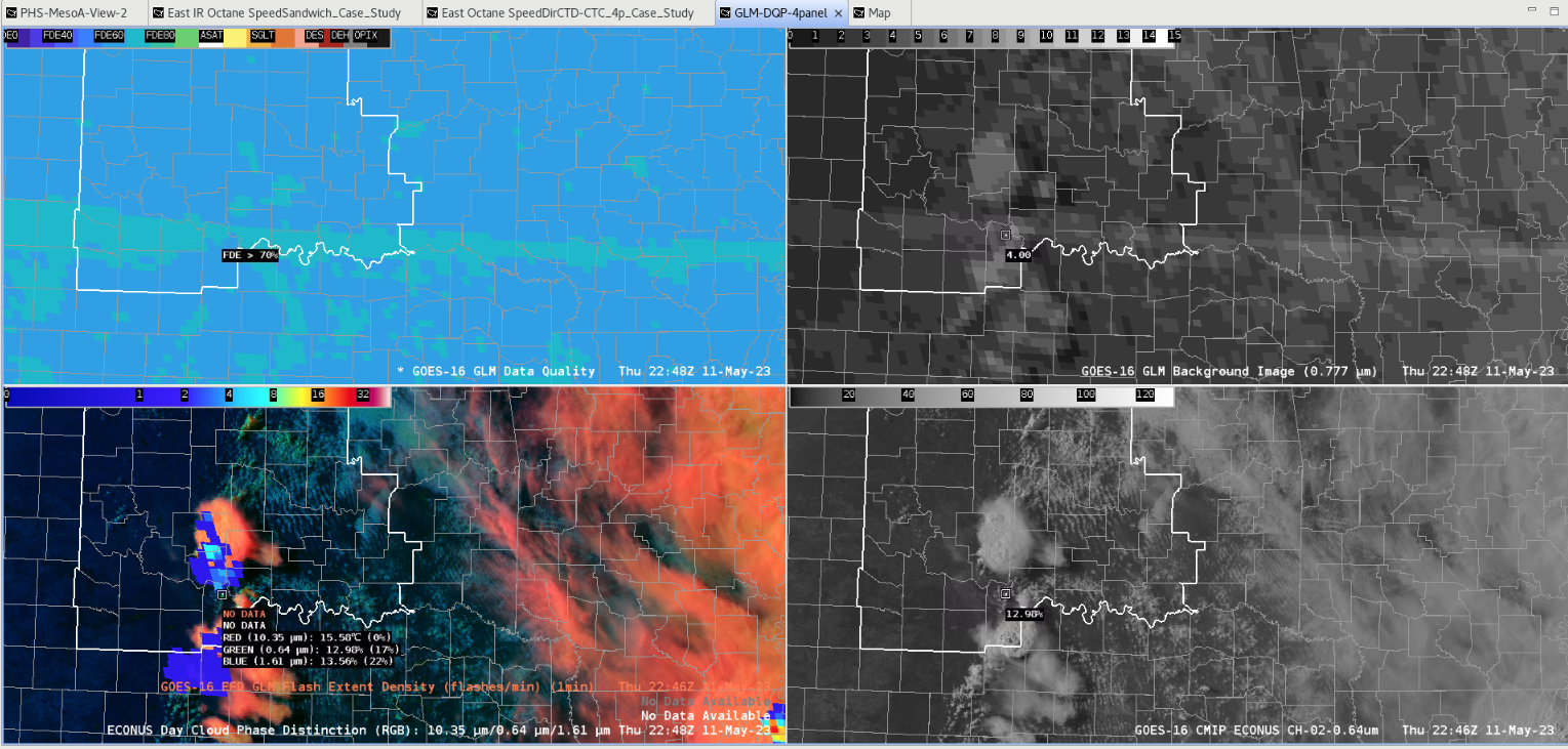
You should be able to make out a sub-array boundary going horizontally (upper left panel) AND also in the GLM background image (upper right panel). In the top right and both bottom panels you can make out strong convection taking place with two cells (one in the southern portion of the CWA, and one just to the south and along the CWA border). I did my best to put my AWIPS cursor along the sub array boundary.  You will notice in the bottom right corner that the cursor is actually between the two convective cells.  However, you can make out some weaker GLM FED signals along the sub array boundary where you are in-between the two cells.  This demonstrates uncertainty around the validity of the GLM data just to the south of the northern convective cell.  They are weaker GLM FED returns with only a minute or so of lag among the various elements being shown. And with these returns being upshear of the northern cell it is likely that this is not related to anvil lightning activity.  In this example with the relatively close proximity of the two cells one cannot be sure that the GLM data is incorrect, but with the GLM returns showing up on the sub array boundary this does increase uncertainty around this portion of the GLM flash extent density data.

Below is the same four panel, but with the ground based earth lightning detection network showing as verification for lightning.

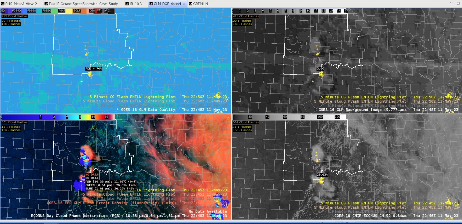
Notice how there is a weaker return with the GLM flash extent density on the southern portion of the northern cell, but the detection (lower right panel displays best) shows the lightning verification within the convective cloud shield and not past the southern portion of the northern cell like in the GLM FED (bottom left panel).  This demonstrates that one should question a portion of the GLM flash extent density output. By using the GLM data quality and background products one can get a better feel for where the GLM FED data may not be reliable.  If something doesn’t make sense with regard to GLM output then this product can verify that suspicion.

– 5454wx

GLM Data Quality Under the Shadow of the Anvil

As we are watching a cluster of thunderstorms develop across Nebraska, we’re in a region where GLM may not be able to most efficiently detect flashes in the region. However, underneath the shadow of the cirrus blow off, the flash detection efficiency increases, and the stoplight colormap begins to suggest that the data quality is better. Perhaps this offers a bit of hope when forecasting charge moving along with the anvil.

Kadic

Storm Hopping Over Subarray

We noticed a change in the storm on GLM as it tracked northeast. GLM seemed to decrease as the storm passed through the subarray region, but the number of flashes remained relatively the same according to the ground network. Knowing the location of this subarray and also comparing GLM to the ground network gave us confidence that the dip in GLM was not due to a reduction in flashes/storm intensity.
Cumulus and Kadic

Learning More About GLM and the GLM-DQP!

Honestly, for warning operations, I am used to using/focusing on the GLM Flash Extent Density and on the warmer color pixels and trends when lighting increases. I also wouldn’t consider myself an expert on lightning – I came into this HWT not having a lot of knowledge on the details of these products, the instrument, and the specifics of lightning. So, I am really grateful that I continue to learn more about this and GLM in general (thanks HWT and SMEs!).

GLM-DQP: It’s really useful to know where the subarray areas are, in case the GLM data looks “funky” (near/at saturation). I feel that this would not only be useful for my “home CWA” but also for when we back up other offices. It was also interesting that we (WFO DMX) found a case today where a storm passed through the subarray line and the GLM FED data pixels looked like it “dipped”, but the flashes stayed relatively the same (or even increased after passing through) when comparing with the ground network.

Forecaster Cumulus

Collection of Day Two Thoughts

Day 2 has featured more convection, and has been a helpful day testing these products and how they help in warning operations. Although I might not feel confident making warning decisions solely based on any of these tools, I think that each tool provides a valuable piece of information.

Pre-Storm

To keep things short here with all the observations, PHS was very helpful today in showing how the QLCS situation would evolved with several areas of embedded rotation. Having CAPE with SRH together showed how these came together, and in conjunction with velocity highlighted rotation updrafts within PHS. This proved to be a helpful pre-storm evaluation. A few storms began rotating, and then everything began rotating as the PHS model indicated.


Observations Related To Warning

The developing squall had a linear appearance at first. As time progressed with more embedded areas of rotation, this became a lot less neatly organized.

Here is a look pre-warning for a tornado warned cell with ProbTor increasing up to almost 40 before moving off the point.


A zoom in on an impressive overshooting top. Sorry for the reverse loop.


Here is a V-notch like structure. Though it doesn’t correspond with a radar V-notch, it does indicate how strong an updraft this was.


And here’s the radar look of that, which appears to somewhat match the configuration seen aloft.
Interesting Signals


One thing to note early was that the PHS forecast had a lot of convective debris lingering in Iowa that was not present in reality. This does not appear to have impacted the instability parameters very much.

We’d mentioned looking at the dewpoints for the tendency for aggressive convection. But it only seemed slightly high compared to reality.

We did have a blob near Sioux City on Gremlin that didn’t really correspond with any signal on radar, and it didn’t seem to have satellite signal to go with it. Not sure where it came from, but we were able to see it was erroneous.


Here’s a look at GREMLIN with waves and wobbles following the GLM lightning.


Here’s another fun look at where it seemed the convection on the northern flank may have affected GLM quality with values decreasing on the north side. Note the reversed image loops.
Here’s an instance where GREMLIN’s max intensity happened before a lightning jump. Unfortunately this is reversed, but GREMLIN struggled to resolve an intensifying storm in the middle of the line.
Here is an example of GREMLIN losing a cell in 3 surrounding cells.

Kadic

Learning the Ropes – GLM DQP Applications!

GLM DQP: learning about its application – where data might be suspect or questionable. Where convection/GLM is along the line/boundaries could be such areas. Although not in Cheyenne’s CWA, saw an example over Cuba of pink pixels (at or near saturation), but could see lightning detection around it. This was an area near one of the boundaries (pink pixels were right along the line).

GLM DQP 1949Z over Cuba 20 May 2024 – pink (at or near saturation) pixels along boundary line


Forecaster Cumulus

GLM Glint in South America / Panama

A glint was observed on various data sources tracking westward across northern South America and Panama between about 1630Z and 2000Z on May 24.

The glint is plainly evident on visible imagery (bottom right) and GLM Background (top right). On the GLM Data Quality, you can witness pixels that reach saturation over South America (directly related to the glint) — but there is also an area of convection that gets to near saturation over Panama. It appears that the most direct sun angle roughly coincides with the mature phase of these thunderstorms over Panama, leading to a period of near-saturation that eventually fades as the convection weakens. Convection can be confirmed by the presence of GLM flashes, but there does appear to be a relative min in GLM flash detections coincident with the near-saturation area.


–Insolation

End of Day 1 Thoughts

Thoughts at the end of Day 1…

The LightningCast product I think would be VERY useful for DSS. Overall, when seeing it perform in real-time, the increasing LC probabilities seem to eventually correlate well with GLM flash density. I look forward to using the DSS form this week and seeing how that works for specific sites.

The GREMLIN product seems to be a great way to see the overall picture of precipitation (say, for a region). I think it struggles with precipitation intensity a bit (>45 dbZ) both for storm cells and for heavy stratiform precipitation. At the “storm” level, I have seen instances of the model not following the evolution well (either too intense or not enough).

For OCTANE, it was easier to pick out an example of CI and divergence with the IR versus the Visible products. I could use the direction product on its own in operations, but I really like having the speed, direction, and cloud top divergence all together in a 3 panel to identify convection.

PHS did a great job today identifying convective initiation when overlayed on visible satellite imagery. I look forward to seeing how this performs in other areas of the country this week.

Still learning how best to utilize the GLM DQP; but, when looking over Cuba, I was able to better understand how it locates areas where the data might not be the best. I hope to learn more about this product through the week and see more examples of its application.

Forecaster Cumulus

Making Four Panels into one with GLM Data Quality

When we started the testbed the GLM products were being displayed on a a four panel display (GIF. 1). This display works fine to find areas of poor data quality, like where the white and yellow pixels pop up in the top left of image 1. However, in it’s four panel setup, I felt that the display took up too much space. As a group, we worked to merge them into a single panel.


Image 1: GLM data quality suite, with Data Quality in the upper left, Background image i nthe upper right, Day cloud phase in the bottom left overlaid with GLM flash density, and the Ch.2 Red visible in the bottom left. Please note that the background image has an erroneous color curve on this display; it is usally closer to the red visible in brightness.

Below are examples of single panel displays created. In general, folks preferred the display in GIF two, but I thought there were ways for ways to merge the two designs. My desire would be to have the GLM background image provide texture to the data quality product like in GIF three, but to have the data quality product maintain the sharp good/bad color curve shown in GIF two. Even more preferred is a color bar like in GIF four, where the “could be poor” but not nearly or fully saturated values are highlighted in another color (red in this example).

GIF 2: A single panel version of the GLM suite of products. The GLM background image is the background and unchanged. The GLM Flash Density is overlayed unchanged next. The GLM data quality product Is overlayed on top and has been altered such that the nearly saturated and totally sutured bins show up as pink pixels.
GIF 3:  A single panel version of the GLM suite of products. The GLM data quality product is plotted unchanged. Overlayed and the reason for the blue-ish hue is the GLM Background Image which has been made transparent in the black.

GIF 4: The same as Gif 2, except that the poor-ish data quality from 10 to 40 percent is highlighted in red.

What did you think was the best single panel layout?


I also want to share something about the data quality scale (Img. 1). In its current format, the scale is not intuitive. Good data quality ranges from roughly 50% to 90% on this scale (blues and greens). Poor data quality is from 50% to 10. Then, the poorest data quality is white and yellow, and represents nearly and full saturation. I was ready this wrongly, such that 50% to 90% was poor because it was closest to the nearly and fully saturated parts of the scale. Instead, it is reversed. Before this product goes to operations, I would want to see the color bar made more intuitive.

 Image 1: GLM Data Quality, focusing on the scale in the upper left. Poor data goes from 10%, at worst, up to 90%, then nearly and fully saturated after 90% in the center-right of the scale.

-Kilometers

Missing data

Charmander and Kilometers were watching over an event in central Tennessee and employed the lightning cast meteogram. The probability of lightning tool worked (img. 1) great for alerting the event staff to an increase in the lightning threat, providing about 45 minutes of lead time.

I began to monitor the cell for further intensification and any chance that it could become severe. In the background of this work I was also monitoring for lightning activity from the cell. Eventually, the cell did produce lightning. Image two showed the ENTLN product pick up on a series of cloud flashes, with the GLM product showing some light lightning activity two minutes later (img. 3).

Positive for GLM was that the latency was not an issue. What was more of an issue was that the meteogram from lightning cast never plotted the GLM data on the meteogram. If the person working the event shared the meteogram to event organizers, they would assume this was a missed event. Positive though, is that the organizers could be shown the GLM image or ground network data and be assured that their actions were not for nothing. This left us wondering why the meteogram did not show the lightning activity picked up in the vicinity?

We saw that the GLM began showing up when the main line of convection moved through the event space about an hour later than we identified it through alternate means (img. 4).


Image one: Meteogram for the Probability of Lightning product with GLM flash Density.


 Image two: GLM Data quality (upper-left), GLM Background Image (upper-right, Day cloud phase RBG overlaid with GLM Flas Density (Bottom-right), ENTLN observed lighting flashes and cloud-to-ground strikes (bottom-right).


Image three: GLM Data quality (upper-left), GLM Background Image (upper-right), Day cloud phase RBG overlaid with GLM Flas Density (Bottom-right), ENTLN observed lighting flashes and cloud-to-ground strikes (bottom-right).


Image four: Meteogram for the Probability of Lightning product with GLM flash Density beginning at 15:15 local time.


– Kilometers / Charmander