Posted by Geoffrey Stano – NASA SPoRT
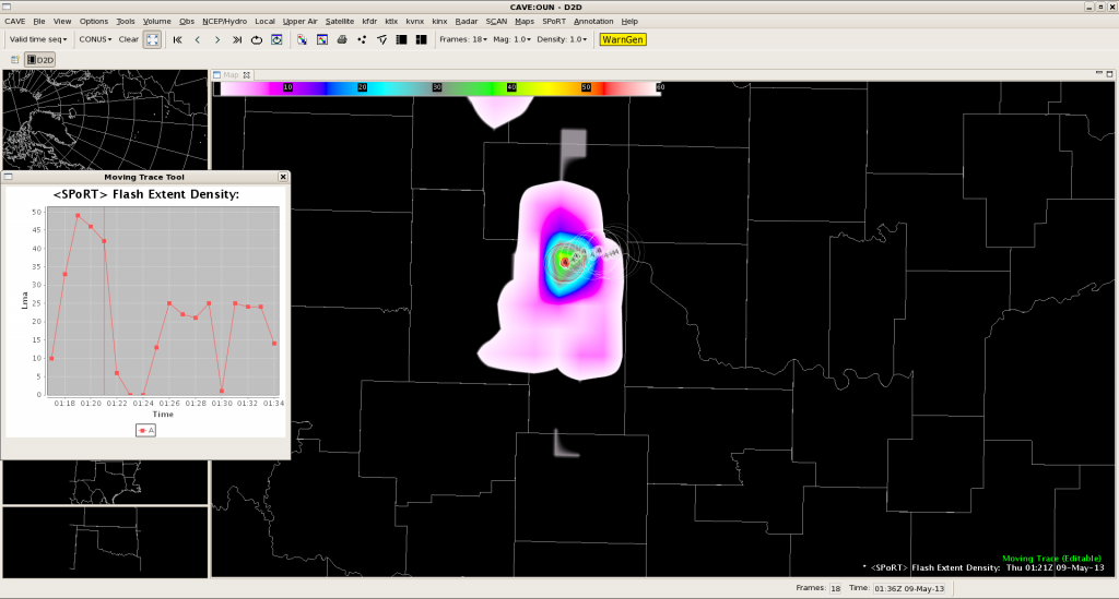
The 2013 Experimental Warning Program (EWP) has offered a great opportunity to test the NASA SPoRT / MDL total lightning tracking tool. Part of EWP’s efforts are to demonstrate future GOES-R capabilities, such as the Geostationary Lightning Mapper. This is being done with the pseudo-geostationary lightning mapper products being produced by NASA SPoRT in collaboration with seven ground-based total lightning networks. With total lightning observations (intra-cloud and cloud-to-ground) forecasters are looking for lightning jumps, or very rapid increases in total lightning activity ahead of severe weather. In the past, this has been done by visually inspecting the PGLM data. From previous evaluations by both SPoRT and the EWP, the number one request was for a way to visualize the time series trend of total lightning in real-time. With AWIPS II and the ability to create custom plug-ins, the first effort for this has been developed and is now here in operations at the EWP. One design feature was to make this a manual tool. In other words, it is the forecaster who selects the cell track and not an automated tracker, which traditionally has difficulty with merging and splitting cells or not activating at the proper time. Once the forecaster places two points, the tracker activates and will create a track based on these points. Each point can be moved individually to adjust the track and the tracker will attempt to maintain the track as new data are ingested. We wanted to evaluate the utility of the total lightning tracking tool as well as its impact on operations. In only a couple days, the feedback has been great. First, here is an example of the PGLM with the total lightning tracking tool this evening.

Overall, feedback has been very positive as forecasters have appreciated being able to visualize the time series instead of creating a mental picture. Also, the time series plot is pinned to always be on top, which prevents it from being lost behind the D2D display. Also, the feedback has been very constructive to help improve the look and provide ways to minimize the time impact. Some of the commentary has focused on modest improvements to the layout and look.
- Add a minimize button to the time series display pop-up.
- Have the time series trend color match the active cell point color for the track.
- Have a way to change the default size of the cell point radius of influence (which determine how much lightning data to query).
The feedback also has included very interesting options to save time in implementation.
- The tracker initiates after two points are plotted. However, it attempts to extrapolate the cell track after placing one point. This results in the cell points being very spread out. Suggest waiting to extrapolate the track until after two points placed.
- Also, when the storms are more discrete, instead of using individual cell points created a small “domain” around the storm cell of interest. The forecaster selects a “polygon” of where the storm will be and the tracker selects the PGLM value within this domain at each time step. This may be able to be done by using the tools similar to how forecasters plot a warning polygon as well as how that can be edited. Furthermore, the storm motion could be added to further aid the plot. The big advantage here is that this polygon may be much quicker to place than several individual cell points.
All of these are very good suggestions and this feedback will be taken back to see what can be implemented. The polygon suggesting is very interesting to consider, while the current cell point method would be most viable in a multi-cellular environment. Additionally, this feedback has been very useful in that it helps refine the total lightning tracking tool ahead of its next evaluation as part of the Operations Proving Ground later this summer.
Tomorrow should be another good day to gather additional feedback.

