Waiting for CI – Looking at PHS

Anticipating most of the activity, should it develop, to begin in the next couple of hours in the western/southwestern portion of ABR’s CWA. However, I wanted to take a quick look at PHS to see some of the environmental parameters and how it relates to what’s going on now (and maybe later).

PHS Composite Reflectivity overlayed onto Visible Satellite (left) and MRMS Reflectivity (right)

For the above loop, PHS has perhaps the general idea of CI from the convection from earlier this afternoon, but struggled a bit with placement of some the stronger cells in the east. However, I think it may have a good handle of the lull we’re expecting until later this afternoon. It will be interesting to see whether we get storms in the line of pearls like it’s suggesting.

PHS MUCAPE at 20Z


SPC (RAP) MUCAPE at 19Z

Comparing the MUCAPE from SPC’s Mesoanalysis page (RAP) and PHS, it seems like both agree on ~2000 J/kg nosing into the southwestern portion of ABR’s CWA. This is the area that we are monitoring for initiation over the next couple of hours.

Forecaster Cumulus

Tags: None

PHS and HRRR for WFO ABR

As of 2030Z, storms have already initiated near Pierre SD in the KABR forecast area.

Both PHS and the HRRR appear to be too slow on forecasting convective initiation in this area.

The first image is PHS comp reflectivity (overlaid on PHS SBCAPE) valid at 22Z.

The image below is HRRR comp reflectivity valid at 22Z. Both PHS and HRRR are depicting convective initiation between 21Z-22Z, but as mentioned, storms have already initiated as of 2030Z. PHS and HRRR both show initiation in slightly different locations, but in real life, initiation occurred near both indicated locations.

Both PHS and HRRR also depict that stronger cells will develop near the SD/ND border in the 23Z-00Z time frame. The next two images show this in the parameter space. The first image shows Sig Tor Parameter on PHS (valid 23Z) and the second image is the same thing, but with PHS comp reflectivity overlaid on top.

Of most note is the simulated storm northwest of Ashley ND, which not only has the highest simulated comp reflectivity value, but also significantly impacts the storm-scale environment (as depicted in the model by an unrealistic significant localized bullseye of STP). As a forecaster, although I recognize these STP values (~10) are likely spurious, I can use their presence as a proxy to the fact that the storm simulated by PHS in this location is likely very strong and modifying its environment in a way that only significant supercells are able to do.

— Insolation

Tags: None

LightningCast and DSS

Monitoring convective development over the southwestern portion of the ABR CWA, where we are providing DSS support to a Fishing Derby (yellow range ring – 10 miles). From this data, I would be able to let an EM know that we’re noticing an uptick in lightning probabilities due to storm cells developing to the south/southeast of the Derby and moving northeast. These are not severe at this time and no lightning has been observed as of yet. However, currently, probabilities of lightning within 10 miles are between 40-50%. If I were to use LC while at an on-site deployment, I would have both the map view (first image/loop below) and the graph (second image below) up to show what I am looking at, but especially the map view to give context to the graph.

LightningCast in “map view” showing probabilities of one or more flashes (as an image, not contoured)
LightningCast Dashboard showing lightning probabilities at DSS point (Fishing Derby, Aberdeen, DS)

UPDATE # 1 – Lightning has been observed! From when the 10% contour (10% chance of 10 or more flashes) first popped up (red contour north of Lyman) at 2010Z, it was 10 minutes until GLM and the ground networks observed flashes. It was 5 minutes later when ground networks observed CGs.

LightningCast – time of first 10% contour (red) 2010Z


LightningCast – GLM and ground networks observe flashes 2020Z


LightningCast – Ground networks observe CGs 2025Z

In terms of lead time, I crafted a DSS message between 310-315pm (seen in the first paragraph above this update) and the first flashes were observed at 320p and CGs at 325p. Therefore, this gave a 10-15 minute lead time.

UPDATE #2 – Below is a snapshot of the LightningCast Dashboard showing the above mentioned GLM flashes within 10 miles.
Forecaster Cumulus
Tags: None

How is GREMLIN Doing? Storms Form Sooner Than Expected.

Took a look at GREMLIN to see how it was handling the convection, as storms have developed a bit earlier than expected. It’s doing a great job with the overall picture of the line of discrete storms (formation and placement), but perhaps not as much with the intensity of those individual storms.

Reflectivity from KUDX on the left, GREMLIN in the center, and MRMS on the right


Forecaster Cumulus

Tags: None

Reviewing Conditions Between the RAP and PHS

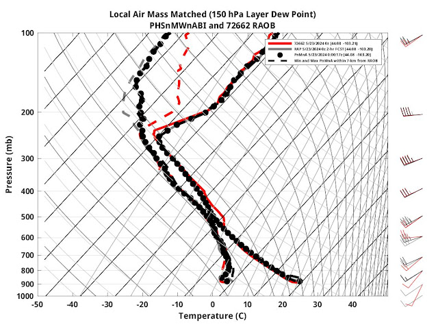
The PHS WRF will offer a unique means to compare RAP analysis and instability parameters. When observing what conditions were like in the PHS, it was noticed that the inclusion of satellite data resulted in drier conditions being observed at the lower levels across western Nebraska.

Satellite viewing of drier weather also corresponded with warmer temperatures across western Nebraska at the surface.


Now how does this look in comparison to various model fields in the RAP. On the bottom left are near surface dewpoints in the PHS, and on the bottom right is the RAP. Carrying forward into the simulation, the values for dewpoint were about 1-2 C below the RAP analyzed forecast. This corresponded better with surface observations within the area. Where the RAP had lower 60s lifting north, these have not been observed near surface stations at the same time. (Note color tables are different. Attempt to get this again was unsuccessful due to CAVE crash)
Here is the same post, but with the CAPE contours now shaded instead with the contours of dewpoint in Kelvin. The lack of a gradient in dewpoint conditions was more representative of the ground truth observed at different ASOS stations.

As far as the temperatures went and how it affected instability, you can also observe the RAP analyzing a cooler pocket, and it likely seems to be the result of the coarse model struggling to capture the terrain across western Nebraska.

What’s interesting is that the instability parameters are not completely different. The reason could perhaps lie in the observed data suggesting a warmer layer aloft. However, the RAP analysis did not differ significantly from the PHS data at 00z.

If you also look, the PHS also has a broader area of instability to the east compared to the RAP. This is where the PHS indicated higher moisture content, and it may be able to destabilize the region more efficiently as a result.

Finally, despite the drier air in comparison to the RAP, it indicated convective initiation about an hour earlier. Using the the forecast helicity and updrafts at 500hPa, one can see that initially pulse convection with minimal rotation should encounter an environment of increasing helicity. We shall see what comes out of this.


For forecast areas that may not have the benefit of features like WoF or other tools to analyze environmental conditions, looking at how differences in the satellite incorporated data and RAP mesoanalysis can help forecasters weigh environmental conditions and what they see from the RAP.

Kadic

Tags: None

Comparing OCTANE Day and Night Products with KSJT Convection

Wanted to make some observations comparing the day and night versions of OCTANE with convection in the KSJT forecast area. This is at about 1837Z.


For the most part, want to compare the speed product (left side) with the storm near Taylor County (bottom left part of the image). The day version is in the top left, and the night version is in the bottom left. There is detail in the day version that does not carry through to the night version. Of note: the anvil-top cirrus (slower motions) do not show up on the night version. Also, the magnitudes of the north and south lobes of higher speeds are muted somewhat on the night version.

Also want to note that the night version of the direction product (bottom right) shows a more significant shift in direction than the day version (top right). This is most evident with the larger shield of clouds over the top right part of the field of view, where more orange colors (about 200deg) are showing up on the northwest flank than in the day version (210deg-220deg). This is also evident somewhat on the storm in the bottom left part of the image.

It was also noted that overshooting tops in the night speed product appear as dark spots, which appears to be related simply to the IR  depiction of the storm. This is not a problem, as it draws the eye to the overshooting top / strong updraft.

–Insolation

Tags: None

Analyzing Clusters, Anvils Carrying Charge North, Final Checkup on LightningCast

Working on the DSS for the PGA tournament, one of the more frustrating features was how thunderstorms well outside the range of the event produced lightning. About the time one DSS image was sent, there was a lightning flash that occurred well north of the primary cluster and near a very weak area of reflectivity.

However, this has been the story for much of the day, where intense convection has been to the south and weaker cells to the north are still managing to produce lightning. Below is the probability of exceeding 10 flashes on GLM, with GLM and MRMS at -10 C to highlight how weak the convection was to the north. The fact that reflectivity was barely at 25-35 dBZ would suggest little potential for lightning.


Analyzing the RGB channels for lightning, one can see this evolution well. With more intense updrafts producing several flashes on GLM, they appear yellow. To the north, where it appears the anvil is carrying charge north, the flashes are very long. From a DSS perspective, this can be frustrating when communicating the potential for high impact weather when all that one gets are sprinkles and rumbles of thunder. Still, the RGB channel can be very helpful in delineating these features, but would also be a helpful means to suggest that the northern convection may not develop quite as much. The 50dBZ echo tops are intended to help highlight the stronger storms. Note how a few pixels of 50dBZ echo tops at best appear in the blue, while the larger cluster of taller storms have the younger convection. This also helped me consider parallax as well. Overall, I really like the potential for lightning characteristics divided into this RGB would be helpful in pulse convection.
And then later, the LightningCast began to behave a bit more oddly. Perhaps these situations cause it to become bouncy. Although, you can almost see these dips in the flashes on the chart as well. At this stage, I feel like I could tell the poor folks playing above par at the PGA tournament and taking forever that they can pack up their clubs and head home, because at this stage, the lightning is here to stay.
Outside of the one flash of lightning that took place over the event about when values crept upwards towards 50 percent, there was a flash. However, values had been hovering around 30-40 percent for much of the day. Values crept even higher, and yet there were no flashes nearby. It seems whatever convective debris left the region, and then the forecast became better overall.
Kadic
Tags: None

LightningCast Imagery Over Vis Satellite

One option that was experimented with for viewing LightningCast data was to use an image overlay on to of visible satellite imagery. Here is an example.


The underlying image is GOES-E meso sector visible imagery (channel 2). The overlaid image is LightningCast East probability of 10 flashes.

To get the image to look like this, the following changes were made to the LightningCast image.

1) In “Edit colors”, fill everything up to about 3% with zero. This ensures that there is no overlay to areas where LightningCast probabilities are very low, and the underlying visible imagery shows through cleanly.

2) In “Imaging”, change the Alpha value to about 25%-30%, and select “Interpolate Image”. I also liked increasing the brightness from 50% to around 60%-65%.

The end result is a display that draws your eyes to the convection with the greatest lightning probabilities, without being as busy as the contours. You could easily overlay extra information over this image, such as GLM, ground-based lightning, or environmental parameters.

–Insolation

Tags: None

Tracking Storm Strength With GLM and OCTANE

The GLM RGB, combining flash extent density and minimum flash area, highlighted the intensity trend of a cell in the northeast corner of the FWD CWA. The yellows of the RGB also corresponded with the uptick of cloud top cooling signatures shown from the OCTANE product. Using these products together I was able to track the intensity of thunderstorm, which took another uptick towards the eastern border of the CWA. The GLM RGB is definitely a useful tool in reading both the characteristics of the flash length and the flash density.
The OCTANE cloud top divergence product here is overlaid atop the visible satellite imagery with the cloud top cooling product, which may look a little messy to look at at first glance. After some practice with the product I was able to learn to pick out both the cooling and the divergence in a strong convective cell. In the third image I did remove the divergence product to have a good look at the cloud top cooling and visible satelitte signatures. After going back to the combination of the two however I found it easy to read what was happening among both the divergence and cloud top cooling with both displayed. I did like having cloud top cooling displayed on top of the divergence product as the divergence product was broader spacially and it made more sense to have the smaller scale cooling signals pop up above the divergence display.


-Joaq

Tags: None