

LightningCast
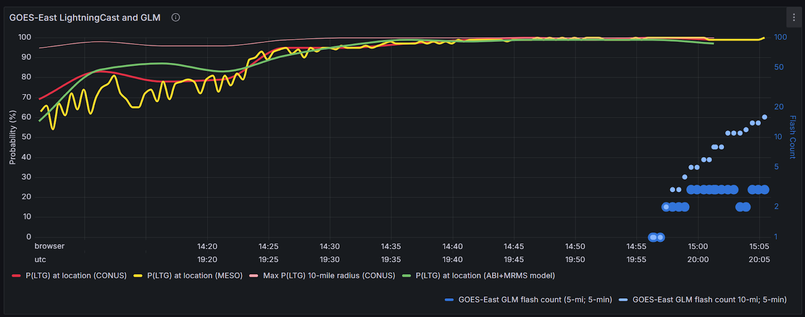
The LightningCast contours didn’t provide much insight due to high probability (>90%) of lightning pretty much the entire event. However we were able to utilize the dashboard for a DSS event. In Figure 1 below, the first thing I noticed was that the first lightning flash was recognized at approximately 2:57PM CDT where both v1 and v2 showed 90-100% probabilities. Looking back within the past hour at around 2:05 PM (not shown in the image), probabilities of lightning occurring within the next hour were approximately in the 50-60% range. It makes sense that the probabilities would increase with shorter lead times, however if this were being utilized for a DSS event and a partner was briefed at 2:05pm, they might decide to take a risk and hold off on sheltering since the probability is only 55% (therefore giving them a 50/50 chance in their eyes). Whereas around 2:20 PM when the probabilities started increasing to 80+%, there was only about a 30 minute lead time at that point. So the DSS events that require additional lead time due to further sheltering options or larger crowds may not be able to fully shelter by the time the first lightning flash occurs.
All that to say, I really like the utilization of this dashboard, however it would need to be used with additional tools (satellite, radar, etc.) in order to provide the most accurate information.
Figure 1: LightningCast Dashboard
Another item that was pointed out was that in Figure 2 below, you can see that the probabilities in v1 (red line) start to decrease around 4:10pm whereas v2 (green) remains above 95%. This could be due to the fact that maybe there were warming cloud tops, however with the ongoing lightning flashes in the vicinity, v2 would be the more reliable tool in my opinion
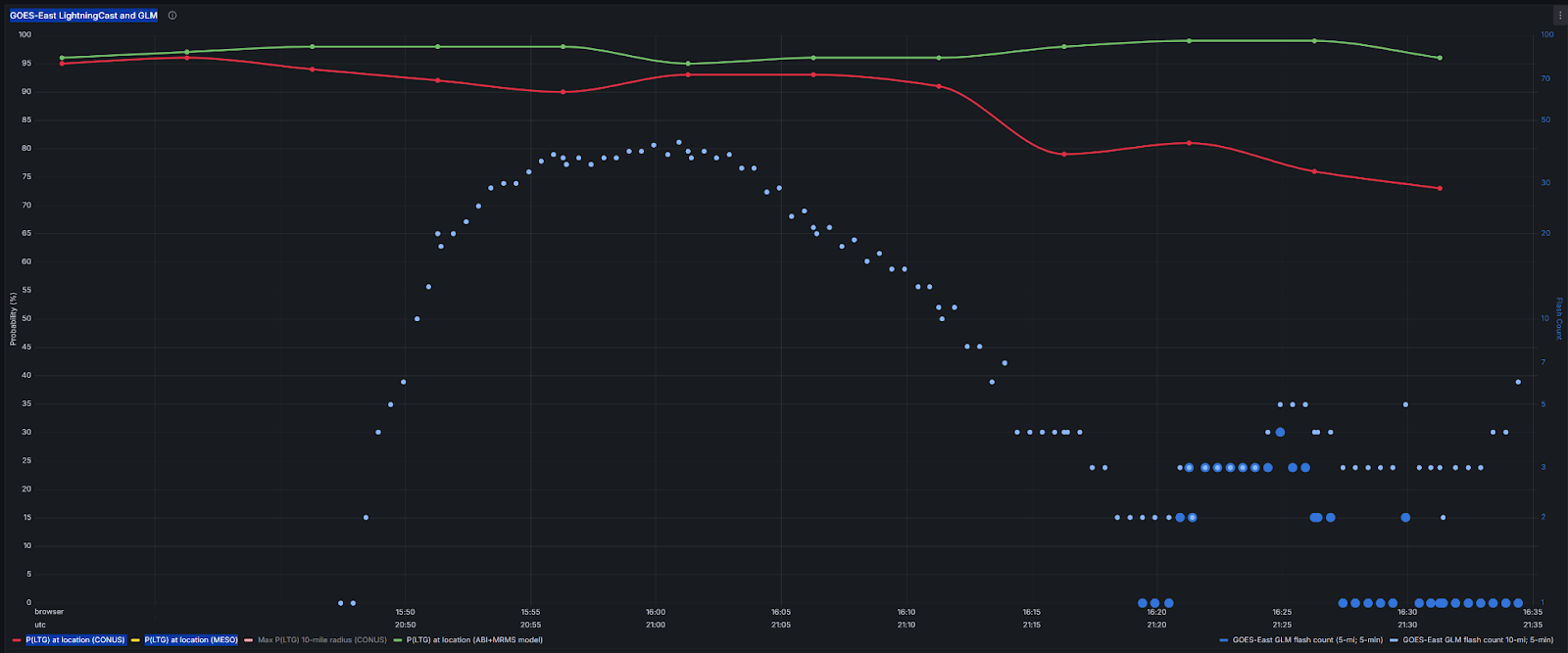
Figure 2: LightningCast Dashboard
Octane
The first cell that caught our attention was the cell in southwest Butler County. Figure 3 below shows the cloud top cooling and cloud top divergence (top right and bottom two panels), and you can see that cell shoot up with decent divergence aloft. We didn’t end up warning on it since radar looked pretty subsevere, however it was a good situational awareness tool to keep an eye on where the stronger storms were located.
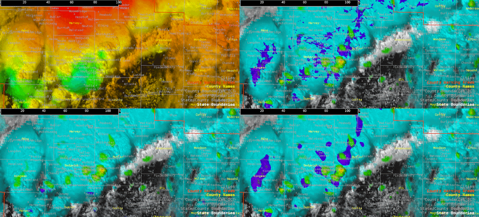
Figure 3: Octane four panel
Later in the period, we did end up issuing two different warnings. The gif below (Figure 4) honestly doesn’t do it justice since I grabbed it a little too late, but there was a pretty pronounced divergence signature that started in Harper County near the city of Anthony that later pushed east into Sumner county. With the divergence remaining consistent and radar showing a pretty good wind signature, we ended up issuing a warning.
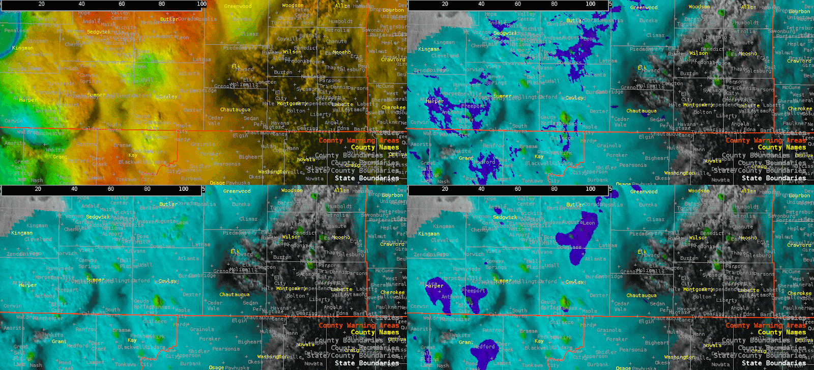
Figure 4: Octane four panel
I messed around with the colortables a little bit in Octane, switching to a stoplight color scale for the divergence and the magenta hue for the cooling. I’m still not fully sure which colorscale I prefer, so I’ll need to continue playing with both. However, comparing the three smoothing techniques for the divergence, I found myself looking at the highest smoothing (bottom right panel) more frequently since the lowest smoothing (top right panel) often looked too noisy. I think for situational awareness and assessing which storms to dive deeper into, the highest smoothing should work well.
-Fropa