

One of the more useful features for DSS messaging today was the Dashboard Request Form for values at our State Track Meet. Since we were operating under the assumption that the go or no-go threshold for this event was lightning within 10 miles, I liked using the dashboard but isolating the Max P 10-mile radius line in pink.
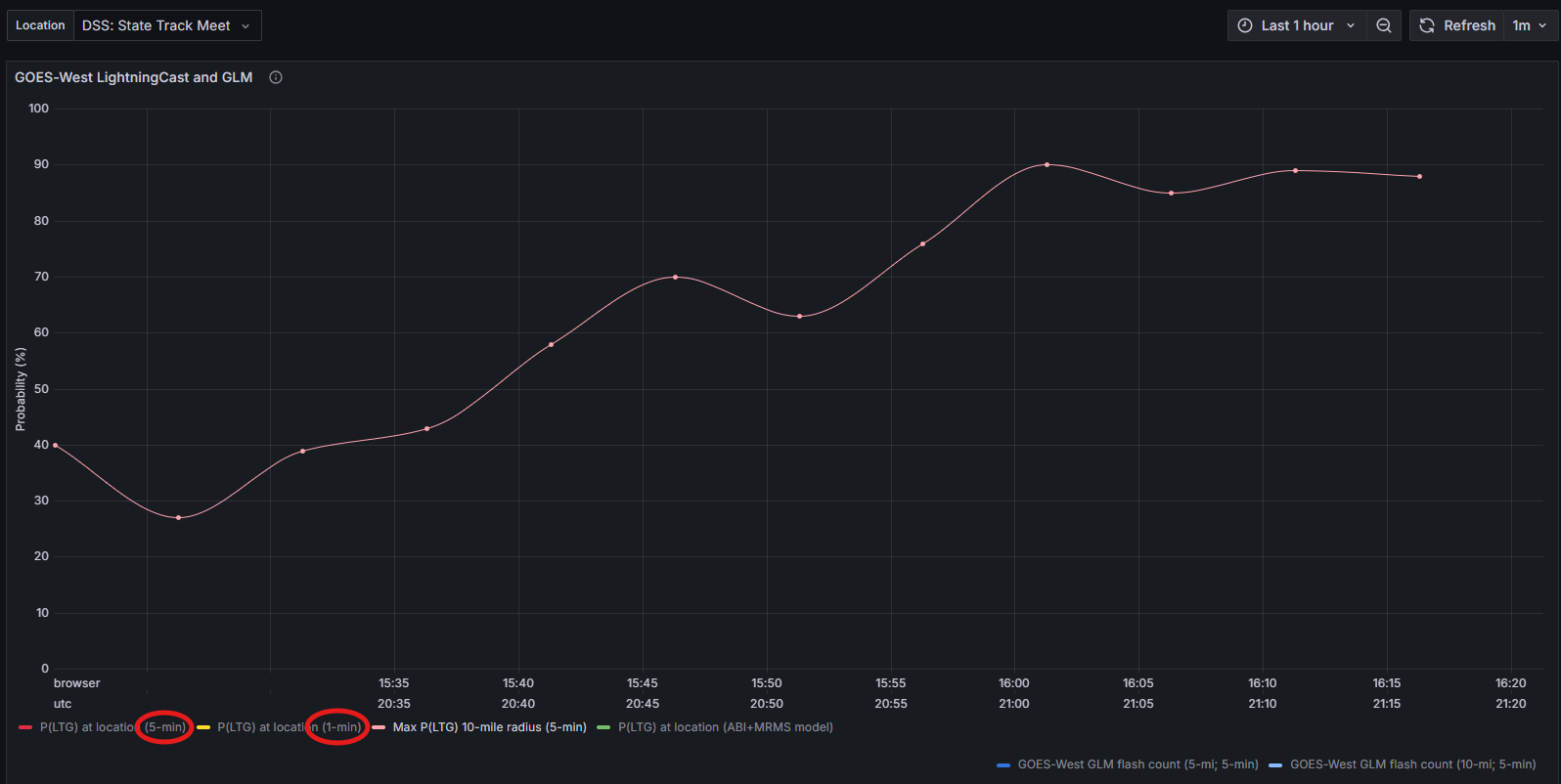
One note of feedback I had was to add some context for what we’re looking in each line at by noting where the data comes from in the legend. I was able to verbally ask a visiting scientist exactly what each line meant and where the data comes from, but this may not always be an option. The suggestion we came up with was adding (5-min, CONUS) and (1-min, MESO) to the legends circled in red so that it’s clear that the 5 minute data came from the CONUS satellite and the 1 minute data comes from one of the mesosectors.
– millibar