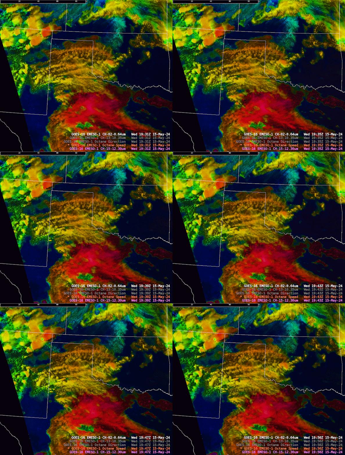
Below I want to provide some (4) examples of how I wanted or needed to adjust the OCTANE products to make the displays work best for me.
The two below graphics are of the octane direction product. Notice a difference between the two? The one on the bottom should look more sharp. The difference was normalizing the reflectivity of the red visible satellite channel (CH 2) so that the visible imagery comes out sharper. While done automatically o nthe CIRA slider product, it is not yet functional in AWIPS. This is a reminder that if you are using this product in AWIPS (currently) you need to keep manually updating the sharpness.

Here is another example from the speed product where the top image has not been normalized for the zenith angle and the bottom one has been.
This is definitely a feature that I would want to see included before release on AWIPS because while it is not an inconvenience to adjust it, it is easily forgotten in the midst of warning operations.
Example two of making OCTANE look how I like it.
While trying to learn how to interpret the direction product from OCTANE, I was offered the barb alternative available on the CIRA slider. I was not a fan. While the direction product has been the most difficult to interpret
Example three of making OCTANE look how I like it.
Here I changed the bottom left of the octane 4-pannel. This was the Divertgence and cooling product. I was discussing with the developer how my eyes were tiring looking at the cyan field after a shift (bottom image) and that I thought it was washing out the divergence and the cooling fields some. We remedied this by lowering the saturation on the cloud top height field. I thought 45 percent saturation was preferred because I was cautioned that going any lower would not allow a forecaster to differentiate the cooler convective cloud tops and the white Red-visible cloud tops of lower clouds.
Example four of making OCTANE look how I like it.
I was struggling to interpret and use the direction tool, which I believe to be on me and not on the tool. To try and remedy this, I was playing around with the color scheme of the direction parameter. The top display shows the regular color scale from the developers and on the bottom is the one I provided input to create. The reason I went for this color comboe
-Kilometers


