ENI Time Series Plots – Ways to View

I’m a big fan of the ENI time series plots. There are a lot of different ways to view the plots themselves, between the mono- and multi-color plots, 4-panels, etc. I wanted to compare them and see which might be the most useful.

First, it is helpful to have a dedicated pane for the ENI DTA cell polygons and cell flash rates, with the Interactive Points overlaid on it. Move the points to 4 (or less) different cell polygons. You have to keep moving the points to keep them within their respective cell polygons, which is time and work-load intensive if you are in an intense warning situation.

point7

There are 4 main ways to view the time series data:

The 4-panel mono-color: better for seeing overall trends in flash rate with multiple cells. In general though, I don’t like the mono color. There’s all these lines and everything is the same color, it’s hard to differentiate what you are looking at.

4Panel_mono

The 4-panel multi-color: better for keeping track of the partitioning of Total, CG, cloud, etc.

4Panel_multi

The 4-panel multi-color and mono-color are each a good way to view multiple cells at once. they can be viewed all on one screen or larger by entering panel combo rotate mode. If you are looking at one storm in particular, or there aren’t many cells around, viewing the single panel multi-color is probably more useful.

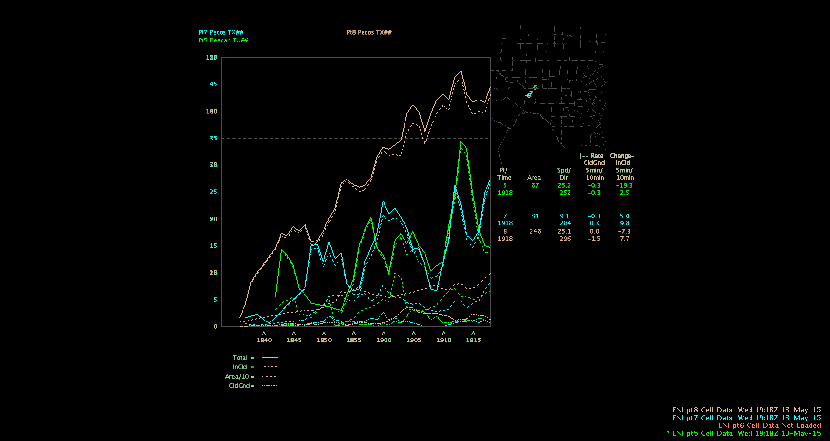
Single-Panel Multi-color (single cell): Great for situations where there aren’t many cells going on, and you really want to investigate the cell for warning purposes. Seeing the trends in the various flash components can help decide if a storm is intensifying or weakening.

single_multi

Single-panel Stacked:

The single panel stacked is not very appealing. If you have a lot of cells at once, the plot can get very busy, very quickly. Yes, you can turn cell off to focus on one or another, but then the individual plots are still mono-color and difficult to pick out the flash components.

SinglePanel_stacked

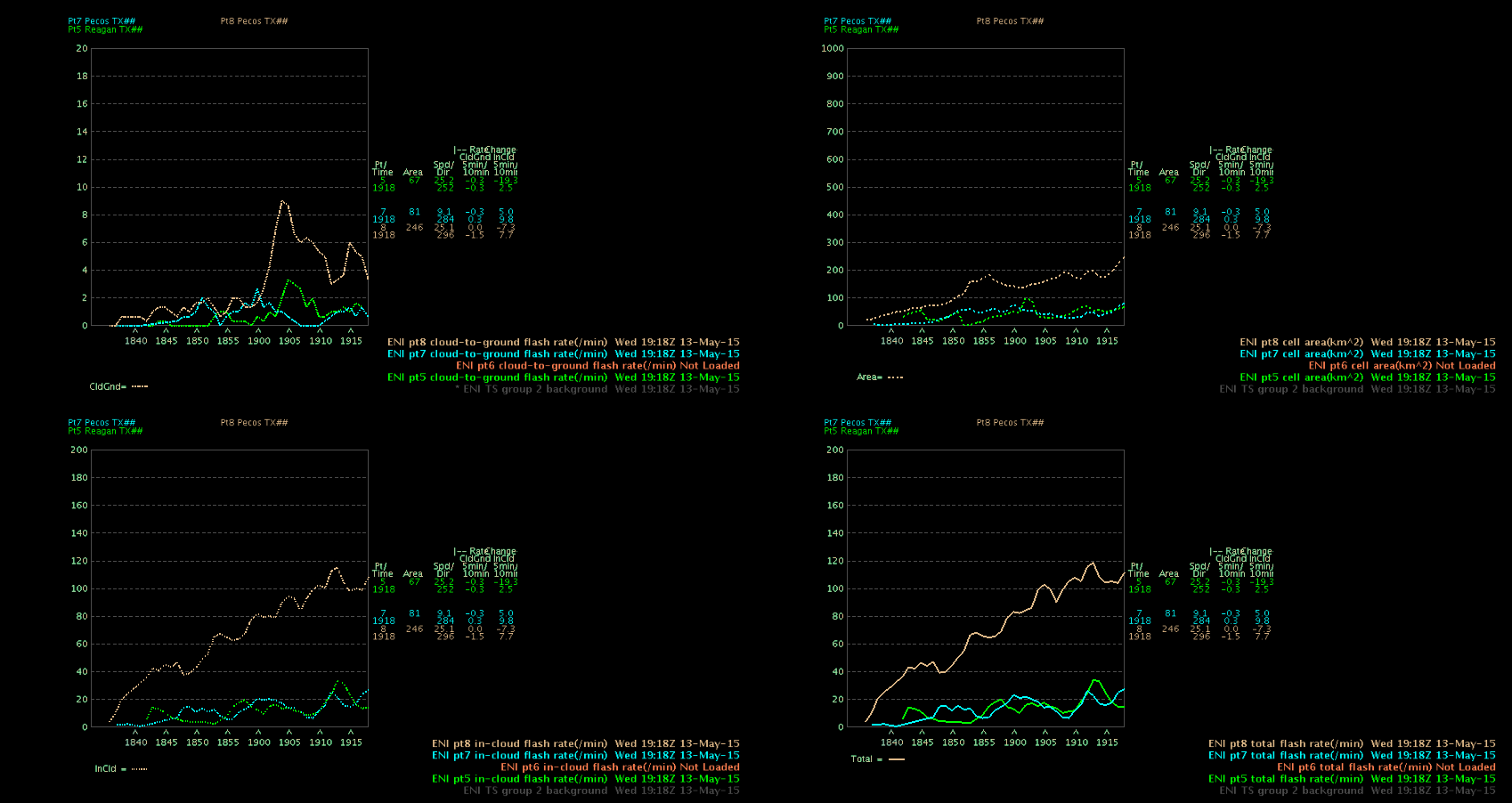
And finally, a 4-Panel composite. The composite product is interesting. It is a stacked 4-panel with each panel devoted to one of the time series components. While it is interesting to look at, I don’t see the utility in a real-time warning situation. It might be good to archive or screen capture and use for case studies after the fact or something like that.

4Panel_composite

Overall, I find the 4-panel mono-color and the single panel multi-color (or 4-panel in panel combo rotate mode) the most useful of the time series displays. The 4-panel mono-color gives you a good overview of the trends for all cells you are tracking. The multi-color plots are very helpful in analyzing individual cells. When comparing with radar reflectivity, you notice changes in the flash rate before the cell exhibits increases or decreases in reflectivity. The faster updates of the flash rate data allows you to see trends in storm cells before they show up in the radar products. This could be immensely helpful in the warning process with a “heads up” without waiting for “one more radar scan”. In the Southwest US, especially, waiting one more scan can be the difference between hitting or missing a warning.

~Regina Phalange

Tags: None

ENI Time Series Case Study

Setting: Northwestern edge of the San Angelo, TX CWA.

I pulled up the ENI time series for a strong cell that exhibited a high flash rate and saw a large peak followed by a rapid drop-off and a subsequent increase again. I wanted to look at radar to see if it matched up with the trend in strength. The cell in question is the northern-most cell in the short, loosely-connected line along the border of the San Angelo CWA (point 7/northern cell polygon in the image below).

point7CZ_1930 Composite Radar image at 1930Z

The northern-most cell has a reflectivity core peak corresponding to the rapid increase that the flash rate on the time series had been showing. The increase/peak in flash rate occurred between 1928-1932Z.

ENI_1930_2006ENI multi-color time series plot for Point 7

The next two radar images at 1936 and 1942Z, respectively, reflect the rapid decrease and subsequent increase again in the time series plot between 1933 and 1938.

  CZ_19361936Z CZ_19421942Z

The flash rate then began a steady, but quick final decline just before 2000Z.

ENI_1930_2010

This was finally reflected in the reflectivity scans at 2000Z and 2006Z.CZ_20002000Z

CZ_20062006Z

I found myself watching the time series plot when it would take a sharp turn to increase or decrease flash rate and going back to the radar, waiting for it to be reflected there, and it usually did. Since the lightning data comes in more often than/ahead of the radar imagery, the time series plots could be used to anticipate increases or decreases in storm cell strength, potentially aiding in the warning process (ie whether to issue (lead time), continue, or let a warning expire).

~ Regina Phalange

Tags: None

Misleading Lightning Jumps

ENI lightning data has been useful at times today.  However, when monitoring lightning jumps all forecasters must exercise caution. The charts can be misleading when tracking cells. Watching the last hour of data in SJT, one can see lightning cells converge, causing a tremendous spike in lightning strikes.  This could lead a forecaster to believe the storm is strengthening, when in fact data is being absorbed. A forecaster must use different tools and further investigate to ensure lightning jumps are indeed really happening.


Panel 1 shows a lightning jump.

051315 lightning jump 2042

This image shows how two different cells later converged according to ENI leading to an unwarranted lightning jump.

051315 eni cell absorbtion

UFFSU

Tags: None

Line Formation with CI Prob

CI Prob continues to handle the developing line heading into western SJT cwa.  Visible satellite hints at outflow and developing clouds, but CI Prob helps confirm new storm initiations.  The 1930z 4 panel view shows the higher probability of thunderstorms developing along a line.

051315 CI Prob continued

The larger view of the radar helps us verify the lengthening of the line into MAF cwa. These storms continue to move slowly SE. It should also be noted CI Prob is also indicating thunderstorm development ahead of the current line.  This area of convection will be contained in central SJT cwa. Will continue to monitor any possible development to see how CI Prob verifies in cloud/cirrus setting.

051315 developing line

UFFSU


Tags: None

DTA Polygon Direction

Dangerous Thunderstorm Alerts from ENI continue to be evaluated. In an environment with more isolated cells, the ENI displays are cleaner and more user friendly (decreased clutter). These cells are more long lived today, which reduces the DTA polygons from jumping all around with quickly developing storms that are short lived (Florida case observed yesterday). My concern with the DTA polygons today revolve around the storm movement indicated by these polygons. As the storm area increases lightning concentration will change, which seems to be throwing off storm direction. I am not sure what variables DTAs use to determine direction, but I have observed a few odd changes with polygon directions from minute to minute (1 minute update).

These following two images show the issue, they are one minute apart..the environment could not have changed that drastically…

UFFSU

051315 dta polygon direction

051315 DTA polygon direction 2

Tags: None

Lightning Spikes, Prob Severe Follows

I am noticing a trend that ENI Lightning Jumps are acting as a precursor in today’s environment to increased Prob Severe probabilities. The trend is developing after a few observations with early initiations in the far west part of our CWA border.  The first image is an example of an ENI jump, please focus on upper right panel (data point 2).

051315 eni spikes

Prob Severe has been a very helpful tool through the week. As we analyze more discrete cells developing and moving east into the SJN CWA. In this cases, our data display from ENI has been much cleaner and seems to help guide the forecaster.  The correlation to lightning jumps and storm intensification will continue to be monitored in today’s environment. The image below demonstrates the increasing prob severe probability just minutes after our ENI lightning jump (bottom left panel, <70%)..

UFFSU

051315 prob severe bump after eni

Tags: None

CI Prob Performance in Cirrus

CI Prob shows several areas for possible thunderstorm development in central and west Texas. While CI Prob has yet to verify at the time of this blog post for much of the region, it has done a very good job in eastern MAF CWA.  The CI Prob increased from 1630 in this region when nothing was showing on radar or prob severe. CI Prob led the way.

1630z    051315 1630 CI cirrus

As the storms initiated, CI Prob continued to indicate growth of other cells. This, too, was verified on in the far west portion of SJT CWA. This provides forecasters with more confidence in CI Prob, even initialized under cirrus in this event, as additional storms are forming along this area.

1745z  051315 1745 CI Prob

UFFSU


Tags: None

LMA Color Tables

This wasn’t the best day to look at LMA color tables because there weren’t many strong storms. I have used Flash Density in Huntsville  on strong storms so I am familiar with the default colormap. Below is an example of a weak storm with the LMA 1 vs LMA Default color table.

So here is LMA 1. One positive about this is because the scale between 0-10 has a lot of colors so those levels stand out quite a bit. This is useful in pulse storms and weaker storms. Above that you can see it is more graduated.

LMA1


Here is the same cell but with the default. You can see under 10 or so, it just looks white and doesn’t show any pinpoint of the updraft or much variation under 10.

LMAdefault

So I think that LMA 1 is good for weak storms but then LMA default for stronger storms!


Lauren13 (and Regina)


Tags: None

LMA detection before ENTLN?

Switching to Colorado, there was a storm that the LMA picked up on while there were no ENTLN data and a scan later only a few…

This is from 2303Z where the LMA was picking up on something.

2303Flash

Then at 2308, the ENTLN data is finally picking up on “something.” It is really hard to see in this degraded image but there is one negative CG strike and then 3 “pulses.”

2308lightning


I usually see “some” in cloud lightning before I see any LMA detection so this was interesting to see especially with such a weak cell.


Lauren13

Tags: None