An official website of the United States government
Here’s how you know
Official websites use .gov A
.gov website belongs to an official government
organization in the United States.
Secure .gov websites use HTTPS A
lock (
) or https:// means you’ve safely connected to
the .gov website. Share sensitive information only on official,
secure websites.
Here is a good example showing the similarities in trends of ProbSevere, ENTLN total lightning data, and radar data. At 1908 UTC, lightning flash rates neared a peak and ProbSevere was ~50%. At 1919 UTC, the lightning flash rates had dropped significantly as did ProbSevere. By 1925 UTC ProbSevere quickly increased to ~75% at the same time that lightning flash rates were rapidly increasing. Finally, by 1945 UTC, ProbSevere decreased to 9% and lightning flash rates plummeted. Soon after this the storm dissipated. These types of products could help forecasters “hold onto” or “let go” of a warning sooner.
Depending on when you look at the last frame of the gridded lightning data you might not get the whole picture. The two screen captures below show this. One of the screen captures was taken at 1924 UTC, but if you look at the legend, the gridded lightning data says 1925 UTC. However, there are only 4 minutes of lightning data going into the 5 minute lightning product. The next image was taken at 1925 UTC and includes the whole 5 minutes of lightning data. As you might expect, there is more lightning when it includes the whole time frame. If a forecaster was not aware of this, it might appear as though the storm is weakening when in reality it is just an artifact of how the product is generated. I would suggest waiting until the full time period is over before displaying the product…which would make analyzing trends much easier!
5 min gridded data with only 4 minutes of data5 min gridded lightning data that has a whole 5 minute period worth of data
Hello everyone! This is day one of Week 2 of the Experimental Warning Program and we are getting situated and learning the products and making procedures. I personally was excited to try out the ProbSvr model as I think it could help with storms that pulse and that become severe or near severe within a scan or two- this is extremely useful in the northeast and even in squall line situations. While looking at it today in LMK’s area, we got a report of power lines down and I captured some of the ProbSvr data and I found it very interesting. I’ll step through the times.
1818z- This is as the northern storm was strengthening and the ProbSvr is hinting about 24%.
Next, at 1823Z, the ProbSvr bumped up to 61%
At 1825Z, the next scan, the 61% is still there (probably the same run).
At 1829, the ProbSvr has decreased once again.
Although I didn’t put velocity here, it isn’t overly impressive. Important to note is the rear inflow notch that looks like it is trying to develop.
At 1830z, the office received a report of power lines down with this northern storm.
In the training on ProbSvr, the examples were giving huge lead times when the model went above 50% but this isn’t always the case. I found this case interesting because it only gave about a 7 minute “lead time” before the first event. It looks like the storm surged/pulsed right at that time but noticed how the model surged back down before the event. How does a forecaster handle this? When it surges up and goes right back down? Would it change my warning process if it decreased next scan? It is still too early to say what the implication is but I will definitely be keeping an eye on these probabilities as I go forward!
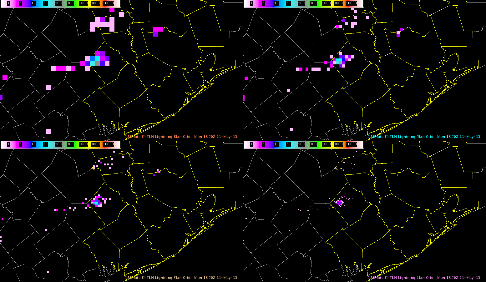
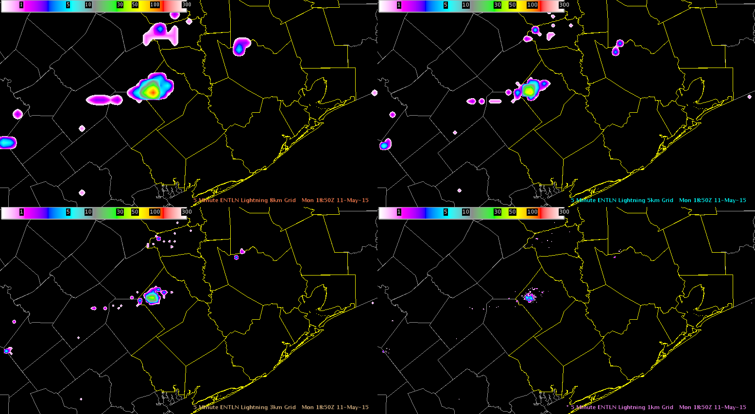
The default color scale for gridded lightning data is not very useful…as it goes all the way to 30,000 flashes. This is pretty unreasonable even for the most electrically active storm. Shown here is the 5 min total lightning data for the ENTLN gridded data at 8 km, 5 km, 3 km, and 1 km using the default color scale (with 30000 as the upper limit) and another image showing a more reasonable color scale (with 300 as the upper limit). Clearly, analysis is far easier using the adjusted color scale as the finer scale details are much easier to see. I also find that interpolating the gridded data makes visualization far easier.
Default color scale (max at 30000)Adjusted Color Scale (max at 300)
I haven’t really used the ENI cell track information much today but over the last hour I have started to pay more attention to it and I believe that it may be useful for larger and/or longer lived storms such as supercells. However, I think it could be more of a problem or less effective in a typical weakly sheared pulse thunderstorm environment which is common in the southeastern US during much of the warm season. It would be interesting to see how this performs in that type of environment.
New convection has been initiating along the nose of stronger instability feeding northward across north central TX and I have been watching one cell in particular in Young county TX.
The ENI time series has provided a nice trend in the strengthening of the storm and showed a large jump in flash rate just before 2050 UTC. Looking at the base data all tilts at the time of the jump revealed a deep 50 dbz core to almost 40kft and a 70 dbz core to over 21kft.
ENI Time Series
I think this ETN time series data was useful in identifying a rapidly developing updraft. Interesting to note, the ProbSevere model indicated a 74% severe threat at 2024 UTC on this storm which then went to 88% at 2033 UTC and then 98% at 2040 UTC.
Radar image loop with ProbSevere overlay
The ProbSevere output on the storm when it showed the 74% threat showed a strong glaciation rate and moderate growth rate with MESH of 0.68 inches.
At 1930 UTC the Convective Initiation product showed a probability over 60% over Montague/Cooke/Denton counties in TX.
However radar imagery over the next hour did not show any development with reflectivities 35 dbz or higher, in fact very little at all was noted. The image below shows the radar data at 2030 UTC with little if any returns.
Storm in the southern portion of our forecast area have been posing the greatest threat for severe weather, actually receiving a 2 inch hail report near Mabelle TX. While focusing my attention there, I have been using the ProbSevere model to provide me with general situational awareness for the north-south line of storms further to the north. I will also run through the all tilts base data just to confirm there is no significant threat to monitor but this is a nice tool to have to provide situational awareness for multiple storms in the forecast area, especially if you are in a situation where staffing would not allow for sectorization. Notice in the image below the very low ProbSevere values along the north-south line of storms.
While looking at the ENI cell polygons and flash rate data on a storm near the border of Greer and Jackson counties I noticed a significant jump in the values from below 20 up to well over 100 in about a 10 minute period. The cell polygons at 1821 UTC on the image below showed two separate storms, one with a flash rate of 12 and another to the north with a flash rate of 54. During the following 10 minute period the southern storm merged with the northern storm.
The radar data at 1832 UTC showed the two storms had merged and there was one large cell polygon now (111 flashs) which encompassed both of the previous cells. The base radar data at this time did not support a warning and this is a case where the lightning data should not be used alone and it yet another tool in the storm interrogation and warning process.
Below is the ENI time series showing the large jump in the lightning flashes. It is important to note that the cell area can be a valuable piece of information for forecasters to look at in situations like this as it can be an indicator of the cell merger that took place.
This was first week of our four-week spring experiment of the 2014 NSSL-NWS Experimental Warning Program (EWP2014) in the NOAA Hazardous Weather Testbed at the National Weather Center in Norman, OK. “The Big Experiment” or “Spring Experiment” had three components: (1) an evaluation of multiple CONUS GOES-R convective applications, including satellite and lightning; (2) an evaluation of the model performance and forecast utility of two convection-allowing models (the variational Local Analysis Prediction System and the Norman WRF); (3) and an evaluation of a new feature tracking tool from NASA SPORT. Additionally we coordinated daily with Experimental Forecast Program, participating in briefings and evaluating the probabilistic severe weather outlooks produced by their forecasters as guidance for our warning operations.
Participants:
Our NWS participants were Joshua Boustead (WFO Omaha, NE), Linda Gilbert (WFO Louisville, KY), Grant Hicks (WFO Glasgow, MT). Our visiting broadcast meteorologist for the week was Danielle Vollmar of WCVB-TV (Boston, MA). The GOES-R program office, the NOAA Global Systems Divisions (GSD), and the National Severe Storms Laboratory provided travel stipends for our participants from NWS forecast offices and television stations nationwide.
Visiting scientists this week included Steve Albers (GSD), John Cintineo (Univ. of Wisconsin/CIMSS), Ashley Griffin (Univ. of Maryland), Chris Jewett (Univ. of Alabama – Huntsville), James McCormick (Air Force Weather Agency), Chris Schultz (Univ. of Alabama – Huntsville), and Bret Williams (Univ. of Alabama – Huntsville).
Darrel Kingfield was the weekly coordinator. Lance VandenBoogart (WDTB) was our “Tales from the Testbed” Webinar facilitator for his last week (we’ll miss you!). Our support team included Kristin Calhoun, Gabe Garfield, Bill Line, Chris Karstens, Greg Stumpf, Karen Cooper, Vicki Farmer, Lans Rothfusz, Travis Smith, Aaron Anderson, and David Andra.
Some of our EWP Week 3 participants. Many others had to catch their flights early 🙁
Feedback on Experimental Products:
Synthetic Imagery (simulated satellite via NSSL WRF):
The technique is great, to be able to visualize what the satellite would look like if this model were to pan out.
Sometimes it got the correct position and missed the timing, sometimes it got the timing and missed the position.
Would be great to integrate with other model solutions.
Nearcast:
I liked that you could see the areas of higher instability. When I used it in conjunction with the ProbSevere or CI products, I found it helpful to see if cumulus field is developing in a region of higher instability.
The wide spectrum of colors allowed for the analysis/tracking of instability gradients
Lots of blank spots due to cloud cover, becomes hard to use in heavily overcast conditions. Would be great to blend with other NWP solutions.
I could see myself going to this product between warnings see where the Theta-E gradient is located.
Could be used to fill the spatial gap between sounding data sites.
GOESR Convection Initiation – probabilities:
Really helped focus my attention to specific regions of favorable convection and block out other regions for now.
Could catch a forecast off guard if he/she is unaware of the deficiencies (e.g. poor detection capability under cirrus).
Mixed results depending on isolated initiation versus new initiation in a complex convective setup.
I’m unsure how well GOES West is performing compared to GOES East.
ProbSevere –
I liked the verbal annotations next to the metadata (e.g. Moderate, Strong)
After initial hesitation, the algorithm performed really well today (5/20) and I was confident in using it as guidance.
Highlighted storm collapse, helping me not issue warnings on storms that were weakening.
I could see this catching things a human would miss but we should still use it in conjunction with base data.
Overshooting Tops:
The 15-30 minute updates made it difficult to use, I’d be more receptive to 1 minute updates.
I see more overshooting tops than what the algorithm is detecting but see its potential when there is no visible imagery (i.e. nighttime).
I could see this filling the gap in a data void region without radar.
Super-Rapid Scan (SRSOR), 1-min imagery:
1 minute data allowed me to gain more confidence in what I was seeing. I saw convective attempts, failures, and dead anvils…something I could not see as clear without SRSOR imagery.
The detail seen in convective development was phenomenal, I could stare at this all day.
I was able to visually identify boundaries feeding into the storm faster than what radar could provide to me.
pGLM –
CG information did not tell the whole picture, it was great to see the ups and downs in electrification.
I could definitely integrate this into warning operations.
Definitely helps in monitoring the health of the updraft pulse.
I factored the sigma jumps into my decision making process and overall it performed well.
SPORT tracking tool:
I think it has potential but the bugs/freezing when loading a lot of data made it difficult to use.
I tracked base velocity with this tool and when multiple meteograms started popping up, I just closed it out.
I liked how the path prior trajectory changed by moving a single circle but it will take some time for me to do this faster. Unsure how to integrate this into fast-paced convective modes.
vLAPS :
Seemed to overproduce convection consistently but I found the instability parameters useful.
Wind and Theta-E fields would be an added benefit.
Odd features seemed to propagate near the edges of the domain, which sometimes made the small domain products difficult to use.
Composite reflectivity seemed way to hot to use this week.