Visualizing Lightning Data

Here is an example of a display that I tried today that seemed to really help with analysis. I liked it since it kept the time series on the side and allowed for interrogation of the other data sets in a larger main editor and at the same time I could quickly glance at the lightning time series to determine the trends in lightning data. In the display, the northern cell goes with the top right time series and the southern cells goes with the bottom right time series.

LTG-TS-Grid-Display

Ertel


Tags: None

ENI Cell Merger Rapid Change in Rate/Area

One thing to keep in mind when looking at the ENTLN total lightning time series graphs is that you must pay attention to if there are any cell mergers in the lightning tracking or the change in flash rate could be misleading. Here is an example where it appears that the storm intensified and then weakened, but in reality the algorithm merged to storms together and then separated them. You can see this on on the time series graph for Pt11 at ~2037 UTC where the cell area rapidly increases at the same time that the lightning rate increased. This was followed by a rapid decrease in lightning flash rates and cell area as the algorithm resplit the cell. Note that radar data clearly indicated that the cells were two separate cells the entire time. Pt11

Looking at the cell polygons over the course of a few minutes also shows this well.

ENIBefore
Before ENTLN algorithm merged cells
ENIAfter
ENTLN algorithm merged cells into 1 giant cell
ENILater
ENTLN algorithm now splits cells apart
Tags: None

Lightning Jump Sample

Image 1.  The Lightning Jump showed a 2 sigma at 2358Z (left image) in southwest TX.  The cell was in the process of strengthening at that time (right image).  19

Image 2.  Within 10 minutes the storm strengthened and showed a TBSS.

18

Will note this is using 0.5 degree and is 18,000 ft AGL about 130 nm away from the radar.

Image 3.  The Lightning Jump increased to a 4 sigma at 0010Z (left image).  A few minutes later this was reflected in the radar (right image).20

-Champion

Tags: None

Lightning Jump Detection Algorithm Suggestion

Image 1.  2238Z.  Sigma 1.

13

Image 2.  2239Z.  Sigma 2.

14

Image 3.  2240Z.  Sigma 3.

15

Image 4.  2241Z.  Sigma 5.

16

Image 5.  2242Z.  Sigma 0?

17

It’s nice having this information update every minute to capture trends.  However, since it updates every minute on AWIPS2 the color could change every minute over a short time (like above).  Forecasters can easily miss these fast changes given all of the data they need to look at.  It would be better for the data to update every minute, but leave the strongest Sigma in place longer.  (Maybe for 5 minutes using a separate product?)  This would allow forecasters to see the largest Sigma more easily.

So in the example above, Image 4 would show Sigma 5 for the area highlighted from 2241Z until 2246Z.  At 2247 the Sigma 5 color for the area highlighted would be replaced by the next strongest Sigma in that area (if any).

-Champion

Tags: None

NUCAPS Sample

In southwest TX.  Modified for the surface.  Severe thunderstorm with a TBSS moved through the area later.

10

11

Plus, another point to the north where nothing happened.

12

-Champion

Tags: None

ENTLN 5 Minute Data Very Misleading

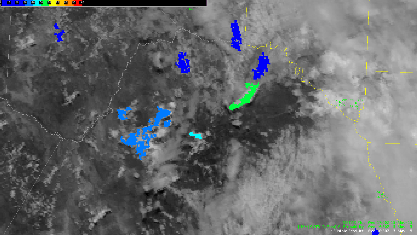
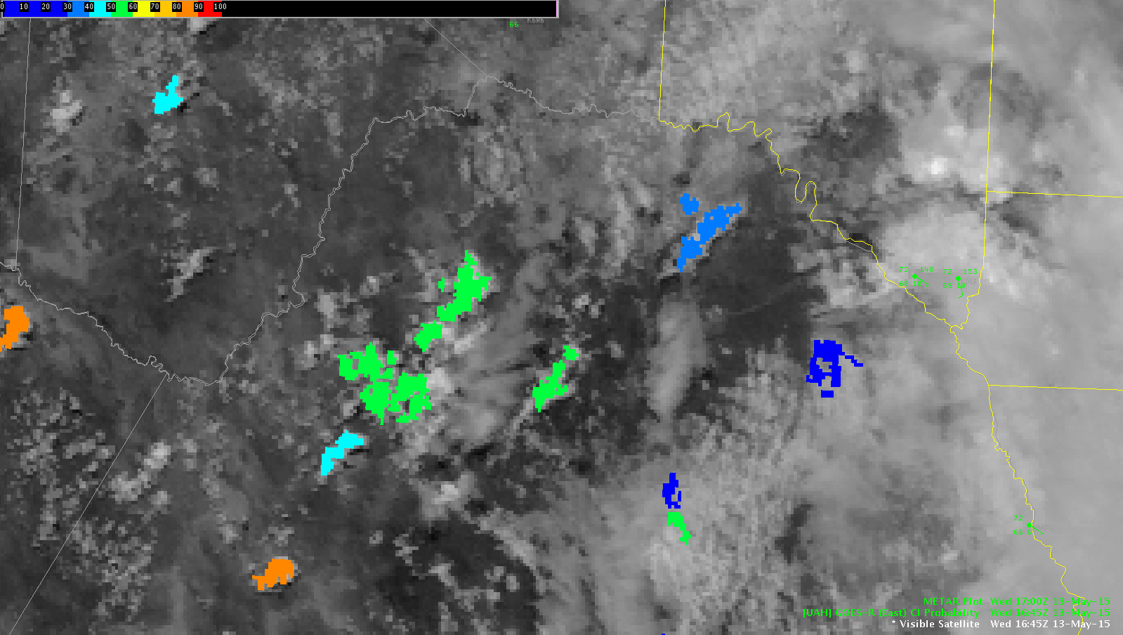
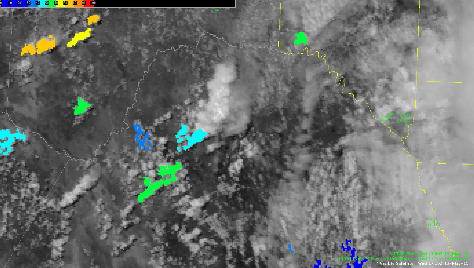
Image 1.  AWIPS Time 1921Z.  5 Minute ENTLN Lightning Plot 1920Z.  Pulse Count (Upper left corner) 255.

3

Image 2.  AWIPS Time 1922Z.  5 Minute ENTLN Lightning Plot 1920Z.  Pulse Count (Upper left corner) 327.

4

Image 3.  AWIPS Time 1923Z.  5 Minute ENTLN Lightning Plot 1925Z.  Pulse Count (Upper left corner) 160.

5

Image 4.  AWIPS Time 1924Z.  5 Minute ENTLN Lightning Plot 1925Z.  Pulse Count (Upper left corner) 175.

6

Image 5.  AWIPS Time 1925Z.  5 Minute ENTLN Lightning Plot 1925Z.  Pulse Count (Upper left corner) 222.

7

Image 6.  AWIPS Time 1926Z.  5 Minute ENTLN Lightning Plot 1925Z.  Pulse Count (Upper left corner) 286.

8

Image 7.  AWIPS Time 1927Z.  5 Minute ENTLN Lightning Plot 1930Z.  Pulse Count (Upper left corner) 137.

9

Critical issue: The 5 Minute ENTLN Lightning Plot is adding new lightning data every minute and “resets” after 5 minutes.  It is NOT a 5 minute total based on the previous 5 minutes as it seems.  It is not a 5 minute running average (that could be updated every minute).  When the forecaster loads the most current frame they are getting data that is misleading.  In the case above it appears that the storm is strengthening from Image 1 to 2, then weakening from Image 2 to 3, then strengthening from Image 3 to 6, then weakening from Image 6 to 7.  In reality, it’s just the addition and reset of the 5 minute lightning data.  Not only is this misleading, but it is detrimental to forecasters trying decide whether to warn or not based on this data.  I certainly won’t use this data until it’s corrected and will pass this information on to others.  I don’t understand how someone in their right mind can find this current scheme above good.

Furthermore, the 5 Minute ENTLN Lightning Plot doesn’t match the AWIPS time.  In Image 3 the AWIPS Time is 1923Z, but the 5 Minute ENTLN Lightning Plot is 1925Z (in the future?).  Why???  In this case the 5 Minute ENTLN Lightning Plot should stay labeled as 1920Z and update to 1925Z after the AWIPS clock hits 1925Z.

What’s also worrisome is it appears other ENTLN Lightning minute products are “adding” new data every minute (i.e. the 5 and 15 Minute Lightning grids, etc.).  This needs to be looked into more and corrected.

How should this be fixed?  The 5 Minute ENTLN Lightning Plot needs to update AFTER it gets 5 minutes worth of added data.  In the example above it should work as…

AWIPS Time 1921Z.  5 Minute ENTLN Lightning Plot 1916Z.  Pulse Count (Upper left corner) NNNN where NNNN is the previous 5 minute total from 1911 to 1916Z.

AWIPS Time 1922Z.  5 Minute ENTLN Lightning Plot 1921Z.  Pulse Count (Upper left corner) 327.

AWIPS Time 1923Z.  5 Minute ENTLN Lightning Plot 1921Z.  Pulse Count (Upper left corner) 327.

AWIPS Time 1924Z.  5 Minute ENTLN Lightning Plot 1921Z.  Pulse Count (Upper left corner) 327.

AWIPS Time 1925Z.  5 Minute ENTLN Lightning Plot 1921Z.  Pulse Count (Upper left corner) 327.

AWIPS Time 1926Z.  5 Minute ENTLN Lightning Plot 1921Z.  Pulse Count (Upper left corner) 327.

AWIPS Time 1927Z.  5 Minute ENTLN Lightning Plot 1926Z.  Pulse Count (Upper left corner) 286.

This allows me to see the total trend every 5 minutes.  Going from a Pulse Count of 327 down to 286 is more informative.

Get the point?

-Champion


Tags: None

CI Trends over Mexico

The CI product did a pretty good job of capturing the initiation of cells to our west over Mexico. The image below at 1630Z shows CI values over the center of the image at 31%. The next scan (1645Z) showed an increase to 53% and by the next scan (1715 Z) CI dropped out since the cell had initiated. It would have been interesting to see what CI trends would have provided if the satellite was in RSO or if there would have been a scan at 1700Z.

CI-mexico-3
1630 UTC
1645 UTC
1645 UTC
CI-mexico-5
1715 UTC

ERTEL

Tags: None

Lightning Data Inconsistencies

4-Panel Image: Upper left is PGLM Total Lightning using PGHG (Houston) Flash Extent Density.  No Lightning data is picked up.  Upper right is PGLM Total Lightning using PGHG (Houston) 6 minute summation.  No Lightning data is picked up.  Lower right is the Lightning Jump Detection Algorithm (200 km).  Minimal returns.  Lower left is the Lightning Jump Detection Algorithm (600 km).  Minimal returns.  However, the large image (right side of screen) shows 5 minute ENTLN lightning data.  It is picking up data along the Grimes/Madison County border.2

-Champion

Tags: None