High Risk: Uncertainty

Well, the atmosphere is showing her cards slowly but surely. The big questions this morning were initiation and coverage in OK especially along the dryline. Convection allowing model guidance was flip flopping in every way possible. Lets remind ourselves that this is normal. The models only marginally resolve storms let alone the initiation process.

Given the recent outbreaks, convection allowing models have a hard time predicting supercells, especially when they remain discrete supercells (in the observations). Models have all kinds of filters to get rid of computational noise and it is likely partially this noise that contributes to initiation of small storms. This is speculation but it is a good first guess. The evidence comes from monitoring every time step of the model and seeing how long storms last and the one thing that stands out is that small storms happen in the model, remain small, and are thus short-lived. To be maintained, I argue that they must grow to a scale large enough for the model to fully resolve them.

Back to the uncertainty today. Many 0000 UTC hi-res models were not that robust with the dry line storms. And even at 1200 UTC, not that robust except for 1 or 2. Even the SREF that I saw yesterday via Patrick Marsh’s weather discussion was a potpourri of model solutions dependent on dynamic core.

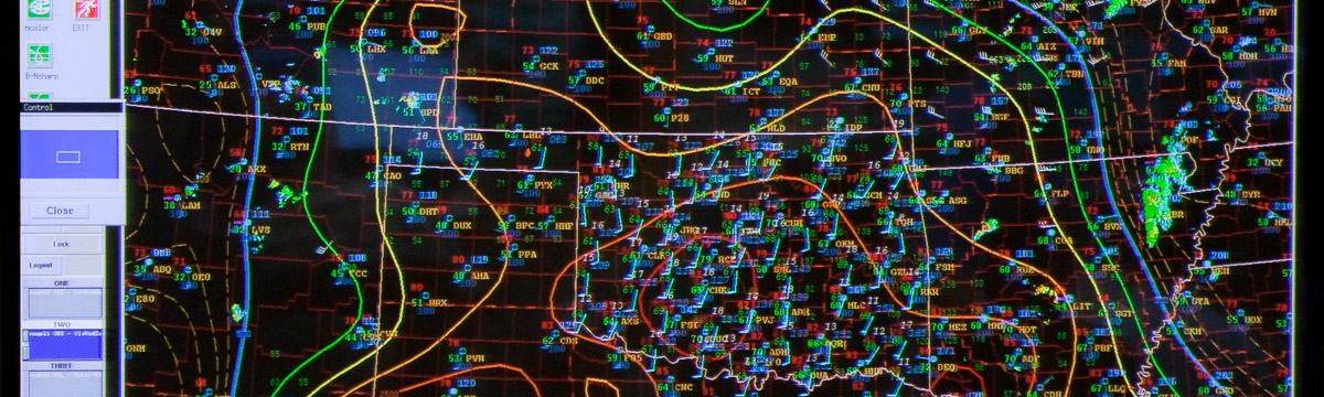
So now that the dryline appears to be initiating storms the question is how many. Well given the current observations your guess is as good as mine. A slug of moisture (mid to upper 60’s) is sitting in western OK in and around where yesterdays supercells dumped upwards of 2″ of rain, while temps warm into the 80’s. That is going to mean low LCL heights throughout the state. The dryline itself is just east of Liberal, KS and west of Gage, OK. Good clearing now occurring in western OK though there is touch of cirrus still drifting through. Much of the low cloud has cleared and a cumulus field stretches along the dryline down into Lubbock. Clearly the dryline is capable of initiating storms and the abundant moisture /favorable environment/ is not going to be at issue today.

Tags: None

SSEO

Here is another 24 hour graphic from the SSEO. This shows the probabilities of rotating storms including a spaghetti overlay of all 7 members UH tracks. This will get your attention. Courtesy of Greg Carbin, WCM SPC.

20120414

The NSSL-WRF is a part of this ensemble. The general idea I am extracting from this graphic is that there will potentially be multiple supercell corridors (and possibly tornado corridors). The ensemble suggests every major city in the Plains is under threat; Talk about potential hyperbole!

I know of one web page that has some information regarding these members if you want to see more detail from each member:

http://www.erh.noaa.gov/rah/hiresnwp/hi.res.nwp.compare.ncep.nam.nest.18.utc.php

UPDATE 1:
Timing for SSEO UH (remember 7 members):

Snapshot 2012-04-14 12-21-06

The ramp up from the hires guidance starts at 2200 UTC indicated by the tallest histogram bar in the time plot. The largest UH values occur in the darker blue to violet shades between 0000-0600 UTC. The threat ramps back up after that too.

UPDATE 2: 4 more members became available from 1200 UTC. The ramp up starts at 19 UTC now. But the dryline remained dry in these runs. That does NOT jive with current observational trends.

Snapshot 2012-04-14 13-53-36

Tags: None

High Risk: NSSL WRF

Here is a graphic representing an attempt to extract hourly reports from local maxima from the NSSL WRF model for the UH, wind, and graupel variables we are outputting. Graupel is totally uncalibrated, meaning I chose random values that make sense but that is about all I can promise. Wind satisfies the 25.7 m/s criteria for severe, and UH follows a more systematic approach*. The algorithm I use to generate this is a double area, double threshold object identification scheme. It is performed on the hourly fields.

Black dots represent the individual “model reports”. The shaded field is a gaussian smoothed (sigma of 160), neighborhood (roi = 100km) approach to represent the spatial extent of the reports for each respective “threat”. As reports come in I will update the graphic with red dots indicating the observed storm reports from the SPC web site. There will also be an observed hail and tornado probability contour in blue perhaps overlaid on the UH and Hail graphic. This is a 24 hour period graphic.

The usual caveats apply. This is where the NSSL-WRF generates reports that meet my criteria. I estimate that there is a 1-4% chance that some “model reports” are missing or incorrectly identified. This is EXPERIMENTAL.

test

The areas identified for the main threat stretch from TX through IN and another corridor in NE.

UPDATE 1:
As far as the timing goes from NSSL-WRF here is how the above UH reports stack up vs the hail reports in time. I am using the Mondrian software as I have detailed in previous posts. The technique used here is called color brushing. I have given each time bin its own color and applied that color to the UH histogram. So prior to 1700 UTC (greenish hues; now) has quite a few weak UH reports. The highest UH occurs in reports after 0000 UTC (bluish hues).

Snapshot 2012-04-14 12-02-50

Tags: None

Live Blogging the High Risk

Time to show off a few things we have been working on experimentally for the HWT. Given the High risk and amazing graphics I have seen this AM, this is entirely appropriate.

I may not be able to live blog from the HWT given it doubles as a media room.

I will turn on the code and get to generating web graphics (I make no claim as to their quality). Everything is EXPERIMENTAL in TEST mode and is prone to errors, lack of quality, and consistency. For official products please see your local NWSFO and the Storm Prediction Center.

Update 1: Processing nicely (NSSL_WRF complete). Going to update my code to process the 12z membership of NCEP experimental hi-res forecasts.

Update 2: Code update nearly complete. 12z hi-res guidance won’t arrive until later on this morning.
Some terminology:
SSEO : Storm scale ensemble of opportunity. A 7 member 00 UTC hi res ensemble (4-5 km grid spacing) including the NSSL-WRF, and 3 ARW members, 3 NMM members along with the 4km NMMB Nest. Crap thats more acronyms to explain.

ARW: Advanced research Weather Research and Forecasting Model. Uses C grid staggering.
NMM: Nonhydrostatic mesoscale model. Uses E grid staggering.
NMMB: similar name as above but the new formulation of WRF using a B grid (old MM5 style).

UH: updraft helicity hourly maximum. Used to infer persistent updraft rotation in the forecast at every model time step. This helps us recognize supercells; not tornadoes. Recent work by Adam Clark and collaborators suggests there is a robust, positive correlation between ensemble UH path length and tornado path length (using the CAPS ARW ensemble). In any case, long path lengths in the models seem to be a good signal that supercell convective modes are probable.

This will conclude this post. Next up graphical updates. 

Drjimmyc

Sneak Peak Part 3: Modeled vs Observed reports

I went ahead and used some educated guesses to develop model proxies for severe storms in the model. But how do those modeled reports compare to observed reports? This question, at least the way it is addressed here, yields an interesting result. Lets go to the figures:

Snapshot-2011-12-20-21-24-52
Click for larger

The 2 images show the barchart of all the dates on the left, with the Modeled reports (top), observed reports close to modeled storms (middle) and the natural log of the pixels of each storm (or area; bottom) on the right. The 1st image has the modeled storm reports selected and it should be pretty obvious I have chosen unwisely (either the variable or the value) for my hail proxy (the reports with a 2 in the string). Interestingly, the area is skewed to the right or very large objects tend to be associated with model storms.

Also note that modeled severe storms are largest in the ensemble for 24 May with 27 Apr coming in 6th.  24 May appears first in percent of storms on that date with the 27 Apr outbreak coming in 15th place (i.e. having a lot of storms that are not severe).

Snapshot 2011-12-20 21-26-07
Click for larger

Changing our perspective and highlighting the observed reports that are close to modeled storms, the storm area distribution switches to the left or smallest storm area.

The modeled storms to verify has 25 May followed by 27 Apr coming in with the most observed reports close by. 24 May lags behind in 5th place. In a relative sense, 27 Apr and 25 May switch places, with 24 May coming in 9th place.

These unique perspectives highlight two subtle but interesting points:
1. Modeled severe storms are more typically larger (i.e. well resolved),
2. Observed reports are more typically associated with smaller storms.

I believe there are a few factors at play here including the volume and spacing of reports on any particular day, and of course how well the model performs. 25 May and 27 Apr had lots of reports so they stand out. Plus all the issues associated with reports in general (timing and location uncertainty). But I think one thing also at work here is that these models have difficulty maintaining storms in the warm sector and tend to produce small, short-lived storms. This is relatively bad news for skill; but perhaps a decent clue for forecasters. I say clue because we really need a larger sample across a lot of different convective modes to make any firm conclusions.

I should address the hail issue noted above. I arbitrarily selected an integrated hail mixing ratio of 30 as the proxy for severe. I chose this value after checking out the 3 severe variable (hourly max UH > 100 m s-2  for tornadoes, hourly max wind > 25.7 m s-1, hourly max hail > 30) distributions. After highlighting UH at various thresholds it became pretty clear that hail and UH were correlated. So I think we need to look for a better variable so we can relate hail-fall to modeled variables.

Sneak Peak 2: Outbreak comparison

I ran my code over the entire 2011 HWT data set to compare the two outbreaks from 27 April and 24 May amidst all the other days. These outbreaks were not that similar … or were they?

b

In the first example, I am comparing the model storms that verified via storm reports with 40% for 27 April and only 17% for 24 May but 37% for 25 May. 25 May also had a lot of storm reports including a large number of tornado reports. Note the distribution of UHobj (upper left) is skewed toward lower values. The natural log of the pixel count per object (middle right) is also skewed toward lower values.
[If I further dice up the data set, requiring UHobj exceed 60, then 27 April has ~12%, 24 May has 7.8%, 25 May has 4% of the respective storms on those days (not shown). ]

a

In the second example, if I only select the UHobj greater than 60, the storm percentages for 27 Apr are 25%, 24 May are 35%, and 25 May are 8%. The natural log of the pixel count per object (middle right) is also skewed toward higher values. Hail and Wind parameters (middle left and bottom left, respectively) shift to higher values as well.

Very interesting interplay exists here since 24 May did not subjectively verify well (too late, not very many supercells). 27 Apr verified well, but had a different convective mode of sorts (linear with embedded supercells). 25 May I honestly cannot recall other than the large number of reports that day.

Comments welcome.

Sneak Peak from the past

So after the Weather Ready Nation: A Vital Conversation Workshop, I finally have some code and visualization software working. So here is a sneak peak, using the software Mondrian and an object identification algorithm that I wrote in Fortran, applied via NCL. Storm objects were defined using a double threshold, double area technique. Basically you set the minimum Composite Reflectivity threshold, and use the second threshold to ensure you have a true storm. The area thresholds apply to the reflectivity thresholds so that you restrict storm sizes (essentially as a filter to reduce noise from very small storms).

So we have a few ensemble members from 27 April generated by CAPS which I was intent on mining. The volume of data is large but the number of variables was restricted to some environmental and storm centric perspectives. I added in the storm report data from SPC (soon I will have the observed storms).

Slide1

In the upper left is a barchart of my cryptic recording of observed storm reports, below that is the histogram of hourly maximum surface wind speed, and below that is the integrated hail mixing ratio parameter. The two scatter plots in the middle show the (top) CAPE-0-6km Shear product versus the hourly maximum updraft helicity obtained from a similar object algorithm that intersects with the storm, and the (bottom) 0-1km Storm Relative Helicity vs the LCL height. The plots to the right show the (top) histogram of model forecast hour, (bottom) sorted ensemble member spinogram*, and (bottom inset) the log of the pixel count of the storms.

The red highlighted storms used a CASH value greater than 30 000 and UHobj greater than 50. So we can see interactively on all the plots, where these storms appear in each distribution. The highlighted storms represent 24.04 percent of the sample of 2271 storms identified from the 17 ensemble members over the 23 hour period from 1400 UTC to 1200 UTC.

Although the contributions from each member are nearly equivalent (not shown; cannot be gleaned from the spinogram easily), some members contribute more of their storms to this parameter space (sorted from highest to lowest in the member spinogram). The peak time for storms in this  environment was at 2100 UTC with the 3 highest hours being from 2000-2200 UTC. Only about half of the modeled storms had observed storm reports within 45km**. This storm environment contained the majority of high hail values though the hail distribution has hints of being bimodal. The majority of these storms had very low LCL heights (below 500 m) though most were below 1500m.

I anticipate using these tools and software for the upcoming HWT. We will be able to do next day verification using storm reports (assuming storm reports are updated via the WFO’s timely) and I hope to also do a strict comparison to observed storms. I still have work to do in order to approach distributions oriented verification.

*The spinogram in this case represents a bar chart where the length of the bar is converted to 100 percent and the width of the bar is the sample size. The red highlighting now represents the within category percentage.

**I also had to do a +/- 1 hour time period. An initial attempt to verify the tornado reports in comparison to the tornado tracks yielded a bit of spatial error. This will need to be quantified.

Visualization

We all did some web displays for various components of the CI desk. I built a few web displays based on object identification of precipitation areas. I counted up the objects per hour for all ensemble or all physics members (separate web pages) in order to 1) rapidly visualize the entire membership and 2) to add a non-map based perspective of when interesting things are happening. It also allows the full perspective of the variability in time, and variability of position and size of the objects.

The goal was to examine the models in multiple ways simultaneously and still investigate the individual members. This, in theory, should be more satisfying for forecasters as they get more comfortable with ensemble probabilities.  It could alleviate data overload by giving a focused look at select variables within the ensemble. Variables that already have meaning and implied depth. Information that is easy to extract and reference.

The basic idea as implemented was to show the object count chart and upon mousing over a grid cell you can call up a map of the area with the precipitation field. At the upper and right most axes, you call up an animation of either all the models at a specific time OR one model at all times. The same concept was applied to updraft helicity.

I applied the same idea to the convection initiation points only this time there were no objects, just the raw number of points. I had not had time to visualize this prior to the experiment, so we used this as a way to compare two of the definitions in test mode.

The ideas were great, but in the end there were a few issues. The graphics were good in some instances because we started with no precipitation or updraft helicity or CI points. But if the region already had storms then interpretation was difficult, at least in terms of the object counts. This was a big issue with the CI points, especially as the counts increased well above 400, for a 400 by 400 km sub domain.

Another display I worked hard on was the so-called pdf generator. The idea was to use the ensemble to reproduce what we were doing, namely putting our CI point on the map where we thought the first storm would be. Great in principle, but automating this was problematic because we could choose our time window o fit the situation of the day. The other complication was that sometimes we had to make our domain small or big, depending on how much pre-existing convection was around. This happened quite frequently so the graphic was less applicable, but still very appealing. It will take some refinement but I think we can make this a part of the verification of our human forecasts.

I found this type of web display to be very useful and very quick. It also allows us to change our perspective from just data mining to information mining and consequently to think more about visualization of the forecast data. There is much work to be done in this regard and I hope some of these ideas can be further built upon for visualization and Information Mining so they can be more relevant to forecasters.