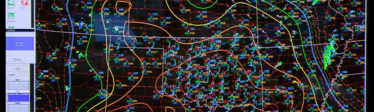
So after the Weather Ready Nation: A Vital Conversation Workshop, I finally have some code and visualization software working. So here is a sneak peak, using the software Mondrian and an object identification algorithm that I wrote in Fortran, applied via NCL. Storm objects were defined using a double threshold, double area technique. Basically you set the minimum Composite Reflectivity threshold, and use the second threshold to ensure you have a true storm. The area thresholds apply to the reflectivity thresholds so that you restrict storm sizes (essentially as a filter to reduce noise from very small storms).
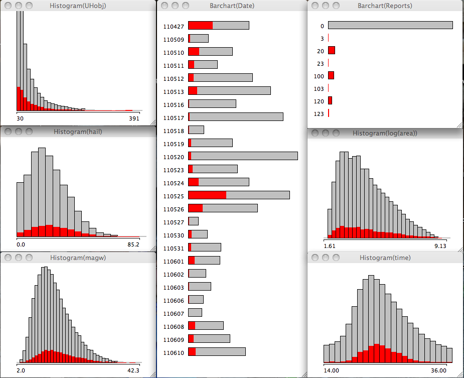
So we have a few ensemble members from 27 April generated by CAPS which I was intent on mining. The volume of data is large but the number of variables was restricted to some environmental and storm centric perspectives. I added in the storm report data from SPC (soon I will have the observed storms).
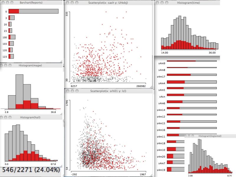
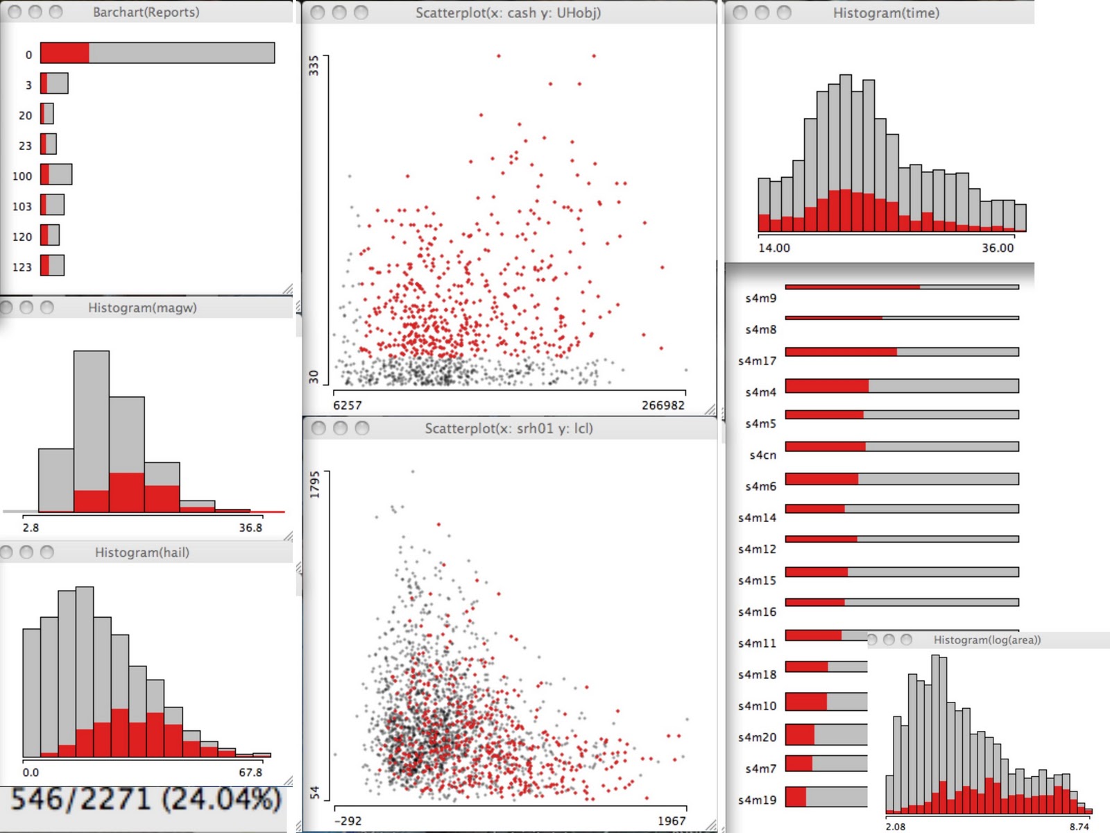
In the upper left is a barchart of my cryptic recording of observed storm reports, below that is the histogram of hourly maximum surface wind speed, and below that is the integrated hail mixing ratio parameter. The two scatter plots in the middle show the (top) CAPE-0-6km Shear product versus the hourly maximum updraft helicity obtained from a similar object algorithm that intersects with the storm, and the (bottom) 0-1km Storm Relative Helicity vs the LCL height. The plots to the right show the (top) histogram of model forecast hour, (bottom) sorted ensemble member spinogram*, and (bottom inset) the log of the pixel count of the storms.
The red highlighted storms used a CASH value greater than 30 000 and UHobj greater than 50. So we can see interactively on all the plots, where these storms appear in each distribution. The highlighted storms represent 24.04 percent of the sample of 2271 storms identified from the 17 ensemble members over the 23 hour period from 1400 UTC to 1200 UTC.
Although the contributions from each member are nearly equivalent (not shown; cannot be gleaned from the spinogram easily), some members contribute more of their storms to this parameter space (sorted from highest to lowest in the member spinogram). The peak time for storms in this environment was at 2100 UTC with the 3 highest hours being from 2000-2200 UTC. Only about half of the modeled storms had observed storm reports within 45km**. This storm environment contained the majority of high hail values though the hail distribution has hints of being bimodal. The majority of these storms had very low LCL heights (below 500 m) though most were below 1500m.
I anticipate using these tools and software for the upcoming HWT. We will be able to do next day verification using storm reports (assuming storm reports are updated via the WFO’s timely) and I hope to also do a strict comparison to observed storms. I still have work to do in order to approach distributions oriented verification.
*The spinogram in this case represents a bar chart where the length of the bar is converted to 100 percent and the width of the bar is the sample size. The red highlighting now represents the within category percentage.
**I also had to do a +/- 1 hour time period. An initial attempt to verify the tornado reports in comparison to the tornado tracks yielded a bit of spatial error. This will need to be quantified.