Sneak Peak Part 3: Modeled vs Observed reports

I went ahead and used some educated guesses to develop model proxies for severe storms in the model. But how do those modeled reports compare to observed reports? This question, at least the way it is addressed here, yields an interesting result. Lets go to the figures:
Snapshot-2011-12-20-21-24-52
Click for larger

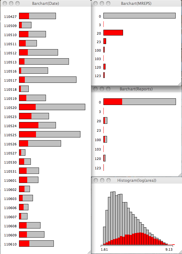
The 2 images show the barchart of all the dates on the left, with the Modeled reports (top), observed reports close to modeled storms (middle) and the natural log of the pixels of each storm (or area; bottom) on the right. The 1st image has the modeled storm reports selected and it should be pretty obvious I have chosen unwisely (either the variable or the value) for my hail proxy (the reports with a 2 in the string). Interestingly, the area is skewed to the right or very large objects tend to be associated with model storms.

Also note that modeled severe storms are largest in the ensemble for 24 May with 27 Apr coming in 6th.  24 May appears first in percent of storms on that date with the 27 Apr outbreak coming in 15th place (i.e. having a lot of storms that are not severe).
Snapshot 2011-12-20 21-26-07
Click for larger

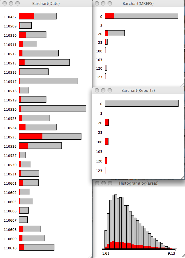
Changing our perspective and highlighting the observed reports that are close to modeled storms, the storm area distribution switches to the left or smallest storm area.

The modeled storms to verify has 25 May followed by 27 Apr coming in with the most observed reports close by. 24 May lags behind in 5th place. In a relative sense, 27 Apr and 25 May switch places, with 24 May coming in 9th place.

These unique perspectives highlight two subtle but interesting points:
1. Modeled severe storms are more typically larger (i.e. well resolved),
2. Observed reports are more typically associated with smaller storms.

I believe there are a few factors at play here including the volume and spacing of reports on any particular day, and of course how well the model performs. 25 May and 27 Apr had lots of reports so they stand out. Plus all the issues associated with reports in general (timing and location uncertainty). But I think one thing also at work here is that these models have difficulty maintaining storms in the warm sector and tend to produce small, short-lived storms. This is relatively bad news for skill; but perhaps a decent clue for forecasters. I say clue because we really need a larger sample across a lot of different convective modes to make any firm conclusions.

I should address the hail issue noted above. I arbitrarily selected an integrated hail mixing ratio of 30 as the proxy for severe. I chose this value after checking out the 3 severe variable (hourly max UH > 100 m s-2  for tornadoes, hourly max wind > 25.7 m s-1, hourly max hail > 30) distributions. After highlighting UH at various thresholds it became pretty clear that hail and UH were correlated. So I think we need to look for a better variable so we can relate hail-fall to modeled variables.

This week in CI

The week was another potpourri of convection initiation challenges ranging from evening convection in WY/SD/ND/NE to afternoon in PA/NY back over to OK/TX/KS for a few days. We encountered many similar events as we had the previous week struggling with timing of the onset of convection. But we consistently can place good categorical outlooks over the region, and have consistently anticipated the correct location of first storms. I think the current perception is that we identify the mechanisms and thus the episodes of convection, but timing the features remains a big challenge. The models tend to not be consistent (at least in the aggregate) for at least two reasons: There is no weather event that is identical to any other, and the process by which CI occurs can vary considerably.

The processes that can lead to CI were discussed on Friday and include:
1. a sufficient lifting mechanism (e.g. a boundary),
2. sufficient instability in the column (e.g. CAPE),
3. instability that can be quickly realized (e.g. low level CAPE or weak CIN or low LCL or small LFC relative to the LCL),
4. a deep moist layer (e.g. reduced dry air entrainment),
5. a weakening cap (e.g. cooling aloft).

That is quite a few ingredients to consider quickly. Any errors in the models then can be amplified to either promote or hinder CI. In the last 2 weeks, we had at least similar simulations along the dryline in OK/TX where the models produced storms where none were observed. Only a few storms were produced by the model that were longer lasting, but the model also produced what we have called CI failure: where storms initiate but do not last very long. Using this information we can quickly assess that it was difficult for the model to produce storms in the aggregate. How we use this information remains a challenge, because storms were produced. It is quite difficult to verify the processes we are seeing in the model and thus either develop confidence in them or determine that the model is just prolific in developing some of these features.

What is becoming quite clear, is that we need far more output fields to adequately scrutinize the models. However, given the self imposed time constraints, we need a data visualization system that can handle lots of variables, perform calculations on the fly, and deal with many ensemble members. We have been introduced to the ALPS system from GSD and it seems to be up to the challenge for the rapid visualization and the unique display capabilities for which it was designed (e.g. large ensembles).

We also saw more of what the DTC is offering in terms of traditional verification, object based verification, and neighborhood object based verification. There is just so much to look at it, that it is overwhelming day to day. I hope to look through this in the post experiment analysis in great detail. There is alot of information buried in that data that is very useful (e.g. day to day) and will be useful (e.g. aggregate statistics). This is truly a good component of the experiment, but there is much work to be done to make it immediately relevant to forecasting, even though the traditional impact is post experiment. Helping every component fill an immediate niche is always a challenge. And that is what experiments are for: identifying challenges and finding creative ways to help forecasting efforts.

Anatomy of a Well Forecast Bow Echo

20090508-13z-jln-bow

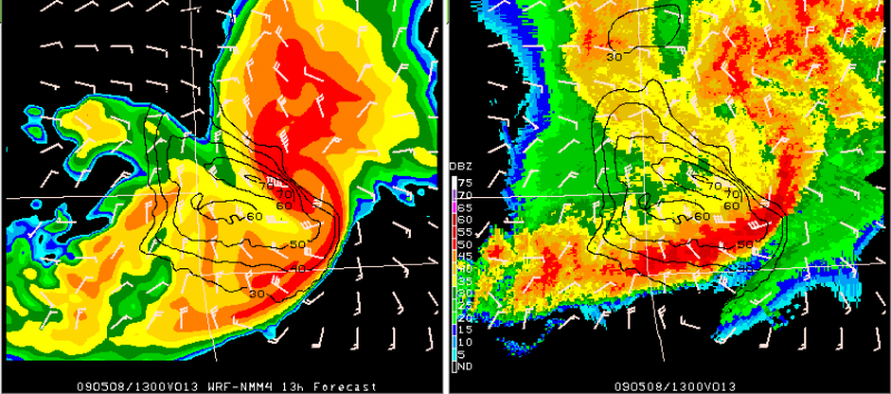
Above is an example of one of the forecasts from the Spring Experiment models from Friday. This bow echo moved across southwest Missouri early Friday morning and these images are centered on Joplin, MO (JLN). On the left is the 13h forecast from the WRF-NMM 4km model initialized at 00Z 08-May-2009 and valid at 13Z. On the right is the verifying 1km base reflectivity image with the model fields for winds overlaid on the radar. The barbs in each of the images are the model’s instantaneous 10m winds in knots (with the grid skipped to lessen the clutter). The isotachs are plotted from the WRF “history variables” for maximum U,V 10m winds (no grid skip). These are the maximum 10m wind speeds in the model over the past hour ending at 13Z.

Instantaneous 10m winds in the model at 13z, near the rotating bow head, are at least 50 knots. The maximum model 10m winds over the past hour range from 60-70 knots near and north of the weak echo channel and around the comma-head of the bow.

This was only one of several exceptional forecasts of this feature from the models being evaluated in this year’s Spring Experiment. To see more output on this case and more, check out the Spring Program website here:

http://hwt.nssl.noaa.gov/Spring_2009/index.php

-GregC