Data Assimilation Stats

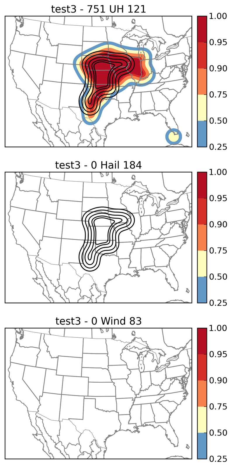
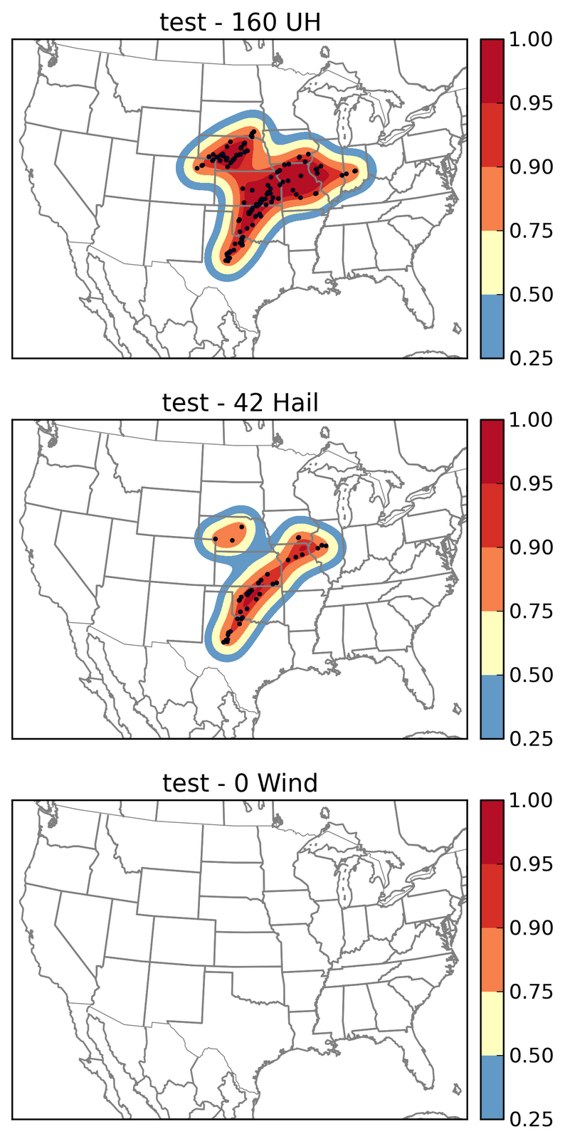
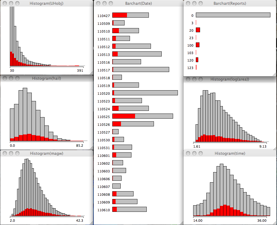
I am debugging and modifying code to complement some of our data assimilation (DA) evaluations. In recent years efforts have been made to provide higher temporal resolution of composite reflectivity. I wanted to take a more statistical visualization approach to these evaluations. One way to do that is to data mine using object based methods, in this case storm objects. I developed an algorithm to identify storms using composite reflectivity using a double area double threshold method using the typical spread-growth approach. The higher temporal resolution of 15 minutes is good enough to identify what is going on in the beginning of the simulations when one model has DA and the other does not; everything else is held constant.

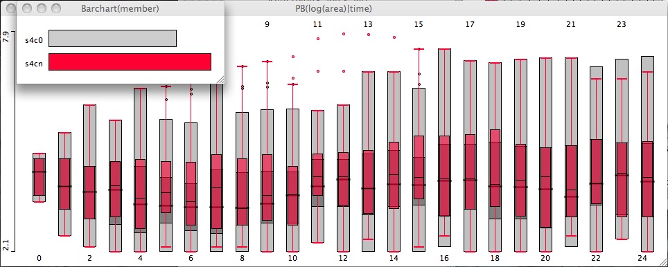
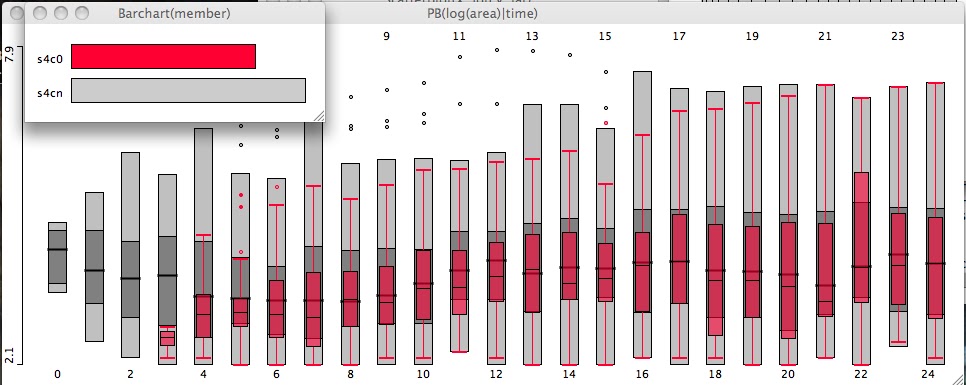
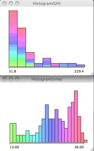
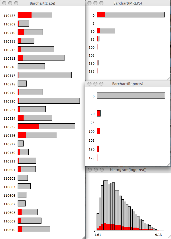
Among the variables extracted are maximum composite reflectivity, maximum 1km reflectivity, and pixel count for each object at every 15 minute output time. In order to make the upcoming plot more readable I have taken the natural log of the pixel count (so a value around 4 equates to 54 pixels, roughly speaking). The plot is a conditional box plot of ln(pixel count) by model time step with 0 being 0000 UTC and 24 being 0600 UTC. I have used a technique called linked highlighting to show the model run using data assimilation in an overlay (top). Note that the model without DA does not initiate storms until 45 minutes into the simulation (bottom). The take away point here being the scale at which storms are assimilated for this one case (over much of the model domain) at the start time is a median of 4.2 (or roughly > 54 pixels) while when the run without DA initiate storms they are on the low end with a median of 2.6 (13 pixels).

This is one aspect we will be able to explore next week. Once things are working well, we can analyze the skill scores from this object based approach.

Snapshot 2012-05-03 21-38-38

Snapshot 2012-05-03 21-52-00

Tags: None

Verification: Updated storm reports

Here are the NSSL(top), SSEO_0000 (middle), and SSEO_1200 (bottom) plots showing the model reports overlaid with the observed reports so far. The SSEO lacks hail and wind. Red dots indicate current observed storm reports. Black contours can be compared directly to he shaded model fields. The ensemble plots have 7 and 4 members, respectively. All go through 1200 UTC tomorrow morning.

UPDATE 1: I have rerun the graphics and they are displayed below.
NSSL-WRF (only looking at the top panel of “test”) compares favorably to the observations, at least in this smoothed representation. It does appear to be shifted too far east and south (the slight offset in the outer contours relative to the shading). But it did not capture the concentrated area of tornadoes in central KS. Despite “looking good” I think the skill scores would be somewhat low. I will try to run the numbers this week for all the models displayed so that each individual model can be compared and we can see which one, if any, stood out from the pack.

test

The SSEO ensembles are below:

test2

test3

Tags: None

High Risk: Uncertainty

Well, the atmosphere is showing her cards slowly but surely. The big questions this morning were initiation and coverage in OK especially along the dryline. Convection allowing model guidance was flip flopping in every way possible. Lets remind ourselves that this is normal. The models only marginally resolve storms let alone the initiation process.

Given the recent outbreaks, convection allowing models have a hard time predicting supercells, especially when they remain discrete supercells (in the observations). Models have all kinds of filters to get rid of computational noise and it is likely partially this noise that contributes to initiation of small storms. This is speculation but it is a good first guess. The evidence comes from monitoring every time step of the model and seeing how long storms last and the one thing that stands out is that small storms happen in the model, remain small, and are thus short-lived. To be maintained, I argue that they must grow to a scale large enough for the model to fully resolve them.

Back to the uncertainty today. Many 0000 UTC hi-res models were not that robust with the dry line storms. And even at 1200 UTC, not that robust except for 1 or 2. Even the SREF that I saw yesterday via Patrick Marsh’s weather discussion was a potpourri of model solutions dependent on dynamic core.

So now that the dryline appears to be initiating storms the question is how many. Well given the current observations your guess is as good as mine. A slug of moisture (mid to upper 60’s) is sitting in western OK in and around where yesterdays supercells dumped upwards of 2″ of rain, while temps warm into the 80’s. That is going to mean low LCL heights throughout the state. The dryline itself is just east of Liberal, KS and west of Gage, OK. Good clearing now occurring in western OK though there is touch of cirrus still drifting through. Much of the low cloud has cleared and a cumulus field stretches along the dryline down into Lubbock. Clearly the dryline is capable of initiating storms and the abundant moisture /favorable environment/ is not going to be at issue today.

Tags: None

SSEO

Here is another 24 hour graphic from the SSEO. This shows the probabilities of rotating storms including a spaghetti overlay of all 7 members UH tracks. This will get your attention. Courtesy of Greg Carbin, WCM SPC.

20120414

The NSSL-WRF is a part of this ensemble. The general idea I am extracting from this graphic is that there will potentially be multiple supercell corridors (and possibly tornado corridors). The ensemble suggests every major city in the Plains is under threat; Talk about potential hyperbole!

I know of one web page that has some information regarding these members if you want to see more detail from each member:

http://www.erh.noaa.gov/rah/hiresnwp/hi.res.nwp.compare.ncep.nam.nest.18.utc.php

UPDATE 1:
Timing for SSEO UH (remember 7 members):

Snapshot 2012-04-14 12-21-06

The ramp up from the hires guidance starts at 2200 UTC indicated by the tallest histogram bar in the time plot. The largest UH values occur in the darker blue to violet shades between 0000-0600 UTC. The threat ramps back up after that too.

UPDATE 2: 4 more members became available from 1200 UTC. The ramp up starts at 19 UTC now. But the dryline remained dry in these runs. That does NOT jive with current observational trends.

Snapshot 2012-04-14 13-53-36

Tags: None

High Risk: NSSL WRF

Here is a graphic representing an attempt to extract hourly reports from local maxima from the NSSL WRF model for the UH, wind, and graupel variables we are outputting. Graupel is totally uncalibrated, meaning I chose random values that make sense but that is about all I can promise. Wind satisfies the 25.7 m/s criteria for severe, and UH follows a more systematic approach*. The algorithm I use to generate this is a double area, double threshold object identification scheme. It is performed on the hourly fields.

Black dots represent the individual “model reports”. The shaded field is a gaussian smoothed (sigma of 160), neighborhood (roi = 100km) approach to represent the spatial extent of the reports for each respective “threat”. As reports come in I will update the graphic with red dots indicating the observed storm reports from the SPC web site. There will also be an observed hail and tornado probability contour in blue perhaps overlaid on the UH and Hail graphic. This is a 24 hour period graphic.

The usual caveats apply. This is where the NSSL-WRF generates reports that meet my criteria. I estimate that there is a 1-4% chance that some “model reports” are missing or incorrectly identified. This is EXPERIMENTAL.

test

The areas identified for the main threat stretch from TX through IN and another corridor in NE.

UPDATE 1:
As far as the timing goes from NSSL-WRF here is how the above UH reports stack up vs the hail reports in time. I am using the Mondrian software as I have detailed in previous posts. The technique used here is called color brushing. I have given each time bin its own color and applied that color to the UH histogram. So prior to 1700 UTC (greenish hues; now) has quite a few weak UH reports. The highest UH occurs in reports after 0000 UTC (bluish hues).

Snapshot 2012-04-14 12-02-50

Tags: None

Live Blogging the High Risk

Time to show off a few things we have been working on experimentally for the HWT. Given the High risk and amazing graphics I have seen this AM, this is entirely appropriate.

I may not be able to live blog from the HWT given it doubles as a media room.

I will turn on the code and get to generating web graphics (I make no claim as to their quality). Everything is EXPERIMENTAL in TEST mode and is prone to errors, lack of quality, and consistency. For official products please see your local NWSFO and the Storm Prediction Center.

Update 1: Processing nicely (NSSL_WRF complete). Going to update my code to process the 12z membership of NCEP experimental hi-res forecasts.

Update 2: Code update nearly complete. 12z hi-res guidance won’t arrive until later on this morning.
Some terminology:
SSEO : Storm scale ensemble of opportunity. A 7 member 00 UTC hi res ensemble (4-5 km grid spacing) including the NSSL-WRF, and 3 ARW members, 3 NMM members along with the 4km NMMB Nest. Crap thats more acronyms to explain.

ARW: Advanced research Weather Research and Forecasting Model. Uses C grid staggering.
NMM: Nonhydrostatic mesoscale model. Uses E grid staggering.
NMMB: similar name as above but the new formulation of WRF using a B grid (old MM5 style).

UH: updraft helicity hourly maximum. Used to infer persistent updraft rotation in the forecast at every model time step. This helps us recognize supercells; not tornadoes. Recent work by Adam Clark and collaborators suggests there is a robust, positive correlation between ensemble UH path length and tornado path length (using the CAPS ARW ensemble). In any case, long path lengths in the models seem to be a good signal that supercell convective modes are probable.

This will conclude this post. Next up graphical updates. 

Drjimmyc

Tags: None

Sneak Peak Part 3: Modeled vs Observed reports

I went ahead and used some educated guesses to develop model proxies for severe storms in the model. But how do those modeled reports compare to observed reports? This question, at least the way it is addressed here, yields an interesting result. Lets go to the figures:

Snapshot-2011-12-20-21-24-52
Click for larger

The 2 images show the barchart of all the dates on the left, with the Modeled reports (top), observed reports close to modeled storms (middle) and the natural log of the pixels of each storm (or area; bottom) on the right. The 1st image has the modeled storm reports selected and it should be pretty obvious I have chosen unwisely (either the variable or the value) for my hail proxy (the reports with a 2 in the string). Interestingly, the area is skewed to the right or very large objects tend to be associated with model storms.

Also note that modeled severe storms are largest in the ensemble for 24 May with 27 Apr coming in 6th.  24 May appears first in percent of storms on that date with the 27 Apr outbreak coming in 15th place (i.e. having a lot of storms that are not severe).

Snapshot 2011-12-20 21-26-07
Click for larger

Changing our perspective and highlighting the observed reports that are close to modeled storms, the storm area distribution switches to the left or smallest storm area.

The modeled storms to verify has 25 May followed by 27 Apr coming in with the most observed reports close by. 24 May lags behind in 5th place. In a relative sense, 27 Apr and 25 May switch places, with 24 May coming in 9th place.

These unique perspectives highlight two subtle but interesting points:
1. Modeled severe storms are more typically larger (i.e. well resolved),
2. Observed reports are more typically associated with smaller storms.

I believe there are a few factors at play here including the volume and spacing of reports on any particular day, and of course how well the model performs. 25 May and 27 Apr had lots of reports so they stand out. Plus all the issues associated with reports in general (timing and location uncertainty). But I think one thing also at work here is that these models have difficulty maintaining storms in the warm sector and tend to produce small, short-lived storms. This is relatively bad news for skill; but perhaps a decent clue for forecasters. I say clue because we really need a larger sample across a lot of different convective modes to make any firm conclusions.

I should address the hail issue noted above. I arbitrarily selected an integrated hail mixing ratio of 30 as the proxy for severe. I chose this value after checking out the 3 severe variable (hourly max UH > 100 m s-2  for tornadoes, hourly max wind > 25.7 m s-1, hourly max hail > 30) distributions. After highlighting UH at various thresholds it became pretty clear that hail and UH were correlated. So I think we need to look for a better variable so we can relate hail-fall to modeled variables.

Sneak Peak 2: Outbreak comparison

I ran my code over the entire 2011 HWT data set to compare the two outbreaks from 27 April and 24 May amidst all the other days. These outbreaks were not that similar … or were they?

b

In the first example, I am comparing the model storms that verified via storm reports with 40% for 27 April and only 17% for 24 May but 37% for 25 May. 25 May also had a lot of storm reports including a large number of tornado reports. Note the distribution of UHobj (upper left) is skewed toward lower values. The natural log of the pixel count per object (middle right) is also skewed toward lower values.
[If I further dice up the data set, requiring UHobj exceed 60, then 27 April has ~12%, 24 May has 7.8%, 25 May has 4% of the respective storms on those days (not shown). ]

a

In the second example, if I only select the UHobj greater than 60, the storm percentages for 27 Apr are 25%, 24 May are 35%, and 25 May are 8%. The natural log of the pixel count per object (middle right) is also skewed toward higher values. Hail and Wind parameters (middle left and bottom left, respectively) shift to higher values as well.

Very interesting interplay exists here since 24 May did not subjectively verify well (too late, not very many supercells). 27 Apr verified well, but had a different convective mode of sorts (linear with embedded supercells). 25 May I honestly cannot recall other than the large number of reports that day.

Comments welcome.