
The Emergency Manager (EM) experiment has hosted over 40 emergency managers since its inception in 2016, including 19 EMs in 2019! Before coming to the NOAA HWT housed in the NOAA National Severe Storms Laboratory in Norman, OK to participate in the Experiment, EMs completed a pretest questionnaire. In particular, they answered questions about their demographics, weather product use, and decision-making styles.
As a whole, our EMs have been predominantly white (91%), male (71%), college graduates (75%), with degrees ranging from Associate degrees to Doctoral degrees, who work primarily for government agencies (86%). The majority of participants indicated working as EMs for more than 10 years. They represent a variety of jurisdictions and services—cities, counties, state governments, hospitals, utilities, and federal agencies—from across the US.
EMs completed various questions assessing their decision-making styles and preferences. One measure, the Subjective Numeracy Scale (Fagerlin et al. 2007), assessed EMs’ self-reported abilities and preferences for working with numbers over words. Sample questions included, “How good are you at working with percentages?” and “When you hear a weather forecast, do you prefer predictions using percentages (e.g., ‘there will be a 0% chance of rain today’) or predictions using only words (e.g., ‘there is a small chance of rain today’)?” Thirty-nine EMs answered these questions. As a whole, EMs self-reported high numeracy, Mean = 4.48 (out of 6), Standard Deviation (s) = 0.98, which seemed to be driven by a preference for receiving numerical over verbal information, M = 4.66, s = 0.99 more than self-reported ability for working with numbers, M = 4.30, s = 1.36.
For a more detailed description of the Experiment, please see our previous posts here and here. Let’s dive right into the good stuff!
Was PHI useful? EMs overwhelmingly reported that PHI was useful for their decisions, M = 6.84 (out of 7), s = 0.99, n = 19. Specifically, it delivered information quickly, M = 6.78 (out of 7), s = 0.43, n = 18; made EMs more confident in their decisions, M = 6.72 (out of 7), s = 0.58, n = 18; delivered pertinent information, M = 6.60 (out of 7), s = 0.70, n = 10; and was easy to use, M = 6.28 (out of 7), s = 0.75, n = 18. Through discussions, EMs elaborated that one of the nice aspects of PHI was the ability to pinpoint where the most damaging impacts could be expected and give people more time to prepare. Their warnings and communications could be more nuanced in that they were better able to indicate which areas should take immediate shelter, which areas should stay on high alert and be ready to shelter soon, and which areas had a bit of time before they could see potential impacts.
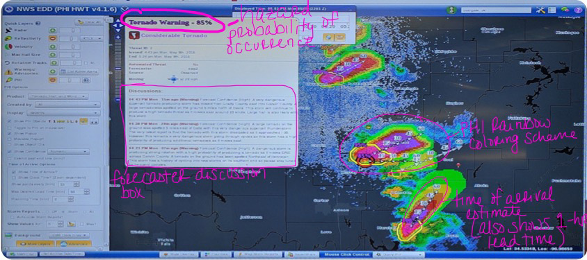
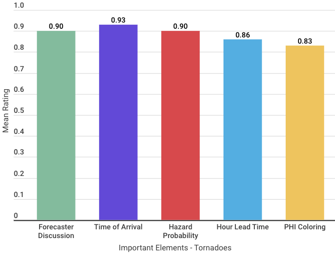
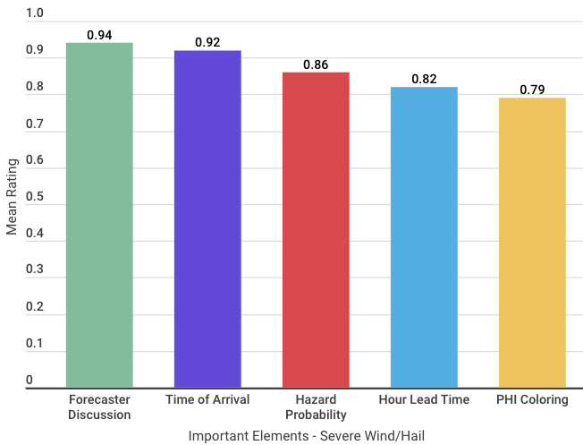
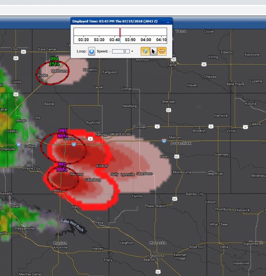
What is it about PHI that is most important/useful? Does that depend on the hazard to which they were responding? For both tornadoes and severe thunderstorms (high wind/hail in particular), similar elements of the PHI and the Enhanced Data Display (EDD; i.e., the tool used to deliver PHI to EMs; see below)
emerged as highly important: the forecaster discussion box, time of arrival estimate, hazard probability of occurrence, having one-hour lead time, and the PHI plume coloring scheme. Of these elements, two were significantly different in their importance across hazards. First, the importance of hazard probability of occurrence for understanding and communicating about tornadoes (M = .90) was significantly higher than for severe thunderstorms (M = .86), t(39) = 2.48, p = .02. Second, the importance of the PHI plume coloring scheme for understanding and communicating about tornadoes (M = .83) was significantly higher than for severe thunderstorms (M = .79), t(39) = 2.70, p = .01. The graphic below depicts these elements in the EDD and the data tables depict the differences in these PHI and EDD elements.
Can EMs successfully manage all of the different types of probabilistic information that were presented to them? This research aim was unique for the 2019 Experiments because EMs were presented with multiple products along the continuum of severe weather events, each conveying different probabilistic information. On a scale of 1 (extremely easy) to 5 (extremely difficult), EMs found it very easy to interpret all of the different kinds of probabilities they received for each case, M = 1.36, s = 0.51, n = 11. In discussions, EMs would note that even though the probabilities differed in the ways in which they were derived (e.g., climatology based vs. storm based) or what they were communicating—among other dimensions—, they “all made sense together” and “told a complete story.” EMs said having the complete picture helped, and having all of the probabilistic information helped them be more confident in making some decisions sooner while holding off on some other decisions.
So, after immersion in our probabilistic information world, did EMs walk away preferring probabilistic information? Well, EMs actually had an overwhelming preference (95% of those asked; n = 20) for a combination of probability and text information. Even among those not asked this question in the posttest survey, discussions revealed support for this preference. In particular, EMs noted that, while they may prefer receiving probabilistic information for their own personal use (to help with interpreting the incoming storms), they would not want to pass probabilistic information on to their constituents (e.g., their bosses, their publics, their peers, etc.). Therefore, they would also need textual information that is ready to pass on to others for their consumption.
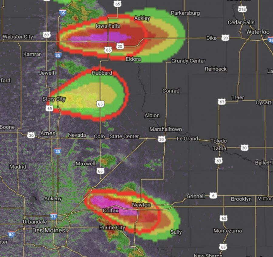
Lastly, a really cool feature of the EDD is the user’s ability to customize the different layers that are shown (e.g., radar, map, PHI plumes) based on their personal preferences. These layers included the color schemes used for the PHI plumes and the particular hazard plumes that are displayed. Participants predominantly (70% of those asked) preferred a monochromatic color scheme over a rainbow color scheme; this color scheme separated each hazard by color with varying probability levels displayed as gradients of the assigned color. For example, tornado PHI objects were red, where higher probabilities were represented by deeper/darker shades of red and lower probabilities were represented by fainter/lighter shades of red. Severe wind/hail PHI objects were yellow with the same probability coloring concepts. EMs noted the monochromatic plumes were “less cluttered/confusing,” “easy to discern on the map,” and “[didn’t] blur out the radar.” They also noted the rainbow-colored PHI plumes were “too busy,” “distracting,” “[easily] confused with radar.” EMs noted difficulty trying to tell differing hazard plumes apart when they were all rainbow-colored. Thus, the monochromatic plumes were preferred because it was easier to distinguish between threats and ostensibly easier to discern the probabilistic information.
The findings discussed here only briefly touch on a few of the concepts that were tested and evaluated over the years of the EM Experiment. Taken together, our EM sample reported relatively high numeracy and a preference for receiving numerical (over textual) information. This preference was expressed in their responses to PHI; they found PHI provided important information and improved their decision-making. Further, they had an overwhelming preference for the PHI visualization that made it easy to distinguish hazards and probabilities of occurrence, i.e., the monochromatic color scheme. Unfortunately, our sample is small. We don’t have the variability in our EMs numeracy scores to speak to whether these preferences change as a function of self-reported numeracy, but that is a great long-term goal for future research! Stay tuned for more updates and information about other aspects of the Experiment!