
Upper Left: 1-minute visible with 5 minute cloud flash (1-min update)
Upper Right: Total Optical Energy
Lower Left: GLM Average Group Area
Lower Right: Event Density
Bright yellow/orange colors on lower left depict a smaller average group area associated with a tighter concentration of flashes. We are intermittently seeing greater concentrations at the southern extent in an area otherwise associated with little activity.
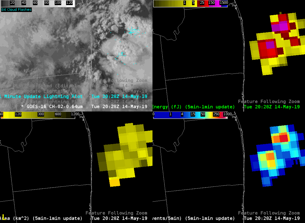
Now taking a look at a specific time below…
We see a single pixel of orange (lower part of lower left panel) corresponding with a small group area. This appears to be associated with two fairly isolated ENTLN flashes (upper left). Total Optical Energy (upper right) and Event Density values (lower right) are not overly impressive, which is not surprising, given the limited activity.
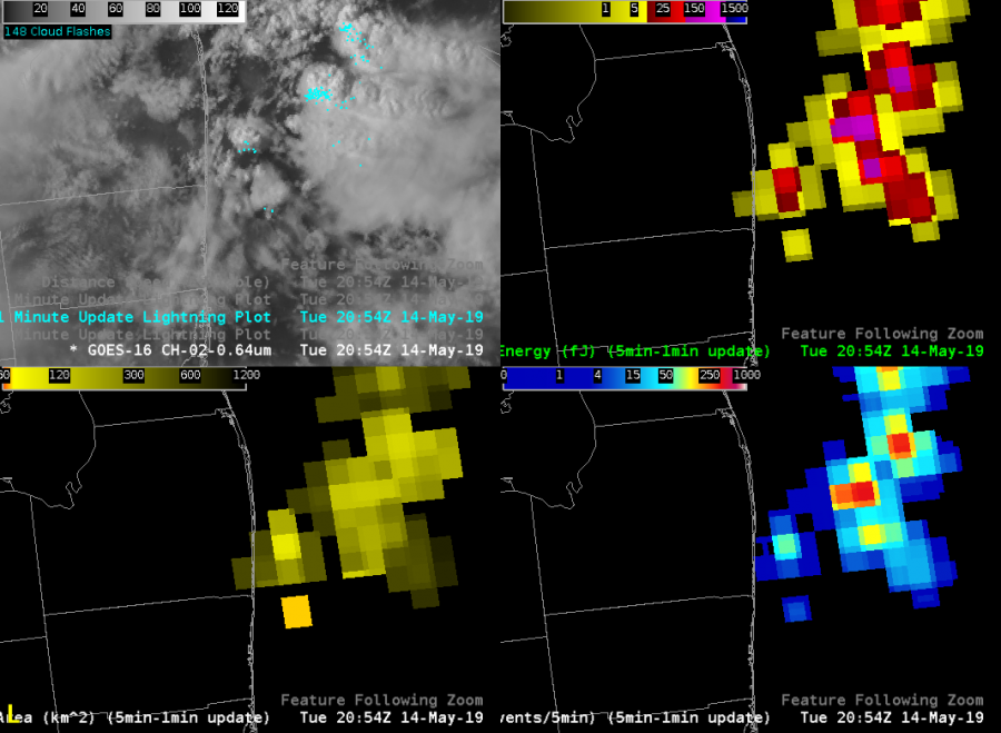
Now for something else that’s rather striking (ha ha) in the eastern half of this area. ENTLN cloud flashes depict two active areas in the northeast corner but little if any activity to the southeast beyond that. Shown another way…
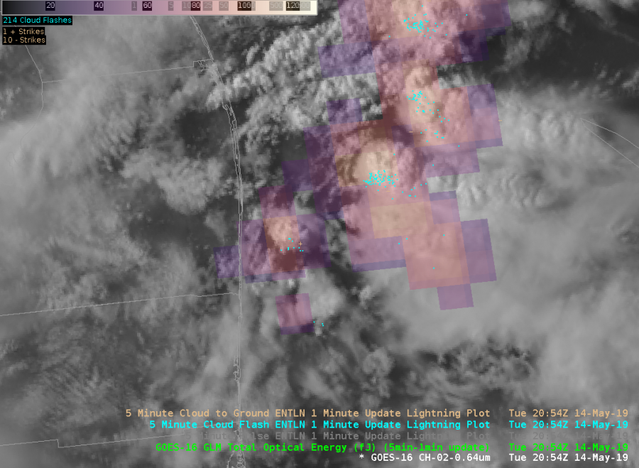 So, we see good connectivity in probable electrification from northwest to southeast that is not otherwise apparent in the flash data. So, I’m slowly coming around to the idea that this can be helpful for IDSS applications when lightning is a concern with multi-cell clusters featuring extensive anvil coverage.
#MarfaFront